Search icon CANCEL
Subscription
0
Cart icon
Cart
Close icon
You have no products in your basket yet
Save more on your purchases!
Savings automatically calculated. No voucher code required
Arrow left icon
All Products
Best Sellers
New Releases
Books
Videos
Audiobooks
Learning Hub
Newsletters
Free Learning
Arrow right icon
$9.99 | ALL EBOOKS & VIDEOS
Save more on purchases! Buy 2 and save 10%, Buy 3 and save 15%, Buy 5 and save 20%
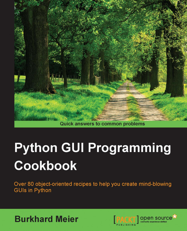
Python GUI Programming Cookbook

Python GUI Programming Cookbook: Over 80 object-oriented recipes to help you create mind-blowing GUIs in Python

By Burkhard Meier
$39.99 $9.99
Book Dec 2015 350 pages 1st Edition
eBook
$39.99 $9.99
Print
$48.99 $33.99
Subscription
$15.99 Monthly
eBook
$39.99 $9.99
Print
$48.99 $33.99
Subscription
$15.99 Monthly

What do you get with eBook?

Product feature icon Instant access to your Digital eBook purchase
Product feature icon Download this book in EPUB and PDF formats
Product feature icon Access this title in our online reader with advanced features
Product feature icon DRM FREE - Read whenever, wherever and however you want
Buy Now
Table of content icon View table of contents Preview book icon Preview Book

Python GUI Programming Cookbook

Chapter 1. Creating the GUI Form and Adding Widgets

In this chapter, we start creating amazing GUIs using Python 3:

  • Creating our first Python GUI

  • Preventing the GUI from being resized

  • Adding a label to the GUI form

  • Creating buttons and changing their text property

  • Text box widgets

  • Setting the focus to a widget and disabling widgets

  • Combo box widgets

  • Creating a check button with different initial states

  • Using radio button widgets

  • Using scrolled text widgets

  • Adding several widgets in a loop

Introduction


In this chapter, we will develop our first GUI in Python. We start with the minimum code required to build a running GUI application. Each recipe then adds different widgets to the GUI form.

In the first two recipes, we show the entire code, consisting of only a few lines of code. In the following recipes we only show the code to be added to the previous recipes.

By the end of this chapter, we will have created a working GUI application that consists of labels, buttons, text boxes, combo boxes, and check buttons in various states, as well as radio buttons that change the background color of the GUI.

Creating our first Python GUI


Python is a very powerful programming language. It ships with the built-in tkinter module. In only a few lines of code (four, to be precise) we can build our first Python GUI.

Getting ready

To follow this recipe, a working Python development environment is a prerequisite. The IDLE GUI that ships with Python is enough to start. IDLE was built using tkinter!

Note

All the recipes in this book were developed using Python 3.4 on a Windows 7 64-bit OS. They have not been tested on any other configuration. As Python is a cross-platform language, the code from each recipe is expected to run everywhere.

If you are using a Mac, it does come built-in with Python, yet it might be missing some modules such as tkinter, which we will use throughout this book.

We are using Python 3 and the creator of Python intentionally chose not to make it backwards compatible with Python 2.

If you are using a Mac or Python 2, you might have to install Python 3 from www.python.org in order to successfully run the recipes in this book.

How to do it...

Here are the four lines of Python code required to create the resulting GUI:

import tkinter as tk     # 1
win = tk.Tk()            # 2
win.title("Python GUI")  # 3
win.mainloop()           # 4

Execute this code and admire the result:

How it works...

In line 1, we import the built-in tkinter module and alias it as tk to simplify our Python code. In line 2, we create an instance of the Tk class by calling its constructor (the parentheses appended to Tk turn the class into an instance). We are using the alias tk so we don't have to use the longer word tkinter. We are assigning the class instance to a variable named win (short for a window). As Python is a dynamically typed language, we did not have to declare this variable before assigning to it and we did not have to give it a specific type. Python infers the type from the assignment of this statement. Python is a strongly typed language, so every variable always has a type. We just don't have to specify its type beforehand like in other languages. This makes Python a very powerful and productive language to program in.

Note

A little note about classes and types:

In Python every variable always has a type. We cannot create a variable without assigning it a type. Yet, in Python, we do not have to declare the type beforehand, as we have to do in the C programming language.

Python is smart enough to infer the type. At the time of writing, C# also has this capability.

Using Python, we can create our own classes using the class keyword instead of the def keyword.

In order to assign the class to a variable, we first have to create an instance of our class. We create the instance and assign this instance to our variable.

class AClass(object):
    print('Hello from AClass')

classInstance = AClass()

Now the variable classInstance is of the type AClass.

If this sounds confusing, do not worry. We will cover OOP in the coming chapters.

In line 3, we use the instance variable of the class (win) to give our window a title via the title property. In line 4, we start the window's event loop by calling the mainloop method on the class instance win. Up to this point in our code, we created an instance and set one property but the GUI will not be displayed until we start the main event loop.

Note

An event loop is a mechanism that makes our GUI work. We can think of it as an endless loop where our GUI is waiting for events to be sent to it. A button click creates an event within our GUI or our GUI being resized also creates an event.

We can write all of our GUI code in advance and nothing will be displayed on the user's screen until we call this endless loop (win.mainloop() in the code shown above).

The event loop ends when the user clicks the red X button or a widget that we have programmed to end our GUI. When the event loop ends, our GUI also ends.

There's more...

This recipe used a minimum amount of Python code to create our first GUI program. However, throughout this book, we will use OOP when it makes sense.

Preventing the GUI from being resized


Getting ready

This recipe extends the previous one. Therefore, it is necessary to have typed Recipe 1 yourself into a project of your own or downloaded the code from https://www.packtpub.com/support.

How to do it...

We are preventing the GUI from being resized.

import tkinter as tk        # 1 imports

win = tk.Tk()               # 2 Create instance
win.title("Python GUI")     # 3 Add a title       
    
win.resizable(0, 0)         # 4 Disable resizing the GUI

win.mainloop()              # 5 Start GUI

Running the code creates this GUI:

How it works...

Line 4 prevents the Python GUI from being resized.

Running this code will result in a GUI similar to the one we created in Recipe 1. However, the user can no longer resize it. Also, notice how the maximize button in the toolbar of the window is grayed out.

Why is this important? Because, once we add widgets to our form, resizing can make our GUI look not as good as we want it to be. We will add widgets to our GUI in the next recipes.

Resizable() is a method of the Tk() class and, by passing in (0, 0), we prevent the GUI from being resized. If we pass in other values, we hard-code the x and y start up size of the GUI, but that won't make it nonresizable.

We also added comments to our code in preparation for the recipes contained in this book.

Note

In visual programming IDEs such as Visual Studio .NET, C# programmers often do not think of preventing the user from resizing the GUI they developed in this language. That creates inferior GUIs. Adding this one line of Python code can make our users appreciate our GUI.

Adding a label to the GUI form


Getting ready

We are extending the first recipe. We will leave the GUI resizable, so don't use the code from the second recipe (or comment the win.resizable line 4 out).

How to do it...

In order to add a Label widget to our GUI, we are importing the ttk module from tkinter. Please note the two import statements.

# imports                  # 1
import tkinter as tk       # 2
from tkinter import ttk    # 3

Add the following code just above win.mainloop() located at the bottom of recipes 1 and 2.

# Adding a Label           # 4
ttk.Label(win, text="A Label").grid(column=0, row=0) # 5

Running the code adds a label to our GUI:

How it works...

In line 3 of the above code, we are importing a separate module from tkinter. The ttk module has some advanced widgets that make our GUI look great. In a sense, ttk is an extension within tkinter.

We still need to import tkinter itself, but we have to specify that we now want to also use ttk from tkinter.

Note

ttk stands for 'themed tk". It improves our GUI look and feel.

Line 5 above adds the label to the GUI, just before we call mainloop (not shown here to preserve space. See recipes 1 or 2).

We are passing our window instance into the ttk.Label constructor and setting the text property. This becomes the text our Label will display.

We are also making use of the grid layout manager, which we'll explore in much more depth in Chapter 2, Layout Management.

Note how our GUI suddenly got much smaller than in previous recipes.

The reason why it became so small is that we added a widget to our form. Without a widget, tkinter uses a default size. Adding a widget causes optimization, which generally means using as little space as necessary to display the widget(s).

If we make the text of the label longer, the GUI will expand automatically. We will cover this automatic form size adjustment in a later recipe in Chapter 2, Layout Management.

There's more...

Try resizing and maximizing this GUI with a label and watch what happens.

Creating buttons and changing their text property


Getting ready

This recipe extends the previous one. You can download the entire code from the Packt Publishing website.

How to do it...

We are adding a button that, when clicked, performs an action. In this recipe, we will update the label we added in the previous recipe, as well as updating the text property of the button.

# Modify adding a Label                                      # 1
aLabel = ttk.Label(win, text="A Label")                      # 2
aLabel.grid(column=0, row=0)                                 # 3


# Button Click Event Callback Function                       # 4
def clickMe():                                               # 5
    action.configure(text="** I have been Clicked! **")
    aLabel.configure(foreground='red')

# Adding a Button                                            # 6
action = ttk.Button(win, text="Click Me!", command=clickMe)  # 7
action.grid(column=1, row=0)                                 # 8

Before clicking the button:

After clicking the button, the color of the label has been changed, and so has the text of the button. Action!

How it works...

In line 2 we are now assigning the label to a variable and in line 3 we use this variable to position the label within the form. We will need this variable to change its properties in the clickMe() function. By default, this is a module-level variable so we can access it inside the function as long as we declare the variable above the function that calls it.

Line 5 is the event handler that is being invoked once the button gets clicked.

In line 7, we create the button and bind the command to the clickMe() function.

Note

GUIs are event-driven. Clicking the button creates an event. We bind what happens when this event occurs in the callback function using the command property of the ttk.Button widget. Notice how we do not use parentheses; only the name clickMe.

We also change the text of the label to include red as in the printed book, this might otherwise not be obvious. When you run the code you can see that the color did indeed change.

Lines 3 and 8 both use the grid layout manager, which will be discussed in the following chapter. This aligns both the label and the button.

There's more...

We will continue to add more and more widgets to our GUI and we will make use of many built-in properties in other recipes in the book.

Text box widgets


In tkinter, the typical textbox widget is called Entry. In this recipe, we will add such an Entry to our GUI. We will make our label more useful by describing what the Entry is doing for the user.

Getting ready

This recipe builds upon the Creating buttons and changing their text property recipe.

How to do it...

# Modified Button Click Function   # 1
def clickMe():                     # 2
    action.configure(text='Hello ' + name.get())
    
# Position Button in second row, second column (zero-based)
action.grid(column=1, row=1)

# Changing our Label               # 3
ttk.Label(win, text="Enter a name:").grid(column=0, row=0) # 4

# Adding a Textbox Entry widget    # 5
name = tk.StringVar()              # 6
nameEntered = ttk.Entry(win, width=12, textvariable=name) # 7
nameEntered.grid(column=0, row=1)  # 8

Now our GUI looks like this:

After entering some text and clicking the button, there is the following change in the GUI:

How it works...

In line 2 we are getting the value of the Entry widget. We are not using OOP yet, so how come we can access the value of a variable that was not even declared yet?

Without using OOP classes, in Python procedural coding we have to physically place a name above a statement that tries to use that name. So how come this works (it does)?

The answer is that the button click event is a callback function, and by the time the button is clicked by a user, the variables referenced in this function are known and do exist.

Life is good.

Line 4 gives our label a more meaningful name, because now it describes the textbox below it. We moved the button down next to the label to visually associate the two. We are still using the grid layout manager, to be explained in more detail in Chapter 2, Layout Management.

Line 6 creates a variable name. This variable is bound to the Entry and, in our clickMe() function, we are able to retrieve the value of the Entry box by calling get() on this variable. This works like a charm.

Now we see that while the button displays the entire text we entered (and more), the textbox Entry widget did not expand. The reason for this is that we had hard-coded it to a width of 12 in line 7.

Note

Python is a dynamically-typed language and infers the type from the assignment. What this means is if we assign a string to the variable name, the variable will be of the type string, and if we assign an integer to name, this variable's type will be integer.

Using tkinter, we have to declare the variable name as the type tk.StringVar() before we can use it successfully. The reason is this that Tkinter is not Python. We can use it from Python but it is not the same language.

Setting the focus to a widget and disabling widgets


While our GUI is nicely improving, it would be more convenient and useful to have the cursor appear in the Entry widget as soon as the GUI appears. Here we learn how to do this.

Getting ready

This recipe extends the previous recipe.

How to do it...

Python is truly great. All we have to do to set the focus to a specific control when the GUI appears is call the focus() method on an instance of a tkinter widget we previously created. In our current GUI example, we assigned the ttk.Entry class instance to a variable we named nameEntered. Now we can give it the focus.

Place the following code just above the bottom of the module that starts the main windows event loop, just like in previous recipes. If you get some errors, make sure you are placing calls to variables below the code where they are declared. We are not using OOP as of yet, so this is still necessary. Later, it will no longer be necessary to do this.

nameEntered.focus()            # Place cursor into name Entry

On a Mac, you might have to set the focus to the GUI window first before being able to set the focus to the Entry widget in this window.

Adding this one line of Python code places the cursor into our text Entry box, giving the text Entry box the focus. As soon as the GUI appears, we can type into this text box without having to click it first.

Note

Note how the cursor now defaults to residing inside the text Entry box.

We can also disable widgets. To do that, we set a property on the widget. We can make the button disabled by adding this one line of Python code:

action.configure(state='disabled')    # Disable the Button Widget

After adding the above line of Python code, clicking the button no longer creates any action!

How it works...

This code is self-explanatory. We set the focus to one control and disable another widget. Good naming in programming languages helps to eliminate lengthy explanations. Later in this book, there will be some advanced tips on how to do this while programming at work or practicing our programming skills at home.

There's more...

Yes. This is only the first chapter. There is much more to come.

Combo box widgets


In this recipe, we will improve our GUI by adding drop-down combo boxes that can have initial default values. While we can restrict the user to only certain choices, at the same time, we can allow the user to type in whatever they wish.

Getting ready

This recipe extends the previous recipes.

How to do it...

We are inserting another column between the Entry widget and the Button using the grid layout manager. Here is the Python code.

ttk.Label(win, text="Choose a number:").grid(column=1, row=0)  # 1
number = tk.StringVar()                         # 2
numberChosen = ttk.Combobox(win, width=12, textvariable=number) #3
numberChosen['values'] = (1, 2, 4, 42, 100)     # 4
numberChosen.grid(column=1, row=1)              # 5
numberChosen.current(0)                         # 6

This code, when added to previous recipes, creates the following GUI. Note how, in line 4 in the preceding code, we assign a tuple with default values to the combo box. These values then appear in the drop-down box. We can also change them if we like (by typing in different values when the application is running).

How it works...

Line 1 adds a second label to match the newly created combo box (created in line 3). Line 2 assigns the value of the box to a variable of a special tkinter type (StringVar), as we did in a previous recipe.

Line 5 aligns the two new controls (label and combo box) within our previous GUI layout, and line 6 assigns a default value to be displayed when the GUI first becomes visible. This is the first value of the numberChosen['values'] tuple, the string "1". We did not place quotes around our tuple of integers in line 4, but they got casted into strings because, in line 2, we declared the values to be of type tk.StringVar.

The screenshot shows the selection made by the user (42). This value gets assigned to the number variable.

There's more...

If we want to restrict the user to only be able to select the values we have programmed into the Combobox, we can do that by passing the state property into the constructor. Modify line 3 in the previous code to:

numberChosen = ttk.Combobox(win, width=12, textvariable=number, state='readonly')

Now users can no longer type values into the Combobox. We can display the value chosen by the user by adding the following line of code to our Button Click Event Callback function:

# Modified Button Click Callback Function
def clickMe():
    action.configure(text='Hello ' + name.get()+ ' ' + numberChosen.get())

After choosing a number, entering a name, and then clicking the button, we get the following GUI result, which now also displays the number selected:

Creating a check button with different initial states


In this recipe, we will add three Checkbutton widgets, each with a different initial state.

Getting ready

This recipe extends the previous recipes.

How to do it...

We are creating three Checkbutton widgets that differ in their states. The first is disabled and has a checkmark in it. The user cannot remove this checkmark as the widget is disabled.

The second Checkbutton is enabled and, by default, has no checkmark in it, but the user can click it to add a checkmark.

The third Checkbutton is both enabled and checked by default. The users can uncheck and recheck the widget as often as they like.

# Creating three checkbuttons    # 1
chVarDis = tk.IntVar()           # 2
check1 = tk.Checkbutton(win, text="Disabled", variable=chVarDis, state='disabled')                     # 3
check1.select()                  # 4
check1.grid(column=0, row=4, sticky=tk.W) # 5

chVarUn = tk.IntVar()            # 6
check2 = tk.Checkbutton(win, text="UnChecked", variable=chVarUn)
check2.deselect()                # 8
check2.grid(column=1, row=4, sticky=tk.W) # 9                  

chVarEn = tk.IntVar()            # 10
check3 = tk.Checkbutton(win, text="Enabled", variable=chVarEn)
check3.select()                  # 12
check3.grid(column=2, row=4, sticky=tk.W) # 13

Running the new code results in the following GUI:

How it works...

In lines 2, 6, and 10, we create three variables of type IntVar. In the following line, for each of these variables we create a Checkbutton, passing in these variables. They will hold the state of the Checkbutton (unchecked or checked). By default, that is either 0 (unchecked) or 1 (checked) so the type of the variable is a tkinter integer.

We place these Checkbutton widgets in our main window so the first argument passed into the constructor is the parent of the widget; in our case win. We give each Checkbutton a different label via its text property.

Setting the sticky property of the grid to tk.W means that the widget will be aligned to the west of the grid. This is very similar to Java syntax and it means that it will be aligned to the left. When we resize our GUI, the widget will remain on the left side and not be moved towards the center of the GUI.

Lines 4 and 12 place a checkmark into the Checkbutton widget by calling the select() method on these two Checkbutton class instances.

We continue to arrange our widgets using the grid layout manager, which will be explained in more detail in Chapter 2, Layout Management.

Using radio button widgets


In this recipe, we will create three tkinter Radiobutton widgets. We will also add some code that changes the color of the main form depending upon which Radiobutton is selected.

Getting ready

This recipe extends the previous recipes.

How to do it...

We are adding the following code to the previous recipe:

# Radiobutton Globals   # 1
COLOR1 = "Blue"         # 2
COLOR2 = "Gold"         # 3
COLOR3 = "Red"          # 4

# Radiobutton Callback  # 5
def radCall():          # 6
   radSel=radVar.get()
   if   radSel == 1: win.configure(background=COLOR1)
   elif radSel == 2: win.configure(background=COLOR2)
   elif radSel == 3: win.configure(background=COLOR3)

# create three Radiobuttons   # 7
radVar = tk.IntVar()          # 8
rad1 = tk.Radiobutton(win, text=COLOR1, variable=radVar, value=1,               command=radCall)              # 9
rad1.grid(column=0, row=5, sticky=tk.W)  # 10

rad2 = tk.Radiobutton(win, text=COLOR2, variable=radVar, value=2, command=radCall)                             # 11
rad2.grid(column=1, row=5, sticky=tk.W)  # 12

rad3 = tk.Radiobutton(win, text=COLOR3, variable=radVar, value=3, command=radCall)                             # 13
rad3.grid(column=2, row=5, sticky=tk.W)  # 14

Running this code and selecting the Radiobutton named Gold creates the following window:

How it works...

In lines 2-4 we create some module-level global variables, which we will use in the creation of each radio button as well as in the callback function that creates the action of changing the background color of the main form (using the instance variable win).

We are using global variables to make it easier to change the code. By assigning the name of the color to a variable and using this variable in several places, we can easily experiment with different colors. Instead of doing a global search-and-replace of a hard-coded string (which is prone to errors), we just need to change one line of code and everything else will work. This is known as the DRY principle, which stands for Don't Repeat Yourself. This is an OOP concept that we will use in later recipes of the book.

Note

The names of the colors we are assigning to the variables (COLOR1, COLOR2 …) are tkinter keywords (technically, they are symbolic names). If we use names that are not tkinter color keywords, then the code will not work.

Line 6 is the callback function that changes the background of our main form (win) depending upon the user's selection.

In line 8 we are creating a tk.IntVar variable. What is important about this is that we are creating only one variable to be used by all three radio buttons. As can be seen from the above screenshot, no matter which Radiobutton we select, all the others will automatically be unselected for us.

Lines 9 to 14 create the three radio buttons, assign them to the main form, and pass in the variable to be used in the callback function that creates the action of changing the background of our main window.

Note

While this is the first recipe that changes the color of a widget, quite honestly, it looks a bit ugly. A large portion of the following recipes in this book explain how to make our GUI look truly amazing.

There's more...

Here is a small sample of the available symbolic color names that you can look up at the official tcl manual page:

http://www.tcl.tk/man/tcl8.5/TkCmd/colors.htm

Name

Red

Green

Blue

alice blue

240

248

255

AliceBlue

240

248

255

Blue

0

0

255

Gold

255

215

0

Red

255

0

0

Some of the names create the same color, so alice blue creates the same color as AliceBlue. In this recipe we used the symbolic names Blue, Gold, and Red.

Using scrolled text widgets


ScrolledText widgets are much larger than simple Entry widgets and span multiple lines. They are widgets like Notepad and wrap lines, automatically enabling vertical scrollbars when the text gets larger than the height of the ScrolledText widget.

Getting ready

This recipe extends the previous recipes. You can download the code for each chapter of this book from the Packt Publishing website.

How to do it...

By adding the following lines of code, we create a ScrolledText widget:

# Add this import to the top of the Python Module    # 1
from tkinter import scrolledtext      # 2

# Using a scrolled Text control       # 3
scrolW  = 30                          # 4
scrolH  =  3                          # 5
scr = scrolledtext.ScrolledText(win, width=scrolW, height=scrolH, wrap=tk.WORD)                         # 6
scr.grid(column=0, columnspan=3)      # 7

We can actually type into our widget, and if we type enough words, the lines will automatically wrap around!

Once we type in more words than the height of the widget can display, the vertical scrollbar becomes enabled. This all works out-of-the-box without us needing to write any more code to achieve this.

How it works...

In line 2 we are importing the module that contains the ScrolledText widget class. Add that to the top of the module, just below the other two import statements.

Lines 4 and 5 define the width and height of the ScrolledText widget we are about to create. These are hard-coded values we are passing into the ScrolledText widget constructor in line 6.

These values are magic numbers found by experimentation to work well. You might experiment by changing srcolW from 30 to 50 and observe the effect!

In line 6 we are setting a property on the widget by passing in wrap=tk.WORD.

By setting the wrap property to tk.WORD we are telling the ScrolledText widget to break lines by words, so that we do not wrap around within a word. The default option is tk.CHAR, which wraps any character regardless of whether we are in the middle of a word.

The second screenshot shows that the vertical scrollbar moved down because we are reading a longer text that does not entirely fit into the x, y dimensions of the SrolledText control we created.

Setting the columnspan property of the grid widget to 3 for the SrolledText widget makes this widget span all three columns. If we did not set this property, our SrolledText widget would only reside in column one, which is not what we want.

Adding several widgets in a loop


So far we have created several widgets of the same type (for example. Radiobutton) by basically copying and pasting the same code and then modifying the variations (for example, the column number). In this recipe, we start refactoring our code to make it less redundant.

Getting ready

We are refactoring some parts of the previous recipe's code, so you need that code to apply to this recipe to.

How to do it...

# First, we change our Radiobutton global variables into a list.
colors = ["Blue", "Gold", "Red"]              # 1

# create three Radiobuttons using one variable
radVar = tk.IntVar()

Next we are selecting a non-existing index value for radVar.
radVar.set(99)                                # 2

Now we are creating all three Radiobutton widgets within one loop.

for col in range(3):                          # 3
    curRad = 'rad' + str(col)  
    curRad = tk.Radiobutton(win, text=colors[col], variable=radVar,     value=col, command=radCall)
    curRad.grid(column=col, row=5, sticky=tk.W)


We have also changed the callback function to be zero-based, using the list instead of module-level global variables. 

# Radiobutton callback function                # 4
def radCall():
   radSel=radVar.get()
   if   radSel == 0: win.configure(background=colors[0])
   elif radSel == 1: win.configure(background=colors[1])
   elif radSel == 2: win.configure(background=colors[2])

Running this code will create the same window as before, but our code is much cleaner and easier to maintain. This will help us when we expand our GUI in the following recipes.

How it works...

In line 1, we have turned our global variables into a list.

In line 2, we are setting a default value to the tk.IntVar variable we named radVar. This is important because, while in the previous recipe we had set the value for Radiobutton widgets starting at 1, in our new loop it is much more convenient to use Python's zero-based indexing. If we did not set the default value to a value outside the range of our Radiobutton widgets, one of the radio buttons would be selected when the GUI appears. While this in itself might not be so bad, it would not trigger the callback and we would end up with a radio button selected that does not do its job (that is, change the color of the main win form).

In line 3 we are replacing the three previously hard-coded creations of the Radiobutton widgets with a loop, which does the same. It is just more concise (fewer lines of code) and much more maintainable. For example, if we want to create 100 instead of just 3 Radiobutton widgets, all we have to change is the number inside Python's range operator. We would not have to type or copy and paste 97 sections of duplicate code, just one number.

Line 4 shows the modified callback, which physically lives above the previous lines. We placed it below to give emphasis to the more important parts of this recipe.

There's more...

This recipe concludes the first chapter of this book. All the following recipes in all of the next chapters will build upon the GUI we have constructed so far, greatly enhancing it.

Left arrow icon Right arrow icon

Key benefits

What you will learn

Product Details

Country selected

Publication date : Dec 1, 2015
Length 350 pages
Edition : 1st Edition
Language : English
ISBN-13 : 9781785283758
Category :

What do you get with eBook?

Product feature icon Instant access to your Digital eBook purchase
Product feature icon Download this book in EPUB and PDF formats
Product feature icon Access this title in our online reader with advanced features
Product feature icon DRM FREE - Read whenever, wherever and however you want
Buy Now

Product Details


Publication date : Dec 1, 2015
Length 350 pages
Edition : 1st Edition
Language : English
ISBN-13 : 9781785283758
Category :

Table of Contents

18 Chapters
Python GUI Programming Cookbook Chevron down icon Chevron up icon
Credits Chevron down icon Chevron up icon
About the Author Chevron down icon Chevron up icon
About the Reviewers Chevron down icon Chevron up icon
www.PacktPub.com Chevron down icon Chevron up icon
Preface Chevron down icon Chevron up icon
1. Creating the GUI Form and Adding Widgets Chevron down icon Chevron up icon
2. Layout Management Chevron down icon Chevron up icon
3. Look and Feel Customization Chevron down icon Chevron up icon
4. Data and Classes Chevron down icon Chevron up icon
5. Matplotlib Charts Chevron down icon Chevron up icon
6. Threads and Networking Chevron down icon Chevron up icon
7. Storing Data in Our MySQL Database via Our GUI Chevron down icon Chevron up icon
8. Internationalization and Testing Chevron down icon Chevron up icon
9. Extending Our GUI with the wxPython Library Chevron down icon Chevron up icon
10. Creating Amazing 3D GUIs with PyOpenGL and PyGLet Chevron down icon Chevron up icon
11. Best Practices Chevron down icon Chevron up icon
Index Chevron down icon Chevron up icon

Customer reviews

Top Reviews
Rating distribution
Empty star icon Empty star icon Empty star icon Empty star icon Empty star icon 0
(0 Ratings)
5 star 0%
4 star 0%
3 star 0%
2 star 0%
1 star 0%
Top Reviews
No reviews found
Get free access to Packt library with over 7500+ books and video courses for 7 days!
Start Free Trial

FAQs

How do I buy and download an eBook? Chevron down icon Chevron up icon

Where there is an eBook version of a title available, you can buy it from the book details for that title. Add either the standalone eBook or the eBook and print book bundle to your shopping cart. Your eBook will show in your cart as a product on its own. After completing checkout and payment in the normal way, you will receive your receipt on the screen containing a link to a personalised PDF download file. This link will remain active for 30 days. You can download backup copies of the file by logging in to your account at any time.

If you already have Adobe reader installed, then clicking on the link will download and open the PDF file directly. If you don't, then save the PDF file on your machine and download the Reader to view it.

Please Note: Packt eBooks are non-returnable and non-refundable.

Packt eBook and Licensing When you buy an eBook from Packt Publishing, completing your purchase means you accept the terms of our licence agreement. Please read the full text of the agreement. In it we have tried to balance the need for the ebook to be usable for you the reader with our needs to protect the rights of us as Publishers and of our authors. In summary, the agreement says:

  • You may make copies of your eBook for your own use onto any machine
  • You may not pass copies of the eBook on to anyone else
How can I make a purchase on your website? Chevron down icon Chevron up icon

If you want to purchase a video course, eBook or Bundle (Print+eBook) please follow below steps:

  1. Register on our website using your email address and the password.
  2. Search for the title by name or ISBN using the search option.
  3. Select the title you want to purchase.
  4. Choose the format you wish to purchase the title in; if you order the Print Book, you get a free eBook copy of the same title. 
  5. Proceed with the checkout process (payment to be made using Credit Card, Debit Cart, or PayPal)
Where can I access support around an eBook? Chevron down icon Chevron up icon
  • If you experience a problem with using or installing Adobe Reader, the contact Adobe directly.
  • To view the errata for the book, see www.packtpub.com/support and view the pages for the title you have.
  • To view your account details or to download a new copy of the book go to www.packtpub.com/account
  • To contact us directly if a problem is not resolved, use www.packtpub.com/contact-us
What eBook formats do Packt support? Chevron down icon Chevron up icon

Our eBooks are currently available in a variety of formats such as PDF and ePubs. In the future, this may well change with trends and development in technology, but please note that our PDFs are not Adobe eBook Reader format, which has greater restrictions on security.

You will need to use Adobe Reader v9 or later in order to read Packt's PDF eBooks.

What are the benefits of eBooks? Chevron down icon Chevron up icon
  • You can get the information you need immediately
  • You can easily take them with you on a laptop
  • You can download them an unlimited number of times
  • You can print them out
  • They are copy-paste enabled
  • They are searchable
  • There is no password protection
  • They are lower price than print
  • They save resources and space
What is an eBook? Chevron down icon Chevron up icon

Packt eBooks are a complete electronic version of the print edition, available in PDF and ePub formats. Every piece of content down to the page numbering is the same. Because we save the costs of printing and shipping the book to you, we are able to offer eBooks at a lower cost than print editions.

When you have purchased an eBook, simply login to your account and click on the link in Your Download Area. We recommend you saving the file to your hard drive before opening it.

For optimal viewing of our eBooks, we recommend you download and install the free Adobe Reader version 9.