Working with views in Dark Mode
So far in this chapter, we've covered not only what dark mode is but also what it has to offer from a development perspective.
In this chapter, we're going to deep dive further into dark mode by looking at how Xcode dynamically handles our UIViews (and objects that are sub-classed from UIViews).
We'll start by understanding the core concept behind adaptive and semantic colors, and by following a simple pattern, Xcode can do so much of the heavy lifting for us.
We'll then dive further and take a look at the various levels of semantic colors available to us, including primary, secondary, and tertiary options, but more importantly, when we would be expected to use them.
What are adaptive colors?
For me, this was a major step in getting developers on board with designing and developing their apps for dark mode and, of course, it was well within Apple's interest to make it as seamless as possible for the developer.
Adaptive colors are a way of defining a single color type or style for a particular appearance. Let's start by diving straight into Xcode and seeing this for ourselves:
- Head back on over to the project you previously created and highlight the UILabel we added in.
- Now, take a look at the Color property in the Attributes Inspector window:
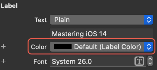
Figure 2.8 – Label properties
You'll notice that the color selected is Default (Label Color) – Label Color is our adaptive color.
But what does that mean? Actually, it's very simple: it means that for one interface style it's one color, and for the other, it's a different color.
In the case of our previous example, our UILabel was black in light mode and white in dark mode – makes sense, right?
Well, to a degree is does, but surely it depends on what type of background our UILabel sits on – let's take a look.
Back in our storyboard, highlight the background of our view and again head over to the Attributes Inspector window:

Figure 2.9 – Background color properties
Again, here we have our adaptive color, System Background Color. Xcode is doing all the work for us when we need to switch appearances.
The preceding parts in the section are a great example of contrasting between two primary colors (black and white used in our labels), which itself is the stereotypical understanding between what colors should be in light and dark appearance – but we're not always going to be using black or white, are we?
So, Apple has updated all their available system colors to be adaptive. Let's take a look.
Head back over to Xcode and highlight our UILabel, and change Color to System Indigo Color:

Figure 2.10 – Font color properties
Now, let's switch between light and dark mode using the toggle in Xcode's storyboard. What do we see? The color indigo, just as we expected:
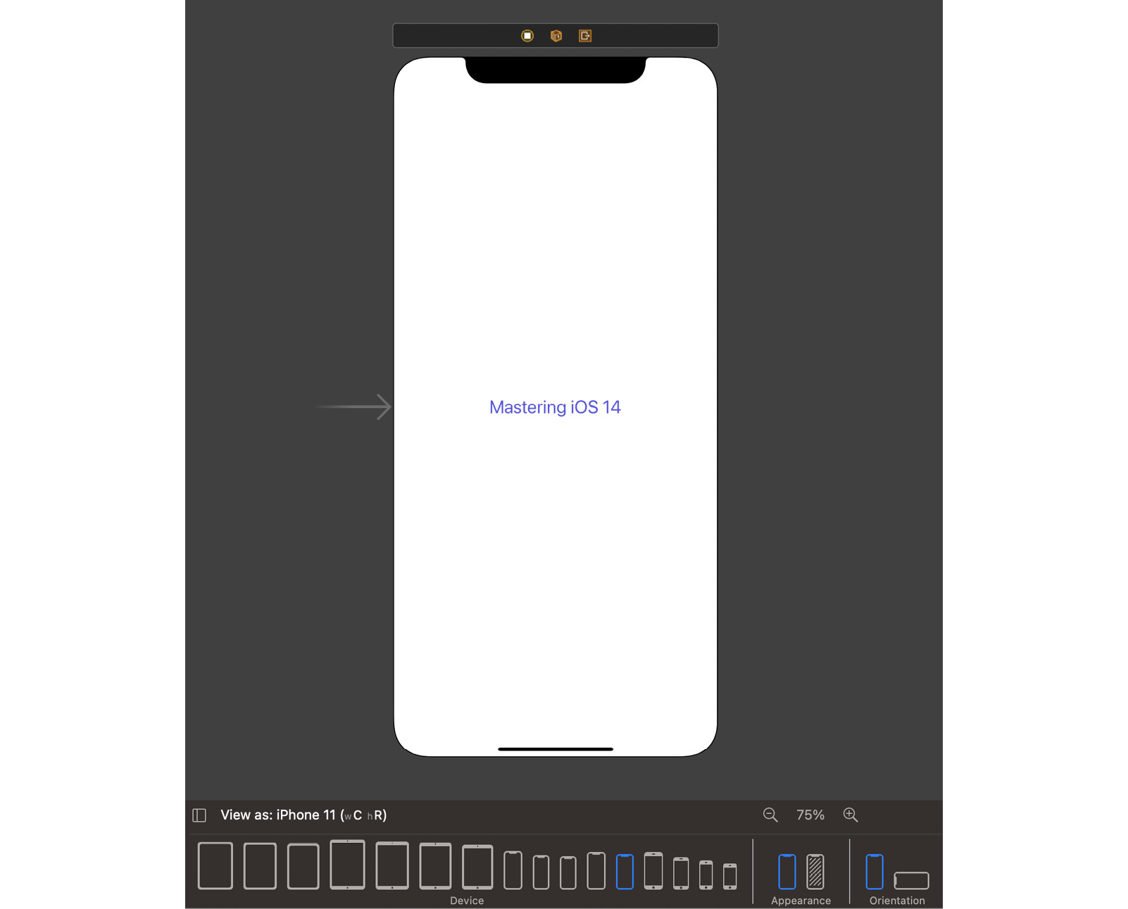
Figure 2.11 – Light mode with Indigo text color
The following screenshot shows the screen with dark mode:
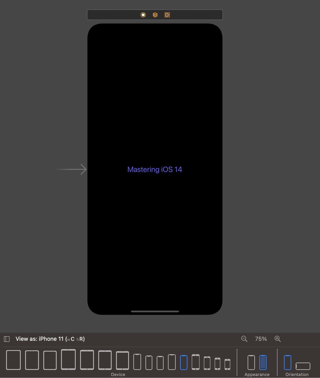
Figure 2.12 – Dark mode with indigo text color
However, each system color has been specifically adapted to each appearance. Let's take a look at the RGB values for each appearance:
- Dark:
R 94: G 92: B 230 - Light:
R 88: G 86: B 214
Although there is a subtle difference in each RGB value, it has a massive effect in terms of appearance and allowing it to stand out against other adapted colors defined by Apple (such as our system background color).
Now that we've learned all about adaptive colors, let's take a look at semantic colors and how Apple helps us pre-define not only the colors we want to use but also where a type of color should be used.
What are semantic colors?
To answer the questions of this section requires us to take a quick look back at what we already covered in the What are adaptive colors? section, because we've already touched on semantic colors.
Remember Label Color from our UILabel and System Background Color? These are all semantic colors – not so much by physical color, but more by their definition and intended purpose.
With semantic colors, Apple has created a whole pre-defined range of adaptive colors that are designed specifically for objects such as labels, backgrounds, and grouped content such as table views. Each of these has additional primary, secondary, and tertiary variants.
Let's put this into practice and update our current Xcode project:
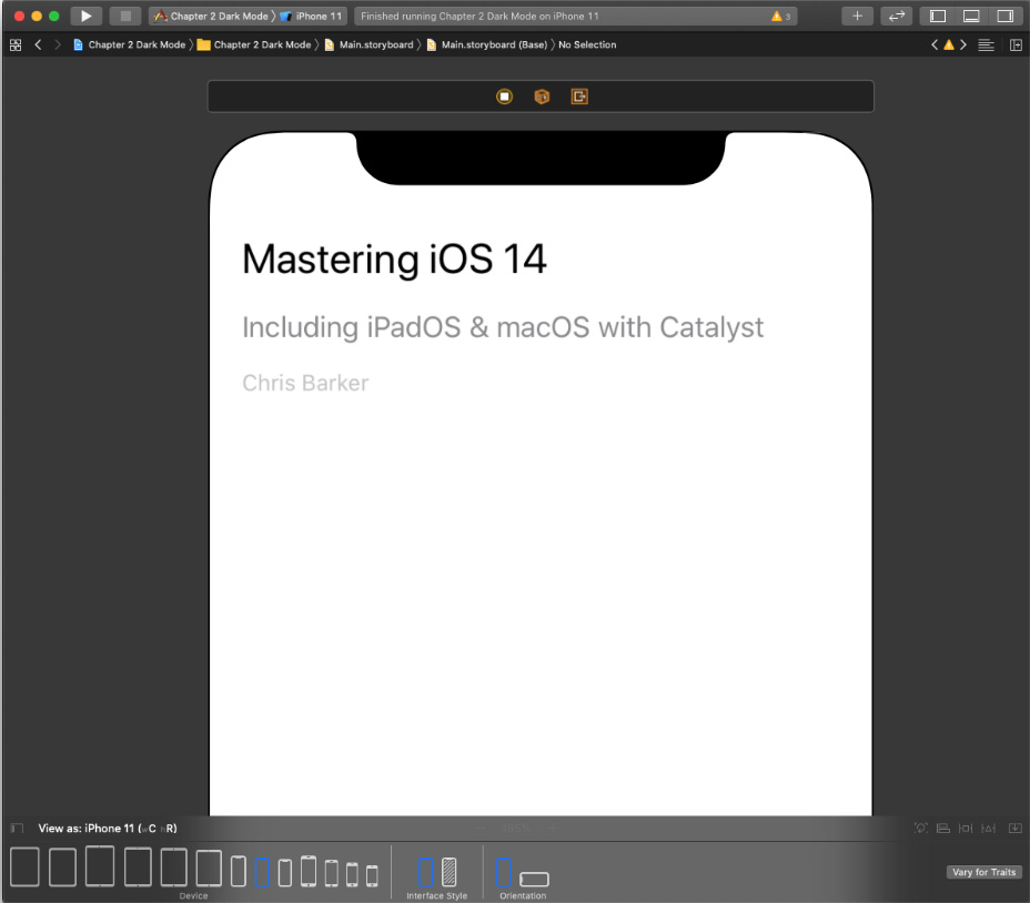
Figure 2.13 – UILabel with semantic variants
I've added a couple more UILabels here and just done a little bit of re-arranging (nothing special), but what I have done is set the semantic variant for each Label with a corresponding variant – let's take a look:
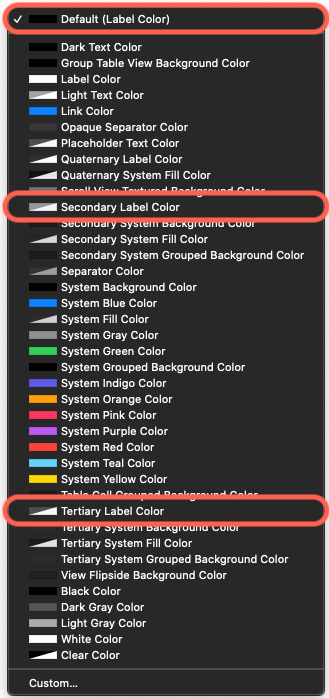
Figure 2.14 – Color options
If we expand the color options for our UILabel, we can see a list of all the pre-defined adaptive/semantic and system and variant colors available to us. I've highlighted the colors I've chosen for each of the new labels.
Now, let's switch the appearance to dark and see how it looks:
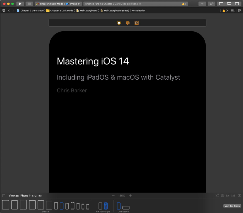
Figure 2.15 – Semantic labels in Dark Mode
Let's go a step further and add some more adaptive content in there. Here, I've dropped in a UIView to act as a separator between content, a UIButton, which will be a URL link, and a UITableView:
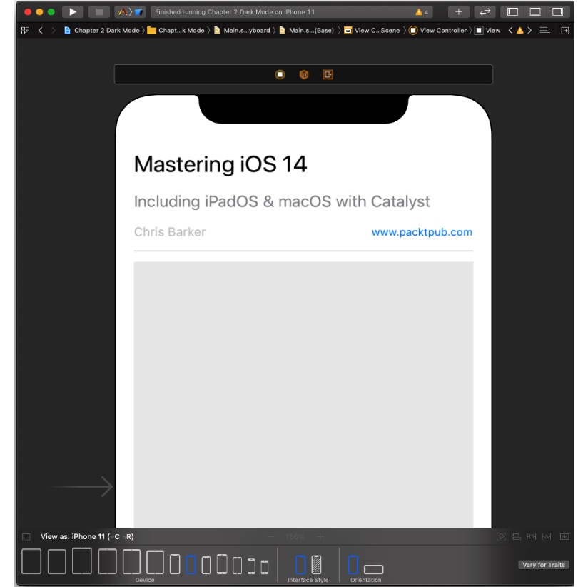
Figure 2.16 – Separators and other background colors
I've assigned the following semantic colors to each of my new views:
- Separator: Separator Color
- Button: Link Color
- Table View: Group Table View Background Color
Let's fire this up in the iOS simulator and see side by side how it looks. You'll notice something interesting:
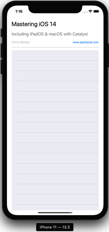
Figure 2.17 – Table view in light and Dark Mode
In the light appearance, you can clearly see the table view's group background color against the system background color; yet if we take a look at this in the dark appearance, you don't see it as much. That's because with a much darker primary background color, the separation isn't needed as much; the black on black doesn't get lost and looks more natural, whereas white on white does.
This all looks great built into Interface Builder, but now let's take a look at how we would do this programmatically.
Using the programmatic approach
Let's start by creating IBOutlets for each of our objects. If you're unfamiliar with creating an outlet, simply, in ViewController, we do the following:
- Declare all our outlet properties first.
- Then, from the
IBOutletconnector (just to the left of your property), press Command + Primary Cursor Click. - Hold and drag this to the UIView or object you want to connect to.
Opening both Interface Builder and
ViewControllerin separate windows will really help this process too:
Figure 2.18 – Creating an outlet
- We'll need to create these in our
ViewController.swiftfile just inside the class declaration. Copy the following highlighted code into your class:class ViewController: UIViewController { @IBOutlet weak var headerImageView: UIImageView! @IBOutlet weak var primaryLabel: UILabel! @IBOutlet weak var secondaryLabel: UILabel! @IBOutlet weak var tertiaryLabel: UILabel! @IBOutlet weak var linkButton: UIButton! @IBOutlet weak var separatorView: UIView! @IBOutlet weak var tableView: UITableView! override func viewDidLoad() { super.viewDidLoad() } } - Now, we can programmatically assign our colors. Inside the
viewDidLoad()function, add the following highlighted code:override func viewDidLoad() { super.viewDidLoad() primaryLabel.textColor = UIColor.label secondaryLabel.textColor = UIColor.secondaryLabel tertiaryLabel.textColor = UIColor.tertiaryLabel linkButton.titleLabel?.textColor = UIColor.link separatorView.backgroundColor = UIColor.separator tableView.backgroundColor = UIColor.systemGroupedBackground }
If you launch the app in the simulator, you'll see that everything should stay the same. If we really want to test our logic, head back on over to Interface Builder and set one of our UILabels to System Green Color. Re-run the app and watch the programmatic code take precedence and override Interface Builder.
In this section, we've looked at how working with views for Dark Mode either in Interface Builder or programmatically is possible with the use of adaptive and semantic colors. We also looked at and understood the value behind using color variations and saw the effect they both have in both light and dark appearance. In the next section, we'll take a look at the asset catalog and how we can create custom adaptive colors and images for use in our app.


