Tweaking Plot Parameters
Looking at the last figure in our previous section, we find that the legend is not appropriately placed. We can tweak the plot parameters to adjust the placements of the legends and the axis labels, as well as change the font-size and rotation of the tick labels.
Exercise 11: Tweaking the Plot Parameters of a Grouped Bar Plot
In this exercise, we'll tweak the plot parameters, for example, hue, of a grouped bar plot. We'll see how to place legends and axis labels in the right places and also explore the rotation feature:
- Import the necessary modules—in this case, only
seaborn:#Import seaborn import seaborn as sns
- Load the dataset:
diamonds_df = sns.load_dataset('diamonds') - Use the
hueparameter to plot nested groups:ax = sns.barplot(x="cut", y="price", hue='color', data=diamonds_df)
The output is as follows:

Figure 1.26: Nested bar plot with the hue parameter
- Place the legend appropriately on the bar plot:
ax = sns.barplot(x='cut', y='price', hue='color', data=diamonds_df)
ax.legend(loc='upper right',ncol=4)
The output is as follows:

Figure 1.27: Grouped bar plot with legends placed appropriately
In the preceding
ax.legend()call, thencolparameter denotes the number of columns into which values in the legend are to be organized, and thelocparameter specifies the location of the legend and can take any one of eight values (upper left, lower center, and so on). - To modify the axis labels on the x axis and y axis, input the following code:
ax = sns.barplot(x='cut', y='price', hue='color', data=diamonds_df)
ax.legend(loc='upper right', ncol=4)
ax.set_xlabel('Cut', fontdict={'fontsize' : 15})
ax.set_ylabel('Price', fontdict={'fontsize' : 15})
The output is as follows:

Figure 1.28: Grouped bar plot with modified labels
- Similarly, use this to modify the font-size and rotation of the x axis of the tick labels:
ax = sns.barplot(x='cut', y='price', hue='color', data=diamonds_df)
ax.legend(loc='upper right',ncol=4)
# set fontsize and rotation of x-axis tick labels
ax.set_xticklabels(ax.get_xticklabels(), fontsize=13, rotation=30)
The output is as follows:
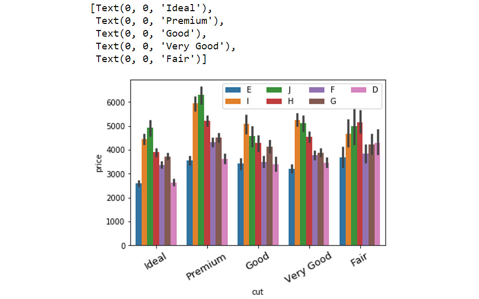
Figure 1.29: Grouped bar plot with the rotation feature of the labels
The rotation feature is particularly useful when the tick labels are long and crowd up together on the x axis.
Annotations
Another useful feature to have in plots is the annotation feature. In the following exercise, we'll make a simple bar plot more informative by adding some annotations.Suppose we want to add more information to the plot about ideally cut diamonds. We can do this in the following exercise:
Exercise 12: Annotating a Bar Plot
In this exercise, we will annotate a bar plot, generated using the catplot function of seaborn, using a note right above the plot. Let's see how:
- Import the necessary modules:
import matplotlib.pyplot as plt
import seaborn as sns
- Load the
diamondsdataset:diamonds_df = sns.load_dataset('diamonds') - Generate a bar plot using
catplotfunction of theseabornlibrary:ax = sns.catplot("cut", data=diamonds_df, aspect=1.5, kind="count", color="b")The output is as follows:

Figure 1.30: Bar plot with seaborn's catplot function
- Annotate the column belonging to the
Idealcategory:# get records in the DataFrame corresponding to ideal cut ideal_group = diamonds_df.loc[diamonds_df['cut']=='Ideal']
- Find the location of the x coordinate where the annotation has to be placed:
# get the location of x coordinate where the annotation has to be placed
x = ideal_group.index.tolist()[0]
- Find the location of the y coordinate where the annotation has to be placed:
# get the location of y coordinate where the annotation has to be placed
y = len(ideal_group)
- Print the location of the x and y co-ordinates:
print(x)
print(y)
The output is:
0
21551
- Annotate the plot with a note:
# annotate the plot with any note or extra information
sns.catplot("cut", data=diamonds_df, aspect=1.5, kind="count", color="b")
plt.annotate('excellent polish and symmetry ratings;\nreflects almost all the light that enters it', xy=(x,y), xytext=(x+0.3, y+2000), arrowprops=dict(facecolor='red'))
The output is as follows:

Figure 1.31: Annotated bar plot
Now, there seem to be a lot of parameters in the annotate function, but worry not! Matplotlib's https://matplotlib.org/3.1.0/api/_as_gen/matplotlib.pyplot.annotate.html official documentation covers all the details. For instance, the xy parameter denotes the point (x,y) on the figure to annotate. xytext denotes the position (x,y) to place the text at. If None, it defaults to xy. Note that we added an offset of .3 for x and 2000 for y (since y is close to 20,000) for the sake of readability of the text. The color of the arrow is specified using the arrowprops parameter in the annotate function.
There are several other bells and whistles associated with visualization libraries in Python, some of which we will see as we progress in the book. At this stage, we will go through a chapter activity to revise the concepts in this chapter.
So far, we have seen how to generate two simple plots using seaborn and pandas—histograms and bar plots:
- Histograms: Histograms are useful for understanding the statistical distribution of a numerical feature in a given dataset. They can be generated using the
hist()function inpandasanddistplot()inseaborn. - Bar plots: Bar plots are useful for gaining insight into the values taken by a categorical feature in a given dataset. They can be generated using the
plot(kind='bar') function inpandasand thecatplot(kind='count'), andbarplot()functions inseaborn.
With the help of various considerations arising in the process of plotting these two types of visualizations, we presented some basic concepts in data visualization:
- Formatting legends to present labels for different elements in the plot with
locand other parameters in thelegendfunction - Changing the properties of tick labels, such as font-size, and rotation, with parameters in the
set_xticklabels()andset_yticklabels()functions - Adding annotations for additional information with the
annotate()function
Activity 1: Analyzing Different Scenarios and Generating the Appropriate Visualization
We'll be working with the 120 years of Olympic History dataset acquired by Randi Griffin from https://www.sports-reference.com/ and made available on the GitHub repository of this book. Your assignment is to identify the top five sports based on the largest number of medals awarded in the year 2016, and then perform the following analysis:
- Generate a plot indicating the number of medals awarded in each of the top five sports in 2016.
- Plot a graph depicting the distribution of the age of medal winners in the top five sports in 2016.
- Find out which national teams won the largest number of medals in the top five sports in 2016.
- Observe the trend in the average weight of male and female athletes winning in the top five sports in 2016.
High-Level Steps
- Download the dataset and format it as a pandas DataFrame.
- Filter the DataFrame to only include the rows corresponding to medal winners from 2016.
- Find out the medals awarded in 2016 for each sport.
- List the top five sports based on the largest number of medals awarded. Filter the DataFrame one more time to only include the records for the top five sports in 2016.
- Generate a bar plot of record counts corresponding to each of the top five sports.
- Generate a histogram for the
Agefeature of all medal winners in the top five sports (2016). - Generate a bar plot indicating how many medals were won by each country's team in the top five sports in 2016.
- Generate a bar plot indicating the average weight of players, categorized based on gender, winning in the top five sports in 2016.
The expected output should be:
After Step 1:
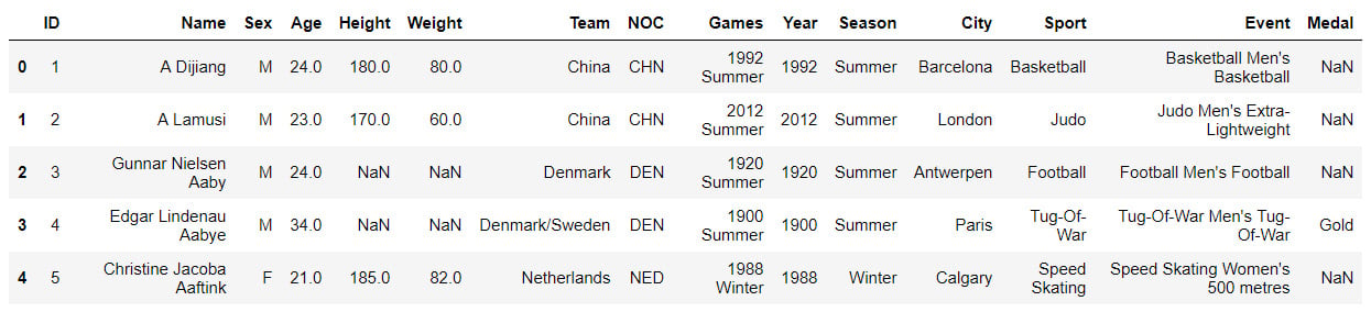
Figure 1.32: Olympics dataset
After Step 2:
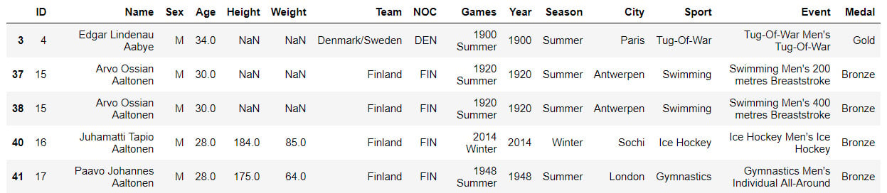
Figure 1.33: Filtered Olympics DataFrame
After Step 3:
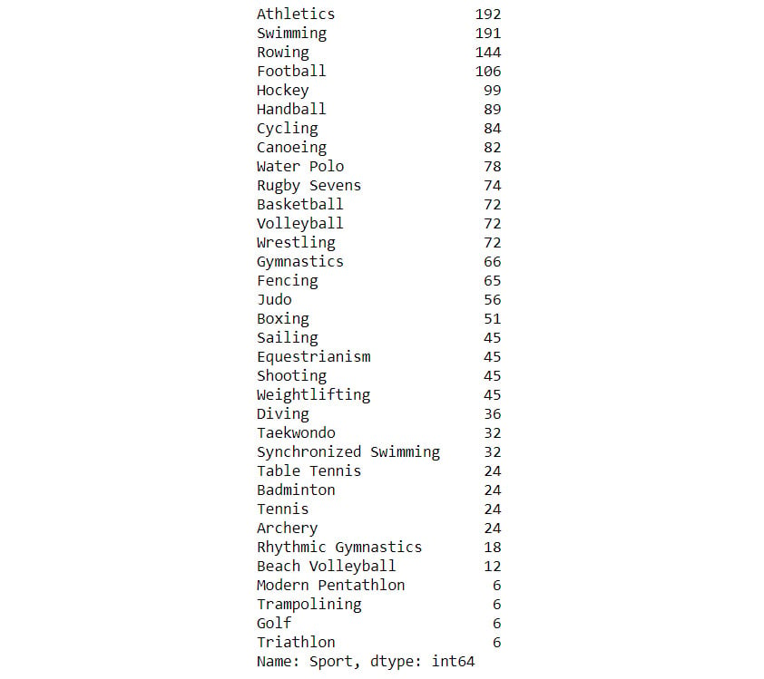
Figure 1.34: The number of medals awarded
After Step 4:
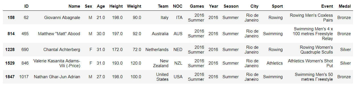
Figure 1.35: Olympics DataFrame
After Step 5:
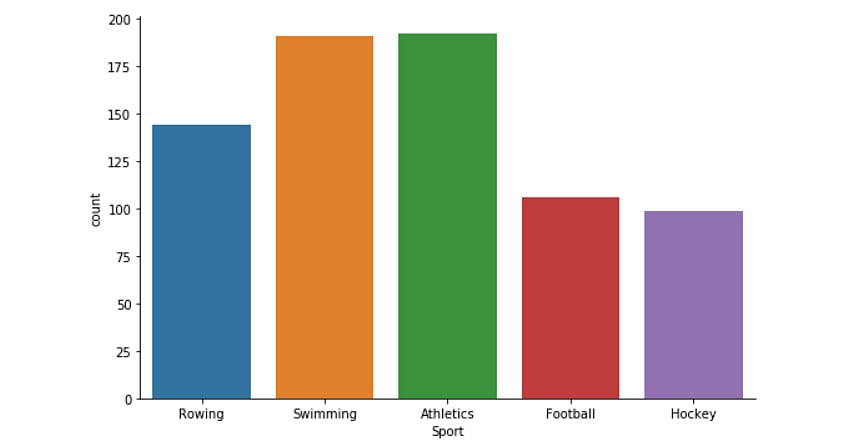
Figure 1.36: Generated bar plot
After Step 6:
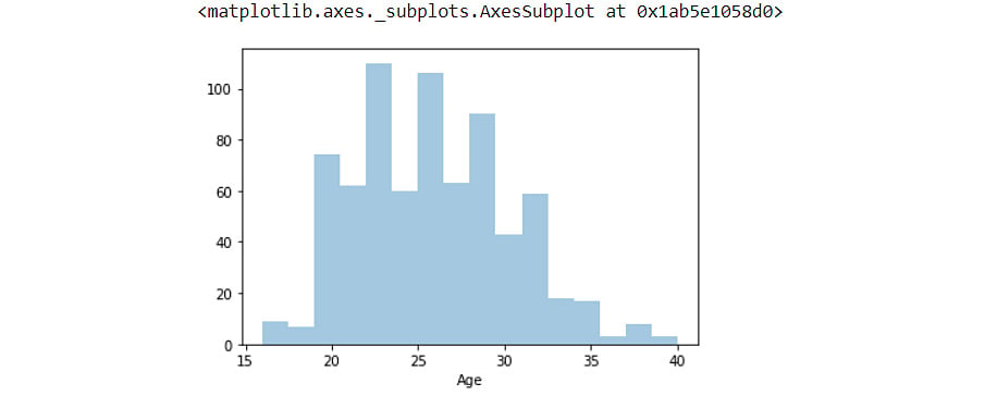
Figure 1.37: Histogram plot with the Age feature
After Step 7:
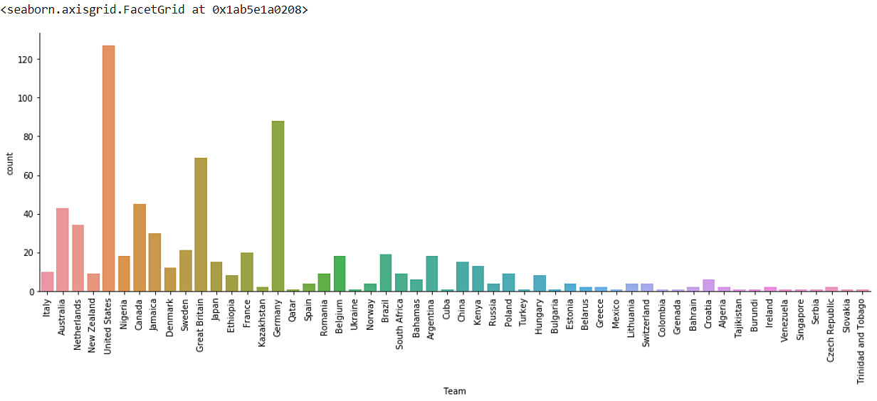
Figure 1.38: Bar plot with the number of medals won
After Step 8:
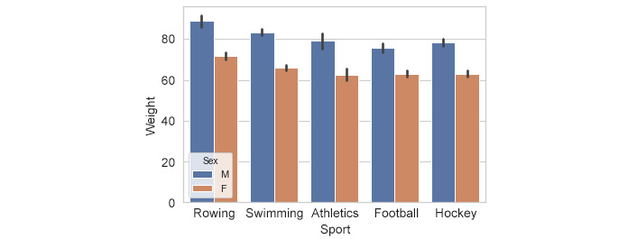
Figure 1.39: Bar plot with the average weight of players
The bar plot indicates the highest athlete weight in rowing, followed by swimming, and then the other remaining sports. The trend is similar across both male and female players.
Note
The solution steps can be found on page 254.