Plotting with pandas and seaborn
Now that we have a basic sense of how to load and handle data in a pandas DataFrame object, let's get started with making some simple plots from data. While there are several plotting libraries in Python (including matplotlib, plotly, and seaborn), in this chapter, we will mainly explore the pandas and seaborn libraries, which are extremely useful, popular, and easy to use.
Creating Simple Plots to Visualize a Distribution of Variables
matplotlib is a plotting library available in most Python distributions and is the foundation for several plotting packages, including the built-in plotting functionality of pandas and seaborn. matplotlib enables control of every single aspect of a figure and is known to be verbose. Both seaborn and pandas visualization functions are built on top of matplotlib. The built-in plotting tool of pandas .is a useful exploratory tool to generate figures that are not ready for primetime but useful to understand the dataset you are working with. seaborn, on the other hand, has APIs to draw a wide variety of aesthetically pleasing plots.
To illustrate certain key concepts and explore the diamonds dataset, we will start with two simple visualizations in this chapter—histograms and bar plots.
Histograms
A histogram of a feature is a plot with the range of the feature on the x-axis and the count of data points with the feature in the corresponding range on the y-axis.
Let's look at the following exercise of plotting a histogram with pandas.
Exercise 8: Plotting and Analyzing a Histogram
In this exercise, we will create a histogram of the frequency of diamonds in the dataset with their respective carat specifications on the x-axis:
- Import the necessary modules:
import seaborn as sns
import pandas as pd
- Import the
diamondsdataset fromseaborn:diamonds_df = sns.load_dataset('diamonds') - Plot a histogram using the
diamondsdataset wherex axis = carat:diamonds_df.hist(column='carat')
The output is as follows:

Figure 1.14: Histogram plot
The y axis in this plot denotes the number of diamonds in the dataset with the
caratspecification on the x-axis.The
histfunction has a parameter calledbins, which literally refers to the number of equally sizedbinsinto which the data points are divided. By default, the bins parameter is set to10inpandas. We can change this to a different number, if we wish. - Change the
binsparameter to50:diamonds_df.hist(column='carat', bins=50)
The output is as follows:

Figure 1.15: Histogram with bins = 50
This is a histogram with
50bins. Notice how we can see a more fine-grained distribution as we increase the number of bins. It is helpful to test with multiple bin sizes to know the exact distribution of the feature. The range ofbinsizes varies from1(where all values are in the same bin) to the number of values (where each value of the feature is in one bin). - Now, let's look at the same function using
seaborn:sns.distplot(diamonds_df.carat)
The output is as follows:

Figure 1.16: Histogram plot using seaborn
There are two noticeable differences between the
pandashistfunction andseaborndistplot:pandassets thebinsparameter to a default of10, butseaborninfers an appropriate bin size based on the statistical distribution of the dataset.- By default, the
distplotfunction also includes a smoothed curve over the histogram, called a kernel density estimation.The kernel density estimation (KDE) is a non-parametric way to estimate the probability density function of a random variable. Usually, a KDE doesn't tell us anything more than what we can infer from the histogram itself. However, it is helpful when comparing multiple histograms on the same plot. If we want to remove the KDE and look at the histogram alone, we can use the
kde=Falseparameter.
- Change
kde=Falseto remove the KDE:sns.distplot(diamonds_df.carat, kde=False)
The output is as follows:

Figure 1.17: Histogram plot with KDE = false
Also note that the
binsparameter seemed to render a more detailed plot when the bin size was increased from10to50. Now, let's try to increase it to 100. - Increase the
binssize to100:sns.distplot(diamonds_df.carat, kde=False, bins=100)
The output is as follows:

Figure 1.18: Histogram plot with increased bin size
The histogram with
100bins shows a better visualization of the distribution of the variable—we see there are several peaks at specific carat values. Another observation is that mostcaratvalues are concentrated toward lower values and thetailis on the right—in other words, it is right-skewed.A log transformation helps in identifying more trends. For instance, in the following graph, the x-axis shows log-transformed values of the
pricevariable, and we see that there are two peaks indicating two kinds of diamonds—one with a high price and another with a low price. - Use a log transformation on the histogram:
import numpy as np
sns.distplot(np.log(diamonds_df.price), kde=False)
The output is as follows:
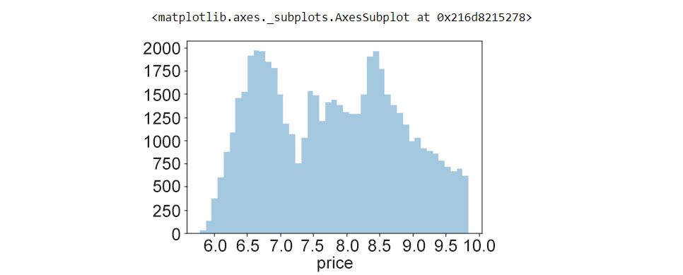
Figure 1.19: Histogram using a log transformation
That's pretty neat. Looking at the histogram, even a naive viewer immediately gets a picture of the distribution of the feature. Specifically, three observations are important in a histogram:
- Which feature values are more frequent in the dataset (in this case, there is a peak at around 6.8 and another peak between
8.5and9—note thatlog(price) = values, in this case, - How many peaks exist in the data (the peaks need to be further inspected for possible causes in the context of the data)
- Whether there are any outliers in the data
Bar Plots
Another type of plot we will look at in this chapter is the bar plot.
In their simplest form, bar plots display counts of categorical variables. More broadly, bar plots are used to depict the relationship between a categorical variable and a numerical variable. Histograms, meanwhile, are plots that show the statistical distribution of a continuous numerical feature.
Let's see an exercise of bar plots in the diamonds dataset. First, we shall present the counts of diamonds of each cut quality that exist in the data. Second, we shall look at the price associated with the different types of cut quality (Ideal, Good, Premium, and so on) in the dataset and find out the mean price distribution. We will use both pandas and seaborn to get a sense of how to use the built-in plotting functions in both libraries.
Before generating the plots, let's look at the unique values in the cut and clarity columns, just to refresh our memory.
Exercise 9: Creating a Bar Plot and Calculating the Mean Price Distribution
In this exercise, we'll learn how to create a table using the pandas crosstab function. We'll use a table to generate a bar plot. We'll then explore a bar plot generated using the seaborn library and calculate the mean price distribution. To do so, let's go through the following steps:
- Import the necessary modules and dataset:
import seaborn as sns
import pandas as pd
- Import the
diamondsdataset fromseaborn:diamonds_df = sns.load_dataset('diamonds') - Print the unique values of the
cutcolumn:diamonds_df.cut.unique()
The output will be as follows:
array(['Ideal', 'Premium', 'Good', 'Very Good', 'Fair'], dtype=object)
- Print the unique values of the
claritycolumn:diamonds_df.clarity.unique()
The output will be as follows:
array(['SI2', 'SI1', 'VS1', 'VS2', 'VVS2', 'VVS1', 'I1', 'IF'],
      dtype=object)
Note
unique()returns an array. There are five uniquecutqualities and eight unique values inclarity. The number of unique values can be obtained usingnunique()inpandas. - To obtain the counts of diamonds of each cut quality, we first create a table using the
pandascrosstab()function:cut_count_table = pd.crosstab(index=diamonds_df['cut'],columns='count') cut_count_table
The output will be as follows:

Figure 1.20: Table using the crosstab function
- Pass these counts to another
pandasfunction,plot(kind='bar'):cut_count_table.plot(kind='bar')
The output will be as follows:

Figure 1.21: Bar plot using a pandas DataFrame
We see that most of the diamonds in the dataset are of the
Idealcut quality, followed byPremium,Very Good,Good, andFair. Now, let's see how to generate the same plot usingseaborn. - Generate the same bar plot using
seaborn:sns.catplot("cut", data=diamonds_df, aspect=1.5, kind="count", color="b")The output will be as follows:

Figure 1.22: Bar plot using seaborn
Notice how the
catplot()function does not require us to create the intermediate count table (usingpd.crosstab()), and reduces one step in the plotting process. - Next, here is how we obtain the mean price distribution of different cut qualities using
seaborn:import seaborn as sns from numpy import median, mean sns.set(style="whitegrid") ax = sns.barplot(x="cut", y="price", data=diamonds_df,estimator=mean)
The output will be as follows:

Figure 1.23: Bar plot with the mean price distribution
Here, the black lines (error bars) on the rectangles indicate the uncertainty (or spread of values) around the mean estimate. By default, this value is set to
95%confidence. How do we change it? We use theci=68parameter, for instance, to set it to68%. We can also plot the standard deviation in the prices usingci=sd. - Reorder the x axis bars using
order:ax = sns.barplot(x="cut", y="price", data=diamonds_df, estimator=mean, ci=68, order=['Ideal','Good','Very Good','Fair','Premium'])
The output will be as follows:

Figure 1.24: Bar plot with proper order
Grouped bar plots can be very useful for visualizing the variation of a particular feature within different groups. Now that you have looked into tweaking the plot parameters in a grouped bar plot, let's see how to generate a bar plot grouped by a specific feature.
Exercise 10: Creating Bar Plots Grouped by a Specific Feature
In this exercise, we will use the diamonds dataset to generate the distribution of prices with respect to color for each cut quality. In Exercise 9, Creating a Bar Plot and Calculating the Mean Price Distribution, we looked at the price distribution for diamonds of different cut qualities. Now, we would like to look at the variation in each color:
- Import the necessary modules—in this case, only
seaborn:#Import seaborn import seaborn as sns
- Load the dataset:
diamonds_df = sns.load_dataset('diamonds') - Use the
hueparameter to plot nested groups:ax = sns.barplot(x="cut", y="price", hue='color', data=diamonds_df)
The output is as follows:
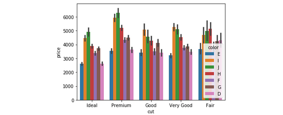
Figure 1.25: Grouped bar plot with legends
Here, we can observe that the price patterns for diamonds of different colors are similar for each cut quality. For instance, for Ideal diamonds, the price distribution of diamonds of different colors is the same as that for Premium, and other diamonds.