Search icon CANCEL
Subscription
0
Cart icon
Your Cart (0 item)
Close icon
You have no products in your basket yet
Arrow left icon
Explore Products
Best Sellers
New Releases
Books
Videos
Audiobooks
Learning Hub
Newsletter Hub
Free Learning
Arrow right icon
timer SALE ENDS IN
0 Days
:
00 Hours
:
00 Minutes
:
00 Seconds
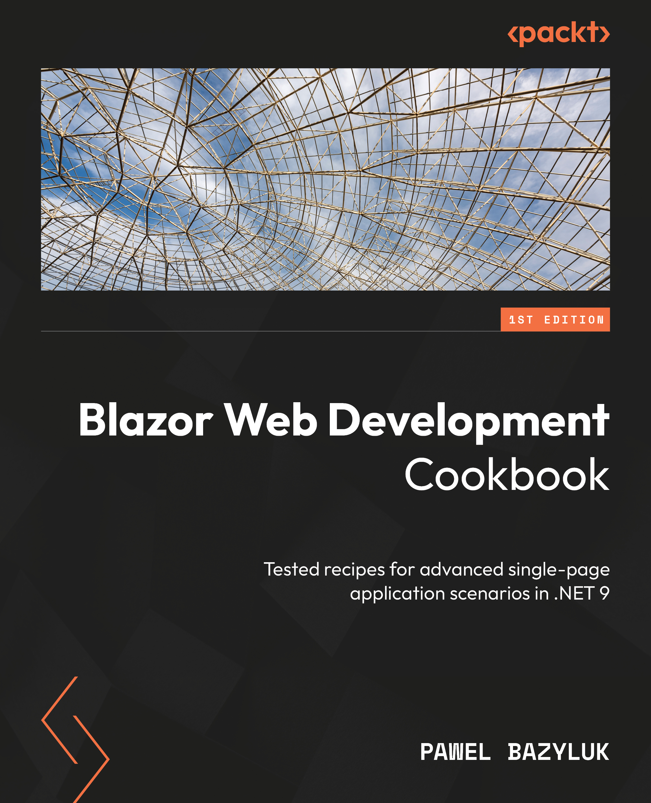
Blazor Web Development Cookbook

Blazor Web Development Cookbook: Tested recipes for advanced single-page application scenarios in .NET 9

Arrow left icon
Profile Icon Pawel Bazyluk
Arrow right icon
$20.98 $29.99
eBook Nov 2024 282 pages 1st Edition
eBook
$20.98 $29.99
Paperback
$36.99
Subscription
Free Trial
Renews at $19.99p/m
Arrow left icon
Profile Icon Pawel Bazyluk
Arrow right icon
$20.98 $29.99
eBook Nov 2024 282 pages 1st Edition
eBook
$20.98 $29.99
Paperback
$36.99
Subscription
Free Trial
Renews at $19.99p/m
eBook
$20.98 $29.99
Paperback
$36.99
Subscription
Free Trial
Renews at $19.99p/m

What do you get with eBook?

Product feature icon Instant access to your Digital eBook purchase
Product feature icon Download this book in EPUB and PDF formats
Product feature icon Access this title in our online reader with advanced features
Product feature icon DRM FREE - Read whenever, wherever and however you want
Product feature icon AI Assistant (beta) to help accelerate your learning
OR
Modal Close icon
Payment Processing...
tick Completed

Billing Address

Table of content icon View table of contents Preview book icon Preview Book

Blazor Web Development Cookbook

Working with Component-Based Architecture

Welcome to Blazor Web Development Cookbook. This book will be your comprehensive guide to enhancing your skills in building dynamic and scalable web applications with Blazor. It offers a collection of practical solutions and techniques for tackling the most common challenges in web development. In each chapter, we’ll dive into different areas of application development. This book is packed with detailed examples and actionable tips. We’ll explore a range of topics – from optimizing components, through managing application state to increasing your application’s interactivity and security. Having such a resource will allow you to gain development velocity and focus on addressing business requirements.

In this chapter, you’ll learn about the core principles of component-based architecture in Blazor. We’ll start by creating a basic component and progress to more complex aspects such as parameterization for reusability and handling required parameters. We’ll also explore advanced topics, such as building components with customizable content, implementing generic components, and increasing loose coupling with DynamicComponent.

By the end of this chapter, you’ll be able to implement and optimize components in Blazor. Understanding component-based architecture is foundational in building more sophisticated, interactive, and responsive web applications. It’s also essential for writing scalable, maintainable, and reusable code.

We’re going to cover the following recipes in this chapter:

  • Initializing a project
  • Creating your first basic component
  • Declaring parameters on a component
  • Detecting render mode at runtime
  • Ensuring that a parameter is required
  • Passing values from the parent component with CascadingParameter
  • Creating components with customizable content
  • Making components generic
  • Decoupling components with DynamicComponent

Technical requirements

You don’t need any paid tools or add-ons to kick off your Blazor journey. To aid with this, we’ve decided to limit the dependencies for the recipes in this book. You can pick up any topic independently whenever you need to.

For this chapter, you’ll need the following:

  • A modern IDE. We’ll be using Visual Studio 17.12.0, but any other is also fine, so long as it supports development in .NET 9.
  • A modern web browser.
  • The .NET 9 SDK. If it wasn’t part of your IDE installation, you can get it from https://dotnet.microsoft.com/en-us/download/dotnet/9.0.

You can find all the code examples for this chapter on GitHub at: https://github.com/PacktPublishing/Blazor-Web-Development-Cookbook/tree/main/BlazorCookbook.App.Client/Chapters/Chapter01.

Initializing a project

With .NET 9, the .NET team focused on improving the quality, stability, and performance of Blazor applications. Thankfully, there are no breaking changes between .NET 8, so you can safely raise the target framework of your application. However, with .NET 8, Blazor got a whole new solution type and rendering experience, so we’ll review the steps required to initialize a new project here.

Let’s initialize a Blazor Web App with a per-component rendering scope. It’s a strategic choice for our cookbook as it enables me to highlight various render mode caveats while we explore different areas of web development.

Getting ready

In this recipe, we’ll showcase initializing the project with the GUI provided as part of Visual Studio. So, start your IDE and dive in.

If you’re using the .NET CLI in your environment, I’ll provide equivalent commands in the There’s more... section.

How to do it...

Perform the following steps to initialize the Blazor Web App project:

  1. Start Visual Studio and select Create a new project from the welcome window:
Figure 1.1: Navigating to the project creation panel

Figure 1.1: Navigating to the project creation panel

  1. Use the search bar at the top of the next panel to narrow the list of available project types, select Blazor Web App, and confirm your choice by clicking Next:
Figure 1.2: Selecting Blazor Web App from the available project types

Figure 1.2: Selecting Blazor Web App from the available project types

  1. On the Configure your new project panel, define the project’s name and location and confirm these details by clicking Next:
Figure 1.3: Setting the name and location of the new project

Figure 1.3: Setting the name and location of the new project

  1. On the Additional information panel, choose the following options:
    • .NET 9.0 (Standard Term Support) under Framework
    • Auto (Server and WebAssembly) under Interactive render mode
    • Per page/component under Interactivity location

    On top of that, check the Include sample pages checkbox. Confirm your choice by clicking Create:

Figure 1.4: Configuring the project’s framework and interactivity

Figure 1.4: Configuring the project’s framework and interactivity

Here’s what your initial solution structure will look like:

Figure 1.5: Initial project structure

Figure 1.5: Initial project structure

How it works...

In step 1, we started Visual Studio and selected the Create a new project option from the welcome menu. Since Visual Studio comes with many project templates preinstalled, in step 2, we utilized the search bar at the top of the panel and, by searching for the blazor keyword, we quickly found and selected Blazor Web App from the results list. We proceeded to the next stage by clicking the Next button. In step 3, we defined the project name and location. For this book, I chose BlazorCookbook.App and D:\packt. We continued the setup process by clicking Next.

In step 4, we configured the project. Considering that we’ll focus on Blazor in .NET 9, we chose .NET 9.0 (Standard Term Support) from the Framework dropdown. Then, we chose a render mode for our application from the Interactive render mode dropdown. With the None option, we effectively indicate that Blazor should use server-side rendering (SSR) mode. SSR is the fastest render mode as the markup is statically generated on the server but offers limited to no interactivity. When we expect interactivity, we must choose from the interactive modes. Here, Server (represented in the code as InteractiveServer) renders components on the server with UI interactions managed via a SignalR connection, allowing dynamic content updates while keeping component logic server-side. Alternatively, WebAssembly (InteractiveWebAssembly) renders components directly in the browser using WebAssembly, facilitating fully interactive experiences without server communication for UI updates. Lastly, with the Auto (Server and WebAssembly) option (InteractiveAuto), we let Blazor select the best rendering method based on the current environment state and network conditions. We want to explore various render mode behaviors, so Auto (Server and Webassembly) was the best option for us. For Interactivity location, we selected Per page/component so that we can define render modes at the component level, as opposed to Global, which would set the render mode globally across the project. We also checked the Include sample pages box to trigger the scaffold of a basic layout and CSS. We intentionally left Authentication type set to None to avoid unnecessary complexity, although we plan to revisit authentication in Chapter 8. We finalized the project creation process by clicking Create.

At this point, you should see the initial project structure. If you spot two projects, BlazorCookbook.App and BlazorCookbook.App.Client, that’s correct. Here, BlazorCookbook.App represents the server-side components of our application, while BlazorCookbook.App.Client is the client-side part that compiles into WebAssembly code. Everything that’s placed in BlazorCookbook.App.Client will be transmitted to the user’s browser, so you shouldn’t place any sensitive or confidential information there. Since BlazorCookbook.App references BlazorCookbook.App.Client, there’s no need to duplicate code, regardless of how it’s rendered initially.

There’s more...

If your IDE doesn’t have a GUI similar to Visual Studio, you can leverage the cross-platform .NET CLI. Navigate to your working directory and run the following command to initialize a Blazor Web App project with the same configuration that was outlined in step 4:

dotnet new blazor -o BlazorCookbook.App -int Auto --framework net9.0

Creating your first basic component

A component is a self-contained chunk of the user interface (UI). A component in Blazor is a .NET class with markup, created as a Razor (.razor) file. In Blazor, components are the primary building blocks of any application and encapsulate markup, logic, and styling. They enable code reusability and increase code maintainability and testability. This modular approach streamlines the development process greatly.

For our first component, we’ll create a Ticket component that renders a tariff name and a price when the user navigates to a page.

Getting ready

Before you dive into creating the first component, in your Blazor project, create a Recipe02 directory – this will be your working directory.

How to do it...

Follow these steps to create your first component:

  1. Navigate to the Recipe02 directory that you just created.
  2. Use the Add New Item feature and create a Razor component:
Figure 1.6: Adding a new Razor component prompt

Figure 1.6: Adding a new Razor component prompt

  1. In the Ticket component, add supporting HTML markup:
    <div class="ticket">
        <div class="name">Adult</div>
        <div class="price">10.00 $</div>
    </div>
  2. Add a new Offer component. Use the @page directive to make it navigable and render the Ticket component within:
    @page "/ch01r02"
    <Ticket />

How it works...

In step 1, we navigated to Recipe02 – our working directory. In step 2, we leveraged a built-in Visual Studio prompt to create files and create the first component: Ticket. While building components in the Razor markup syntax, we named our component file Ticket.razor. In step 3, we added simple markup to Ticket – we rendered Adult and 10.00 $, which describe a given ticket. In step 4, we created our first page – the Offer page. In Blazor, any component can become a page with the help of a @page directive, which requires a fixed path argument starting with /. The @page "/ch01r02" directive enables navigation to that component. In the Offer markup, we embedded Ticket using the self-closing tag syntax – a simpler, more convenient equivalent of the explicit opening and closing tags (<Ticket></Ticket>). However, we can only utilize it when the component doesn’t require any additional content to render.

There’s more...

While componentization in Blazor offers numerous benefits, it’s essential to know when and how much to use it. Components are a great way to reuse representation markup with various data objects. They significantly enhance code readability and testability. However, caution is necessary – you can overdo componentization. Using too many components leads to increased reflection overhead and unnecessary complexities in managing render modes. It’s especially easy to overlook when you’re refactoring grids or forms. Ask yourself whether every cell must be a component and whether you need that input encapsulated. Always weigh what you might gain from higher markup granularity with the performance cost it brings.

Declaring parameters on a component

In Blazor, component parameters allow you to pass data into components. It’s the first step in making your application dynamic. Component parameters are like method parameters in traditional programming. You can utilize the same primitive, as well as the reference and complex types. This results in code flexibility, simplified UI structures, and high markup reusability.

Let’s create a parametrized component that represents a ticket so that we can display any incoming tariff and price without unnecessary code duplication or markup incoherence.

Getting ready

Before you dive into component parameterization, do the following:

  • Create a Recipe03 directory – this will be your working directory
  • Copy the Ticket component from the Creating your first basic component recipe or copy its implementation from the Chapter01/Recipe02 directory of this book’s GitHub repository

How to do it...

To declare parameters on your component, start with these foundational steps:

  1. In the Ticket component, declare parameters in the @code block:
    @code {
        [Parameter] public string Tariff { get; set; }
        [Parameter] public decimal Price { get; set; }
        [Parameter]
        public EventCallback OnAdded { get; set; }
    }
  2. Modify the Ticket markup so that you can render values from parameters:
    <div class="ticket">
        <div class="name">@Tariff</div>
        <div class="price">
            @(Price.ToString("0.00 $"))
        </div>
        <div class="ticket-actions">
            <button @onclick="@OnAdded">
                Add to cart
            </button>
        </div>
    </div>
  3. Create an Offer page and enhance it so that it renders in InteractiveWebAssembly mode:
    @page "/ch01r03"
    @rendermode InteractiveWebAssembly
  4. Below the functional directives in the Offer component, add two parametrized instances of Ticket. Implement an Add() method as a placeholder for interactivity:
    <Ticket Tariff="Adult" Price="10.00m"
            OnAdded="@Add" />
    <Ticket Tariff="Child" Price="5.00m"
            OnAdded="@Add" />
    @code {
        private void Add()
            => Console.WriteLine("Added to cart!");
    }

How it works...

In step 1, we extended the Ticket component with a @code block, which Blazor recognizes as a container for the C# code. Within this @code block, we used the Parameter attribute to mark properties that are settable externally, such as method arguments in C#. In our example, we used a string for a ticket tariff and a decimal for its price. For the last parameter, we used the EventCallback type. It’s a Blazor-specific struct that carries an invokable action with an additional benefit. When you change the UI state, you should use the StateHasChanged() life cycle method to notify Blazor that something happened. By design, EventCallback triggers StateHasChanged() automatically, so you can’t omit it accidentally. In step 2, we rebuilt the Ticket markup based on parameter values that we accessed using the @ symbol. That symbol signaled to the compiler that we were switching to dynamic C# code. If you pair it with round brackets, you can embed complex code blocks as well, as we did when we formatted the price in a money format.

In step 3, we created a navigable Offer page. This time, on top of the @page directive, we also declared a @rendermode directive, which allowed us to control how our component renders initially. We can choose from any of the render modes that a Blazor Web App supports, but as we expect some interactivity on the page, we opted for InteractiveWebAssembly mode. In step 4, in the @code block of Offer, we implemented an Add() placeholder method that simulates adding a ticket to the cart. We also implemented the Offer markup, where we rendered two Ticket instances with different parameters. You pass parameter values similarly to standard HTML attributes such as class or style. Blazor automatically recognizes that you’re calling a component, not an HTML element. Finally, we rendered Adult and Child tickets and attached the Add() method to the exposed EventCallback parameter.

There’s more...

You must be aware that the number of parameters can directly affect the rendering speed. That’s because the renderer uses reflection to resolve parameter values. Over-reliance on reflection can significantly hinder performance. You can optimize that process by overriding the SetParametersAsync() method of the component life cycle, though that’s an advanced operation. Instead, you should focus on keeping the parameters list concise or introducing wrapper classes where necessary.

Earlier in this chapter, we declared a specific render mode for a component when your Blazor application is set to expect interactivity at the page or component level. However, when you enable interactivity globally, you can still exclude certain pages from interactive routing. You’ll find it useful for pages that depend on standard request/response cycles or reading or writing HTTP cookies:

@attribute [ExcludeFromInteractiveRouting]

To enforce static server-side rendering on a page, you must add the ExcludeFromInteractiveRouting attribute, using the @attribute directive, at the top of the page. In this case, you no longer add the @rendermode directive as it’s dedicated to declaring interactive render modes.

Detecting render mode at runtime

Understanding where and how your component renders is crucial for optimizing performance and tailoring user experience. Blazor allows you to detect the render location, interactivity, and assigned render mode at runtime. You can query whether the component is operating in an interactive state or just prerendering. These insights open up new possibilities for debugging, performance optimization, and building components that adapt dynamically to their rendering context.

Let’s hide the area with tickets in the Offer component to prevent user interactions, such as adding tickets to the cart, until the component is ready and interactive.

Getting ready

Before you explore render mode detection, do the following:

  • Create a Recipe04 directory – this will be your working directory
  • Copy the Offer and Ticket components from the Declaring parameters on a component recipe or copy their implementations from the Chapter01/Recipe03 directory of this book’s GitHub repository

How to do it...

Follow these steps:

  1. Navigate to the Offer component and update the path attached to the @page directive to avoid routing conflicts:
    @page "/ch01r04"
    @rendermode InteractiveWebAssembly
  2. Below the component directives, add some conditional markup to indicate that the component is getting ready based on the value of the RendererInfo.IsInteractive property:
    @if (!RendererInfo.IsInteractive)
    {
        <p>Getting ready...</p>
        return;
    }
    @* existing markup is obscured, but still down here *@

How it works...

In step 1, we navigated to the Offer component and updated the path that was assigned to the @page directive. Blazor doesn’t allow duplicated routes, so we triggered a conflict since we copied the Offer component with a route from the Declaring parameters on a component recipe.

In step 2, we introduced a conditional markup block below the component directives. We leveraged the RendererInfo property that the ComponentBase class exposes, allowing us to track the component rendering state. The RendererInfo property has two properties:

  • The RendererInfo.Name property tells us where the component is currently running and returns the following options:
    • Static: This indicates that the component is running on the server without any interactivity
    • Server: This indicates that the component is running on the server and will be interactive after it fully loads
    • WebAssembly: This indicates that the component is running in the client’s browser and becomes interactive after loading
    • WebView: This indicates that it’s dedicated to .NET MAUI and native devices
  • The RendererInfo.IsInteractive property shows whether the component is in an interactive state or not (such as during prerendering or static SSR)

We leveraged the RendererInfo.IsInteractive property to detect whether the interactivity is ready. If it isn’t, we display a Getting ready... message to inform users they should wait.

Ensuring that a parameter is required

The EditorRequired attribute indicates to your IDE that passing data to the component is functionally critical. This attribute triggers data validation at compile time, creating a quick feedback loop and enhancing code quality. Utilizing the EditorRequired attribute ensures neither you nor anyone from your team will fall into errors due to missing parameters. You can simplify your code by skipping initial parameter value validation. Using the EditorRequired attribute leads to robust and predictable component behavior throughout the application.

Let’s enhance the Ticket component parameters so that Blazor treats them as required. You’ll also learn how to configure your IDE so that you can flag any missing required parameters as compilation errors.

Getting ready

Before setting up the required parameters, do the following:

  • Create a Recipe05 directory – this will be your working directory
  • Copy the Ticket and Offer components from the previous recipe or copy their implementation from the Chapter01/Recipe04 directory of this book’s GitHub repository

How to do it...

Ensure parameters are required in your component by following these steps:

  1. Navigate to the @code block of the Ticket component and extend attribute collection on parameters with the EditorRequired attribute:
    @code {
        [Parameter, EditorRequired]
        public string Tariff { get; set; }
        [Parameter, EditorRequired]
        public decimal Price { get; set; }
        [Parameter]
        public EventCallback OnAdded { get; set; }
    }
  2. Now, navigate to the .csproj file of the project where you’re keeping your components.
  3. Add the RZ2012 code to the WarningsAsErrors section:
    <Project Sdk="Microsoft.NET.Sdk.Web">
      <PropertyGroup>
        <TargetFramework>net9.0</TargetFramework>
        <ImplicitUsings>enable</ImplicitUsings>
        <WarningsAsErrors>RZ2012</WarningsAsErrors>
      </PropertyGroup>
      <!-- ... -->
    </Project>
  4. In the Offer markup, modify the Ticket instances by removing the OnAdded parameter from both. Additionally, remove the Price parameter from the second instance:
    <Ticket Tariff="Adult" Price="10.00m" />
    <Ticket Tariff="Child" />
  5. Compile your application so that you can see your IDE flagging the omitted but required Price parameter:
Figure 1.7: IDE flags missing the Price parameter as a compilation error

Figure 1.7: IDE flags missing the Price parameter as a compilation error

How it works...

In step 1, we enhanced the Tariff and Price parameters of the Ticket component with the EditorRequired attribute. This prompts your IDE to expect these values during compilation and flag the missing ones as warnings by default. I suggest that you raise that severity. In step 2, you navigated to the .csproj file of your project. Here, as outlined in step 3, you either found or added the WarningsAsErrors section and included the RZ2012 code within. In step 4, we broke the Offer markup a little. We removed the OnAdded parameter from both Ticket instances and the Price parameter from one of them. Now, any compilation attempt will end with an error, similar to the one shown in step 5. This makes it practically impossible to miss required assignments and encounter related rendering errors. Notice that as we didn’t mark the OnAdded parameter with the EditorRequired attribute, the compiler will treat it as optional and allow it to be skipped.

Passing values from the parent component with CascadingParameter

Sharing parameters across multiple components is a common scenario in web applications. It boosts performance as data can be shared rather than being requested from an external source by each component. It also simplifies the code, especially in parent-child scenarios. In Blazor, that’s where the concept of CascadingParameter comes into play. Its counterpart, CascadingValue, allows you to provide a value that cascades down the component tree. This pair enables child components to receive and use this shared data or state. This approach solves the challenge of passing information through component hierarchies without complex plumbing or tightly coupled communication.

Let’s implement a Cart service and pass it downward in a cascading fashion so that we can intercept it within the offer area represented by Ticket components. We’ll also render the Cart summary – fully decoupled from the Ticket behavior.

Getting ready

Before we start exploring how to pass the cascading value, do the following:

  • Create a Recipe06 directory – this will be your working directory
  • Copy the Ticket component from the Ensuring that a parameter is required recipe or copy its implementation from the Chapter01/Recipe05 directory of this book’s GitHub repository.

How to do it...

Follow these steps to implement CascadingParameter for value sharing:

  1. Add a Cart class and declare supporting Content and Value properties. Extend Cart so that you can communicate state changes by requiring a fallback Action property with a primary constructor and implement the basic Add() method that triggers this notification:
    public class Cart(Action onStateHasChanged)
    {
        public List<string> Content { get; init; } = [];
        public decimal Value { get; private set; }
        public int Volume => Content.Count;
        public void Add(string tariff, decimal price)
        {
            Content.Add(tariff);
            Value += price;
            onStateHasChanged.Invoke();
        }
    }
  2. Create a SellingTickets component so that our tickets can be sold:
Figure 1.8: Adding a new SellingTickets component

Figure 1.8: Adding a new SellingTickets component

  1. Use the @rendermode attribute to declare that SellingTickets operates in InteractiveWebAssembly mode and a @page directive to enable routing:
    @page "/ch01r06"
    @rendermode InteractiveWebAssembly
  2. In the @code block of SellingTickets, declare the Cart object and initialize it within the OnInitialized() life cycle method:
    @code {
        protected Cart Cart;
        protected override void OnInitialized()
        {
            Cart = new(() =>
                InvokeAsync(StateHasChanged));
        }
    }
  3. In the SellingTickets markup, add the CascadingValue wrapper with the Cart instance as its value. Declare two sellable tickets within the cart’s operational scope, leveraging the Ticket component:
    <CascadingValue Value="Cart">
        <Ticket Tariff="Adult" Price="10.00m" />
        <Ticket Tariff="Child" Price="5.00m" />
    </CascadingValue>
  4. Below the Cart area of the SellingTickets markup, append additional markup to display the Cart summary:
    <div class="cart-summary">
        <div class="cart-content">
            Items: @Cart.Volume
        </div>
        <div class="cart-value">Price: @Cart.Value</div>
    </div>
  5. Navigate to the Ticket component. In the @code block, declare CascadingParameter so that you can intercept the Cart instance and replace the OnAdded parameter with an Add() method:
    @code {
        [CascadingParameter]
        public Cart Cart { get; set; }
        public void Add() => Cart.Add(Tariff, Price);
    }
  6. In the Ticket markup, replace the @onclick button action so that you can execute the new Add() method:
    <div class="ticket-actions">
        <button @onclick="@Add">Add to cart</button>
    </div>

How it works...

In step 1, we implemented the Cart class. We declared a Value property to hold the current cart value and a Content collection to store added ticket tariffs. We also implemented a parameterless Volume method to calculate the amount of tickets currently in the cart. Then, we implemented an Add() method that, in addition to the normal logic for adding to the cart, is responsible for communicating those changes to external objects by invoking the onStateHasChanged delegate, which is passed using the primary constructor pattern. That way, we ensured Cart initialization requires us to provide an action to execute upon state changes.

In step 2, we created a SellingTickets component. In step 3, we declared it to render in InteractiveWebAssembly mode and leveraged the @page directive to enable routing. In step 4, in the @code block of SellingTickets, we declared a Cart instance. We initialized Cart as part of the overridden OnInitialized() life cycle method and, as an invokable Action delegate responsible for applying state changes, we passed in the StateHasChanged() life cycle method. With that in place, any change in the Cart object will prompt Blazor to recalculate DOM changes at the level of the SellingTicket component. To avoid any threading or race condition issues, we wrapped the StateHasChanged() method in the InvokeAsync() component base method. In step 5, we implemented the SellingTickets markup. We used a CascadingValue component and assigned Cart as its value. We also declared CascadingValue content by adding two Ticket instances, representing tickets available for sale. In step 6, we extended the SellingTickets markup further by adding a section that contained the summary of the cart, showing its current size and value.

In step 7, we navigated to the @code block of the Ticket component and declared CascadingParameter there. Blazor will intercept this parameter’s value as it cascades from a parent component. Notably, we didn’t use EditorRequired here – as Blazor resolves the cascading value just in time, it would have no impact on compilation. With Cart available in the scope of the Ticket component, we replaced the existing OnAdded parameter with an Add() method that invokes Cart.Add() directly. In step 8, we updated the Ticket markup by replacing the outdated @onclick assignment on the existing button with a reference to the newly implemented Add() method.

There’s more...

So, why does the Cart implementation require an Action delegate to work? Here, StateHasChanged() is a component life cycle method, so it triggers DOM re-rendering scoped to that component and its nested children. Since adding to the cart happens at the Ticket component level and invokes StateHasChanged(), there’s no impact on the parent SellingTickets component, and the Cart summary section remains unchanged! Having the Action delegate allows the Cart object to persist a reference to the origin component and thus trigger a DOM update at any level of the component tree.

Creating components with customizable content

Creating components with customizable content in Blazor applications is another level in building flexible and reusable UI elements. This approach allows you to design functional components that can be adapted to various content needs and data types. We’ll utilize the RenderFragment feature to address it. The RenderFragment feature represents a segment of UI content. It allows components to accept arbitrary HTML markup as a parameter. That’s how you can achieve higher flexibility. You can repurpose a single component structure with different content, enhancing the modularity and reusability of your code base.

Let’s create a Ticket component with a customizable display of ticket details while keeping a fixed button so that you can add the ticket to a cart.

Getting ready

Before you start implementing a component with customizable content, do the following:

  • Create a Recipe07 directory – this will be your working directory
  • Copy the Chapter01/Data directory, which contains the Samples and TicketViewModel objects required for this recipe, next to the working directory

How to do it...

Follow these steps to build a component with customizable content:

  1. Create a new Ticket component. We’ll use this to display individual ticket details.
  2. In the @code block of Ticket, add the Id and ChildContent parameters and an Add() placeholder method that simply writes a console message displaying the ID of the ticket that was added to the cart:
    @code {
        [Parameter, EditorRequired]
        public Guid Id { get; set; }
        [Parameter, EditorRequired]
        public RenderFragment ChildContent { get; set; }
        public void Add()
            => Console.WriteLine($"Ticket {Id} added!");
    }
  3. As the Ticket markup, render the ChildContent value and a button to trigger the Add() method:
    <div class="ticket">
        <div class="ticket-info">@ChildContent</div>
        <div class="ticket-actions">
            <button @onclick="@Add">Add to cart</button>
        </div>
    </div>
  4. Create a routable Offer component that renders in InteractiveWebAssembly mode. Add a @using directive so that the Samples object can be referenced:
    @page "/ch01r07"
    @using
        BlazorCookbook.App.Client.Chapters.Chapter01.Data
    @rendermode InteractiveWebAssembly
  5. As markup of the Offer component, while leveraging the Ticket component, render a Samples.Adult ticket tariff and price and a Samples.FreeAdmission ticket with just a tariff name since it’s free to do so:
    <Ticket Id="@Samples.Adult.Id">
        @Samples.Adult.Tariff (@Samples.Adult.Price)
    </Ticket>
    <Ticket Id="@Samples.FreeAdmission.Id">
        <div class="free-ticket">
            @Samples.FreeAdmission.Tariff
        </div>
    </Ticket>

How it works...

In step 1, we created a new Ticket component and implemented its @code block in step 2. Then, we declared a set of required parameters – Id to add a ticket to the cart and ChildContent, which is of the RenderFragment type, to hold the custom markup for a Ticket instance. We leveraged the EditorRequired attribute and made both parameters required. In step 3, we implemented the Ticket markup. We embedded the ChildContent value to render ticket details by placing it the same as any other parameter. We also added a button that allows the user to add a ticket to the cart by leveraging the Add() method.

In step 4, we created an Offer component. We utilized the @page directive to make it routable and declared it so that it rendered in the InteractiveWebAssembly mode. On top of that, we added a @using directive with the namespace of the Samples object so that we could reference it within the Offer component (the namespace can vary depending on the structure and name of your solution). In step 5, we implemented the Offer markup and saw the RenderFragment object in action. For an adult ticket with a price tag, we rendered both its tariff and price. For the free admission ticket, we chose to render only the tariff name. Blazor will inject the custom markup in place of the ChildContent parameter, within the Ticket component, while retaining and reusing the interactive button implementation, regardless of the customized content.

There’s more...

You can use a RenderFragment object to encapsulate common parts of your components. The testing and maintainability of your code will skyrocket. Another reason to leverage them is that a static RenderFragment instance positively impacts performance.

You might have noticed that when a RenderFragment parameter is named ChildContent, the compiler automatically recognizes and assigns its value. You can still opt to declare <ChildContent> </ChildContent> explicitly but there’s no need to complicate your code.

However, you might encounter scenarios where you need more than one customizable section within a component. Fortunately, Blazor allows you to have multiple RenderFragment parameters. To implement that, you must explicitly declare both RenderFragment values using markup element syntax within your component. This approach enables even higher modularity and adaptability of your UI. For instance, you could have Details and Actions content to structure your component with multiple customizable areas. You can see that in the following code blocks.

Here’s the Ticket component, which allows us to customize the Details and Actions areas:

<div class="ticket">
    <div class="ticket-info">@Details</div>
    <div class="ticket-actions">@Actions</div>
</div>
@code {
    [Parameter, EditorRequired]
    public RenderFragment Details { get; set; }
    [Parameter, EditorRequired]
    public RenderFragment Actions { get; set; }
}

Here’s the Ticket component in action, with customized Details and Actions areas:

<Ticket>
    <Details>
        @Samples.Adult.Tariff (@Samples.Adult.Price)
    </Details>
    <Actions>
        <button @onclick="@(() => Add(Samples.Adult.Id))">
            Add to cart
        </button>
    </Actions>
</Ticket>

Making components generic

A generic class in C# is a class that’s defined with a placeholder type, allowing it to operate with any data type. This flexibility enables the creation of a single class that can adapt its behavior to a variety of data types, enhancing code reusability and efficiency. Generic components in Blazor applications are a similar concept. These components are highly reusable across different contexts and data types. They abstract away specific details, allowing high adaptability to various data or functionalities with minimal changes. This approach significantly reduces code duplication. With that flexibility, you can achieve even higher delivery velocity. The most common scenario where you’ll see generic components shine is repetitive data display, especially grids.

Let’s create a generic Grid component that can render objects of any type by using the provided row template.

Getting ready

Before you start implementing the generic grid, do the following:

  • Create a Recipe08 directory – this will be your working directory
  • Copy the Chapter01/Data directory, which contains the Samples and TicketViewModel objects required for this recipe, next to the working directory

How to do it...

Follow these steps to build and use your generic component:

  1. Create a Grid component. At the top of the file, declare it as generic with the @typeparam attribute:
    @typeparam T
  2. In the @code block of the Grid component, declare parameters for data source and table area customization. The source and row template must be generic:
    @code {
        [Parameter, EditorRequired]
        public IList<T> Data { get; set; }
        [Parameter, EditorRequired]
        public RenderFragment Header { get; set; }
        [Parameter, EditorRequired]
        public RenderFragment<T> Row { get; set; }
    }
  3. For the Grid markup, add a standard HTML table with the Header content rendered where the table header is. For the table body, iterate over Data and render the Row template for each element:
    <table class="grid">
        <thead>
            @Header
        </thead>
        <tbody>
            @foreach (var item in Data)
                @Row(item)
        </tbody>
    </table>
  4. Create a routable Offer component that renders in InteractiveWebAssembly mode and uses the Samples assembly so that Samples can be referenced later:
    @page "/ch01r08"
    @using
        BlazorCookbook.App.Client.Chapters.Chapter01.Data
    @rendermode InteractiveWebAssembly
  5. In the @code block of Offer, implement an Add() placeholder method that writes a simple action confirmation to Console:
    public void Add(TicketViewModel ticket)
       => Console.WriteLine($"Ticket {ticket.Id} added!");
  6. In the markup of the Offer component, use the Grid component and pass in Samples.Tickets as the data source for Grid:
    <Grid Data="@Samples.Tickets">
        @* you will add areas here *@
    </Grid>
  7. Implement the required Header area inside the Grid instance in the Offer markup:
    <Header>
        <tr>
            <td>Ticket code</td>
            <td>Tariff</td>
            <td>Price</td>
            <td></td>
        </tr>
    </Header>
  8. Inside the Grid instance, in the Offer markup, implement the required Row template so that elements of the TicketViewModel type can be rendered:
    <Row>
        <tr>
            <td>@context.Id</td>
            <td>@context.Tariff</td>
            <td>@context.Price</td>
            <td @onclick="() => Add(context)">
                Add to Cart
            </td>
        </tr>
    </Row>

How it works...

We started this recipe by implementing the foundation for creating a generic component. In step 1, we created a Grid component and added the @typeparam attribute at the top. We also specified the name for the parameter type placeholder – much like you would in backend development. We chose to call it T. Blazor recognized @typeparam and now allows us to operate on T inside the component. The IDE will also apply all validations that generic modules require. In step 2, we implemented the @code block of the Grid component by adding a Data parameter that will hold elements to render and two RenderFragment parameters, enabling Grid customization. You can learn more about RenderFragment in the Creating components with customizable content section. Notably, the Data collection isn’t the only generic object. The Row parameter, which contains a row template, is also generic, which means it will expect a data object of type T for initialization. In step 3, we implemented the Grid markup. We rendered the Header value inside the <thead> tags, where the table header normally goes; for the table body, we used a foreach loop to iterate over the Data collection and rendered the Row template for each element.

In step 4, we created a routable Offer component to test our grid. As we expected interactivity, we declared that Offer rendered in InteractiveWebAssembly mode. We also leveraged the Samples object, so we exposed the required assembly with the @using directive. In step 5, we implemented an Add() placeholder method within the @code block of the Offer component to test the Grid component’s interactivity. In step 6, we started implementing the Offer markup. We embedded the Grid component and passed the Samples.Tickets array as the value of the Data parameter. In step 7, we declared the content of Header, which in our case is a set of columns representing TicketViewModel properties and an additional column where we placed action buttons. The real rendering magic happened in step 8. As the Row template expects a TicketViewModel object, we can access TicketViewModel properties in the markup with a @context directive and place them in table columns matching the Header declaration.

There’s more...

The power of the generic component lies in its agnosticism to the data type you’ll use. It simply knows how to construct a template, and where to place customizable content. It’s up to you to define markup to present data properties.

You might find yourself in need of nesting multiple generic components. To do so, you’ll have to define all required RenderFragment parameters. However, a key challenge here is going to be distinguishing each generic context. In that case, you must assign custom names to the context of each generic component using the Context parameter. This parameter is inherited automatically, streamlining the process and enhancing the readability of your code.

Even though our example doesn’t require nesting, we can still leverage the Context naming feature to enhance the code’s readability:

<Grid Data="@Data.Tickets" Context="ticket">
    ...
    <Row>
        <tr>
            <td>@ticket.Id</td>
            ... *
        </tr>
    </Row>
</Grid>

Remember that the more intuitive your code is, the easier it is to navigate and update, especially when you’re working in team environments or returning to the code after some time.

Decoupling components with DynamicComponent

Decoupling is a design principle that enhances the flexibility and maintainability of your applications. It comes down to reducing direct dependencies between various parts of your code. Blazor offers an elegant solution for rendering components dynamically. In this recipe, we’ll explore the strategic use of DynamicComponent. It allows you to render components dynamically at runtime based on certain conditions or parameters. You’re not required to specify the component type in the markup at compile time explicitly. Heads up – most compilation validators won’t apply here.

Let’s implement the fully decoupled and dynamic prompting of success and failure notifications when the user adds a ticket to the cart, based on that ticket’s availability.

Getting ready

Before you dive into implementing DynamicComponent, do the following:

  • Create a Recipe09 directory – this will be your working directory
  • Copy the Offer and Grid components from the Making components generic recipe or copy their implementation from the Chapter01/Recipe08 directory of this book’s GitHub repository
  • Copy the Chapter01/Data directory, which contains the Samples and TicketViewModel objects required in this recipe, next to the working directory

How to do it...

Follow these steps to learn how to create more modular and independent components using DynamicComponent:

  1. Add a new Alerts directory to your project.
  2. Within the Alerts directory, create the AddedToCart and SoldOut components:
Figure 1.9: Project structure with newly added alert components and sample objects

Figure 1.9: Project structure with newly added alert components and sample objects

  1. Navigate to the AddedToCart component and add a successful alert markup:
    <div class="alert alert-success" role="alert">
        Added to cart successfully.
    </div>
  2. Navigate to the SoldOut component. Declare a Tariff parameter and add a danger alert markup by using the Tariff value:
    <div class="alert alert-danger" role="alert">
        Ticket @Tariff is sold out!
    </div>
    @code {
        [Parameter] public string Tariff { get; set; }
    }
  3. Navigate to the Offer component and, in the @code block, declare additional AlertType and AlertParams variables:
    protected Type AlertType;
    protected Dictionary<string, object> AlertParams;
  4. Inside the @code block of Offer, replace the Add() method’s implementation to validate ticket availability and display a designated notification:
    public void Add(TicketViewModel ticket)
    {
        AlertType = ticket.AvailableSeats == 0 ?
            typeof(Alerts.SoldOut) :
            typeof(Alerts.AddedToCart);
        AlertParams = new();
        if (ticket.AvailableSeats == 0)
        {
            AlertParams.Add(
                nameof(ticket.Tariff),
                ticket.Tariff
            );
        }
    }
  5. In the Offer markup, below the existing Grid instance, add a conditional rendering of DynamicComponent while leveraging the resolved values of the AlertType and AlertParams variables:
    @if (AlertType is null) return;
    <DynamicComponent Type="@AlertType"
                      Parameters="@AlertParams" />

How it works...

In step 1, we added an Alerts directory where we could place different alert components. In step 2, we created the AddedToCart and SoldOut components, representing success and failure notifications when adding a ticket to the cart. In step 3, we focused on implementing the AddedToCart component, which renders an alert-success class with an Added to cart successfully message. In step 4, we implemented the SoldOut component, which renders an alert-danger class and renders the sold-out ticket tariff.

In step 5, we added two critical variables that DynamicComponent leverages. The first is AlertType, of the Type type, which determines the type of component to render. The second is AlertParams, a dictionary that allows us to dynamically pass parameter values to the loaded component. In step 6, we resolved the state of the requested ticket. We checked seat availability and decided whether to use the SoldOut or AddedToCart component. When seats are unavailable, we conditionally add the Tariff parameter to our dynamic collection of parameters. Finally, in step 7, we embedded the DynamicComponent component in the Offer markup. If the AlertType value is unset, we skip rendering it. Otherwise, we append the dynamically resolved markup.

Notice that we utilized the built-in typeof() and nameof() functions to declare the type and parameters of the current notification. If you want or need to take decoupling even further, you can initialize them purely from string variables. That’s especially powerful when you’re working in architecture such as micro-frontends.

Left arrow icon Right arrow icon
Download code icon Download Code

Key benefits

  • Develop generic, customizable components secured with roles and policies
  • Manage application and user states, in simple to complex scenarios, across render boundaries
  • Enhance user experience by embedding AI-powered features into the application
  • Purchase of the print or Kindle book includes a free PDF eBook

Description

With support for both server-side and client-side hosting, as well as the flexibility to mix render modes, Blazor empowers you to leverage cloud computing while maintaining the performance of local applications. Paweł Bazyluk—a Blazor expert with over a decade of experience in .NET technologies—shows you how Blazor, a Microsoft framework, enables you to create interactive web applications using C# and .NET, while reducing reliance on JavaScript. This cookbook highlights Blazor’s vast possibilities using practical recipes that address key aspects of web development and showcase the framework's versatility in building modern, integrated applications. Pawel demonstrates how to skillfully navigate component-based architecture, and create, parameterize, and customize components to achieve high modularity. Working through practical insights and hands-on guidance in each chapter, you’ll progress from advanced data binding and event handling intricacies to optimizing data display using grids. You’ll explore application state management, build interactive forms with validation, leverage Blazor’s routing engine, and keep every part of the application secure. The book also explores cutting-edge topics, touching on how to enhance your application with AI-powered features. By the end of the book, you’ll be fully equipped to build robust, scalable, and secure web applications in Blazor.

Who is this book for?

This book is for developers with a foundational understanding of Blazor and .NET seeking proven solutions to common web application development challenges. Frontend engineers, .NET developers, and solution architects looking to gain full-stack expertise will also find this resource invaluable. Familiarity with HTML, CSS, and JavaScript programming will help you get the most out of this web development book.

What you will learn

  • Build modular, reusable, maintainable code in component-based architecture
  • Exchange data between a UI and external service while ensuring UI responsiveness
  • Implement efficient user interactions and event handling
  • Present data in a structured and user-friendly manner using grids
  • Understand state management strategies crucial for complex applications
  • Create user-friendly and robust data input forms with smart validations
  • Explore routing capabilities and leverage navigation events
  • Enhance forms with AI-powered features and implement your own AI chatbot

Product Details

Country selected
Publication date, Length, Edition, Language, ISBN-13
Publication date : Nov 29, 2024
Length: 282 pages
Edition : 1st
Language : English
ISBN-13 : 9781835469729
Languages :
Tools :

What do you get with eBook?

Product feature icon Instant access to your Digital eBook purchase
Product feature icon Download this book in EPUB and PDF formats
Product feature icon Access this title in our online reader with advanced features
Product feature icon DRM FREE - Read whenever, wherever and however you want
Product feature icon AI Assistant (beta) to help accelerate your learning
OR
Modal Close icon
Payment Processing...
tick Completed

Billing Address

Product Details

Publication date : Nov 29, 2024
Length: 282 pages
Edition : 1st
Language : English
ISBN-13 : 9781835469729
Languages :
Tools :

Packt Subscriptions

See our plans and pricing
Modal Close icon
$19.99 billed monthly
Feature tick icon Unlimited access to Packt's library of 7,000+ practical books and videos
Feature tick icon Constantly refreshed with 50+ new titles a month
Feature tick icon Exclusive Early access to books as they're written
Feature tick icon Solve problems while you work with advanced search and reference features
Feature tick icon Offline reading on the mobile app
Feature tick icon Simple pricing, no contract
$199.99 billed annually
Feature tick icon Unlimited access to Packt's library of 7,000+ practical books and videos
Feature tick icon Constantly refreshed with 50+ new titles a month
Feature tick icon Exclusive Early access to books as they're written
Feature tick icon Solve problems while you work with advanced search and reference features
Feature tick icon Offline reading on the mobile app
Feature tick icon Choose a DRM-free eBook or Video every month to keep
Feature tick icon PLUS own as many other DRM-free eBooks or Videos as you like for just $5 each
Feature tick icon Exclusive print discounts
$279.99 billed in 18 months
Feature tick icon Unlimited access to Packt's library of 7,000+ practical books and videos
Feature tick icon Constantly refreshed with 50+ new titles a month
Feature tick icon Exclusive Early access to books as they're written
Feature tick icon Solve problems while you work with advanced search and reference features
Feature tick icon Offline reading on the mobile app
Feature tick icon Choose a DRM-free eBook or Video every month to keep
Feature tick icon PLUS own as many other DRM-free eBooks or Videos as you like for just $5 each
Feature tick icon Exclusive print discounts

Table of Contents

12 Chapters
Chapter 1: Working with Component-Based Architecture Chevron down icon Chevron up icon
Chapter 2: Synchronous and Asynchronous Data Binding Chevron down icon Chevron up icon
Chapter 3: Taking Control of Event Handling Chevron down icon Chevron up icon
Chapter 4: Enhancing Data Display with Grids Chevron down icon Chevron up icon
Chapter 5: Managing Application State Chevron down icon Chevron up icon
Chapter 6: Building Interactive Forms Chevron down icon Chevron up icon
Chapter 7: Validating User Input Forms Chevron down icon Chevron up icon
Chapter 8: Keeping the Application Secure Chevron down icon Chevron up icon
Chapter 9: Exploring Navigation and Routing Chevron down icon Chevron up icon
Chapter 10: Integrating with OpenAI Chevron down icon Chevron up icon
Index Chevron down icon Chevron up icon
Other Books You May Enjoy Chevron down icon Chevron up icon
Get free access to Packt library with over 7500+ books and video courses for 7 days!
Start Free Trial

FAQs

How do I buy and download an eBook? Chevron down icon Chevron up icon

Where there is an eBook version of a title available, you can buy it from the book details for that title. Add either the standalone eBook or the eBook and print book bundle to your shopping cart. Your eBook will show in your cart as a product on its own. After completing checkout and payment in the normal way, you will receive your receipt on the screen containing a link to a personalised PDF download file. This link will remain active for 30 days. You can download backup copies of the file by logging in to your account at any time.

If you already have Adobe reader installed, then clicking on the link will download and open the PDF file directly. If you don't, then save the PDF file on your machine and download the Reader to view it.

Please Note: Packt eBooks are non-returnable and non-refundable.

Packt eBook and Licensing When you buy an eBook from Packt Publishing, completing your purchase means you accept the terms of our licence agreement. Please read the full text of the agreement. In it we have tried to balance the need for the ebook to be usable for you the reader with our needs to protect the rights of us as Publishers and of our authors. In summary, the agreement says:

  • You may make copies of your eBook for your own use onto any machine
  • You may not pass copies of the eBook on to anyone else
How can I make a purchase on your website? Chevron down icon Chevron up icon

If you want to purchase a video course, eBook or Bundle (Print+eBook) please follow below steps:

  1. Register on our website using your email address and the password.
  2. Search for the title by name or ISBN using the search option.
  3. Select the title you want to purchase.
  4. Choose the format you wish to purchase the title in; if you order the Print Book, you get a free eBook copy of the same title. 
  5. Proceed with the checkout process (payment to be made using Credit Card, Debit Cart, or PayPal)
Where can I access support around an eBook? Chevron down icon Chevron up icon
  • If you experience a problem with using or installing Adobe Reader, the contact Adobe directly.
  • To view the errata for the book, see www.packtpub.com/support and view the pages for the title you have.
  • To view your account details or to download a new copy of the book go to www.packtpub.com/account
  • To contact us directly if a problem is not resolved, use www.packtpub.com/contact-us
What eBook formats do Packt support? Chevron down icon Chevron up icon

Our eBooks are currently available in a variety of formats such as PDF and ePubs. In the future, this may well change with trends and development in technology, but please note that our PDFs are not Adobe eBook Reader format, which has greater restrictions on security.

You will need to use Adobe Reader v9 or later in order to read Packt's PDF eBooks.

What are the benefits of eBooks? Chevron down icon Chevron up icon
  • You can get the information you need immediately
  • You can easily take them with you on a laptop
  • You can download them an unlimited number of times
  • You can print them out
  • They are copy-paste enabled
  • They are searchable
  • There is no password protection
  • They are lower price than print
  • They save resources and space
What is an eBook? Chevron down icon Chevron up icon

Packt eBooks are a complete electronic version of the print edition, available in PDF and ePub formats. Every piece of content down to the page numbering is the same. Because we save the costs of printing and shipping the book to you, we are able to offer eBooks at a lower cost than print editions.

When you have purchased an eBook, simply login to your account and click on the link in Your Download Area. We recommend you saving the file to your hard drive before opening it.

For optimal viewing of our eBooks, we recommend you download and install the free Adobe Reader version 9.