Understanding modern building blocks
The term modern in this context usually leads us to one of two places. It could simply mean that we are now using SharePoint Online (and the default sites, pages, templates, and other services it provides) rather than using SharePoint Server (SP Server) on-premises. It most likely means that we are using the modern UI components introduced in SharePoint Online and made available to SP Server 2019 as well.
The modern UI components can best be defined as the collection of responsive, client-side UI elements and the structures that support them. These elements provide us with the building blocks of mobile-ready sites that automatically adjust to the screen and device they’re on. The modern UI also provides a tremendously simple editing canvas that should enable both IT and content owners with little technical experience to quickly create and modify the content in a compelling and dynamic way.
There are five core areas where we can see this modern structure shining through:
- Sites (formerly known as site collections)
- Lists and libraries
- Pages
- Web parts
- Navigation
We will take a look at each of these structures in the following sections. Each section will dig deeper into one of the components that comprise modern SharePoint. I like to think of it as a nesting doll with one component containing another. Sites are the big doll with lists, libraries, and pages inside. Pages then contain web parts that we can configure to build our modern UI.
Sites
In SharePoint on-premises, we had a variety of site templates to choose from when provisioning a new site. Most sites were created as team sites, but we could get more specialized as the need arose. While there was a long list of site templates to choose from, they primarily differed in which features were activated by default. In SharePoint Server 2016, there were just over 50 site templates that would be returned when executing the Get-SPOWebTemplate cmdlet. You can see the full list here: https://social.technet.microsoft.com/wiki/contents/articles/52674.sharepoint-server-2019-list-of-all-templates.aspx.
For the most part, we could really just use the blank site template and enable the features we need at the site collection or site level. For example, if you wanted the capabilities of a Document Center site, you could start with a blank site template and add the Document ID and Content Organizer features.
The story is greatly simplified in SharePoint Online. While admins can create classic sites from most of the legacy templates, there are only two modern site templates – Communication site and Team site. Something to remember is that once a site is created from a template, we cannot change that template. Our only hope would be starting over and migrating data, so we must choose wisely. This is the choice we’re given as a user creating sites or the defaults in the admin center:
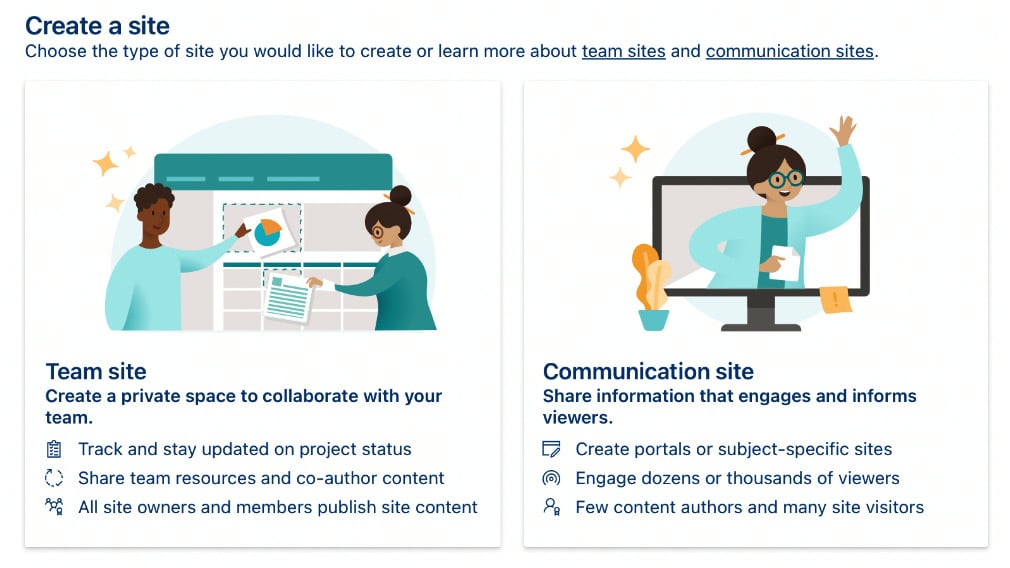
Figure 1.1 – Team site and Communication site template options
For admins, team sites can come in two flavors, depending on whether you want to connect the site to M365 Groups (which we’ll explore in Chapter 4). Generally, while features are still present to an admin or owner, I have very rarely bothered with feature activation in the modern SharePoint world. Generally, it is no longer needed to make modern sites behave in specific ways. The out-of-the-box configuration is sufficient in most cases.
Lists and libraries
The pages automatically created for viewing lists and libraries will be modern in SharePoint Online by default. You can change this at the site level with the activation of a feature (to be consistent with my previous statement, I’ve never had to do this) called SharePoint Lists and Libraries experience. Activating the feature turns off the modern UI for list pages. You can also use the Advanced list or library settings to change the default list experience on a one-by-one basis. The following figure shows that option:

Figure 1.2 – List experience on the List settings page
While it is possible to make that change for a particular list or even for all lists on a particular site, I wouldn’t recommend it unless you have a compelling reason to do so. These modern pages are crucial to connect our SharePoint sites to features outside the platform (such as Power Apps and Power Automate) and to take advantage of the latest and greatest from Microsoft. The modern UI for system-generated list and library pages (for everything but the calendar that is) no longer features the classic ribbon, but a new streamlined UI filled with modern features, as seen in the following figure:

Figure 1.3 – The menu seen on list and library pages in SharePoint Online
Modern views are also much friendlier to work with and change. We can do so directly on the same page as the list, rather than having to navigate to a separate screen. Therefore, views can be manipulated in place. We can then save them as public or private. We will explore these options further in Chapter 5, Magic Tool in the Toolbox – Integrating SPO with Other Collaboration Tools, when we discuss Microsoft Lists as a standalone service. Lists brings new formatting and other enhancements to a single new app experience where users can interact with list data across sites they have access to as well as their own private lists created in OneDrive for Business.
Pages
For pages that we create, including the home page of the site, we have a great leap forward in ease of use and depth of functionality with modern UI enhancements. We have an entirely new canvas providing easier editing and updating. Modern pages also render correctly whether we’re on a phone, a tablet, or viewing the page on a 49-inch wide-screen monitor. This works because Microsoft has built the underlying page structure to be responsive.
Modern pages are possible because each new modern site contains an enabled site pages feature that gives us a new Site Page content type. A modern page can include multiple sections with different layouts, without the use of the Publishing Infrastructure features or page templates. Moreover, the layout of the section can change as we build our page, so we could have a single, wide panel at the top with a three-column layout just underneath it, and back to a page width section. Section layouts can be changed even after the page is saved and web parts will adjust to fit into their container if they are moved.
On the following page, for example, we have a vertical section down the right side. A hero layout of four images is in a single-column section across the top, and a two-column section with some text and previews/links to videos is just below it. If we moved the hero images to the smaller section below, it would render as a slider, showing one image at a time. The following figure shows a hero layout rendered on a desktop monitor, displaying all four images at once:
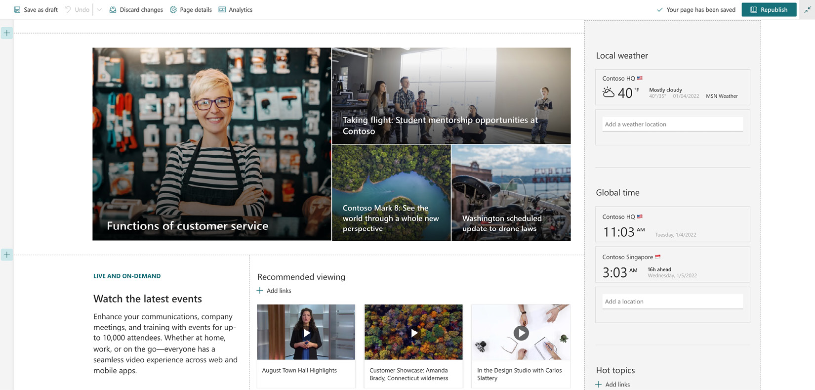
Figure 1.4 – A modern SharePoint page from a communication site
Microsoft has created and continues to curate a tremendously valuable resource to make sure we understand and get the most benefit from modern sites. The SharePoint look book contains loads of ideas, documentation, and visual samples, and you can deploy entire sites to your tenant directly from the site as well. The look book is available at https://lookbook.microsoft.com/.
Web parts
Classic pages are built with classic web parts. Modern pages are composed of modern web parts. That may sound elementary, but it is crucial to understand that we cannot mix and match components between the two worlds. They’re both building blocks, but one is like LEGO bricks while the other is like Mega Bloks. They simply don’t fit together.
Modern web parts are responsive, just like the pages that host them. When a page is placed into edit mode, so are all of the web parts, so there are fewer clicks for our content owners. The Edit panel that opens for each web part is also simpler and more consistent with the rest of the modern UI. Just look for a pencil icon to click and the details panel will open on the right:
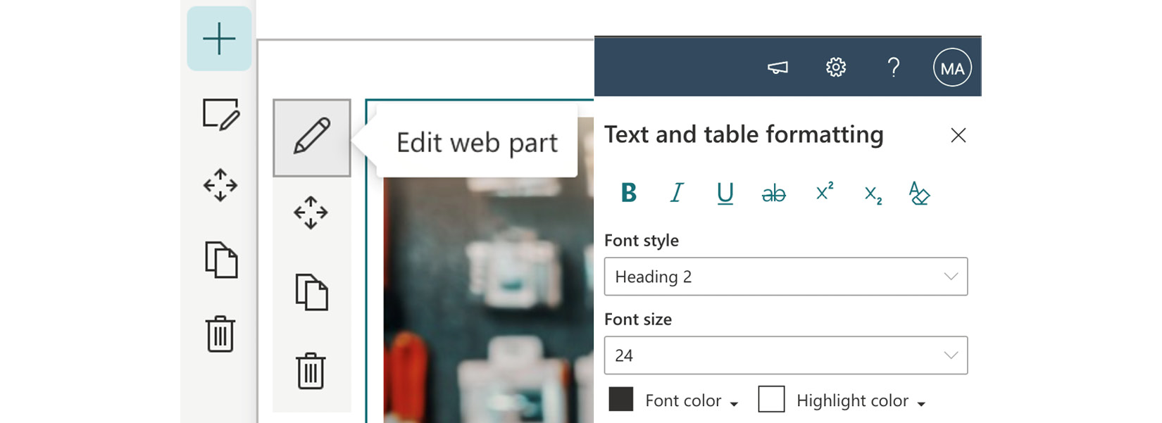
Figure 1.5 – Editing a modern web part
The look book noted earlier does a great job of indicating which web parts have been used with each template’s home page, with hyperlinks to the Microsoft documentation to explain how to use each one.
Navigation
In both classic and modern SharePoint, we have navigation elements that can be hosted in one of two locations on the page. Team sites still provide a left-hand quick launch, while site navigation can still be found at the top of the page. Adding and editing links becomes more streamlined with the owner’s ability to edit the navigation in place and use the Change the Look menu to decide on a more traditional Cascading look or the more updated Mega menu:
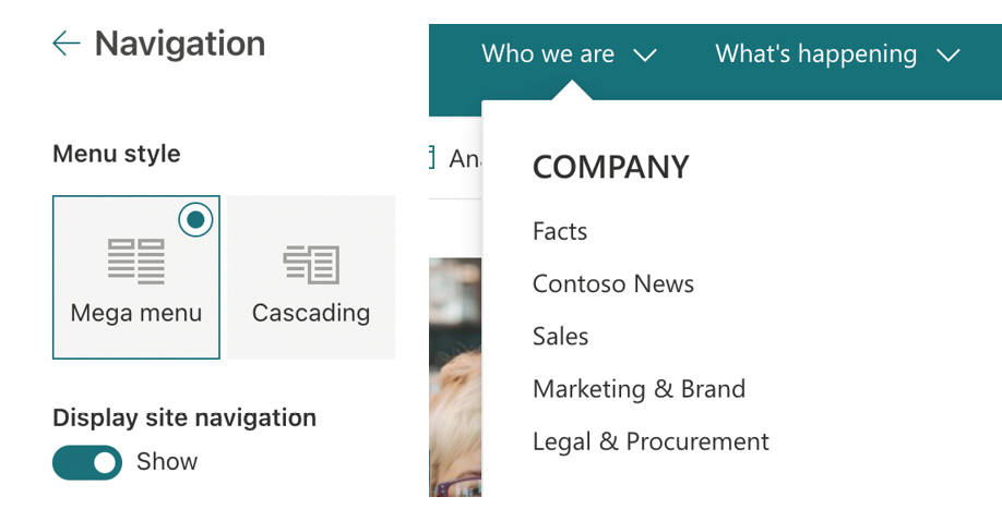
Figure 1.6 – An example of Mega menu
The biggest change to navigation in the modern world is through the use of hub sites, which we will explore in much greater depth in Chapter 7, Up with Hubs, Down with Subs – Planning Hub Sites. A hub provides a way for one site to be the logical parent of other sites. One advantage of this functionality is to provide global navigation that is at the very top of the page, above the site’s navigation, which is consistent across all sites that are connected to a given hub. We can also use that same global navigation to supply links to the SharePoint Online app bar. The app bar is designed to be sticky to the left-hand side of all SharePoint Online sites and to also drive the Viva Connections experience in Teams, referenced in greater detail at https://docs.microsoft.com/en-us/viva/connections/sharepoint-app-bar. The following figure shows us the app bar:

Figure 1.7 – SharePoint app bar
We’ve taken a look at the five core components of the modern experience in SharePoint Online. Understanding these elements will guide us through the rest of this book. However, to truly appreciate the modern world, we should spend a little time pondering the past and remember classic SharePoint.


