Search icon CANCEL
Subscription
0
Cart icon
Your Cart (0 item)
Close icon
You have no products in your basket yet
Save more on your purchases! discount-offer-chevron-icon
Savings automatically calculated. No voucher code required.
Arrow left icon
Explore Products
Best Sellers
New Releases
Books
Videos
Audiobooks
Learning Hub
Newsletter Hub
Free Learning
Arrow right icon
timer SALE ENDS IN
0 Days
:
00 Hours
:
00 Minutes
:
00 Seconds
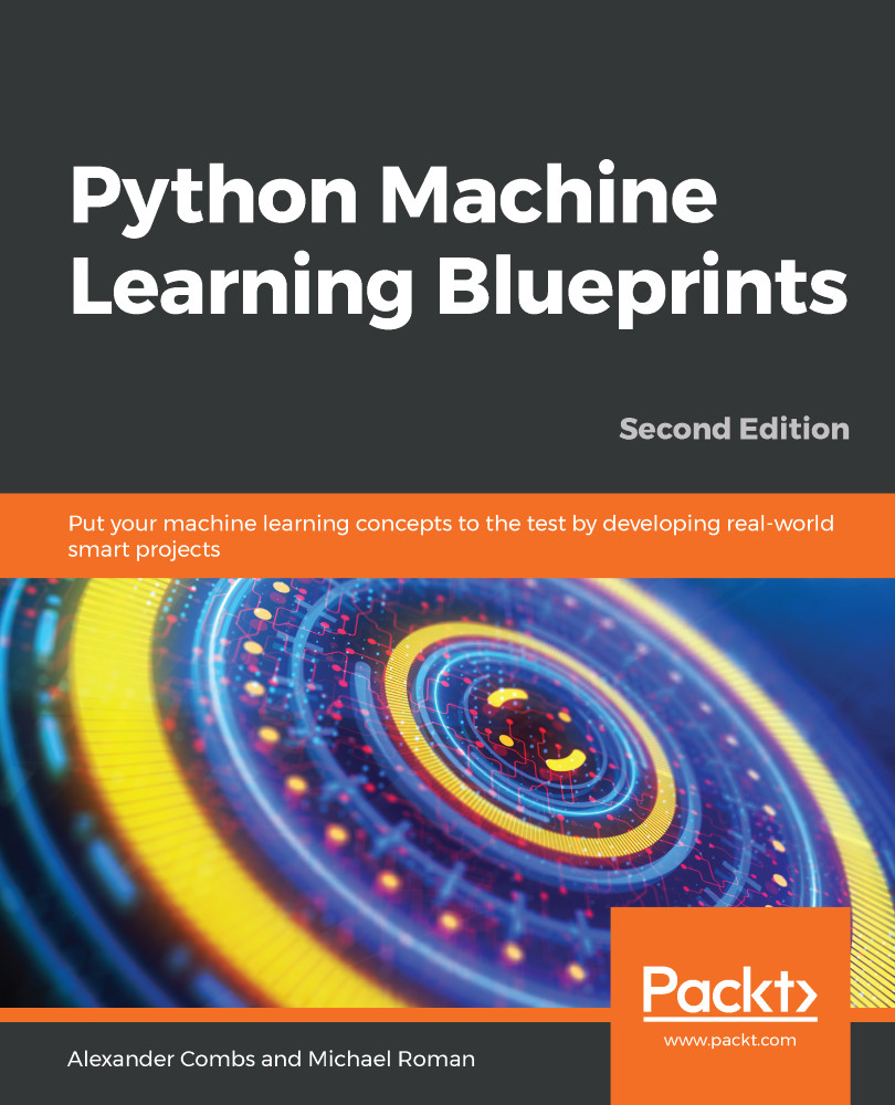
Python Machine Learning Blueprints

Python Machine Learning Blueprints: Put your machine learning concepts to the test by developing real-world smart projects , Second Edition

Arrow left icon
Profile Icon Combs Profile Icon Chhajed Profile Icon Roman
Arrow right icon
$48.99
Paperback Jan 2019 378 pages 2nd Edition
eBook
$9.99 $35.99
Paperback
$48.99
Subscription
Free Trial
Renews at $19.99p/m
Arrow left icon
Profile Icon Combs Profile Icon Chhajed Profile Icon Roman
Arrow right icon
$48.99
Paperback Jan 2019 378 pages 2nd Edition
eBook
$9.99 $35.99
Paperback
$48.99
Subscription
Free Trial
Renews at $19.99p/m
eBook
$9.99 $35.99
Paperback
$48.99
Subscription
Free Trial
Renews at $19.99p/m

What do you get with Print?

Product feature icon Instant access to your digital eBook copy whilst your Print order is Shipped
Product feature icon Paperback book shipped to your preferred address
Product feature icon Download this book in EPUB and PDF formats
Product feature icon Access this title in our online reader with advanced features
Product feature icon DRM FREE - Read whenever, wherever and however you want
Product feature icon AI Assistant (beta) to help accelerate your learning
OR
Modal Close icon
Payment Processing...
tick Completed

Shipping Address

Billing Address

Shipping Methods
Table of content icon View table of contents Preview book icon Preview Book

Python Machine Learning Blueprints

The Python Machine Learning Ecosystem

Machine learning is rapidly changing our world. As the centerpiece of artificial intelligence, it is difficult to go a day without reading how it will lead us into either a techno-utopia along the lines of the Singularity, or into some sort of global Blade Runner-esque nightmare scenario. While pundits may enjoy discussing these hyperbolic futures, the more mundane reality is that machine learning is rapidly becoming a fixture of our daily lives. Through subtle but progressive improvements in how we interact with computers and the world around us, machine learning is progressively making our lives better.

If you shop at online retailers such as Amazon.com, use streaming music or movie services such as Spotify or Netflix, or have even just done a Google search, you have encountered an application that utilizes machine learning. These services collect vast amounts of data—much of it from their users—that is used to build models that improve the user experience.

It's an ideal time to dive into developing machine learning applications, and, as you will discover, Python is an ideal choice with which to develop them. Python has a deep and active developer community, many with roots in the scientific community. This heritage has provided Python with an unparalleled array of libraries for scientific computing. In this book, we will discuss and use a number of the libraries included in this Python Scientific Stack.

In the chapters that follow, we'll learn how to build a wide variety of machine learning applications step by step. Before we begin in earnest though, we'll spend the remainder of this chapter discussing the features of these key libraries and how to prepare your environment to best utilize them.

These are the topics that will be covered in this chapter:

  • The data science/machine learning workflow
  • Libraries for each stage of the workflow
  • Setting up your environment

Data science/machine learning workflow

Building machine learning applications, while similar in many respects to the standard engineering paradigm, differs in one crucial aspect: the need to work with data as a raw material. The success of your project will, in large part, depend on the quality of the data you acquire, as well as your handling of that data. And because working with data falls into the domain of data science, it is helpful to understand the data science workflow:

Data science workflow

The process involves these six steps in the following order:

  1. Acquisition
  2. Inspection
  3. Preparation
  4. Modeling
  5. Evaluation
  6. Deployment

Frequently, there is a need to circle back to prior steps, such as when inspecting and preparing the data, or when evaluating and modeling, but the process at a high level can be as described in the preceding list.

Let's now discuss each step in detail.

Acquisition

Data for machine learning applications can come from any number of sources; it may be emailed to you as a CSV file, it may come from pulling down server logs, or it may require building a custom web scraper. Data is also likely to exist in any number of formats. In most cases, you will be dealing with text-based data, but, as we'll see, machine learning applications may just as easily be built that utilize images or even video files. Regardless of the format, once you have secured the data, it is crucial that you understand what's in the data, as well as what isn't.

Inspection

Once you have acquired your data, the next step is to inspect it. The primary goal at this stage is to sanity check the data, and the best way to accomplish this is to look for things that are either impossible or highly unlikely. As an example, if the data has a unique identifier, check to see that there is indeed only one; if the data is price-based, check that it is always positive; and whatever the data type, check the most extreme cases. Do they make sense? A good practice is to run some simple statistical tests on the data, and visualize it. The outcome of your models is only as good as the data you put in, so it is crucial to get this step right.

Preparation

When you are confident you have your data in order, next you will need to prepare it by placing it in a format that is amenable to modeling. This stage encompasses a number of processes, such as filtering, aggregating, imputing, and transforming. The type of actions you need to take will be highly dependent on the type of data you're working with, as well as the libraries and algorithms you will be utilizing. For example, if you are working with natural language-based texts, the transformations required will be very different from those required for time-series data. We'll see a number of examples of these types of transformations throughout the book.

Modeling

Once the data preparation is complete, the next phase is modeling. Here, you will be selecting an appropriate algorithm and using the data to train your model. There are a number of best practices to adhere to during this stage, and we will discuss them in detail, but the basic steps involve splitting your data into training, testing, and validation sets. This splitting up of the data may seem illogical—especially when more data typically yields better models—but as we'll see, doing this allows us to get better feedback on how the model will perform in the real world, and prevents us from the cardinal sin of modeling: overfitting. We will talk more about this in later chapters.

Evaluation

So, now you've got a shiny new model, but exactly how good is that model? This is the question that the evaluation phase seeks to answer. There are a number of ways to measure the performance of a model, and again it is largely dependent on the type of data you are working with and the type of model used, but on the whole, we are seeking to answer the question of how close the model's predictions are to the actual value. There is an array of confusing sounding terms, such as root mean-square error, or Euclidean distance, or F1 score. But in the end, they are all just a measure of distance between the actual prediction and the estimated prediction.

Deployment

Once you are comfortable with the performance of your model, you'll want to deploy it. This can take a number of forms depending on the use case, but common scenarios include utilization as a feature within another larger application, a bespoke web application, or even just a simple cron job.

Python libraries and functions for each stage of the data science workflow

Now that you have an understanding of each step in the data science workflow, we'll take a look at a selection of useful Python libraries and functions within those libraries for each step.

Acquisition

Since one of the more common ways to access data is through a RESTful API, one library that you'll want to be aware of is the Python Requests library, http://www.python-requests.org/en/latest/. Dubbed HTTP for humans, it makes interacting with APIs a clean and simple experience.

Let's take a look at a sample interaction, using requests to pull down data from GitHub's API. Here, we will make a call to the API and request a list of starred repositories for a user:

import requests r = requests.get(r"https://api.github.com/users/acombs/starred") r.json() 

This will return a JSON of all the repositories the user has starred, along with attributes about each. Here is a snippet of the output for the preceding call:

Output snippet when we return a JSON of all the repositories

The requests library has an amazing number of features—far too many to cover here, but I do suggest you check out the documentation.

Inspection

Because inspecting your data is such a critical step in the development of machine learning applications, we'll now take an in-depth look at several libraries that will serve you well in this task.

The Jupyter Notebook

There are a number of libraries that will make the data inspection process easier. The first is Jupyter Notebook with IPython (http://ipython.org/). This is a fully-fledged, interactive computing environment, and it is ideal for data exploration. Unlike most development environments, Jupyter Notebook is a web-based frontend (to the IPython kernel) that is divided into individual code blocks or cells. Cells can be run individually or all at once, depending on the need. This allows the developer to run a scenario, see the output, then step back through the code, make adjustments, and see the resulting changes—all without leaving the notebook. Here is a sample interaction in the Jupyter Notebook:

Sample interaction in the Jupyter Notebook

You will notice that we have done a number of things here and have interacted with not only the IPython backend, but the terminal shell as well. Here, I have imported the Python os library and made a call to find the current working directory (cell #2), which you can see is the output below my input code cell. I then changed directories using the os library in cell #3, but stopped utilizing the os library and began using Linux-based commands in cell #4. This is done by adding the ! prepend to the cell. In cell #6, you can see that I was even able to save the shell output to a Python variable (file_two). This is a great feature that makes file operations a simple task.

Note that the results would obviously differ slightly on your machine, since this displays information on the user under which it runs.

Now, let's take a look at some simple data operations using the notebook. This will also be our first introduction to another indispensable library, pandas.

Pandas

Pandas is a remarkable tool for data analysis that aims to be the most powerful and flexible open source data analysis/manipulation tool available in any language. And, as you will soon see, if it doesn't already live up to this claim, it can't be too far off. Let's now take a look:

Importing the iris dataset

You can see from the preceding screenshot that I have imported a classic machine learning dataset, the iris dataset (also available at https://archive.ics.uci.edu/ml/datasets/Iris), using scikit-learn, a library we'll examine in detail later. I then passed the data into a pandas DataFrame, making sure to assign the column headers. One DataFrame contains flower measurement data, and the other DataFrame contains a number that represents the iris species. This is coded 0, 1, and 2 for setosa, versicolor, and virginica respectively. I then concatenated the two DataFrames.

For working with datasets that will fit on a single machine, pandas is the ultimate tool; you can think of it a bit like Excel on steroids. And, like the popular spreadsheet program, the basic units of operation are columns and rows of data that form tables. In the terminology of pandas, columns of data are series and the table is a DataFrame.

Using the same iris DataFrame we loaded previously, let's now take a look at a few common operations, including the following:

The first action was just to use the .head() command to get the first five rows. The second command was to select a single column from the DataFrame by referencing it by its column name. Another way we perform this data slicing is to use the .iloc[row,column] or .loc[row,column] notation. The former slices data using a numeric index for the columns and rows (positional indexing), while the latter uses a numeric index for the rows, but allows for using named columns (label-based indexing).

Let's select the first two columns and the first four rows using the .iloc notation. We'll then look at the .loc notation:

Using the .iloc notation and the Python list slicing syntax, we were able to select a slice of this DataFrame.

Now, let's try something more advanced. We'll use a list iterator to select just the width feature columns:

What we have done here is create a list that is a subset of all columns. df.columns returns a list of all columns, and our iteration uses a conditional statement to select only those with width in the title. Obviously, in this situation, we could have just as easily typed out the columns we wanted into a list, but this gives you a sense of the power available when dealing with much larger datasets.

We've seen how to select slices based on their position within the DataFrame, but let's now look at another method to select data. This time, we will select a subset of the data based upon satisfying conditions that we specify:

  1. Let's now see the unique list of species available, and select just one of those:
  1. In the far-right column, you will notice that our DataFrame only contains data for the Iris-virginica species (represented by the 2) now. In fact, the size of the DataFrame is now 50 rows, down from the original 150 rows:
  1. You can also see that the index on the left retains the original row numbers. If we wanted to save just this data, we could save it as a new DataFrame, and reset the index as shown in the following diagram:

  1. We have selected data by placing a condition on one column; let's now add more conditions. We'll go back to our original DataFrame and add two conditions:

The DataFrame now only includes data from the virginica species with a petal width greater than 2.2.

Let's now move on to using pandas to get some quick descriptive statistics from our iris dataset:

With a call to the .describe() function, I have received a breakdown of the descriptive statistics for each of the relevant columns. (Notice that species was automatically removed as it is not relevant for this.) I could also pass in my own percentiles if I wanted more granular information:

Next, let's check whether there is any correlation between these features. That can be done by calling .corr() on our DataFrame:

The default returns the Pearson correlation coefficient for each row-column pair. This can be switched to Kendall's Tau or Spearman's rank correlation coefficient by passing in a method argument (for example, .corr(method="spearman") or .corr(method="kendall")).

Visualization

So far, we have seen how to select portions of a DataFrame and how to get summary statistics from our data, but let's now move on to learning how to visually inspect the data. But first, why even bother with visual inspection? Let's see an example to understand why.

Here is the summary statistics for four distinct series of x and y values:

Series of x and y

Values

Mean of x

9

Mean of y

7.5

Sample variance of x

11

Sample variance of y

4.1

Correlation between x and y

0.816

Regression line

y = 3.00 + 0.500x

Based on the series having identical summary statistics, you might assume that these series would appear visually similar. You would, of course, be wrong. Very wrong. The four series are part of Anscombe's quartet, and they were deliberately created to illustrate the importance of visual data inspection. Each series is plotted as follows:

Clearly, we would not treat these datasets as identical after having visualized them. So, now that we understand the importance of visualization, let's take a look at a pair of useful Python libraries for this.

The matplotlib library

The first library we'll take a look at is matplotlib. The matplotlib library is the center of the Python plotting library universe. Originally created to emulate the plotting functionality of MATLAB, it grew into a fully-featured library in its own right with an enormous range of functionality. If you have not come from a MATLAB background, it can be hard to understand how all the pieces work together to create the graphs you see. I'll do my best to break down the pieces into logical components so you can get up to speed quickly. But before diving into matplotlib in full, let's set up our Jupyter Notebook to allow us to see our graphs inline. To do this, add the following lines to your import statements:

import matplotlib.pyplot as plt 
plt.style.use('ggplot') 
%matplotlib inline 

The first line imports matplotlib, the second line sets the styling to approximate R's ggplot library (requires matplotlib 1.41 or greater), and the last line sets the plots so that they are visible within the notebook.

Now, let's generate our first graph using our iris dataset:

fig, ax = plt.subplots(figsize=(6,4)) 
ax.hist(df['petal width (cm)'], color='black'); 
ax.set_ylabel('Count', fontsize=12) 
ax.set_xlabel('Width', fontsize=12) 
plt.title('Iris Petal Width', fontsize=14, y=1.01) 

The preceding code generates the following output:

There is a lot going on even in this simple example, but we'll break it down line by line. The first line creates a single subplot with a width of 6 inches and a height of 4 inches. We then plot a histogram of the petal width from our iris DataFrame by calling .hist() and passing in our data. We also set the bar color to black here. The next two lines place labels on our y and x axes, respectively, and the final line sets the title for our graph. We tweak the title's y position relative to the top of the graph with the y parameter, and increase the font size slightly over the default. This gives us a nice histogram of our petal width data. Let's now expand on that, and generate histograms for each column of our iris dataset:

fig, ax = plt.subplots(2,2, figsize=(6,4)) 
 
ax[0][0].hist(df['petal width (cm)'], color='black'); 
ax[0][0].set_ylabel('Count', fontsize=12) 
ax[0][0].set_xlabel('Width', fontsize=12) 
ax[0][0].set_title('Iris Petal Width', fontsize=14, y=1.01) 
 
ax[0][1].hist(df['petal length (cm)'], color='black'); 
ax[0][1].set_ylabel('Count', fontsize=12) 
ax[0][1].set_xlabel('Length', fontsize=12) 
ax[0][1].set_title('Iris Petal Length', fontsize=14, y=1.01) 
 
ax[1][0].hist(df['sepal width (cm)'], color='black'); 
ax[1][0].set_ylabel('Count', fontsize=12) 
ax[1][0].set_xlabel('Width', fontsize=12) 
ax[1][0].set_title('Iris Sepal Width', fontsize=14, y=1.01) 
 
ax[1][1].hist(df['sepal length (cm)'], color='black'); 
ax[1][1].set_ylabel('Count', fontsize=12) 
ax[1][1].set_xlabel('Length', fontsize=12) 
ax[1][1].set_title('Iris Sepal Length', fontsize=14, y=1.01) 
 
plt.tight_layout()  
 

The output for the preceding code is shown in the following diagram:

Obviously, this is not the most efficient way to code this, but it is useful for demonstrating how matplotlib works. Notice that instead of the single subplot object, ax, as we had in the first example, we now have four subplots, which are accessed through what is now the ax array. A new addition to the code is the call to plt.tight_layout(); this function will nicely auto-space your subplots to avoid crowding.

Let's now take a look at a few other types of plots available in matplotlib. One useful plot is a scatterplot. Here, we will plot the petal width against the petal length:

fig, ax = plt.subplots(figsize=(6,6)) 
ax.scatter(df['petal width (cm)'],df['petal length (cm)'],                      color='green') 
ax.set_xlabel('Petal Width') 
ax.set_ylabel('Petal Length') 
ax.set_title('Petal Scatterplot') 

The preceding code generates the following output:

As before, we could add in multiple subplots to examine each facet.

Another plot we could examine is a simple line plot. Here, we will look at a plot of the petal length:

fig, ax = plt.subplots(figsize=(6,6)) 
ax.plot(df['petal length (cm)'], color='blue') 
ax.set_xlabel('Specimen Number') 
ax.set_ylabel('Petal Length') 
ax.set_title('Petal Length Plot') 

The preceding code generates the following output:

We can already begin to see, based on this simple line plot, that there are distinctive clusters of lengths for each species—remember our sample dataset had 50 ordered examples of each type. This tells us that petal length is likely to be a useful feature to discriminate between the species if we were to build a classifier.

Let's look at one final type of chart from the matplotlib library, the bar chart. This is perhaps one of the more common charts you'll see. Here, we'll plot a bar chart for the mean of each feature for the three species of irises, and to make it more interesting, we'll make it a stacked bar chart with a number of additional matplotlib features:

import numpy as np
fig, ax = plt.subplots(figsize=(6,6))
bar_width = .8
labels = [x for x in df.columns if 'length' in x or 'width' in x]
set_y = [df[df['species']==0][x].mean() for x in labels]
ver_y = [df[df['species']==1][x].mean() for x in labels]
vir_y = [df[df['species']==2][x].mean() for x in labels]
x = np.arange(len(labels))
ax.bar(x, set_y, bar_width, color='black')
ax.bar(x, ver_y, bar_width, bottom=set_y, color='darkgrey')
ax.bar(x, vir_y, bar_width, bottom=[i+j for i,j in zip(set_y, ver_y)], color='white')
ax.set_xticks(x + (bar_width/2))
ax.set_xticklabels(labels, rotation=-70, fontsize=12);
ax.set_title('Mean Feature Measurement By Species', y=1.01)
ax.legend(['Setosa','Versicolor','Virginica'])

The output for the preceding snippet is given here:

To generate the bar chart, we need to pass the x and y values into the .bar() function. In this case, the x values will just be an array of the length of the features we are interested in—four here, or one for each column in our DataFrame. The np.arange() function is an easy way to generate this, but we could nearly as easily input this array manually. Since we don't want the x axis to display this as 1 through 4, we call the .set_xticklabels() function and pass in the column names we wish to display. To line up the x labels properly, we also need to adjust the spacing of the labels. This is why we set the xticks to x plus half the size of the bar_width, which we also set earlier at 0.8. The y values come from taking the mean of each feature for each species. We then plot each by calling .bar(). It is important to note that we pass in a bottom parameter for each series, which sets the minimum y point and the maximum y point of the series below it. This creates the stacked bars. And finally, we add a legend, which describes each series. The names are inserted into the legend list in order of the placement of the bars from top to bottom.

The seaborn library

The next visualization library we'll look at is called seaborn, (http://seaborn.pydata.org/index.html). It is a library that was created specifically for statistical visualizations. In fact, it is perfect for use with pandas DataFrames, where the columns are features and the rows are observations. This style of DataFrame is called tidy data, and is the most common form for machine learning applications.

Let's now take a look at the power of seaborn:

import seaborn as sns 
sns.pairplot(df, hue='species') 

With just those two lines of code, we get the following:

Seaborn plot

Having just detailed the intricate nuances of matplotlib, you will immediately appreciate the simplicity with which we generated this plot. All of our features have been plotted against each other and properly labeled with just two lines of code. You might wonder if I just wasted dozens of pages teaching you matplotlib when seaborn makes these types of visualizations so simple. Well, that isn't the case, as seaborn is built on top of matplotlib. In fact, you can use all of what you learned about matplotlib to modify and work with seaborn. Let's take a look at another visualization:

fig, ax = plt.subplots(2, 2, figsize=(7, 7)) 
sns.set(style='white', palette='muted')
sns.violinplot(x=df['species'], y=df['sepal length (cm)'], ax=ax[0,0]) sns.violinplot(x=df['species'], y=df['sepal width (cm)'], ax=ax[0,1]) sns.violinplot(x=df['species'], y=df['petal length (cm)'], ax=ax[1,0]) sns.violinplot(x=df['species'], y=df['petal width (cm)'], ax=ax[1,1]) fig.suptitle('Violin Plots', fontsize=16, y=1.03)
for i in ax.flat:
plt.setp(i.get_xticklabels(), rotation=-90)
fig.tight_layout()

The preceding code generates the following output:

Violin Plots

Here, we have generated a violin plot for each of the four features. A violin plot displays the distribution of the features. For example, you can easily see that the petal length of setosa (0) is highly clustered between 1 cm and 2 cm, while virginica (2) is much more dispersed, from nearly 4 cm to over 7 cm. You will also notice that we have used much of the same code we used when constructing the matplotlib graphs. The main difference is the addition of the sns.plot() calls, in place of the ax.plot() calls previously. We have also added a title above all of the subplots, rather than over each individually, with the fig.suptitle() function. One other notable addition is the iteration over each of the subplots to change the rotation of the xticklabels. We call ax.flat() and then iterate over each subplot axis to set a particular property using .setp(). This prevents us from having to individually type out ax[0][0]...ax[1][1] and set the properties, as we did previously in the earlier matplotlib subplot code.

There are hundreds of styles of graphs you can generate using matplotlib and seaborn, and I highly recommend digging into the documentation for these two libraries—it will be time well spent—but the graphs I have detailed in the preceding section should go a long way toward helping you to understand the dataset you have, which in turn will help you when building your machine learning models.

Preparation

We've learned a great deal about inspecting the data we have, but now let's move on to learning how to process and manipulate our data. Here, we will learn about the .map(), .apply(), .applymap(), and .groupby() functions of pandas. These are invaluable for working with data, and are especially useful in the context of machine learning for feature engineering, a concept we will discuss in detail in later chapters.

map

We'll now begin with the map function. The map function works on series, so in our case we will use it to transform a column of our DataFrame, which you will recall is just a pandas series. Suppose we decide that the species numbers are not suitable for our needs. We'll use the map function with a Python dictionary as the argument to accomplish this. We'll pass in a replacement for each of the unique iris types:

Let's look at what we have done here. We have run the map function over each of the values of the existing species column. As each value was found in the Python dictionary, it was added to the return series. We assigned this return series to the same species name, so it replaced our original species column. Had we chosen a different name, say short code, that column would have been appended to the DataFrame, and we would then have the original species column plus the new short code column.

We could have instead passed the map function a series or a function to perform this transformation on a column, but this is a functionality that is also available through the apply function, which we'll take a look at next. The dictionary functionality is unique to the map function, and the most common reason to choose map over apply for a single column transformation. But, let's now take a look at the apply function.

apply

The apply function allows us to work with both DataFrames and series. We'll start with an example that would work equally well with map, before moving on to examples that would only work with apply.

Using our iris DataFrame, let's make a new column based on petal width. We previously saw that the mean for the petal width was 1.3. Let's now create a new column in our DataFrame, wide petal, that contains binary values based on the value in the petal width column. If the petal width is equal to or wider than the median, we will code it with a 1, and if it is less than the median, we will code it 0. We'll do this using the apply function on the petal width column:

A few things happened here, so let's walk through them step by step. The first is that we were able to append a new column to the DataFrame simply by using the column selection syntax for a column name, which we want to create, in this case wide petal. We set that new column equal to the output of the apply function. Here, we ran apply on the petal width column that returned the corresponding values in the wide petal column. The apply function works by running through each value of the petal width column. If the value is greater than or equal to 1.3, the function returns 1, otherwise it returns 0. This type of transformation is a fairly common feature engineering transformation in machine learning, so it is good to be familiar with how to perform it.

Let's now take a look at using apply on a DataFrame rather than a single series. We'll now create a feature based on the petal area:

Creating a new feature

Notice that we called apply not on a series here, but on the entire DataFrame, and because apply was called on the entire DataFrame, we passed in axis=1 in order to tell pandas that we want to apply the function row-wise. If we passed in axis=0, then the function would operate column-wise. Here, each column is processed sequentially, and we choose to multiply the values from the petal length (cm) and petal width (cm) columns. The resultant series then becomes the petal area column in our DataFrame. This type of power and flexibility is what makes pandas an indispensable tool for data manipulation.

applymap

We've looked at manipulating columns and explained how to work with rows, but suppose you'd like to perform a function across all data cells in your DataFrame. This is where applymap is the correct tool. Let's take a look at an example:

Using applymap function

Here, we called applymap on our DataFrame in order to get the log of every value (np.log() utilizes the NumPy library to return this value), if that value is of the float type. This type checking prevents returning an error or a float for the species or wide petal columns, which are string and integer values respectively. Common uses of applymap include transforming or formatting each cell based on meeting a number of conditional criteria.

groupby

Let's now look at an operation that is highly useful, but often difficult for new pandas users to get their heads around: the .groupby() function. We'll walk through a number of examples step by step in order to illustrate the most important functionality.

The groupby operation does exactly what it says: it groups data based on some class or classes you choose. Let's take a look at a simple example using our iris dataset. We'll go back and reimport our original iris dataset, and run our first groupby operation:

Here, data for each species is partitioned and the mean for each feature is provided. Let's take it a step further now and get full descriptive statistics for each species:

Statistics for each species

And now, we can see the full breakdown bucketed by species. Let's now look at some other groupby operations we can perform. We saw previously that petal length and width had some relatively clear boundaries between species. Now, let's examine how we might use groupby to see that:

In this case, we have grouped each unique species by the petal width they were associated with. This is a manageable number of measurements to group by, but if it were to become much larger, we would likely need to partition the measurements into brackets. As we saw previously, that can be accomplished by means of the apply function.

Let's now take a look at a custom aggregation function:

In this code, we grouped petal width by species using the .max() and .min() functions, and a lambda function that returns a maximum petal width less than the minimum petal width.

We've only just touched on the functionality of the groupby function; there is a lot more to learn, so I encourage you to read the documentation available at http://pandas.pydata.org/pandas-docs/stable/.

Hopefully, you now have a solid base-level understanding of how to manipulate and prepare data in preparation for our next step, which is modeling. We will now move on to discuss the primary libraries in the Python machine learning ecosystem.

Modeling and evaluation

In this section ,we will go through different libraries such as statsmodels and Scikit-learn and also understand what is deployment.

Statsmodels

The first library we'll cover is the statsmodels library (http://statsmodels.sourceforge.net/). Statsmodels is a Python package that is well documented and developed for exploring data, estimating models, and running statistical tests. Let's use it here to build a simple linear regression model of the relationship between sepal length and sepal width for the setosa species.

First, let's visually inspect the relationship with a scatterplot:

fig, ax = plt.subplots(figsize=(7,7)) 
ax.scatter(df['sepal width (cm)'][:50], df['sepal length (cm)'][:50]) 
ax.set_ylabel('Sepal Length') 
ax.set_xlabel('Sepal Width') 
ax.set_title('Setosa Sepal Width vs. Sepal Length', fontsize=14, y=1.02) 

The preceding code generates the following output:

So, we can see that there appears to be a positive linear relationship; that is, as the sepal width increases, the sepal length does as well. We'll next run a linear regression on the data using statsmodels to estimate the strength of that relationship:

import statsmodels.api as sm 
 
y = df['sepal length'][:50] 
x = df['sepal width'][:50] 
X = sm.add_constant(x) 
 
results = sm.OLS(y, X).fit() 
print results.summary() 

The preceding code generates the following output:

In the preceding diagram, we have the results of our simple regression model. Since this is a linear regression, the model takes the format of Y = Β0+ Β1X, where B0 is the intercept and B1 is the regression coefficient. Here, the formula would be Sepal Length = 2.6447 + 0.6909 * Sepal Width. We can also see that the R2 for the model is a respectable 0.558, and the p-value, (Prob), is highly significant—at least for this species.

Let's now use the results object to plot our regression line:

fig, ax = plt.subplots(figsize=(7,7)) 
ax.plot(x, results.fittedvalues, label='regression line') 
ax.scatter(x, y, label='data point', color='r') 
ax.set_ylabel('Sepal Length') 
ax.set_xlabel('Sepal Width') 
ax.set_title('Setosa Sepal Width vs. Sepal Length', fontsize=14, y=1.02) 
ax.legend(loc=2) 

The preceding code generates the following output:

By plotting results.fittedvalues, we can get the resulting regression line from our regression.

There are a number of other statistical functions and tests in the statsmodels package, and I invite you to explore them. It is an exceptionally useful package for standard statistical modeling in Python. Let's now move on to the king of Python machine learning packages: scikit-learn.

Scikit-learn

Scikit-learn is an amazing Python library with unrivaled documentation, designed to provide a consistent API to dozens of algorithms. It is built upon, and is itself, a core component of the Python scientific stack, which includes NumPy, SciPy, pandas, and matplotlib. Here are some of the areas scikit-learn covers: classification, regression, clustering, dimensionality reduction, model selection, and preprocessing.

We'll look at a few examples. First, we will build a classifier using our iris data, and then we'll look at how we can evaluate our model using the tools of scikit-learn:

  1. The first step to building a machine learning model in scikit-learn is understanding how the data must be structured.
  2. The independent variables should be a numeric n × m matrix, X, and the dependent variable, y, an n × 1 vector.
  3. The y vector may be either a numeric continuous or categorical, or a string categorical.
  4. These are then passed into the .fit() method on the chosen classifier.
  5. This is the great benefit of using scikit-learn: each classifier utilizes the same methods to the extent possible. This makes swapping them in and out a breeze.

Let's see this in action in our first example:

from sklearn.ensemble import RandomForestClassifier 
from sklearn.cross_validation import train_test_split 
 
clf = RandomForestClassifier(max_depth=5, n_estimators=10) 
 
X = df.ix[:,:4] 
y = df.ix[:,4] 
 
X_train, X_test, y_train, y_test = train_test_split(X, y, test_size=.3) 
 
clf.fit(X_train,y_train) 
 
y_pred = clf.predict(X_test) 
 
rf = pd.DataFrame(zip(y_pred, y_test), columns=['predicted', 'actual']) 
rf['correct'] = rf.apply(lambda r: 1 if r['predicted'] == r['actual'] else 0, axis=1) 
     
rf 

The preceding code generates the following output:

Now, let's execute the following line of code:

rf['correct'].sum()/rf['correct'].count() 

The preceding code generates the following output:

In the preceding few lines of code, we built, trained, and tested a classifier that has a 95% accuracy level on our iris dataset. Let's unpack each of the steps. Up at the top, we made a couple of imports; the first two are from scikit-learn, which thankfully is shortened to sklearn in import statements. The first import is a random forest classifier, and the second is a module for splitting your data into training and testing cohorts. This data partitioning is critical in building machine learning applications for a number of reasons. We'll get into this in later chapters, but suffice to say at this point it is a must. This train_test_split module also shuffles your data, which again is important as the order can contain information that would bias your actual predictions.

The first curious-looking line after the imports instantiates our classifier, in this case a random forest classifier. We select a forest that uses 10 decision tress, and each tree is allowed a maximum split depth of five. This is put in place to avoid overfitting, something we will discuss in depth in later chapters.

The next two lines create our X matrix and y vector. If you remember our original iris DataFrame, it contained four features: petal width and length, and sepal width and length. These features are selected and become our independent feature matrix, X. The last column, the iris class names, then becomes our dependent y vector.

These are then passed into the train_test_split method, which shuffles and partitions our data into four subsets, X_train, X_test, y_train, and y_test. The test_size parameter is set to .3, which means 30% of our dataset will be allocated to the X_test and y_test partitions, while the rest will be allocated to the training partitions, X_train and y_train.

Next, our model is fitted using the training data. Having trained the model, we then call the predict method on our classifier using our test data. Remember, the test data is data the classifier has not seen. The return of this prediction is a list of prediction labels. We then create a DataFrame of the actual labels versus the predicted labels. We finally total the correct predictions and divide by the total number of instances, which we can see gave us a very accurate prediction. Let's now see which features gave us the most discriminative or predictive power:

f_importances = clf.feature_importances_ 
f_names = df.columns[:4]
f_std = np.std([tree.feature_importances_ for tree in clf.estimators_], axis=0)

zz = zip(f_importances, f_names, f_std)
zzs = sorted(zz, key=lambda x: x[0], reverse=True)

imps = [x[0] for x in zzs]
labels = [x[1] for x in zzs]
errs = [x[2] for x in zzs]

plt.bar(range(len(f_importances)), imps, color="r", yerr=errs, align="center")
plt.xticks(range(len(f_importances)), labels);

The preceding code generates the following output:

As we expected, based upon our earlier visual analysis, the petal length and width have more discriminative power when differentiating between the iris classes. Where exactly did these numbers come from though? The random forest has a method called .feature_importances_ that returns the relative performance of the feature for splitting at the leaves. If a feature is able to consistently and cleanly split a group into distinct classes, it will have a high feature importance. This number will always total one. As you will notice here, we have included the standard deviation, which helps to illustrate how consistent each feature is. This is generated by taking the feature importance, for each of the features, for each ten trees, and calculating the standard deviation.

Let's now take a look at one more example using scikit-learn. We will now switch out our classifier and use a support vector machine (SVM):

from sklearn.multiclass import OneVsRestClassifier 
from sklearn.svm import SVC 
from sklearn.cross_validation import train_test_split 
 
clf = OneVsRestClassifier(SVC(kernel='linear')) 
 
X = df.ix[:,:4] 
y = np.array(df.ix[:,4]).astype(str) 
 
X_train, X_test, y_train, y_test = train_test_split(X, y, test_size=.3) 
 
clf.fit(X_train,y_train) 
 
y_pred = clf.predict(X_test) 
 
rf = pd.DataFrame(zip(y_pred, y_test), columns=['predicted', 'actual']) 
rf['correct'] = rf.apply(lambda r: 1 if r['predicted'] == r['actual'] else 0, axis=1) 
     
rf 

The preceding code generates the following output:

Now, let's execute the following line of code:

rf['correct'].sum()/rf['correct'].count() 

The preceding code generates the following output:

Here, we have swapped in an SVM without changing virtually any of our code. The only changes were the ones related to the importing of the SVM instead of the random forest, and the line that instantiates the classifier. (I did have to make one small change to the format of the y labels, as the SVM wasn't able to interpret them as NumPy strings like the random forest classifier was. Sometimes, these data type conversions have to be made specific or it will result in an error, but it's a minor annoyance.)

This is only a small sample of the functionality of scikit-learn, but it should give you a hint of the power of this magnificent tool for machine learning applications. There are a number of additional machine learning libraries we won't have a chance to discuss here but will explore in later chapters, but I strongly suggest that if this is your first time utilizing a machine learning library, and you want a strong general-purpose tool, scikit-learn is your go-to choice.

Deployment

There are a number of options you can choose from when you decide to put your machine learning model into production. It depends substantially on the nature of the application. Deployment could include anything from a cron job run on your local machine to a full-scale implementation deployed on an Amazon EC2 instance.

We won't go into detail regarding specific implementations here, but we will have a chance to delve into different deployment examples throughout the book.

Setting up your machine learning environment

We've covered a number of libraries, and it could be somewhat of a chore to install if you were to do each individually—which you certainly can, since most can be installed with pip, Python's package manager, but I would strongly urge you to go with a prepacked solution such as the Anaconda Python distribution (http://anaconda.org). This allows you to download and install a single executable with all the packages and dependencies handled for you. And since the distribution is targeted to Python scientific stack users, it is essentially a one-and-done solution.

Anaconda also includes a package manager that makes updating your packages a simple task. Simply type conda update <package_name>, and you will be updated to the most recent stable release.

Summary

In this chapter, we learned about the data science/machine learning workflow. We learned how to take our data step by step through each stage of the pipeline, going from acquisition all the way through to deployment. We also learned key features of each of the most important libraries in the Python scientific stack. We will now take this knowledge and these lessons and begin to apply them to create unique and useful machine learning applications. Let's get started!

Left arrow icon Right arrow icon
Download code icon Download Code

Key benefits

  • Get to grips with Python's machine learning libraries including scikit-learn, TensorFlow, and Keras
  • Implement advanced concepts and popular machine learning algorithms in real-world projects
  • Build analytics, computer vision, and neural network projects

Description

Machine learning is transforming the way we understand and interact with the world around us. This book is the perfect guide for you to put your knowledge and skills into practice and use the Python ecosystem to cover key domains in machine learning. This second edition covers a range of libraries from the Python ecosystem, including TensorFlow and Keras, to help you implement real-world machine learning projects. The book begins by giving you an overview of machine learning with Python. With the help of complex datasets and optimized techniques, you’ll go on to understand how to apply advanced concepts and popular machine learning algorithms to real-world projects. Next, you’ll cover projects from domains such as predictive analytics to analyze the stock market and recommendation systems for GitHub repositories. In addition to this, you’ll also work on projects from the NLP domain to create a custom news feed using frameworks such as scikit-learn, TensorFlow, and Keras. Following this, you’ll learn how to build an advanced chatbot, and scale things up using PySpark. In the concluding chapters, you can look forward to exciting insights into deep learning and you'll even create an application using computer vision and neural networks. By the end of this book, you’ll be able to analyze data seamlessly and make a powerful impact through your projects.

Who is this book for?

This book is for machine learning practitioners, data scientists, and deep learning enthusiasts who want to take their machine learning skills to the next level by building real-world projects. The intermediate-level guide will help you to implement libraries from the Python ecosystem to build a variety of projects addressing various machine learning domains. Knowledge of Python programming and machine learning concepts will be helpful.

What you will learn

  • Understand the Python data science stack and commonly used algorithms
  • Build a model to forecast the performance of an Initial Public Offering (IPO) over an initial discrete trading window
  • Understand NLP concepts by creating a custom news feed
  • Create applications that will recommend GitHub repositories based on ones you've starred, watched, or forked
  • Gain the skills to build a chatbot from scratch using PySpark
  • Develop a market-prediction app using stock data
  • Delve into advanced concepts such as computer vision, neural networks, and deep learning
Estimated delivery fee Deliver to United States

Economy delivery 10 - 13 business days

Free $6.95

Premium delivery 6 - 9 business days

$21.95
(Includes tracking information)

Product Details

Country selected
Publication date, Length, Edition, Language, ISBN-13
Publication date : Jan 31, 2019
Length: 378 pages
Edition : 2nd
Language : English
ISBN-13 : 9781788994170
Category :
Languages :
Tools :

What do you get with Print?

Product feature icon Instant access to your digital eBook copy whilst your Print order is Shipped
Product feature icon Paperback book shipped to your preferred address
Product feature icon Download this book in EPUB and PDF formats
Product feature icon Access this title in our online reader with advanced features
Product feature icon DRM FREE - Read whenever, wherever and however you want
Product feature icon AI Assistant (beta) to help accelerate your learning
OR
Modal Close icon
Payment Processing...
tick Completed

Shipping Address

Billing Address

Shipping Methods
Estimated delivery fee Deliver to United States

Economy delivery 10 - 13 business days

Free $6.95

Premium delivery 6 - 9 business days

$21.95
(Includes tracking information)

Product Details

Publication date : Jan 31, 2019
Length: 378 pages
Edition : 2nd
Language : English
ISBN-13 : 9781788994170
Category :
Languages :
Tools :

Packt Subscriptions

See our plans and pricing
Modal Close icon
$19.99 billed monthly
Feature tick icon Unlimited access to Packt's library of 7,000+ practical books and videos
Feature tick icon Constantly refreshed with 50+ new titles a month
Feature tick icon Exclusive Early access to books as they're written
Feature tick icon Solve problems while you work with advanced search and reference features
Feature tick icon Offline reading on the mobile app
Feature tick icon Simple pricing, no contract
$199.99 billed annually
Feature tick icon Unlimited access to Packt's library of 7,000+ practical books and videos
Feature tick icon Constantly refreshed with 50+ new titles a month
Feature tick icon Exclusive Early access to books as they're written
Feature tick icon Solve problems while you work with advanced search and reference features
Feature tick icon Offline reading on the mobile app
Feature tick icon Choose a DRM-free eBook or Video every month to keep
Feature tick icon PLUS own as many other DRM-free eBooks or Videos as you like for just $5 each
Feature tick icon Exclusive print discounts
$279.99 billed in 18 months
Feature tick icon Unlimited access to Packt's library of 7,000+ practical books and videos
Feature tick icon Constantly refreshed with 50+ new titles a month
Feature tick icon Exclusive Early access to books as they're written
Feature tick icon Solve problems while you work with advanced search and reference features
Feature tick icon Offline reading on the mobile app
Feature tick icon Choose a DRM-free eBook or Video every month to keep
Feature tick icon PLUS own as many other DRM-free eBooks or Videos as you like for just $5 each
Feature tick icon Exclusive print discounts

Frequently bought together


Stars icon
Total $ 126.97
Python Machine Learning Blueprints
$48.99
Python Machine Learning By Example
$38.99
Python Machine Learning Cookbook
$38.99
Total $ 126.97 Stars icon
Banner background image

Table of Contents

12 Chapters
The Python Machine Learning Ecosystem Chevron down icon Chevron up icon
Build an App to Find Underpriced Apartments Chevron down icon Chevron up icon
Build an App to Find Cheap Airfares Chevron down icon Chevron up icon
Forecast the IPO Market Using Logistic Regression Chevron down icon Chevron up icon
Create a Custom Newsfeed Chevron down icon Chevron up icon
Predict whether Your Content Will Go Viral Chevron down icon Chevron up icon
Use Machine Learning to Forecast the Stock Market Chevron down icon Chevron up icon
Classifying Images with Convolutional Neural Networks Chevron down icon Chevron up icon
Building a Chatbot Chevron down icon Chevron up icon
Build a Recommendation Engine Chevron down icon Chevron up icon
What's Next? Chevron down icon Chevron up icon
Other Books You May Enjoy Chevron down icon Chevron up icon
Get free access to Packt library with over 7500+ books and video courses for 7 days!
Start Free Trial

FAQs

What is the delivery time and cost of print book? Chevron down icon Chevron up icon

Shipping Details

USA:

'

Economy: Delivery to most addresses in the US within 10-15 business days

Premium: Trackable Delivery to most addresses in the US within 3-8 business days

UK:

Economy: Delivery to most addresses in the U.K. within 7-9 business days.
Shipments are not trackable

Premium: Trackable delivery to most addresses in the U.K. within 3-4 business days!
Add one extra business day for deliveries to Northern Ireland and Scottish Highlands and islands

EU:

Premium: Trackable delivery to most EU destinations within 4-9 business days.

Australia:

Economy: Can deliver to P. O. Boxes and private residences.
Trackable service with delivery to addresses in Australia only.
Delivery time ranges from 7-9 business days for VIC and 8-10 business days for Interstate metro
Delivery time is up to 15 business days for remote areas of WA, NT & QLD.

Premium: Delivery to addresses in Australia only
Trackable delivery to most P. O. Boxes and private residences in Australia within 4-5 days based on the distance to a destination following dispatch.

India:

Premium: Delivery to most Indian addresses within 5-6 business days

Rest of the World:

Premium: Countries in the American continent: Trackable delivery to most countries within 4-7 business days

Asia:

Premium: Delivery to most Asian addresses within 5-9 business days

Disclaimer:
All orders received before 5 PM U.K time would start printing from the next business day. So the estimated delivery times start from the next day as well. Orders received after 5 PM U.K time (in our internal systems) on a business day or anytime on the weekend will begin printing the second to next business day. For example, an order placed at 11 AM today will begin printing tomorrow, whereas an order placed at 9 PM tonight will begin printing the day after tomorrow.


Unfortunately, due to several restrictions, we are unable to ship to the following countries:

  1. Afghanistan
  2. American Samoa
  3. Belarus
  4. Brunei Darussalam
  5. Central African Republic
  6. The Democratic Republic of Congo
  7. Eritrea
  8. Guinea-bissau
  9. Iran
  10. Lebanon
  11. Libiya Arab Jamahriya
  12. Somalia
  13. Sudan
  14. Russian Federation
  15. Syrian Arab Republic
  16. Ukraine
  17. Venezuela
What is custom duty/charge? Chevron down icon Chevron up icon

Customs duty are charges levied on goods when they cross international borders. It is a tax that is imposed on imported goods. These duties are charged by special authorities and bodies created by local governments and are meant to protect local industries, economies, and businesses.

Do I have to pay customs charges for the print book order? Chevron down icon Chevron up icon

The orders shipped to the countries that are listed under EU27 will not bear custom charges. They are paid by Packt as part of the order.

List of EU27 countries: www.gov.uk/eu-eea:

A custom duty or localized taxes may be applicable on the shipment and would be charged by the recipient country outside of the EU27 which should be paid by the customer and these duties are not included in the shipping charges been charged on the order.

How do I know my custom duty charges? Chevron down icon Chevron up icon

The amount of duty payable varies greatly depending on the imported goods, the country of origin and several other factors like the total invoice amount or dimensions like weight, and other such criteria applicable in your country.

For example:

  • If you live in Mexico, and the declared value of your ordered items is over $ 50, for you to receive a package, you will have to pay additional import tax of 19% which will be $ 9.50 to the courier service.
  • Whereas if you live in Turkey, and the declared value of your ordered items is over € 22, for you to receive a package, you will have to pay additional import tax of 18% which will be € 3.96 to the courier service.
How can I cancel my order? Chevron down icon Chevron up icon

Cancellation Policy for Published Printed Books:

You can cancel any order within 1 hour of placing the order. Simply contact customercare@packt.com with your order details or payment transaction id. If your order has already started the shipment process, we will do our best to stop it. However, if it is already on the way to you then when you receive it, you can contact us at customercare@packt.com using the returns and refund process.

Please understand that Packt Publishing cannot provide refunds or cancel any order except for the cases described in our Return Policy (i.e. Packt Publishing agrees to replace your printed book because it arrives damaged or material defect in book), Packt Publishing will not accept returns.

What is your returns and refunds policy? Chevron down icon Chevron up icon

Return Policy:

We want you to be happy with your purchase from Packtpub.com. We will not hassle you with returning print books to us. If the print book you receive from us is incorrect, damaged, doesn't work or is unacceptably late, please contact Customer Relations Team on customercare@packt.com with the order number and issue details as explained below:

  1. If you ordered (eBook, Video or Print Book) incorrectly or accidentally, please contact Customer Relations Team on customercare@packt.com within one hour of placing the order and we will replace/refund you the item cost.
  2. Sadly, if your eBook or Video file is faulty or a fault occurs during the eBook or Video being made available to you, i.e. during download then you should contact Customer Relations Team within 14 days of purchase on customercare@packt.com who will be able to resolve this issue for you.
  3. You will have a choice of replacement or refund of the problem items.(damaged, defective or incorrect)
  4. Once Customer Care Team confirms that you will be refunded, you should receive the refund within 10 to 12 working days.
  5. If you are only requesting a refund of one book from a multiple order, then we will refund you the appropriate single item.
  6. Where the items were shipped under a free shipping offer, there will be no shipping costs to refund.

On the off chance your printed book arrives damaged, with book material defect, contact our Customer Relation Team on customercare@packt.com within 14 days of receipt of the book with appropriate evidence of damage and we will work with you to secure a replacement copy, if necessary. Please note that each printed book you order from us is individually made by Packt's professional book-printing partner which is on a print-on-demand basis.

What tax is charged? Chevron down icon Chevron up icon

Currently, no tax is charged on the purchase of any print book (subject to change based on the laws and regulations). A localized VAT fee is charged only to our European and UK customers on eBooks, Video and subscriptions that they buy. GST is charged to Indian customers for eBooks and video purchases.

What payment methods can I use? Chevron down icon Chevron up icon

You can pay with the following card types:

  1. Visa Debit
  2. Visa Credit
  3. MasterCard
  4. PayPal
What is the delivery time and cost of print books? Chevron down icon Chevron up icon

Shipping Details

USA:

'

Economy: Delivery to most addresses in the US within 10-15 business days

Premium: Trackable Delivery to most addresses in the US within 3-8 business days

UK:

Economy: Delivery to most addresses in the U.K. within 7-9 business days.
Shipments are not trackable

Premium: Trackable delivery to most addresses in the U.K. within 3-4 business days!
Add one extra business day for deliveries to Northern Ireland and Scottish Highlands and islands

EU:

Premium: Trackable delivery to most EU destinations within 4-9 business days.

Australia:

Economy: Can deliver to P. O. Boxes and private residences.
Trackable service with delivery to addresses in Australia only.
Delivery time ranges from 7-9 business days for VIC and 8-10 business days for Interstate metro
Delivery time is up to 15 business days for remote areas of WA, NT & QLD.

Premium: Delivery to addresses in Australia only
Trackable delivery to most P. O. Boxes and private residences in Australia within 4-5 days based on the distance to a destination following dispatch.

India:

Premium: Delivery to most Indian addresses within 5-6 business days

Rest of the World:

Premium: Countries in the American continent: Trackable delivery to most countries within 4-7 business days

Asia:

Premium: Delivery to most Asian addresses within 5-9 business days

Disclaimer:
All orders received before 5 PM U.K time would start printing from the next business day. So the estimated delivery times start from the next day as well. Orders received after 5 PM U.K time (in our internal systems) on a business day or anytime on the weekend will begin printing the second to next business day. For example, an order placed at 11 AM today will begin printing tomorrow, whereas an order placed at 9 PM tonight will begin printing the day after tomorrow.


Unfortunately, due to several restrictions, we are unable to ship to the following countries:

  1. Afghanistan
  2. American Samoa
  3. Belarus
  4. Brunei Darussalam
  5. Central African Republic
  6. The Democratic Republic of Congo
  7. Eritrea
  8. Guinea-bissau
  9. Iran
  10. Lebanon
  11. Libiya Arab Jamahriya
  12. Somalia
  13. Sudan
  14. Russian Federation
  15. Syrian Arab Republic
  16. Ukraine
  17. Venezuela