Linear models assume that the independent variables are normally distributed. Failure to meet this assumption may produce algorithms that perform poorly. We can determine whether a variable is normally distributed with histograms and Q-Q plots. In a Q-Q plot, the quantiles of the independent variable are plotted against the expected quantiles of the normal distribution. If the variable is normally distributed, the dots in the Q-Q plot should fall along a 45 degree diagonal. In this recipe, we will learn how to evaluate normal distributions using histograms and Q-Q plots.
Identifying a normal distribution
How to do it...
Let's begin by importing the necessary libraries:
- Import the required Python libraries and modules:
import pandas as pd
import numpy as np
import matplotlib.pyplot as plt
import seaborn as sns
import scipy.stats as stats
To proceed with this recipe, let's create a toy dataframe with a single variable, x, that follows a normal distribution.
- Create a variable, x, with 200 observations that are normally distributed:
np.random.seed(29)
x = np.random.randn(200)
Setting the seed for reproducibility using np.random.seed() will help you get the outputs shown in this recipe.
- Create a dataframe with the x variable:
data = pd.DataFrame([x]).T
data.columns = ['x']
- Make a histogram and a density plot of the variable distribution:
sns.distplot(data['x'], bins=30)
The output of the preceding code is as follows:
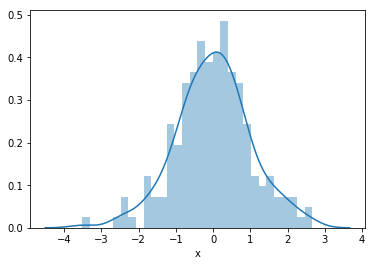
We can also create a histogram using the pandas hist() method, that is, data['x'].hist(bins=30).
- Create and display a Q-Q plot to assess a normal distribution:
stats.probplot(data['x'], dist="norm", plot=plt)
plt.show()
The output of the preceding code is as follows:
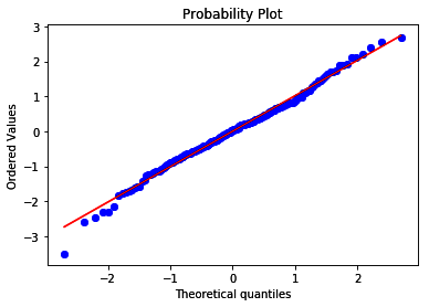
Since the variable is normally distributed, its values follow the theoretical quantiles and thus lie along the 45-degree diagonal.
How it works...
In this recipe, we determined whether a variable is normally distributed with a histogram and a Q-Q plot. To do so, we created a toy dataframe with a single independent variable, x, that is normally distributed, and then created a histogram and a Q-Q plot.
For the toy dataframe, we created a normally distributed variable, x, using the NumPy random.randn() method, which extracted 200 random values from a normal distribution. Next, we captured x in a dataframe using the pandas DataFrame() method and transposed it using the T method to return a 200 row x 1 column dataframe. Finally, we added the column name as a list to the dataframe's columns attribute.
To display the variable distribution as a histogram and density plot, we used seaborn's distplot() method. By setting the bins argument to 30, we created 30 contiguous intervals for the histogram. To create the Q-Q plot, we used stats.probplot() from SciPy, which generated a plot of the quantiles for our x variable in the y-axis versus the quantiles of a theoretical normal distribution, which we indicated by setting the dist argument to norm, in the x-axis. We used Matplotlib to display the plot by setting the plot argument to plt. Since x was normally distributed, its quantiles followed the quantiles of the theoretical distribution, so that the dots of the variable values fell along the 45-degree line.
There's more...
For examples of Q-Q plots using real data, visit the Jupyter Notebook in this book's GitHub repository (https://github.com/PacktPublishing/Python-Feature-Engineering-Cookbook/blob/master/Chapter01/Recipe-6-Identifying-a-normal-distribution.ipynb).
See also
For more details about seaborn's distplot or SciPy's Q-Q plots, take a look at the following links:
- distplot(): https://seaborn.pydata.org/generated/seaborn.distplot.html
- stats.probplot(): https://docs.scipy.org/doc/scipy/reference/generated/scipy.stats.probplot.html