Top 3 features you need to know about 960 Grid System
In this section, we will see how to prepare our desktop-only portfolio that runs in mobile phones and tablets.
Responsive web design
Nowadays, almost everyone has a smartphone or tablet in hand; this section prepares these individuals to adapt their portfolio to this new reality. Acknowledging that, today, there are tablets that are also phones and some laptops that are also tablets, we use an approach known as device agnostic, where instead of giving devices names, such as mobile, tablet, or desktop, we refer to them as small, medium, or large. With this approach, we can cover a vast array of gadgets from smartphones, tablets, laptops, and desktops, to the displays on refrigerators, cars, watches, and so on.
Photoshop
Within the pages of this book, you will find two Photoshop templates that I prepared for you. The first is small.psd, which you may use to prepare your layouts for smartphones, small tablets, and even, to a certain extent, displays on a refrigerator. The second is medium.psd, which can be used for tablets, net books, or even displays in cars.
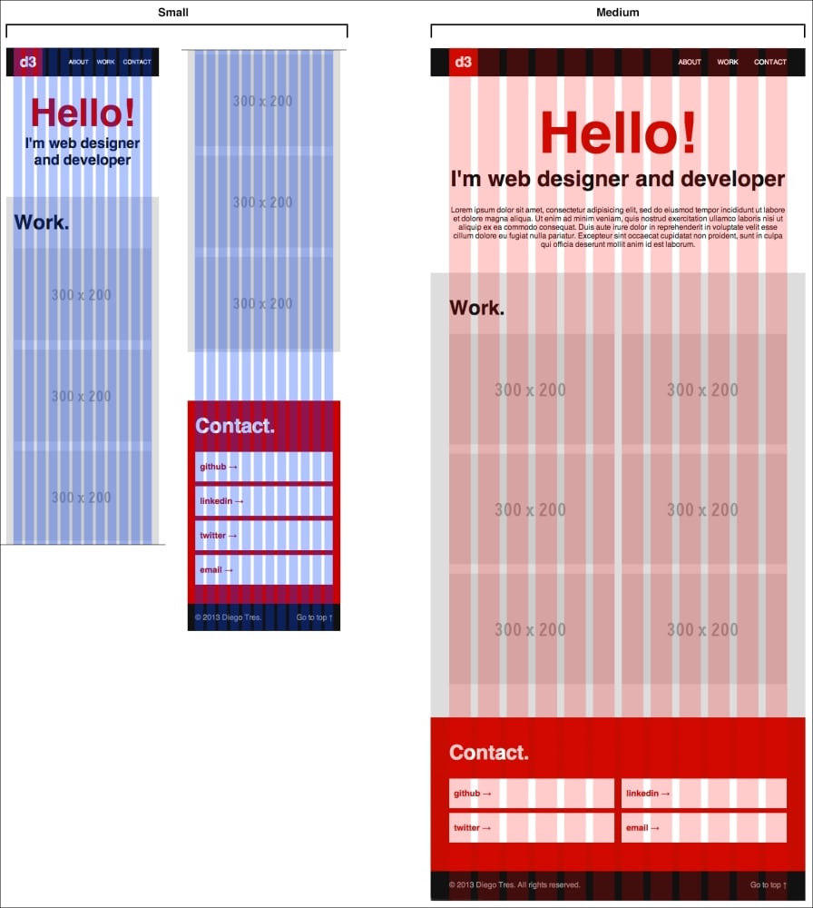
I used these templates to lay out all the sizes of our website (portfolio) that we will work on in this book, as you can see in the following screenshot:

One of the principle elements of responsive web design is the flexible grid and what I did with Photoshop layout was to mimic those grids, which we will use later. With time, this will be easier and it won't be necessary to lay out every version of every page, but, for now, it is good to understand how things happen.
Code
Now that we have a preview of how the small version will look, it's time to code it.
The first thing we will need is the fluid version of the 960.gs, which you can download from https://raw.github.com/bauhouse/fluid960gs/master/css/grid.css and save as 960_fluid.css in the css folder.
After that, let's create two more files in this folder, small.css and medium.css. We will use these files to maintain the organized versions of our portfolio.
Lastly, let's link the files to our HTML document as follows:
<head>
    <meta charset="utf-8">
     <meta name="viewport" content="width=device-width">
    <title>Portfolio</title>
    <link href="css/reset.css" rel="stylesheet" type="text/css">
    <link href="css/960_fluid.css" rel="stylesheet" type="text/css">
    <link href="css/main.css" rel="stylesheet" type="text/css">
    <link href="css/medium.css" rel="stylesheet" type="text/css">
    <link href="css/small.css" rel="stylesheet" type="text/css">
  </head>
If you reload your browser now, you should see that the portfolio is stretching all over the browser. This occurs because the grid is now fluid.
To fix the width to, at most, 960 pixels, we need to insert the following lines at the beginning of the main.css file:
/* grid
================================ */
.container_12 {
  max-width: 960px;
  margin: 0 auto;
}
Once you reload the browser and resize the window, you will see that the display is overly stretched and broken. In order to fix this, keeping in mind the layout we did in Photoshop, let's start with the small version first.
The small version
In this version, we will cover the widths of containers up to 500 pixels; to do that, we will use media queries.
All the code we will type in this file (small.css) must be within the tag @media. So, let's write this important tag in the first line:
@media screen and (max-width:500px) {
  /* all the code must be here */
}
As you can see, it's not so hard.
Now, to make the design responsive and because, sometimes, we need to change the number of columns in each version, let's open 960_fluid.css to let it guide us. We won't change this file; it's only for reference. To do this part, it is better to resize your browser to the width of a popular smartphone (something between 320px and 500px should be ok).
Header
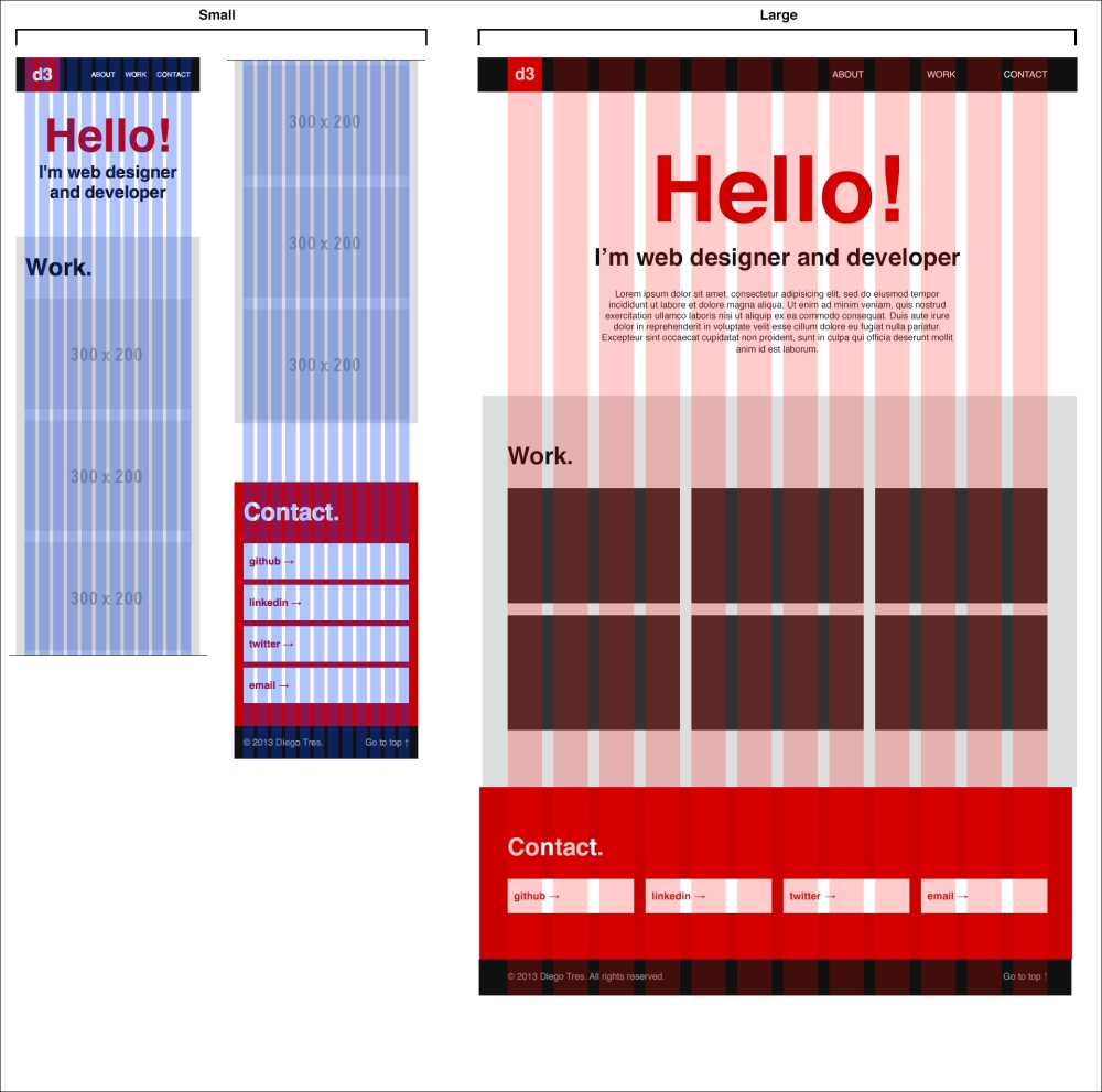
Starting with the header, let's figure out what the differences are between the large and small versions in the following screenshot:

As you can see, our logo now needs more than one column. This happens because our columns are now narrower than in the larger version. Let's prepare the logo for three columns. To do this, we need to know the size of three columns in the fluid grid. Let's check them out in the 960_fluid.css file.
If you scroll to 45th line, you will see the definition of the grid_3 grid with the container_12 container:
.container_12 .grid_3,
.container_16 .grid_4
{
  width: 23%;
}
Just copy this size of the width to our mobile.css file as shown in the following code:
@media screen and (max-width:500px) {
  /* main header
  ================================ */
  .main_header .grid_1 {
    width: 23%; /* match 3 columns in fluid grid */
  }
}
As you can see, we changed the width of the grid_1 grid to that of the small version, but only for the .main_header scope. This means that for the main_header scope, from now on, one column has the width of three columns. This is how we will adapt to our layout.
Let's follow the same approach with the navigation menu, but, this time, in addition to changing the size of the columns, we need to remove the value of the class prefix and decrease the font size to 12px:
.main_header .grid_6 {
  width: 73%; /* match 9 columns in fluid grid */
  padding-left: 0; /* remove prefix */
  font-size: 12px;
}
As you can see, a prefix class in the 960.gs framework is nothing more than padding-left.
About
In this section, we remove the large text and decrease the font size of the title and subtitle:
/* about
================================ */
#about h2 {
  font-size: 80px;
}

#about h3 {
  font-size: 30px;
}

#about .grid_8 {
  display: none;
}
Work
In this section, we want each image filling all the width. To do this, we need each image to have a width of 12 columns. Using the 960_fluid.css file as the reference, we can see that 12 columns in the container_12 container comprise 98 percent of the width of the containers in this version. Just copy the value to our context:
#work .grid_4 {
  width: 98%; /* match 12 columns in fluid grid */
}
Contact
In this section, we need to adapt our buttons to have the whole available width be the same as it is in the previous section. As we know, now that 12 columns represent 98 percent of width of the container, it isn't necessary to check the 960_fluid.css file again. I added a little margin at the bottom to separate the buttons:
#contact .grid_3 {
  width: 98%; /* match 12 columns in fluid grid */
  margin-bottom: 10px;
}
Footer
To finalize the small version, we need to fix the footer:
.main_footer .grid_10 {
  width: 64.666%; /* match 8 columns in fluid grid */
}

.main_footer .grid_10 span {
  display: none; /* Remove legal text */
}

.main_footer .grid_2 {
  width: 31.333%; /* match 4 columns in fluid grid */
}
Now, if you reload and resize your browser, you will see a portfolio that adapts well to small and large screens; we just need to cover the space between them. But, now that you worked on the widths of the small version, the medium one will be a piece of cake.
The medium version
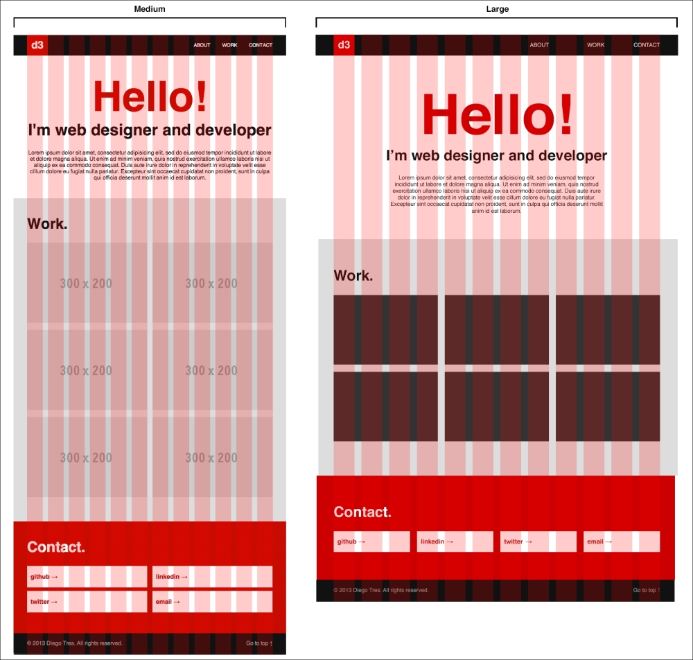
In this version, we will cover the widths from 501 pixels through to 800 pixels. So, as we did in the previous version, let's check the differences between the two versions, medium and large, in this case:

As you may have noticed, the size of the medium layout is pretty close to that of the large one. But, what we cannot see in this static layout of 768 pixels width is that, since this version need to cover the resolutions from 501 pixels to 800 pixels and we can draw only one of these almost 300 possible widths, it will have to adapt. As it is impractical to draw a version for each possible width in Photoshop, we have to draw the key resolutions wondering only about how the elements will behave in the other resolutions that we do not draw. Trent Walton from Paravel wrote a good article named CONTENT CHOREOGRAPHY which can be found at http://trentwalton.com/2011/07/14/content-choreography/.
Header
Starting with the header, I really recommend you use the same columns from the small version to support the widths at the beginning of this breakpoint:
@media screen and (min-width:501px) and (max-width:800px) {
  .main_header .grid_1 {
    width: 23%; /* match 3 columns in fluid grid */
  }

  .main_header .grid_6 {
    width: 73%; /* match 9 columns in fluid grid */
    padding-left: 0; /* remove prefix */
    font-size: 14px;
  }

  .main_header ul li {
    margin-left: 30px;
  }
}
As you may have noticed in the first line, we're using a media query with a range of widths 501px through to 800px:
@media screen and (min-width:501px) and (max-width:800px)
Further, we set the font size of the menu to 14px and the spaces between the menu items to 30px.
About
In this section, let's improve the font sizes and set the width of the large text to 12 columns:
#about h2 {
  font-size: 120px;
}

#about h3 {
  font-size: 46px;
}

#about .grid_8 {
  width: 98%; /* match 12 columns in fluid grid */
  padding-left: 0; /* remove prefix */
  padding-right: 0; /* remove suffix */
}
Moreover, we removed the prefix and suffix classes, and, as you may have noticed, the suffix class is just a padding-right.
Work
As our layout is medium sized, let's set the columns in the work section to six in order to have two images per line:
#work .grid_4 {
  width: 48%; /* match 6 columns in fluid grid */
}
Now, set the columns for the contact section.
Contact
As we did in the previous section, we want two elements per line with a little margin at the bottom of the containers to separate them:
#contact .grid_3 {
  width: 48%; /* match 6 columns in fluid grid */
  margin-bottom: 10px;
}
Footer
Now we have enough space, so we won't hide the legal text. We just need to make a simple adjustment in the columns from grid_10 to grid_9 on the left side of the column and from grid_2 to grid_3 in the link on the right side of the column:
.main_footer .grid_10 {
  width: 73%;  /* match 9 columns in fluid grid */
}

.main_footer .grid_2 {
  width: 23%;  /* match 3 columns in fluid grid */
}
Reload your browser for the last time and that is it. You should have a portfolio running in all the screen sizes.


