


Graphing parametric curves
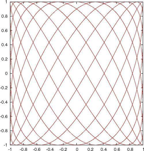
Gnuplot can graph functions whose x and y values depend on a third variable, called a parameter. In this way, more complicated curves can be drawn. The following plot resembles a lissajous figure, which can be seen on an oscilloscope when sine waves of different frequencies are controlling the x and y axes:
How to do it…
The following script creates the previous figure:
set samples 1000
set parametric
plot sin(7*t), cos(11*t) notitle
How it works…
We want more samples than the default 100 for a smoother plot, hence the first line. The second line (highlighted) changes the way gnuplot interprets plot commands; now the two functions (in the third line) are understood to provide x and y coordinates in the plane as the parameter t is varied. Once we say set parametric, then we can say plot x(t), y(t), and the plot will trace out a curve given by x and y as t is varied between the limits given in trange.
There's more…
The range of values that t varies through to draw the plot defaults to [-5:5]. Try out different ranges to see what happens by setting the trange. For example, you can say set trange [0:2] and then replot to see the effect.


