Understanding components plots
In Chapter 1, The History and Development of Time Series Forecasting, Prophet was introduced as an additive regression model. Figures 1.4 and 1.5 showed how individual component curves for the trend and the different seasonalities are added together to create a more complex curve. The Prophet algorithm essentially does this in reverse; it takes a complex curve and decomposes it into its constituent parts. The first step toward greater control over a Prophet forecast is to understand these components so that they can be manipulated individually. Prophet provides a plot_components method to visualize these.
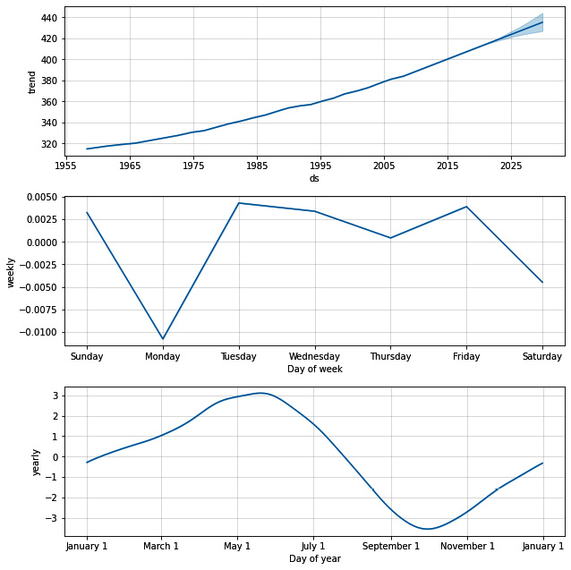
Continuing with our progress on the Mauna Loa model, plotting the components is as simple as running these commands:
fig2 = model.plot_components(forecast)
plt.show()
As you can see in the output plot, Prophet has isolated three components in this dataset: trend, weekly seasonality, and yearly seasonality:

Figure 2...


