The beauty of functional components is their simplicity. They are stateless components without any data, computed properties, or even life cycles. They are just render functions that are called when the data that has been passed changes.
You may be wondering how this can be useful. Well, a functional component is a perfect companion for UI components that don't need to keep any data inside them, or visual components that are just rendered components that don't require any data manipulation.
As the name implies, they are similar to function components, and they have nothing more than the render function. They are a stripped-down version of a component that's used exclusively for performance rendering and visual elements.
Getting ready
The prerequisite for this recipe is Node.js 12+.
The Node.js global objects that are required for this recipe are as follows:
- @vue/cli
- @vue/cli-service-global
To complete this recipe, we will use our Vue project and the Vue CLI, as we did in the Passing data to your component and validating the data recipe.
How to do it...
Follow these instructions to create a Vue functional component:
- Create a new file called MaterialButton.vue inside the src/components folder.
- In this component, we need to validate whether the prop we'll receive is a valid color. To do this, install the is-color module inside the project. You'll need to open a Terminal (macOS or Linux) or Command Prompt/PowerShell (Windows) and execute the following command:
> npm install --save is-color
- In the <script> part of our component, we need to create the props object that the functional component will receive. As a functional component is just a render function with no state, it's stateless – the <script> part of the component is trimmed down to props, injections, and slots. There will be four props objects: backgroundColor, textColor, isRound, and isFlat. These won't be required when we're installing the component as we will have a default value defined in props:
<script>
import isColor from 'is-color';

export default {
  name: 'MaterialButton',
  props: {
    backgroundColor: {
      type: String,
      required: false,
      default: '#fff',
      validator: (v) => typeof v === 'string' && isColor(v),
    },
    textColor: {
      type: String,
      required: false,
      default: '#000',
      validator: (v) => typeof v === 'string' && isColor(v),
    },
    isRound: {
      type: Boolean,
      required: false,
      default: false,
    },
    isFlat: {
      type: Boolean,
      required: false,
      default: false,
    },
  },
};
</script>
- We need to create a button HTML element with a basic class attribute button and a dynamic class attribute based on the props object that's received. Compared to the normal component, we need to specify the props property in order to use the functional component. For the style of the button, we need to create a dynamic style attribute, also based on $props. To emit all the event listeners directly to the parent, we can call the v-bind directive and pass the $attrs property. This will bind all the event listeners without us needing to declare each one. Inside the button, we will add a div HTML element for visual enhancement and add <slot> where the text will be placed:
<template>
  <button
    tabindex="0"
    class="button"
    :class="{
      round: $props.isRound,
      isFlat: $props.isFlat,
    }"
    :style="{
      background: $props.backgroundColor,
      color: $props.textColor
    }"
    v-bind="$attrs"
  >
    <div
      tabindex="-1"
      class="button_focus_helper"
    />
    <slot/>
  </button>
</template>
- Now, let's make it pretty. In the <style> part of the component, we need to create all the CSS rules for this button. We need to add the scoped attribute to <style> so that the CSS rules won't affect any other elements in our application:
<style scoped>
  .button {
    user-select: none;
    position: relative;
    outline: 0;
    border: 0;
    border-radius: 0.25rem;
    vertical-align: middle;
    cursor: pointer;
    padding: 4px 16px;
    font-size: 14px;
    line-height: 1.718em;
    text-decoration: none;
    color: inherit;
    background: transparent;
    transition: 0.3s cubic-bezier(0.25, 0.8, 0.5, 1);
    min-height: 2.572em;
    font-weight: 500;
    text-transform: uppercase;
  }
  .button:not(.isFlat){
    box-shadow: 0 1px 5px rgba(0, 0, 0, 0.2),
    0 2px 2px rgba(0, 0, 0, 0.14),
    0 3px 1px -2px rgba(0, 0, 0, 0.12);
  }

  .button:not(.isFlat):focus:before,
  .button:not(.isFlat):active:before,
  .button:not(.isFlat):hover:before {
    content: '';
    position: absolute;
    top: 0;
    right: 0;
    bottom: 0;
    left: 0;
    border-radius: inherit;
    transition: 0.3s cubic-bezier(0.25, 0.8, 0.5, 1);
  }

  .button:not(.isFlat):focus:before,
  .button:not(.isFlat):active:before,
  .button:not(.isFlat):hover:before {
    box-shadow: 0 3px 5px -1px rgba(0, 0, 0, 0.2),
    0 5px 8px rgba(0, 0, 0, 0.14),
    0 1px 14px rgba(0, 0, 0, 0.12);
  }

  .button_focus_helper {
    position: absolute;
    top: 0;
    left: 0;
    width: 100%;
    height: 100%;
    pointer-events: none;
    border-radius: inherit;
    outline: 0;
    opacity: 0;
    transition: background-color 0.3s cubic-bezier(0.25, 0.8, 0.5,
      1),
    opacity 0.4s cubic-bezier(0.25, 0.8, 0.5, 1);
  }

  .button_focus_helper:after, .button_focus_helper:before {
    content: '';
    position: absolute;
    top: 0;
    left: 0;
    width: 100%;
    height: 100%;
    opacity: 0;
    border-radius: inherit;
    transition: background-color 0.3s cubic-bezier(0.25, 0.8, 0.5,
      1),
    opacity 0.6s cubic-bezier(0.25, 0.8, 0.5, 1);
  }

  .button_focus_helper:before {
    background: #000;
  }

  .button_focus_helper:after {
    background: #fff;
  }

  .button:focus .button_focus_helper:before,
  .button:hover .button_focus_helper:before {
    opacity: .1;
  }

  .button:focus .button_focus_helper:after,
  .button:hover .button_focus_helper:after {
    opacity: .6;
  }

  .button:focus .button_focus_helper,
  .button:hover .button_focus_helper {
    opacity: 0.2;
  }

  .round {
    border-radius: 50%;
  }
</style>
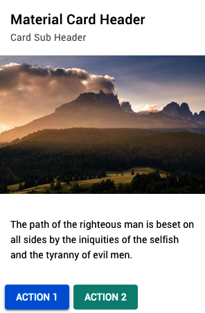
- In the App.vue file, we need to import our component to be able to see it:
<template>
  <div id="app">
    <MaterialCardBox
      header="Material Card Header"
      sub-header="Card Sub Header"
      show-media
      show-actions
      img-src="https://picsum.photos/300/200"
      :main-text="`
        The path of the righteous man is beset on all sides by the
          iniquities of the selfish and the tyranny of evil men.`"
      >
      <template v-slot:action>
        <MaterialButton
          background-color="#027be3"
          text-color="#fff"
        >
          Action 1
        </MaterialButton>
        <MaterialButton
          background-color="#26a69a"
          text-color="#fff"
          is-flat
        >
          Action 2
        </MaterialButton>
      </template>
    </MaterialCardBox>
  </div>
</template>

<script>
import MaterialCardBox from './components/MaterialCardBox.vue';
import MaterialButton from './components/MaterialButton.vue';

export default {
  name: 'App',
  components: {
    MaterialButton,
    MaterialCardBox,
  },
};
</script>
<style>
  body {
    font-size: 14px;
  }
</style>
- To run the server and see your component, you need to open a Terminal (macOS or Linux) or Command Prompt/PowerShell (Windows) and execute the following command:
npm run serve
Here is the component rendered and running:

How it works...
Functional components are as simple as render functions. They don't have any sort of data, functions, or access to the outside world.
They were first introduced in Vue as a JavaScript object render() function only; later, they were added to vue-template-compiler for the Vue single-file application.
A functional component works by receiving two arguments: createElement and context. As we saw in the single file, we only had access to the elements as they weren't in the this property of the JavaScript object. This occurs because as the context is passed to the render function, there is no this property.
A functional component provides the fastest rendering possible on Vue as it doesn't depend on the life cycle of a component to check for the rendering; it just renders each time data is changed.
See also
- You can find more information about the is-color module at https://www.npmjs.com/package/is-color.


