
Creating a dashboard
While the app is running, it acquires data from sensors and sends the values acquired to the Artik cloud. We can use these values to create charts and visualize the data using different formats. Data charts offer a better way to analyze the data. Let us see how to do it:
- Log in to the Artik cloud.
- Go to https://my.artik.cloud/ and select
Charts:
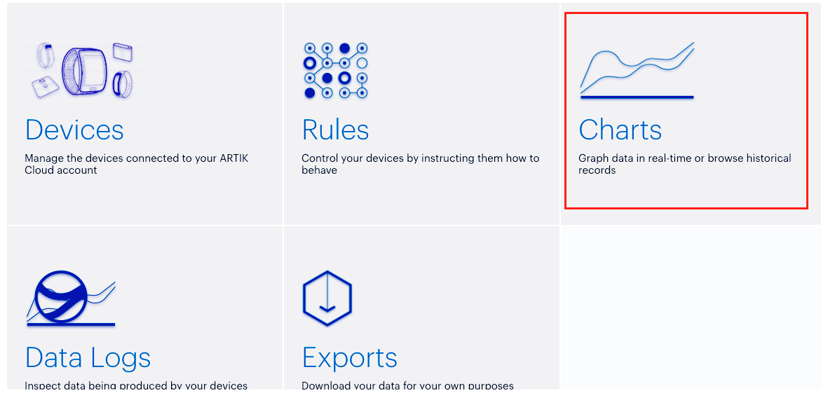
- Click on
Chartin the left top of the window to add the variable we used to collect data from the Android Things board. Add temperature and pressure. - Adjust the time range to fit the period when you sent the data.
- At the end, you will see a chart like the following:

- Notice the temperature, the pressure, and the different charts used to represent these two variables.
- You can use other chart types to better represent your information.
Data logging
While charts give an overview of the values acquired by the Android Things app we developed, we can use other ways to show data. We can visualize all the requests Android Things clients made to...