Visualizing GIS data
Although the data has been added to the GIS through the ETL process, it is of limited value without adding some visualization enhancements.
The layer style
The layer style is configured through the Style tab in the Layer Properties dialog. The Single Symbol style is the default style type, and it simply shows all the geographic layer objects using the same basic symbol. This setting doesn't provide any visual differentiation between objects other than their apparent geospatial characteristics. The Categorized and Graduated style types provide different styles according to the attribute table field of your choosing. Graduated, which applies to quantitative data, is particularly powerful in the way the color and symbols size are mapped to a numerical scale. This is all accomplished through the Layer Properties | Style tab.
To configure a simple graduated layer style to the data, perform the following steps:
- Under the Layer Properties | Style tab, select Graduated for the style type.
- Select your quantitative field for Column (such as
temperature_mean_temp). - Click on Classify to group your data into the number of classes specified (by default, 5) and to select the classification mode (Equal Interval, by default):

- Now, click on Apply.
If you applied the preceding steps to the joined tract/temperature layer, you'd see something similar to the following image:

- You can add some layer transparency here if you'd like to simultaneously view other layers. This would be appropriate if this layer were to be included in a basemap.
Tip
You can save and load the layer style using the Style menu at the bottom of the Layer Properties | Style tab. For example, this is useful if you wish to apply the same style to different layers.
- Now, click on OK.
You will now see the following output:

Perhaps the lower temperatures to the north of the city are related to the historical development in other parts of the city.
Labels
Labels can provide important information in a map without requiring a popup or legend. As labels are automatically placed by the software (they do not have an actual physical position in space), they are subject to particular placement issues. Also, a map with too much label text quickly becomes confusing. Sometimes, labels can be easily rendered into tiles by integrated QGIS operations. At other times, this will require an external rendering engine or a map server. These issues are discussed later on in this chapter.
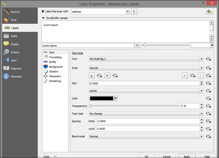
To label the address points in our example, go to that layer's Layer Properties | Labels tab. Perform the following steps:
- Select address for the Label this layer with field. Note that the checkbox next to this selection will be toggled. All other label style options will remain the same, as shown in the following screenshot:

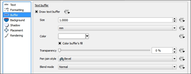
- Open the Buffer subtab and toggle Draw text buffer:

- After you click on OK, you will see something similar to the following screenshot:


