Search icon CANCEL
Subscription
0
Cart icon
Your Cart (0 item)
Close icon
You have no products in your basket yet
Arrow left icon
Explore Products
Best Sellers
New Releases
Books
Videos
Audiobooks
Learning Hub
Newsletter Hub
Free Learning
Arrow right icon
timer SALE ENDS IN
0 Days
:
00 Hours
:
00 Minutes
:
00 Seconds
Arrow up icon
GO TO TOP
Predictive Analytics using Rattle and Qlik Sense

You're reading from   Predictive Analytics using Rattle and Qlik Sense Create comprehensive solutions for predictive analysis using Rattle and share them with Qlik Sense

Arrow left icon
Product type Paperback
Published in Jun 2015
Publisher
ISBN-13 9781784395803
Length 242 pages
Edition 1st Edition
Languages
Tools
Arrow right icon
Author (1):
Arrow left icon
Ferran Garcia Pagans Ferran Garcia Pagans
Author Profile Icon Ferran Garcia Pagans
Ferran Garcia Pagans
Arrow right icon
View More author details
Toc

Table of Contents (11) Chapters Close

Preface 1. Getting Ready with Predictive Analytics FREE CHAPTER 2. Preparing Your Data 3. Exploring and Understanding Your Data 4. Creating Your First Qlik Sense Application 5. Clustering and Other Unsupervised Learning Methods 6. Decision Trees and Other Supervised Learning Methods 7. Model Evaluation 8. Visualizations, Data Applications, Dashboards, and Data Storytelling 9. Developing a Complete Application Index

Associative logic


Before learning how to create charts, we'll learn how associative logic works. Associative logic is a key functionality in Qlik Sense – it allows a business user without technical knowledge to explore the data.

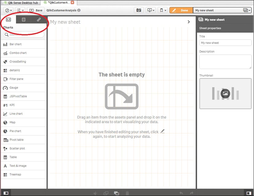
In the following screenshot, we'll see the Qlik Sense main screen in the Edit mode. The screen is divided into three areas. In the center pane, you can see the sheet you're developing; the current screenshot shows an empty sheet. The right-hand pane shows the properties of the active object. In this case, the right-hand pane shows the sheet properties – Title, Description, and Thumbnail. The left-hand pane has a tab row with three options – Charts, Fields, and Master items; in this chapter, we'll use Charts and Fields, as shown here:
From the left-hand side tab row, select Fields; you'll see all fields in alphabetical order. Drag the Channel_Desc field and drop it into the central area, as shown in the following screenshot:
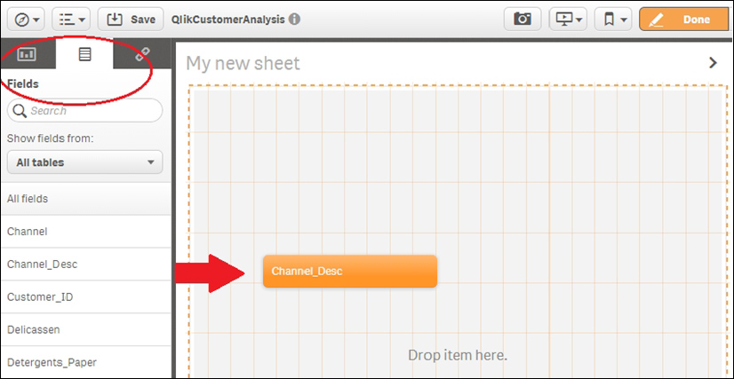
This action will add a filter pane to your...

lock icon The rest of the chapter is locked
Register for a free Packt account to unlock a world of extra content!
A free Packt account unlocks extra newsletters, articles, discounted offers, and much more. Start advancing your knowledge today.
Unlock this book and the full library FREE for 7 days
Get unlimited access to 7000+ expert-authored eBooks and videos courses covering every tech area you can think of
Renews at $19.99/month. Cancel anytime