Search icon CANCEL
Subscription
0
Cart icon
Your Cart (0 item)
Close icon
You have no products in your basket yet
Save more on your purchases! discount-offer-chevron-icon
Savings automatically calculated. No voucher code required.
Arrow left icon
Explore Products
Best Sellers
New Releases
Books
Videos
Audiobooks
Learning Hub
Newsletter Hub
Free Learning
Arrow right icon
timer SALE ENDS IN
0 Days
:
00 Hours
:
00 Minutes
:
00 Seconds
Arrow up icon
GO TO TOP
matplotlib Plotting Cookbook

You're reading from   matplotlib Plotting Cookbook Discover how easy it can be to create great scientific visualizations with Python. This cookbook includes over sixty matplotlib recipes together with clarifying explanations to ensure you can produce plots of high quality.

Arrow left icon
Product type Paperback
Published in Mar 2014
Publisher Packt
ISBN-13 9781849513265
Length 222 pages
Edition Edition
Languages
Arrow right icon
Author (1):
Arrow left icon
Alexandre Devert Alexandre Devert
Author Profile Icon Alexandre Devert
Alexandre Devert
Arrow right icon
View More author details
Toc

Table of Contents (15) Chapters Close

matplotlib Plotting Cookbook
Credits
About the Author
About the Reviewers
www.PacktPub.com
Preface
1. First Steps FREE CHAPTER 2. Customizing the Color and Styles 3. Working with Annotations 4. Working with Figures 5. Working with a File Output 6. Working with Maps 7. Working with 3D Figures 8. User Interface Index

Plotting back-to-back bar charts


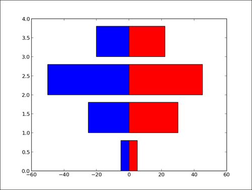
A simple but useful trick is to display two bar charts back-to-back at the same time. Think of an age pyramid of a population, showing the number of people within different age ranges. On the left side, we show the male population, while on the right we show the female population.

How to do it...

The idea is to have two bar charts, using a simple trick, that is, the length/height of one bar can be negative!

import numpy as np
import matplotlib.pyplot as plt

women_pop = np.array([5., 30., 45., 22.])
men_pop     = np.array( [5., 25., 50., 20.])
X = np.arange(4)

plt.barh(X, women_pop, color = 'r')
plt.barh(X, -men_pop, color = 'b')
plt.show()

The preceding script will produce the following graph:
How it works...

The bar chart for the female population (in red) is plotted as usual. However, the bar chart for the male population (in blue) has its bar extending to the left rather than the right. Indeed, the lengths of the bars for the blue bar chart are negative values. Rather than editing the input values, we use a list comprehension to negate values for the male population bar chart.

You have been reading a chapter from
matplotlib Plotting Cookbook
Published in: Mar 2014
Publisher: Packt
ISBN-13: 9781849513265
Register for a free Packt account to unlock a world of extra content!
A free Packt account unlocks extra newsletters, articles, discounted offers, and much more. Start advancing your knowledge today.
Unlock this book and the full library FREE for 7 days
Get unlimited access to 7000+ expert-authored eBooks and videos courses covering every tech area you can think of
Renews at $19.99/month. Cancel anytime
Banner background image