Matplotlib is a cross-platform Python library for plotting two-dimensional graphs (also called plots). It can be used in a variety of user interfaces such as Python scripts, IPython shells, Jupyter Notebooks, web applications, and GUI toolkits. It can be used to develop professional reporting applications, interactive analytical applications, complex dashboard applications or embed into web/GUI applications. It supports saving figures into various hard-copy formats as well. It also has limited support for three-dimensional figures. It also supports many third-party toolkits to extend its functionality.
Introduction
Architecture of Matplotlib
Matplotlib has a three-layer architecture: backend, artist, and scripting, organized logically as a stack. Scripting is an API that developers use to create the graphs. Artist does the actual job of creating the graph internally. Backend is where the graph is displayed.
Backend layer
This is the bottom-most layer where the graphs are displayed on to an output device. This can be any of the user interfaces that Matplotlib supports. There are two types of backends: user interface backends (for use in pygtk, wxpython, tkinter, qt4, or macosx, and so on, also referred to as interactive backends) and hard-copy backends to make image files (.png, .svg, .pdf, and .ps, also referred to as non-interactive backends). We will learn how to configure these backends in later Chapter 9, Developing Interactive Plots and Chapter 10, Embedding Plots in a Graphical User Interface.
Artist layer
This is the middle layer of the stack. Matplotlib uses the artist object to draw various elements of the graph. So, every element (see elements of a figure) we see in the graph is an artist. This layer provides an object-oriented API for plotting graphs with maximum flexibility. This interface is meant for seasoned Python programmers, who can create complex dashboard applications.
Scripting layer
This is the topmost layer of the stack. This layer provides a simple interface for creating graphs. This is meant for use by end users who don't have much programming expertise. This is called a pyplot API.
Elements of a figure
The high-level Matplotlib object that contains all the elements of the output graph is called a figure. Multiple graphs can be arranged in different ways to form a figure. Each of the figure's elements is customizable.
Figure
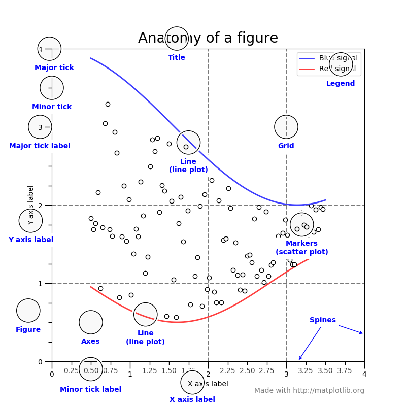
The following diagram is the anatomy of a figure, containing all its elements:
Axes
axes is a sub-section of the figure, where a graph is plotted. axes has a title, an x-label and a y-label. A figure can have many such axes, each representing one or more graphs. In the preceding figure, there is only one axes, two line graphs in blue and red colors.
Axis
These are number lines representing the scale of the graphs being plotted. Two-dimensional graphs have an x axis and a y axis, and three-dimensional graphs have an x axis, a y axis, and a z axis.
Label
This is the name given to various elements of the figure, for example, x axis label, y axis label, graph label (blue signal/red signal in the preceding figure Anatomy of a figure), and so on.
Legend
When there are multiple graphs in the axes (as in the preceding figure Anatomy of a figure), each of them has its own label, and all these labels are represented as a legend. In the preceding figure, the legend is placed at the top-right corner of the figure.
Title
It is the name given to each of the axes. The figure also can have its own title, when the figure has multiple axes with their own titles. The preceding figure has only one axes, so there is only one title for the axes as well as the figure.
Ticklabels
Each axis (x, y, or z) will have a range of values that are divided into many equal bins. Bins are chosen at two levels. In the preceding figure Anatomy of a figure, the x axis scale ranges from 0 to 4, divided into four major bins (0-1, 1-2, 2-3, and 3-4) and each of the major bins is further divided into four minor bins (0-0.25, 0.25-0.5, and 0.5-0.75). Ticks on both sides of major bins are called major ticks and minor bins are called minor ticks, and the names given to them are major ticklabels and minor ticklabels.
Spines
Boundaries of the figure are called spines. There are four spines for each axes(top, bottom, left, and right).
Grid
For easier readability of the coordinates of various points on the graph, the area of the graph is divided into a grid. Usually, this grid is drawn along major ticks of the x and y axis. In the preceding figure, the grid is shown in dashed lines.


