Understanding the basic rules related to CSS Grid
First, we need to know what grids are and what their purpose is. In short, grids aim to arrange items in a consistent manner. Grids provide clarity about content structure and sizing and allow us to steer where things are placed. Grids provide structure.
To achieve this understanding, we first have a look at some standard grid terminology, before creating our first CSS grid.
Defining grid terminology
We first need to establish some words we’ll use throughout the book. The following diagram will explain to us the most important terms:
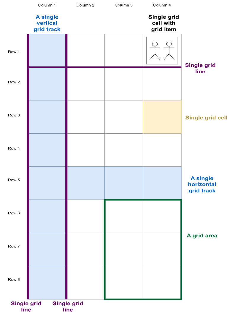
Figure 1.1 – A grid and all its terms
We see many different elements here, as follows:
- The grid is the whole structure. It consists of all arranged elements, the layout, and its attributes.
- A grid is made up of grid cells. These grid cells can have different sizes, depending on the row and column definitions we give the grid. A grid cell doesn’t necessarily have content.
- A grid has several grid lines. These are the lines that separate grid cells and make up the structure of the grid. They can be horizontal or vertical. In the diagram, three grid lines are marked: the two surrounding Column 1 and a single line between Row 1 and Row 2.
- These grid lines can become gaps. Gaps are also sometimes called gutters. Gaps are used to separate grid tracks and allow us to add white space between elements. Gaps between rows don’t have to be the same size as gaps between columns.
- Between two adjacent parallel grid lines, we see rows and columns of grid cells, also known as grid tracks or simply tracks. Two such tracks are marked in blue in the diagram: Row 5 and Column 1.
- When we place content within a grid, we speak of them as grid items. Grid items can be images,
divtags, text nodes, or any other HTML element we want to place and arrange. A grid item can be seen in Row 1, Column 4 in the diagram. - When we want to name specific groups of one or more cells, we speak of a grid area. Those grid areas are delimited by four grid lines and are, therefore, rectangles.
With these terms, we now have a common language to use when we talk about grids. We’ll use these terms throughout the book when defining grids.
Creating our first grid
In many ways, CSS Grid behaves like Flexbox. It needs a grid container and elements to align. In most cases, such as general page layouts or when working with teaser elements to link to additional content, we use <div> elements. Teaser elements can be built with <article> elements, too. We don’t have to, though! When working with semantic HTML, we might as well use the elements that fit best: <main>, <aside>, <header>, <footer>, <nav>, and more.
To start, let’s consider the following HTML structure. It resembles a standard Document Object Model (DOM) that we would use to structure any website and features most of the elements we would typically use when we develop a page’s layout:
<div class="container">  <header><!-- Header with a logo, navigation, etc. -->
    </header>
  <aside><!—Partially related things like social buttons --
   ></aside>
  <main><!-- Main content, headings, teasers, etc. -->
    </main>
  <footer><!-- Footer with contact, FAQ, etc. --></footer>
</div>
We see four elements that we want to align in a grid, as follows:
- A header that might contain a logo or navigation
- An element that will contain content not directly related to the main page content
- An element for the actual content
- A footer that displays things such as contact details, information about the company, a link to the FAQ, and similar additional controls
For ease of illustration, we will apply the following CSS upfront (the code has nothing to do with CSS Grid just yet and only serves illustration purposes):
/* 01_page_layout.html,  Micro-resetting */body { padding: 0; margin: 0; }
* { box-sizing: border-box; font-size: 25px; }
/* Making things visible on the page */
.container {
  border: 2px solid #555;
  padding: 8px;
  min-height: 100vh;
}
header {
  border: 2px solid #dd0808; /* Dark red */
  background-color: #ff6666; /* Light red */
}
aside {
  border: 2px solid #0ba7c6; /* Dark cyan */
  background-color: #74ddf2; /* Light cyan */
}
main {
  border: 2px solid #6f09e5; /* Dark purple */
  background-color: #b880f7; /* Light purple */
}
footer {
  border: 2px solid #c4be0d; /* Dark yellow */
  background-color: #f7f380; /* Light yellow */
}
This CSS code will color our containers and ensure we can track which element goes where. When loaded up in a browser, this results in four colored stripes along the screen. That’s what we expected. After all, our DOM does not have any content.
Things get interesting, though, when we add the following CSS code:
.container {  display: grid; /* Marks this class as a grid container */
}
When reloading, we see that CSS Grid has evenly distributed the four containers vertically. Since the outer <div> element has a fixed height, CSS will calculate the height of every element and rescale it to fit. Since we have not yet defined anything other than This is a grid, each element takes up the same amount of space:
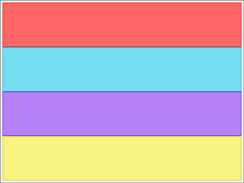
Figure 1.2 – Our HTML is styled and displayed as a grid
CSS Grid has entirely taken over the placing and sizing of statically and relatively positioned elements within the grid. This, in turn, means that any other inline positioning method does not apply anymore. Any use of display: inline-block, display: table-cell, float, or vertical-align will have no effect. However, we can still use position: fixed, position: absolute, or position: sticky because the elements are not static anymore. Elements that have position: relative; attached to them can be moved around and are still affected by the grid.
There’s also the possibility to define an inline grid by using display: inline-grid;. The main difference is that the grid container behaves like an inline container instead of a block container. Therefore, we now know that display: grid defines a grid that behaves like a block element.
Let’s remove the colors briefly and see how the browser development tools indicate that we use a grid. Usually, Chrome shows grids with dashed lines. When we open the inspector and hover over the grid container in the Elements tab, we can see what we already knew from our color experiment. We can also click on the grid button that appears in the inspector to turn on grid debugging, which will show us the grid lines.
In the following screenshot, we can see the full grid representation in Chrome’s development tools:

Figure 1.3 – Chrome’s inspector showing us the different grid slots
Just as in the color experiment we did before, we see four grid rows, indicated by purple dashed lines. These lines also indicate the grid lines and would become larger once we introduce gaps. The blue areas we see are our grid cells. Currently, they don’t contain any grid items. The green border around the grid is our padding. It’s not related to the grid.
Arranging grid elements
So far, CSS Grid has taken care of arranging things for us—in our example, it automatically created four rows because there were four elements, spaced them evenly, and placed them in the same order as they appeared in the DOM.
However, often, we don’t want this, especially when wanting responsive layouts. For example, on a mobile, social media buttons might move to the bottom of the page and become sticky elements, whereas on a desktop they should stay in one place, such as the sidebar.
To be able to move elements, we first need to state the number of grid rows and grid columns explicitly. We achieve this by using the grid-template-rows and grid-template-columns rules, which go into the container element and will pre-create a grid structure for us. We specify the number of grid columns and rows by providing their size, separated by spaces. The size may vary from row to row and column to column.
The total number of grid cells may be larger than the total amount of elements we’d like to arrange. We can, for example, define a grid with three rows and three columns and only arrange five items within it—a case that’s common in galleries or news websites. The remaining grid cells remain empty.
For the time being, let’s work with 1fr. fr is a unit that has been introduced to CSS with CSS Grid and works exclusively with grids. 1fr essentially means: Take one unit of free space for this grid element. We will discuss the fr unit later in this chapter. So, if we used it for grid rows, this means taking one unit of free space for this grid row. The same applies to columns too.
Let’s change our example to a 2x3 grid of evenly spaced grid elements by applying the following CSS code to the container class:
.container {  display: grid;
  grid-template-columns: 1fr 1fr;
  grid-template-rows: 1fr 1fr 1fr;
}
As we can see, we used 1fr twice in grid-template-columns, resulting in two equally sized columns, and three times in grid-template-rows, resulting in three equally sized rows. When inspected, Chrome shows us that it has now created a grid structure, as indicated in the following screenshot:
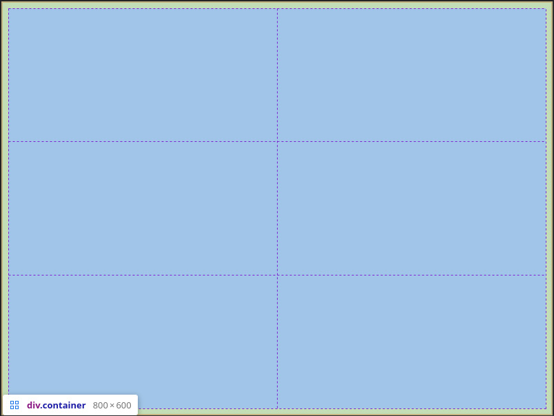
Figure 1.4 – Chrome’s inspector showing us our 2x3 grid
CSS Grid assigns integers to all grid lines for us to use as coordinates. These integers increase from left to right and top to bottom, starting at 1. When we think of the grid as a coordinate system, its origin is in the top-left corner. This allows us to place grid items starting from the top left to the bottom right.
However, CSS Grid offers a second origin that lets us place items from the bottom-right to the top-left corner. It does so by also assigning negative integers to the same grid lines, starting at the bottom-right corner with -1.
Our grid so far would receive the numbers illustrated here:
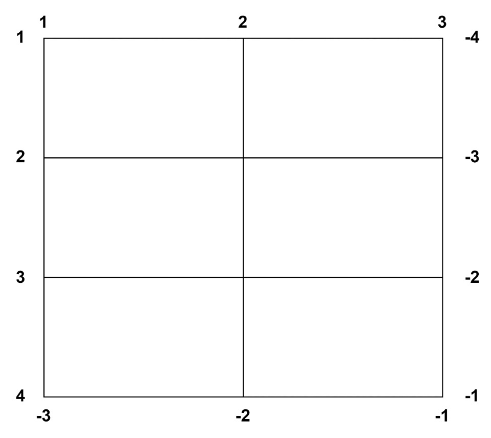
Figure 1.5 – Grid line numbering
Currently, all columns are the same size. If we want one column twice the size of the other, we increase the value of that column to 2fr. For example, if we wish to have a 1/4 sidebar and 3/4 main content slot, we adjust the grid-template-column rule to 1fr 3fr. Then, if wanted to have a 1/6 header, 1/6 footer, and the other 2/3 (4/6 in a six-column layout) for the main content, we would use the grid-template-rows: 1fr 4fr 1fr rule.
We see that the size of the grid rows and columns depends on the total number of free space units. If we think of a grid as 100% wide and 100% tall, we can calculate the size of each row and column as percentages. For example, in a layout with four columns of size 1fr, each column takes up 25% of the space.
In a two-column layout with sizes 1fr and 3fr, however, the total number of free space units is 4, resulting in 1fr being 25% wide and 3fr equaling 75% width. The total number of fr units determines the size of each fr unit.
Let’s adjust our example to this new layout:
.container {  display: grid;
  grid-template-columns: 1fr 3fr;
  grid-template-rows: 1fr 4fr 1fr;
}
This won’t affect the assigned numbers (they just stay the same), but we can see that this has the desired effect when inspecting, as illustrated in the following screenshot:
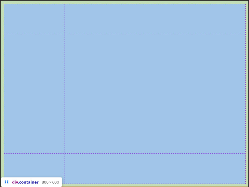
Figure 1.6 – Chrome’s inspector shows us our adjusted 2x3 grid
By re-applying the colors, we can now see the default arrangement for this grid. By default, CSS Grid fills grid elements from left to right, top to bottom. This grid resembles a painting by Piet Mondrian and is not exactly what we’d like:
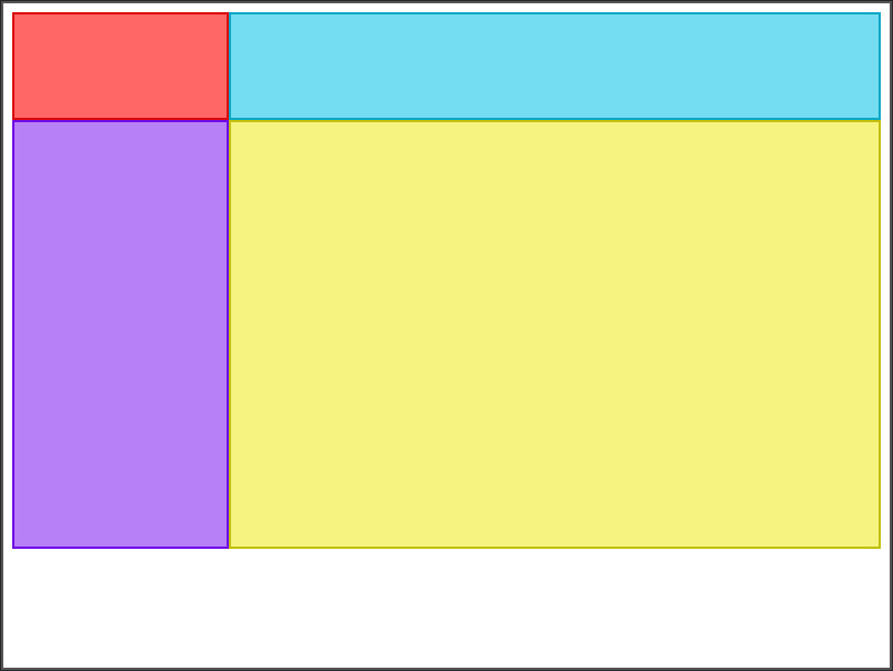
Figure 1.7 – Our accidental neoplasticism painting, using CSS on HTML
But we still have not explicitly arranged the elements yet. For that, we use four different CSS rules: grid-column-start, grid-column-end, grid-row-start, and grid-row-end. We apply these to the elements we want to position—so, in our case, header (marked red), footer (marked yellow), aside (marked cyan), and main (marked purple).
By default, grid-row-start, grid-row-end, grid-column-start, and grid-column-end will have the auto value, meaning that CSS Grid will figure out the beginning row and column itself, again with the left-to-right, top-to-bottom method. Most of the time, this is enough. We can, however, define where to place any element explicitly.
Looking at the grid outline in Figure 1.6, we notice that the header and footer both have to span two columns. We achieve this with the span keyword for grid-column-end and grid-row-end. span tells the browser to enlarge the element until it encounters a grid cell with that name or for the amount specified. (But wait—grid cells can have names? Yes, they can. We’ll have a look at this a bit later in this chapter.)
So, grid-column-end: span 2; means enlarge the element to a width of two columns, and grid-column-end: span something; means enlarge the element to the gap named “something” (we will have a look at gap names later on too). If the element already starts at the second column, this will not do much. However, if it begins in the first column, it will fill two adjacent grid cells.
Let’s place the header and footer first since they work very similarly:
header {  grid-column-end: span 2; /* Make it reach to the end of
    the second column */
}
footer {
  grid-column-end: span 2; /* Make it reach to the end of
    the second column */
}
Let’s see if this does what we want. And indeed, it does. The default placing of the main and aside grid elements already makes them appear in the place we want them to. Since the header and the footer elements both take up two grid cells each, we’re left with two remaining grid cells for the main and aside elements.
These grid cells are occupied by the aside and main elements in the order of appearance in the HTML code:
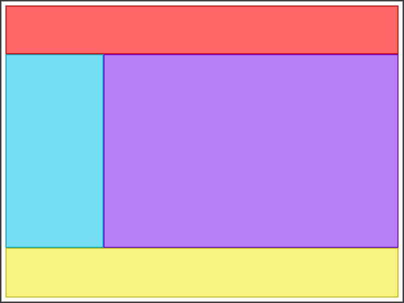
Figure 1.8 – The header, sidebar, content, and footer elements arranged
Adding some breathing room (or gaps)
Right now, all the elements are aligned snuggly. However, we don’t always want this. Especially for elements arranged in a grid in the page content, we might wish to have some space in between. There are two approaches to this. Either we can use paddings and margins to try to get the spacing right or we can use CSS Grid’s column-gap and row-gap rules.
Usually, when working with paddings and margins as grid gutters, there is a risk of inconsistencies because we need to specify values for each grid element individually. Furthermore, we might want to use paddings and margins for other purposes, such as adding more margin to text or giving images a border effect. To mitigate these risks, CSS Grid offers two rules regarding gaps between elements: column-gap and row-gap.
These two rules are defined on the container level and govern the space between all rows and all columns. We can use any unit we’d like—so, px, rem, em, or even %. If the latter, the browser does the percentage calculation on the container’s size. So, if our container is 100px high and we define a 5% row gap, we have a 5px gap between every row.
However, if we do not define the height or width of the container, its size would be determined by its content and the gaps. So, for example, if the gaps are 5% of the container size, we have a circular dependency: the gap is 5% of the width and at the same time is contributing to the width.
The browser would first calculate the gap size by calculating 5% of the container’s size, assuming the gap has a current width of 0. It then sets the size of the gap, enlarging the container. The browser would then realize that the gap is now smaller than 5% of the size of the container, re-calculate the gap, and so on.
Mathematically speaking, this is the limit of a series. If you’re not familiar with calculus, you can skip the following part. We can define the total width of a container as the sum of the gap, g, and its element’s width, e. We can define the series and its limit as follows:
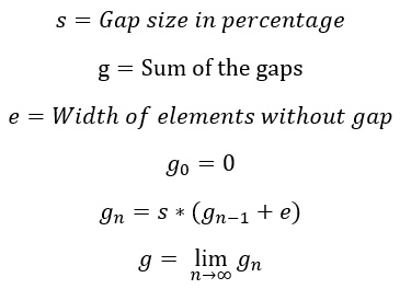
This limit might either converge to a single value or diverge off to infinity, if s is greater than or equal to 100%. Limits are hard to calculate, especially if they are of complex series. CSS Grid circumvents these calculations by simply downsizing the grid cell widths so that the total width doesn’t change. This effect is often undesired. Elements will overlap the container if no explicit size is given to it.
In summary, to avoid unexpected behavior in element sizing, it’s recommended to use non-relative units for gaps. With that knowledge, we can start practicing gaps.
Let’s add a 16px row gap and a 4px column gap to our modern art-like example and see how it behaves. We’ll apply the following code:
.container {  /* Grid definition */
  row-gap: 16px;
  column-gap: 4px;
}
And the result looks just like what we expected:
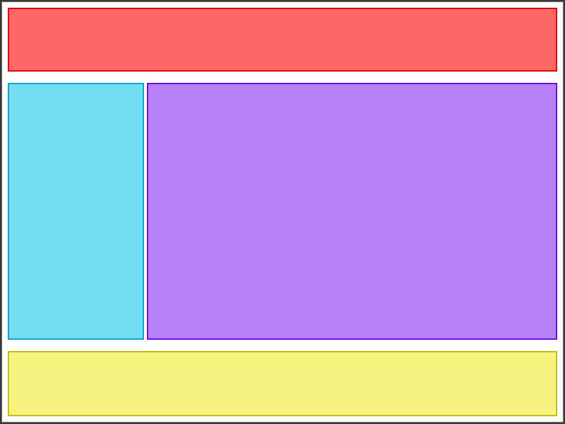
Figure 1.9 – Our grid now has spacing in it
Notice that the inner padding of the grid container was already there. This is because row-gap and column-gap only affect the space between rows and columns, not around them.
We now know how to define basic grids. This allows us to define grids for most use cases already. However, these rules often need extra context by using explicit class names and perhaps even comments in the code. Otherwise, they’re hard to maintain, which might cause frustration and delay development. Let’s learn how we can be more explicit about the intent of our code.


