What is a dashboard?
A dashboard is a visual representation of information that can help us spot a risk, or bad or wrong behavior. It also can help us monitor and track our performance. You can see a dashboard example in this screenshot:

A dashboard is a container or view that can contain any number of the components listed as follows:
- Indicators
- Key performance indicators (KPIs)
- Key risk indicators (KRIs)
- Scorecards
- Reports
We will discuss each component in detail in the upcoming sections.
Indicators
An indicator is a visual effect that can add extra information that is not included in the original metric.
Note
A metric is a figure that measures something. Profit is our metric in the following example.
Let's have an example to help you understand this in a better way. Let's say our profit this month is $10. As you can see, you can't judge whether this number is good or bad. But by adding some indicators, we may get a better idea about this metric's performance. As you can see in the following screenshot, the first row display information without indicator while the second row display information with yellow color and side arrow indicators.

There are many types of indicators, such as these:
- Traffic light colors
- Icons
Traffic light colors
The traffic light colors type is the most traditional indicator that we have. In this type, we utilize the colors common in traffic lights (red, yellow, and green) to give proper indications.
Red color is used to grape user attention and warn him. we use red color with loses or bad performing KPIs. Red color indicates that immediate correction action should be taken.
Yellow will give the impression that we should be prepared to do something, such as slowing down our car and preparing to stop at the traffic lights, or trying to increase our sales to increase your net profit.
Finally, green will give the impression that everything is okay and we are performing well. We can use green color with profit metrics and well performing KPIs.
Icons
Icons are another type of indicators. We can use an icon to give the required impression to end users. For example, a trend-up icon beside a profit metric will give the impression that we are trending up. We can find some other types of icon indicators, as follows:
- Arrows, such as up, side, or down arrows
- Faces, such as a smiley, normal, or sad
- Progress bars
Tip
Use icons if your dashboards will be printed in grayscale (black and white).
You also need to note the following:
- You can use more than one indicator type at the same time. For example, you can use traffic light colors and arrows to indicate your profit performance, as you saw in the previous screenshot.
- You can use more than three levels in the traffic light indicator type. For example, a five-color indicator may use the following colors: red, orange, yellow, light green, and dark green.
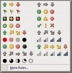
You can see an example of sets of indicator types in the following screenshot:

Key performance indicators (KPIs)
When we start working on something, we should first define our goals and objectives. After that, we should start trying to achieve our goals. Then, from time to time, we need to check how far we are from our goals and whether our performance with respect to achieving our goals is good or bad. The main purpose of a key performance indicator (KPI) is to show how close we are to our goals (target). Normally, we will need more than one KPI to indicate how far we are from our goals.
Note
Different industries will have different KPIs, even if they are related to the same goals, such as increasing profit, because the metrics are different.
A KPI is a metric used to measure and monitor our performance in order to achieve our goal (or goals), and it gives us an indication of our performance.
Let's now look at a small example of a business case.
Let's suppose that we have a new website. There are many ways of income implemented in our site, such as advertisement, exam registration fees, products sold, and so on. First, we need to set our goals. Let's set a simple goal here: our net profit is $10 million, and our goal is simply to make it $15 million by the end of the fiscal year. So, the defined goal here is as follows:
Goal: Increase the net revenue of our website by 50 percent during this year.
Now we have a goal and we need to find out how to achieve it. There are many factors that will affect our goals, and we need to focus on the important ones. We call those factors metrics. A metric is usually a number that will affect our goal somehow, such as the number of sold products or Product price, so let's define our metrics here.
Net profit = Net income – Net cost
Net income= Product income [Number of sold products * Unit price]
+ Advertisement income [Number of visitors * AD revenue per view]
+ Exam income [Number of scheduled exams * Exam fee]
Net cost = Fixed monthly site maintenance
+ Product processing cost
+ Exam setup
+ Other expenses
Now, as we can see, there are some variable metrics and some static metrics. For example, the number of visitors is a dynamic variable metric and monthly site maintenance fee is an example of a static metric. You should concentrate on dynamic metric in your KPIs.
We will use # of visitors as a metric in our KPI, but first we need to check whether this is enough of an indicator. Of course not! We need to link it somehow to our goal (achieving 50 percent growth in profit by the end of the year). To make it clearer, let's take a look at the # of visitors trend graph here:

As we can see, the graph displays the number of visitors (in thousands) per month. It is clear that this is not enough to know whether those figures are good or bad. Let's try to answer this question using the previous graph: Does the count of 100,000 visitors in January mean that we will be able to achieve our goal by the end of the year or not?
As we can see, a metric is just a plain number, and all that we can indicate here is the number of visitors trend by linking our metric's values across time. We can get an idea on whether our number of visitors is increasing or decreasing over time. Also, as we already saw in our goal definition, we need to increase the number of visitors in general to get more advertisement income. So far, this is just a trend metric and there is something missing.
In order to gain $15 million, let's say that our strategy is to focus on advertisement profit this year. If we maintain constant values of the remaining factors, then we should get $10 million by the end of the year and, to increase our profit, we have to increase our average number of visitors per month. Let's say the old average number of visitors to our site was 60,000 per month. If we get an average of 60,000 visitors per month and everything else remains the same, then we should make a profit of $10 million by the end of the year. We need to calculate the new required average number of visitors (target), assuming that we will not change any other factors. Let's say that we need, on average, 90,000 visitors per month to achieve our target, which will somehow lead us to our goal. Now the graph should like this, after adding the calculated target:

Now we have a KPI, as we can see after adding our monthly target that needs to be met in order to achieve our goal; we can indicate our performance month by month to achieve our goal. We can easily see that we performed well in Jan, Apr, and Aug. We nearly achieved our target in May, and performed badly in the remaining months.
How to define your KPIs
To define a KPI, we need to complete the following:
- Define a goal: First, we need to define our goals, or set of goals. Our goals should tell us what we want to achieve.
- Define a metric: The next step is to define our metrics. A metric is a number that will affect our goal.
- Define a Target: A target will help us understand how our metric should behave in order for us to achieve our goal.
- Build your KPI: A KPI will show us how our metric will behave against a preset target and will indicate our performance against our target.
Visual elements used to present KPIs (charts)
In the previous example, we had one measure (number of visitors) and one dimension (time), and this is why we selected the line chart—because it is the best visual element for showing a time trend. There are many other chart types, such as a pie chart for example, which can be used to show the relationship between one measure and one dimension. We can use a pie chart if we want to show, for example, sales by product. Also, we can use a combined chart (bar and line chart combined) to see the relationship between two measures and one dimension, such as the relationship between the communication channel, number of complaints, and average service time. We will discuss how to select the most proper chart components based on our metrics in Chapter 3, UI Components.
Key Risk Indicator (KRI)
A Key risk indicator (KRI) is mostly the same as a KPI but with a few differences, as listed in the following table:
|
Feature |
KPI |
KRI |
|---|---|---|
|
Measuring |
Performance |
Risk |
|
Against |
Target |
Threshold |
In many cases, we may need to incorporate an alerting system with a KRI to send it immediately by mail or a warning SMS message to the risk owner. This is because, in most cases, we want to act immediately when the risk is triggered.
Scorecards
A scorecard is a group of related KPIs that contribute to achieve a major goal. There are two types of scorecards:
- Balanced: This is an equal-weight score card, which means that all KPIs under this goal have the same importance; when we calculate our achievement percentage for our goal, we simply take the average.
- Not balanced: This is a none equal-weight scorecard, which means that every KPI has it is own weight (importance); when we calculate our achievement percentage for our goal, we consider the KPI weight to calculate the average.
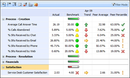
You can see a scorecard example in this screenshot:

Reports
A report is a summary or detailed information displayed in a simple table or chart format. An example of a detailed report is shown in the following screenshot:

In this book, we will discuss all that you need to learn SAP BusinessObjects Dashboard Designer. This is a SAP tool that can be used to create stunning dashboards, KPIs, KRIs, and scorecards using the Flash and MS Excel technologies.
Congratulations for taking a step towards learning how to create dashboards using SAP BO Dashboard. Are you ready? Then let's go…
In this book, you will learn how to create a complete, interactive dashboard that contains charts, single-value components, selectors, and maps. You will learn how to apply advanced features,such as dynamic visibility, alerts, and color binding.


