Search icon CANCEL
Arrow left icon
Explore Products
Best Sellers
New Releases
Books
Videos
Audiobooks
Learning Hub
Conferences
Free Learning
Arrow right icon
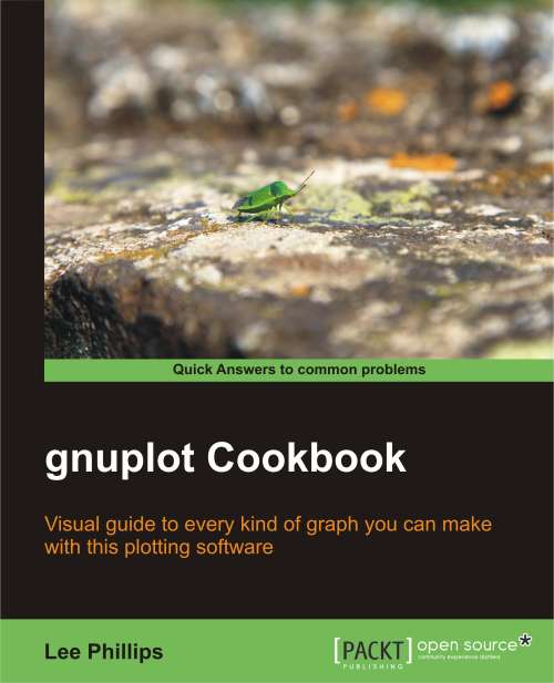
gnuplot Cookbook
gnuplot Cookbook

gnuplot Cookbook: Visual guide to every kind of graph you can make with this plotting software with this book and ebook

eBook
$17.99 $25.99
Paperback
$43.99
Subscription
Free Trial
Renews at $19.99p/m

What do you get with Print?

Product feature icon Instant access to your digital eBook copy whilst your Print order is Shipped
Product feature icon Paperback book shipped to your preferred address
Product feature icon Download this book in EPUB and PDF formats
Product feature icon Access this title in our online reader with advanced features
Product feature icon DRM FREE - Read whenever, wherever and however you want
Table of content icon View table of contents Preview book icon Preview Book

gnuplot Cookbook

Chapter 1. Plotting Curves, Boxes, Points, and more

This chapter contains the following recipes:

  • Plotting a function

  • Plotting multiple curves

  • Using two different y-axes

  • Making a scatterplot

  • Plotting boxes

  • Plotting circles

  • Drawing filled curves

  • Handling financial data

  • Making a basic histogram plot

  • Stacking histograms

  • Plotting multiple histograms

  • Dealing with errors

  • Making a statistical whisker plot

  • Making an impulse plot

  • Graphing parametric curves

  • Plotting with polar coordinates

Introduction


We begin the book with a set of recipes that cover gnuplot's one-dimensional graph styles. A 1D graph refers to the plotting of data or mathematical functions where the values plotted depend on a single variable. Examples are simple mathematical functions, such as y = sin(x), or 1D data, such as the temperature in a particular location versus time. The plotting of quantities that depend on two variables is covered starting in Chapter 8, The Third Dimension, where we show how to make surface, contour, and image plots.

Gnuplot can create a vast array of 1D plot types in a large number of styles. The recipes in this chapter survey all of the major types of 1D graph, with an example that can be run immediately to produce the result in the illustration. For each example, we have provided enough explanation in the There's more... section for you to extend and adapt the recipe for your particular problem. We assume that you have gnuplot up and running and are able to create plots on one of the terminals; the recipes in this chapter work on every terminal or output file type.

Plotting a function


gnuplot can be used as a tool to interactively explore the structure of mathematical functions, as well as to create illustrations for publication or education. It has built-in knowledge of both elementary functions, such as sine and cosine, and some special functions, such as Bessel functions and elliptic integrals. The following figure shows the plotting of the besj0(x) function:

Getting ready

Start up an interactive gnuplot session and make sure that your graphic terminal of choice is selected, and working, using the set term command (for example, at the console you simply type gnuplot, and, to change the default terminal to X Windows, type set term x11).

How to do it…

Type plot besj0(x) at the console. The plot in the figure should pop up immediately.

There's more…

Gnuplot understands a big handful of mathematical functions, listed in Section 13.1 of the official manual (the official gnuplot documentation can be found at gnuplot's home, http://gnuplot.info/). It also understands all the basic mathematical operators, with a syntax similar to Fortran or C, so you can combine functions into expressions, as shown in the following command:

plot [-5:5] (sin(1/x) - cos(x))*erfc(x)

In the previous command, we have also shown how to use the [a:b] notation to limit the plot to a specified range on the x-axis.

Plotting multiple curves


You will often want to plot more than one curve on a single graph, all sharing the same axes. This is simple in gnuplot: just separate the functions or datafiles by commas, and gnuplot will plot them in a sequence of colors or curve styles, with a legend so you can identify them. The following figure shows the plotting of multiple curves:

Getting ready

It will be useful to have some datafiles on your disk for use with some of the plotting recipes. You could make them by hand with a text editor or write a program in your favorite language to generate them, but gnuplot can do this itself. To make a file with data that forms a parabola flipped upside down, tell gnuplot to set table 'parabola.text'. Make sure to include the quotes around the filename. Then say plot -x**2. This writes a table out to the file parabola.text rather than making a picture. Now, say unset table. You should have a file called parabola.text in the directory in which you started gnuplot. Keep it around so we can use it later.

How to do it…

After setting your terminal back to the graphics device you want to use at the gnuplot console, type the following command:

plot [-1:1] 'parabola.text', -x, -x**3

How it works…

Gnuplot plots the curves using three different colors, dash styles, or line thicknesses, depending on the terminal in use, with a legend so you can tell them apart. The functions are plotted as smooth curves, as we did earlier, and the data from the file is plotted as a series of points, by default; one for each point in the range. This can all be adjusted, as we shall see in Chapter 3, Applying Colors and Styles.

Take a look at the datafile that gnuplot created to see the format it understands. After several comment lines beginning with the "#" character, we find a series of x coordinates and y values. The last character on each of these lines is a letter: "i" if the point is in the active range, "o" if it is out of range, or "u" if it is undefined.

Using two different y-axes


Sometimes our curves can or should not share the same y-axis. Gnuplot handles this with its tics commands, which we cover in greater detail in Chapter 4, Controlling your Tics. The following figure is a plot of two functions covering very different ranges; if the two curves were plotted against the same y-axis, one would be too small to see:

How to do it…

The following simple three-line script will create the previous figure:

set y2tics -100, 10
set ytics nomirror
plot sin(1/x) axis x1y1,100*cos(x) axis x1y2

Tip

You can download the example code files for all Packt books you have purchased from your account at http://www.packtpub.com. If you purchased this book elsewhere, you can visit http://www.packtpub.com/support and register to have the files e-mailed directly to you.

How it works…

Gnuplot can have two different y-axes and two different x-axes. In order to define a second y-axis, use the y2tics command; the first parameter is the starting value at the bottom of the graph, and the second is the interval between tics on the axis. The command set ytics nomirror tells gnuplot to use a different axis on the right-hand side, rather than simply mirroring the left-hand y-axis. The final plot command is similar to the ones we've seen before, with the addition of the "axis" commands; these tell gnuplot which set of axes to use for which curve.

There's more…

One of our functions, sin(1/x), oscillates infinitely quickly near x = 0. Experiment with issuing the command set samples N before the plot command to see how more information is plotted near the singularity at the origin if you use larger values of N.

You can have two x-axes as well (but be careful, this can often lead to plots that are difficult to understand). The following script is used to set the ranges of the two x axes to be different:

set x2tics -20 2
set xtics nomirror
set xrange [-10:10]
set x2range [-20:0]
plot sin(1/x) axis x1y1, 100*cos(x-1) axis x2y2

The previous script creates a plot that sets different scales on the top and bottom axes as well as on left and right axes; it uses the axis command in the last line to specify against which axes the curves are plotted.

One problem with the graphs in this recipe is that, although there is a legend generated automatically to show which curve is a plot of which function, there is nothing to show us which curve is plotted against which axis. In Chapter 2, Annotating with Labels and Legends, you will see how to put informative labels and arrows on your plots to address this.

Making a scatterplot


If you are in possession of a collection of measurements that, as is usually the case, is subject to random errors, an attempt to simply plot a curve through the measurements may result in a chaotic graph that will be difficult to interpret. In these cases, one usually begins with a scatterplot, which is simply a plot of a dot or small symbol at each data point. An examination of such a plot often leads to the discovery of correlations or patterns.

Getting ready

To make this recipe interesting, we need some slightly random-looking data. You may have some available, in which case you merely need to ensure that it is in a format that gnuplot can read. Simply arrange the data so that each line of the file contains one data point with space-separated x and y values:

x1 y1
x2 y2
...

Then name the file scatter.dat.

If you don't have such a file of your own handy, use the one called scatter.dat that we have provided. Make sure that the file is in the directory in which you have started gnuplot, so that the program can find it.

How to do it…

Tip

Some of the recipes in this book will not work as intended if entered in the same interactive session unless you give the reset command first. This is because these scripts make settings that change gnuplot's default behavior.

Now simply tell gnuplot:

plot 'scatter.dat' with points pt 7

If you are using the file we provided, you will get a plot similar to the one shown in the previous figure.

There's more…

You can plot the points using different symbols. Try plot 'scatter.dat' with dots to get the smallest dot available to your terminal. For use with scatterplots of very large datasets, try the following command:

plot 'scatter.dat' with points pt n

With different integers for n. pt stands for pointtype, and the different pointtypes available are dependent on your terminal. Simply type test in gnuplot to see a demonstration of all the pointtypes available for the currently selected terminal. You can find more about point and line styles in Chapter 3, Applying Colors and Styles.

Plotting boxes


Gnuplot's box style is similar to a bar chart, with each value plotted as a box extending up from the axis. You can have the boxes filled with patterns, solid colors, or leave them empty.

This style is commonly used either as a type of histogram (covered later in this chapter) or as a way to compare a set of disparate items. The following figure plots boxes using the fill pattern:

How to do it…

It just takes the following script to get the previous figure:

set style fill pattern
plot [-6:6]  besj0(x) with boxes, sin(x) with boxes

How it works…

The first command tells gnuplot to fill the boxes with a fill pattern, cycling through the patterns available on the selected output device for each plot on the graph. The second command plots the two specified functions using the boxes style, which draws a box from the x-axis to the y value for each point.

There's more…

You can specify empty boxes with set style fill empty or a solid color with set style fill solid, and of course you can select the fill style explicitly with set style fill pattern n, where n is any integer associated with a fill style in the selected terminal.

Plotting circles


This recipe will introduce gnuplot's ability to place objects at locations specified in a datafile or by mathematical functions, and to define their properties dynamically to convey information about the data. The following figure shows how gnuplot plots circles:

Getting ready

We have provided a datafile called parabolaCircles.text, which is similar to the parabola.text file that we created previously with gnuplot's help, but with a third column that consists of some random numbers. Make sure this file is in your current directory so that gnuplot can find it. Alternatively, use any datafile you like with three columns.

How to do it…

Enter the following script to make a circle plot:

set key off
plot "parabolaCircles.text" with circles

How it works…

For each point in the datafile, we get a circle with a radius determined by the number in the third column. Here the radii are random, but in practice you can encode some value of interest in the radii, in effect providing a way to plot two values for each point on the x-axis.

For example, the y coordinate can represent a measurement and the radii can indicate the uncertainty in the measurement; or we can get meteorological data and can plot temperature versus time, with the circle radius representing humidity.

The first line in the script turns off the legend that otherwise gnuplot adds by default.

Drawing filled curves


When you want to highlight the difference between two curves or datasets, or show when your data values exceed some reference value, the filled curve style, with some encouragement, can be made to serve. The following figure shows an example of filled curves:

Getting ready

For the main recipe, you should be ready to go. If you want to try the commands for creating the second plot in this section, as shown in the next figure, you need another datafile intersection, which we have provided. This consists of the numerical output of a program that simply calculated the coordinates of a straight line and a parabola. You can substitute your own data, as long as it is the format described in the following There's more... section.

How to do it…

The following command creates the previous figure:

plot [0:50] besy0(x) with filledcurves above y1=0.07

How it works…

This simple use of the filledcurves style colors in the area showing when the plotted Bessel function exceeds 0.07. We let gnuplot use the default color and shading style.

There's more…

You can change the color (to blue, for example) by appending lt rgb blue to the plotting command. If you want to change the fill style to use a pattern rather than a solid color, precede the plotting command with the following command:

set style fill pattern n

In this command n is an integer that specifies the fill style from those available in your terminal. To see a list of these, just issue the command test.

Suppose you are plotting data from a file, and the data is arranged in a table in the following format:

x1 y1 z1
x2 y2 z2
x3 y3 z3
...

You can fill in the difference between the two curves y versus x and z versus x with the following command:

plot <'file'> using 1:2:3 with filledcurves

Following is the complete script for creating the plot shown in the previous figure:

set style fill pattern 5
plot 'intersection' using 1:2:3 with filledcurves,\'' using 1:2 lw 3 notitle, '' using 1:3 lw 3 notitle

This plot shows the difference between a parabola and a straight line.

The fill pattern is similar to what you will get with the X11, Postscript, and some other terminals, but, as with all patterns and styles selected by an index number, this is dependent on the terminal. On the Macintosh using the Aquaterm terminal, for example, all the fill patterns are solid colors, and selecting an index merely changes the color.

The plot command used here exploits some features that we have not covered before. The using keyword selects the column from the datafile; using 1:2:3 means to plot all columns, and the filledcurves style knows how to fill in the difference between the curves in this case. After this, we plot the parabola and line separately, using a blank filename to select the previous name. The purpose of the last two plot components of the command is to plot the thick lines that delimit the filled area; the lw 3 chooses the line thickness, and the notitle tells gnuplot not to add an entry into the legend for these plot components, which would be redundant.

But what if you want to make something similar to the previous figure without making an intermediate datafile? You can make a plot that fills the area between two functions by using gnuplot's special filenames. This is a facility that allows you to do things that normally can only be done with datafiles right on the command line or in a script, without having to make a datafile.

Following is another way to get the previous figure:

set style fill pattern 5
plot [0:1] '+' using 1:(-$1):(-$1**2) with filledcurves,\-x lw 3 notitle, -x**2 lw 3 notitle

The + refers to a fictitious datafile where the first column consists of the automatically calculated sample points.

We've already encountered another of gnuplot's special files, the file called '' (an empty string), which refers to the previously named datafile, and we used it to avoid having to type its name multiple times.

Handling financial data


Although gnuplot was originally envisioned as a scientist's companion, it has proven to be a worthy and reliable friend to financial analysts. Financial plotting comes with its own set of complex problems, some of which we'll have to defer to later chapters; in the following figure, we illustrate the basic financial plotting style:

This type of plot will be familiar to you if you follow the stock market.

Getting ready

Sample financial data is essential for illustrating financial plotting. Fortunately, the gnuplot distribution comes with an appropriate sample datafile. In case you don't have it, we have provided a copy called finance.dat. Make sure it's in your current directory so that gnuplot can find it. You are welcome, of course, to use your own data, but it must be in the correct format. Each line of the file represents a separate data point, and consists of (at least) five numbers, separated by spaces: date open low high close.

An example of a line from such a datafile would look similar to the following:

3/11/2011  76.15  76.63  75.2  75.35

How to do it…

Enter the following commands while you are in the directory containing the datafile:

set bars 2
plot [0:100] 'finance.dat' using 0:2:3:4:5 notitle with financebars

How it works…

This makes the conventional financial graph showing the high, low, open, and close prices for a stock. If you are reading this recipe, you no doubt already know why you want this type of plot.

The default size of the tics for the opening and closing prices is quite small; the first command makes it longer. The second command sets the range, chooses the file, and specifies the columns to use for the finance plot.

Making a basic histogram plot


This recipe shows you how to make the simplest step-type histogram. Later, we will build histogram and statistical plots on this, but sometimes this is all you need. The following figure shows a simple step-type histogram:

Getting ready

We're going to plot a part of our file parabola.text, so make sure that's still available. Of course, if you have your own sorted statistical data that will probably be more interesting.

How to do it…

Type the following command to make a histogram plot:

plot [-2:2] 'parabola.text' with histeps

How it works…

As we can see, rather than drawing a line through a series of x-y points, the histeps style draws a staircase composed of horizontal and vertical line segments. The vertical lines are drawn not at the actual x-coordinates given in the data, but at the average values of neighboring x-coordinates. This is the usual way to construct a histogram, where each box represents "how much" is contained in each interval between two x-values.

Stacking histograms


A more interesting type of histogram plot shows the distribution of some quantity with a second distribution stacked on top. This provides a quick way to visually compare two distributions. The values of the second distribution are measured not from the axis, but from the top of the box showing the first distribution. The following figure shows a stacking histogram:

You might have noticed that the information printed in the legend on the upper-right corner is not very descriptive. This is the default; in the next chapter, you will learn how to change it to whatever you want.

Getting ready

We are going to reuse our datafile parabolaCircles.text.

How to do it…

The script that produced the stacked histogram is as follows:

set style fill solid 1.0 border lt -1
set style data histograms
set style histogram rowstacked
plot [0:40] 'parabolaCircles.text' using (-$2),\'' using (20*$3) notitle

How it works…

The first line requests histogram bars filled with a solid color, and with a black border. Without this, the bars are plotted unfilled, which makes the plot more difficult to interpret.

The next two lines specify that data from files should be plotted using histograms; the rowstacked style means that data from each row in the file will be plotted together in one vertical stack.

In the last line, we have chosen to illustrate how to do simple calculations on data columns; the expression is enclosed in parentheses, the column number is preceded with a dollar sign, and the familiar Fortran or C type syntax works just the way you would expect. So we have flipped our parabola back "right side up" with a negative sign, and increased the magnitude of our random numbers by multiplying by 20. (This file was used to plot circles with random diameters in the Plotting circles recipe in this chapter. The random numbers were scaled to give appropriately sized circles, but are too small to give a good illustration of the stacked histogram here. Rather than generating new data, some simple arithmetic allows us to reuse the file.)

Plotting multiple histograms


Rather than stacking the histograms, you can plot them side by side. The following figure shows the same data as in the previous plot, but has two separate sets of histograms plotted beside each other:

To make room, the histogram boxes are automatically drawn thinner. The different data sets are distinguished by different fill colors or patterns, depending on terminal, and/or different styles for the lines delineating the histogram boxes.

Getting ready

We are going to continue to wear out our datafile parabolaCircles.text.

How to do it…

Following are the commands used to produce a multiple histogram plot:

set style fill solid 1.0 border lt -1
set style data histograms
plot [0:40] 'parabolaCircles.text' using (-$2),\'' using (20*$3) notitle

How it works…

The shrewd reader will have noticed that this is the same recipe as the previous one, with the line set style histogram rowstacked removed. Here, we see the default multiple histogram style.

Dealing with errors


Along with data often comes error, uncertainty, or the general concept of a range of values associated with each plotted value. To express this in a plot, various conventions can be used; one of these is the "error bar", for which gnuplot has some special styles. The following figure shows an example of an error bar:

The previous figure has the same data that we used in our previous recipe, Plotting circles, plotted over a restricted range, and using the random number column to supply "errors", which are depicted here as vertical lines with small horizontal caps.

Getting ready

Keep the datafile parabolaCircles.text ready again.

How to do it…

Following is the script for producing a basic data set plot with errorbars:

set pointsize 3
set bars 3
plot [1:3] 'parabolaCircles.text' using 1:(-$2):3 with errorbars,\'' using 1:(-$2):3  pt 7 notitle

How it works…

We are using our trusty parabola plus the random number file again; here the random numbers will stand in for errors.

The default point size in gnuplot is quite small; the first line in the recipe increases this. This is especially important for presentations, where increasing the size of various plot elements will make your projected slides far easier to see. The second line increases the size of the small horizontal bars on the ends of the error bars; the default is rather small and hard to see. The third line selects the range, flips the parabola as before, and selects the error bars style. If we omit the portion after the comma, the error bars alone are plotted, with another small horizontal bar indicating the data values. This is OK, but the graph is easier to interpret if we plot a more distinct symbol at each data point; that's what the component after the comma does. We use the special file designator '' to mean the file already mentioned; pt is short for point type, and pt 7 gives a solid circle on most terminals. Finally, notitle prevents a second, redundant entry in the legend.

There's more…

Error bars can be combined with some of the other plot styles. To create the following figure, which combines a box plot with error bars, change the last line in the recipe to the following commands:

set style fill pattern 2 border lt -1
plot [1:3] 'parabolaCircles.text' using 1:(-$2):3 with boxerrorbars

We've just changed errorbars to boxerrorbars, but first we set the fill pattern to a fine hatching pattern, (this will depend on your output device, try the command test to see them) and asked for a black border to be drawn around the boxes.

This is the same data plotted in the previous figure, in a different style.

Making a statistical whisker plot


Also known in the statistics world as a "box and whisker plot" or simply as a boxplot, the statistical whisker plot is a series of symbols, each one showing the mean value of a set of measurements, the extent of the central part of the measurements' or population's distribution, and the extent of the remainder of the distribution excluding the "outliers" (the outliers themselves are sometimes shown as dots, but we won't use that style here). This type of plot is also sometimes used for financial price data rather than the finance plot that was the subject of the Handling financial data recipe in this chapter. We will avoid the specialized language of statistics and further discussion of the uses of these plots, but the statisticians among our readers know why they're here. The following figure shows the depiction of a statistical whisker plot using gnuplot:

In the previous plot, typically, the boxes show the range of the central part of the data distribution; the short horizontal line within the boxes shows the value of the mean; and the vertical lines extending above and below the boxes show the range of the bulk of the distribution excluding the outliers.

Getting ready

We've borrowed the demo file candlesticks.dat that comes with the gnuplot distribution; make sure it's in your current directory. If you want to use your own data instead, each line of the file must be in the following format:

x  whisker_min  box_min  mean  box_high   whisker_high

How to do it…

Feed the following script to gnuplot to get the whisker plot:

set xrange [0:11]
set yrange [0:10]
set boxwidth 0.2
plot 'candlesticks.dat' using 1:3:2:6:5 with candlesticks lt -1 lw 2 whiskerbars,\
    '' using 1:4:4:4:4 with candlesticks lt -1 lw 2 notitle

How it works…

The first two lines set the x and y ranges of the axes; they are set to give a little room around the data. The next line sets the boxwidth—the width of the rectangle showing the extent of the central part of the distribution (the default is very skinny). Next comes the plot command, split here over two lines. The order of the fields expected by the candlestick style is x box_min whisker_min whisker_high box_high, which is not in the same order as our datafile, so we need to use the using command to put the columns in the right order for plotting. The first plot command also specifies the line type lt to be -1 for solid black and a line width is set to 2; whiskerbars means put the little caps on the end of the whiskers. The second plot command—starting on the last line—plots from the same datafile, but employs a trick to use the 4th column—containing the mean value—repeatedly, effectively collapsing the box ends and whiskers down to the mean, all just to plot the little horizontal line in the middle of the boxes. This may seem like a convoluted method, but it ensures that the lines indicating the mean values are in the right places and have exactly the correct width to lie within the boxes.

There's more…

Some people prefer their whisker plot boxes to be filled in with a solid color or pattern. To get this, before issuing the plot command try the following command:

set style fill solid

or

set style fill pattern n

Making an impulse plot


Impulse or stick plots are another way to represent discrete points. If the line thickness is made large, the impulse plot can be made to look like a bar chart.

How to do it…

The following script illustrates the use of the impulses style:

set samples 30
plot [0:2*pi] sin(x) with impulses lw 2

How it works…

The first command set the number of points used to sample or plot the function. The plot command tells gnuplot to use the impulse style, which draws a line from the x-axis to each y value; the thickness of the line is given by lw 2.

There's more…

A "stem plot" is sometimes used in electrical engineering. It is similar to the impulse plot, but with a mark at the end of each stick; this allows the eye to more easily follow the trend of the data; conversely, the sticks make it easier to read the graph, especially when the data is sparse, compared with a simple point plot. Use the following recipe to create a stem plot of a decaying sine wave, illustrated in the following figure:

set samples 50
plot [0:4*pi] exp(-x/4.)*sin(x) with impulses lw 2 notitle,\exp(-x/4.)*sin(x) with points pt 7

As you can see, we have plotted the same function twice. The first time through plot the impulses, as in the previous script, and the second time we plot the function again with points to draw the dots.

The previous plot shows a typical exponentially damped sine wave; it represents, for example, the motion of a pendulum with friction.

Graphing parametric curves


Gnuplot can graph functions whose x and y values depend on a third variable, called a parameter. In this way, more complicated curves can be drawn. The following plot resembles a lissajous figure, which can be seen on an oscilloscope when sine waves of different frequencies are controlling the x and y axes:

How to do it…

The following script creates the previous figure:

set samples 1000
set parametric
plot sin(7*t), cos(11*t) notitle

How it works…

We want more samples than the default 100 for a smoother plot, hence the first line. The second line (highlighted) changes the way gnuplot interprets plot commands; now the two functions (in the third line) are understood to provide x and y coordinates in the plane as the parameter t is varied. Once we say set parametric, then we can say plot x(t), y(t), and the plot will trace out a curve given by x and y as t is varied between the limits given in trange.

There's more…

The range of values that t varies through to draw the plot defaults to [-5:5]. Try out different ranges to see what happens by setting the trange. For example, you can say set trange [0:2] and then replot to see the effect.

Plotting with polar coordinates


All the plots in this chapter up to now have implicitly used rectangular coordinates, usually denoted as x and y. For certain types of information, however, polar geometry is the natural coordinate system. In polar coordinates we have a radius, r, measured from the origin, usually at the center of the graph, and an angle, θ, usually measured counter-clockwise from the horizontal. On the gnuplot command line, the angular coordinate is called t by default. The following is an example of a spiral illustration:

Using polar coordinates we can plot spirals and closed curves that are impossible to define explicitly using rectangular coordinates.

How to do it…

Following is an example of how to use polar coordinates to get the spiral shown in the previous illustration:

set xtics axis nomirror
set ytics axis nomirror
set zeroaxis
unset border
set samples 500
set polar
plot [0:12*pi] t

How it works…

The first three lines create a pair of axes that intersect at the origin in the center of the graph. This works for polar plots too, where we are measuring the radius from the center. The unset border line removes the frame that has served up to now as axes for our rectangular coordinate plots. Next, we increase the number of samples for a smooth plot. The crucial, highlighted line set polar changes to polar (r-θ) coordinates from the default rectangular (x-y). In the plot command, t is now a dummy variable that passes through the given angular range (default [0:2*pi], changed to [0:12*pi] here), and the provided function (r) is a function of t, in this case the identity, that yields a circular spiral.

Left arrow icon Right arrow icon

Key benefits

  • See a picture of the graph you want to make and find a ready-to-run script to produce it
  • Working examples of using gnuplot in your own programming language... C, Python, and more
  • Find a problem-solution approach with practical examples enriched with good pictorial illustrations and code

Description

gnuplot is the world's finest technical plotting software, used by scientists, engineers, and others for many years. It is in constant development and runs on practically every operating system, and can produce output in almost any format. The quality of its 3d plots is unmatched and its ability to be incorporated into computer programs and document preparation systems is excellent. gnuplot Cookbook ñ it will help you master gnuplot. Start using gnuplot immediately to solve your problems in data analysis and presentation. Quickly find a visual example of the graph you want to make and see a complete, working script for producing it. Learn how to use the new features in gnuplot 4.4. Find clearly explained, working examples of using gnuplot with LaTeX and with your own computer programming language. You will master all the ins and outs of gnuplot through gnuplot Cookbook. You will learn to plot basic 2d to complex 3d plots, annotate from simple labels to equations, integrate from simple scripts to full documents and computer progams. You will be taught to annotate graphs with equations and symbols that match the style of the rest of your text, thus creating a seamless, professional document. You will be guided to create a web page with an interactive graph, and add graphical output to your simulation or numerical analysis program. Start using all of gnuplot's simple to complex features to suit your needs, without studying its 200 page manual through this Cookbook.

Who is this book for?

Whether you are an old hand at gnuplot or new to it, this book is a convenient visual reference that covers the full range of gnuplot's capabilities, including its latest features. Some basic knowledge of plotting graphs is necessary.

What you will learn

  • Control the exact appearance of your graph
  • Create illustrations out of multiple plots
  • Rearrange your data before plotting
  • Create professional quality technical documents with beautiful illustrations
  • Add graphical output to your computer programs, in any language
  • Make web pages with interactive graphs
Estimated delivery fee Deliver to Ukraine

Economy delivery 10 - 13 business days

$6.95

Premium delivery 6 - 9 business days

$21.95
(Includes tracking information)

Product Details

Country selected
Publication date, Length, Edition, Language, ISBN-13
Publication date : Feb 24, 2012
Length: 220 pages
Edition : 1st
Language : English
ISBN-13 : 9781849517249
Category :
Tools :

What do you get with Print?

Product feature icon Instant access to your digital eBook copy whilst your Print order is Shipped
Product feature icon Paperback book shipped to your preferred address
Product feature icon Download this book in EPUB and PDF formats
Product feature icon Access this title in our online reader with advanced features
Product feature icon DRM FREE - Read whenever, wherever and however you want
Estimated delivery fee Deliver to Ukraine

Economy delivery 10 - 13 business days

$6.95

Premium delivery 6 - 9 business days

$21.95
(Includes tracking information)

Product Details

Publication date : Feb 24, 2012
Length: 220 pages
Edition : 1st
Language : English
ISBN-13 : 9781849517249
Category :
Tools :

Packt Subscriptions

See our plans and pricing
Modal Close icon
$19.99 billed monthly
Feature tick icon Unlimited access to Packt's library of 7,000+ practical books and videos
Feature tick icon Constantly refreshed with 50+ new titles a month
Feature tick icon Exclusive Early access to books as they're written
Feature tick icon Solve problems while you work with advanced search and reference features
Feature tick icon Offline reading on the mobile app
Feature tick icon Simple pricing, no contract
$199.99 billed annually
Feature tick icon Unlimited access to Packt's library of 7,000+ practical books and videos
Feature tick icon Constantly refreshed with 50+ new titles a month
Feature tick icon Exclusive Early access to books as they're written
Feature tick icon Solve problems while you work with advanced search and reference features
Feature tick icon Offline reading on the mobile app
Feature tick icon Choose a DRM-free eBook or Video every month to keep
Feature tick icon PLUS own as many other DRM-free eBooks or Videos as you like for just $5 each
Feature tick icon Exclusive print discounts
$279.99 billed in 18 months
Feature tick icon Unlimited access to Packt's library of 7,000+ practical books and videos
Feature tick icon Constantly refreshed with 50+ new titles a month
Feature tick icon Exclusive Early access to books as they're written
Feature tick icon Solve problems while you work with advanced search and reference features
Feature tick icon Offline reading on the mobile app
Feature tick icon Choose a DRM-free eBook or Video every month to keep
Feature tick icon PLUS own as many other DRM-free eBooks or Videos as you like for just $5 each
Feature tick icon Exclusive print discounts

Frequently bought together


Stars icon
Total $ 136.97
Python Data Visualization Cookbook
$43.99
gnuplot Cookbook
$43.99
NumPy Cookbook
$48.99
Total $ 136.97 Stars icon

Table of Contents

10 Chapters
Plotting Curves, Boxes, Points, and more Chevron down icon Chevron up icon
Annotating with Labels and Legends Chevron down icon Chevron up icon
Applying Colors and Styles Chevron down icon Chevron up icon
Controlling your Tics Chevron down icon Chevron up icon
Combining Multiple Plots Chevron down icon Chevron up icon
Including Plots in Documents Chevron down icon Chevron up icon
Programming gnuplot and Dealing with Data Chevron down icon Chevron up icon
The Third Dimension Chevron down icon Chevron up icon
Using and Making Graphical User Interfaces Chevron down icon Chevron up icon
Surveying Special Topics Chevron down icon Chevron up icon

Customer reviews

Rating distribution
Full star icon Full star icon Full star icon Half star icon Empty star icon 3.8
(4 Ratings)
5 star 0%
4 star 75%
3 star 25%
2 star 0%
1 star 0%
Mr. Simon O'riordan Nov 04, 2013
Full star icon Full star icon Full star icon Full star icon Empty star icon 4
This is a 220 page book.I didn't reach the first nugget of actual Gnuplot information until I'd turned 13% of the pages. Honestly, that first 13% was like a parody of what goes into a book. I'm not interested in a reprint of copyright law, or the author's dedication to his pet Goldfish; I only want to learn about Gnuplot.I suggest anyone who bought this book is entitled to a 13% refund on the £15.99 asking price. What a rip off. If that was the whole story. Fortunately it isn't.Once the author gets down to the nitty-gritty, you just get loads of comprehensively explained examples of how to use the package.Gnuplot is giving me plenty of good ideas about the current architecture of our data visualisation systems, the possibilities springing to the fore due to the (eventual) no-nonsense clarity of this book.Definitely recommended.
Amazon Verified review Amazon
Dr. Scott Best Sep 04, 2014
Full star icon Full star icon Full star icon Full star icon Empty star icon 4
Excellent reference text.
Amazon Verified review Amazon
John Minter Sep 12, 2020
Full star icon Full star icon Full star icon Full star icon Empty star icon 4
The cookbook has well explained explantions and the data sets are available for downloads
Amazon Verified review Amazon
Amazon Customer Jul 14, 2013
Full star icon Full star icon Full star icon Empty star icon Empty star icon 3
The book give sufficient details about gnuplot to get you started. I bought the book so I could incorporate gnuplot diagrams in latex files and also in java programs.
Amazon Verified review Amazon
Get free access to Packt library with over 7500+ books and video courses for 7 days!
Start Free Trial

FAQs

What is the delivery time and cost of print book? Chevron down icon Chevron up icon

Shipping Details

USA:

'

Economy: Delivery to most addresses in the US within 10-15 business days

Premium: Trackable Delivery to most addresses in the US within 3-8 business days

UK:

Economy: Delivery to most addresses in the U.K. within 7-9 business days.
Shipments are not trackable

Premium: Trackable delivery to most addresses in the U.K. within 3-4 business days!
Add one extra business day for deliveries to Northern Ireland and Scottish Highlands and islands

EU:

Premium: Trackable delivery to most EU destinations within 4-9 business days.

Australia:

Economy: Can deliver to P. O. Boxes and private residences.
Trackable service with delivery to addresses in Australia only.
Delivery time ranges from 7-9 business days for VIC and 8-10 business days for Interstate metro
Delivery time is up to 15 business days for remote areas of WA, NT & QLD.

Premium: Delivery to addresses in Australia only
Trackable delivery to most P. O. Boxes and private residences in Australia within 4-5 days based on the distance to a destination following dispatch.

India:

Premium: Delivery to most Indian addresses within 5-6 business days

Rest of the World:

Premium: Countries in the American continent: Trackable delivery to most countries within 4-7 business days

Asia:

Premium: Delivery to most Asian addresses within 5-9 business days

Disclaimer:
All orders received before 5 PM U.K time would start printing from the next business day. So the estimated delivery times start from the next day as well. Orders received after 5 PM U.K time (in our internal systems) on a business day or anytime on the weekend will begin printing the second to next business day. For example, an order placed at 11 AM today will begin printing tomorrow, whereas an order placed at 9 PM tonight will begin printing the day after tomorrow.


Unfortunately, due to several restrictions, we are unable to ship to the following countries:

  1. Afghanistan
  2. American Samoa
  3. Belarus
  4. Brunei Darussalam
  5. Central African Republic
  6. The Democratic Republic of Congo
  7. Eritrea
  8. Guinea-bissau
  9. Iran
  10. Lebanon
  11. Libiya Arab Jamahriya
  12. Somalia
  13. Sudan
  14. Russian Federation
  15. Syrian Arab Republic
  16. Ukraine
  17. Venezuela
What is custom duty/charge? Chevron down icon Chevron up icon

Customs duty are charges levied on goods when they cross international borders. It is a tax that is imposed on imported goods. These duties are charged by special authorities and bodies created by local governments and are meant to protect local industries, economies, and businesses.

Do I have to pay customs charges for the print book order? Chevron down icon Chevron up icon

The orders shipped to the countries that are listed under EU27 will not bear custom charges. They are paid by Packt as part of the order.

List of EU27 countries: www.gov.uk/eu-eea:

A custom duty or localized taxes may be applicable on the shipment and would be charged by the recipient country outside of the EU27 which should be paid by the customer and these duties are not included in the shipping charges been charged on the order.

How do I know my custom duty charges? Chevron down icon Chevron up icon

The amount of duty payable varies greatly depending on the imported goods, the country of origin and several other factors like the total invoice amount or dimensions like weight, and other such criteria applicable in your country.

For example:

  • If you live in Mexico, and the declared value of your ordered items is over $ 50, for you to receive a package, you will have to pay additional import tax of 19% which will be $ 9.50 to the courier service.
  • Whereas if you live in Turkey, and the declared value of your ordered items is over € 22, for you to receive a package, you will have to pay additional import tax of 18% which will be € 3.96 to the courier service.
How can I cancel my order? Chevron down icon Chevron up icon

Cancellation Policy for Published Printed Books:

You can cancel any order within 1 hour of placing the order. Simply contact customercare@packt.com with your order details or payment transaction id. If your order has already started the shipment process, we will do our best to stop it. However, if it is already on the way to you then when you receive it, you can contact us at customercare@packt.com using the returns and refund process.

Please understand that Packt Publishing cannot provide refunds or cancel any order except for the cases described in our Return Policy (i.e. Packt Publishing agrees to replace your printed book because it arrives damaged or material defect in book), Packt Publishing will not accept returns.

What is your returns and refunds policy? Chevron down icon Chevron up icon

Return Policy:

We want you to be happy with your purchase from Packtpub.com. We will not hassle you with returning print books to us. If the print book you receive from us is incorrect, damaged, doesn't work or is unacceptably late, please contact Customer Relations Team on customercare@packt.com with the order number and issue details as explained below:

  1. If you ordered (eBook, Video or Print Book) incorrectly or accidentally, please contact Customer Relations Team on customercare@packt.com within one hour of placing the order and we will replace/refund you the item cost.
  2. Sadly, if your eBook or Video file is faulty or a fault occurs during the eBook or Video being made available to you, i.e. during download then you should contact Customer Relations Team within 14 days of purchase on customercare@packt.com who will be able to resolve this issue for you.
  3. You will have a choice of replacement or refund of the problem items.(damaged, defective or incorrect)
  4. Once Customer Care Team confirms that you will be refunded, you should receive the refund within 10 to 12 working days.
  5. If you are only requesting a refund of one book from a multiple order, then we will refund you the appropriate single item.
  6. Where the items were shipped under a free shipping offer, there will be no shipping costs to refund.

On the off chance your printed book arrives damaged, with book material defect, contact our Customer Relation Team on customercare@packt.com within 14 days of receipt of the book with appropriate evidence of damage and we will work with you to secure a replacement copy, if necessary. Please note that each printed book you order from us is individually made by Packt's professional book-printing partner which is on a print-on-demand basis.

What tax is charged? Chevron down icon Chevron up icon

Currently, no tax is charged on the purchase of any print book (subject to change based on the laws and regulations). A localized VAT fee is charged only to our European and UK customers on eBooks, Video and subscriptions that they buy. GST is charged to Indian customers for eBooks and video purchases.

What payment methods can I use? Chevron down icon Chevron up icon

You can pay with the following card types:

  1. Visa Debit
  2. Visa Credit
  3. MasterCard
  4. PayPal
What is the delivery time and cost of print books? Chevron down icon Chevron up icon

Shipping Details

USA:

'

Economy: Delivery to most addresses in the US within 10-15 business days

Premium: Trackable Delivery to most addresses in the US within 3-8 business days

UK:

Economy: Delivery to most addresses in the U.K. within 7-9 business days.
Shipments are not trackable

Premium: Trackable delivery to most addresses in the U.K. within 3-4 business days!
Add one extra business day for deliveries to Northern Ireland and Scottish Highlands and islands

EU:

Premium: Trackable delivery to most EU destinations within 4-9 business days.

Australia:

Economy: Can deliver to P. O. Boxes and private residences.
Trackable service with delivery to addresses in Australia only.
Delivery time ranges from 7-9 business days for VIC and 8-10 business days for Interstate metro
Delivery time is up to 15 business days for remote areas of WA, NT & QLD.

Premium: Delivery to addresses in Australia only
Trackable delivery to most P. O. Boxes and private residences in Australia within 4-5 days based on the distance to a destination following dispatch.

India:

Premium: Delivery to most Indian addresses within 5-6 business days

Rest of the World:

Premium: Countries in the American continent: Trackable delivery to most countries within 4-7 business days

Asia:

Premium: Delivery to most Asian addresses within 5-9 business days

Disclaimer:
All orders received before 5 PM U.K time would start printing from the next business day. So the estimated delivery times start from the next day as well. Orders received after 5 PM U.K time (in our internal systems) on a business day or anytime on the weekend will begin printing the second to next business day. For example, an order placed at 11 AM today will begin printing tomorrow, whereas an order placed at 9 PM tonight will begin printing the day after tomorrow.


Unfortunately, due to several restrictions, we are unable to ship to the following countries:

  1. Afghanistan
  2. American Samoa
  3. Belarus
  4. Brunei Darussalam
  5. Central African Republic
  6. The Democratic Republic of Congo
  7. Eritrea
  8. Guinea-bissau
  9. Iran
  10. Lebanon
  11. Libiya Arab Jamahriya
  12. Somalia
  13. Sudan
  14. Russian Federation
  15. Syrian Arab Republic
  16. Ukraine
  17. Venezuela