Designing for different displays and devices
When designing a dashboard, some of the first questions you'll often ask yourself are: How will my audience view this dashboard? What kind of device will they use? With the wide adoption of mobile devices, this question becomes very important because what looks great on a large flat screen monitor doesn't always look great on a tablet or phone.
Previous versions of Tableau have given you the ability to set sizes for dashboards, but Tableau 10 gives you even greater flexibility by allowing you to define layouts for different devices.
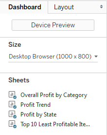
The top of the Dashboard tab on the left sidebar reveals a button to preview the dashboard on various devices as well as a drop-down menu for Size options.

Clicking the Device Preview button not only allows you to see how your dashboard will look with various device types (and even specific models), but also allows you to add a layout for each device type that you can customize:

You can not only see how your dashboard...


