The Calendar is an input component that selects a date input in different customized ways, such as inline, localization, restricted to particular dates, and time-oriented. In this case, the Calendar model is backed by a date type property. The simplest component declaration for a basic date selection would be as follows:
<p-calendar [(ngModel)]="basicDateInput" name="basic"></p-calendar>
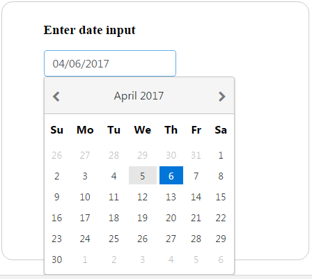
This displays an input textbox that, on being clicked opens up a pop-up date selection dialog, as shown here:

Apart from the basic date selection, there is also a provision to navigate each month for each year with the help of left and right arrow controls at the top. This will be explained in the section on advanced features.
The date selection is straightforward and can be done by clicking on a particular date in the pop-up dialog. By default, the Calendar is displayed in a popup, but this behavior can be altered with the inline...


