Search icon CANCEL
Subscription
0
Cart icon
Your Cart (0 item)
Close icon
You have no products in your basket yet
Save more on your purchases! discount-offer-chevron-icon
Savings automatically calculated. No voucher code required.
Arrow left icon
Explore Products
Best Sellers
New Releases
Books
Videos
Audiobooks
Learning Hub
Newsletter Hub
Free Learning
Arrow right icon
timer SALE ENDS IN
0 Days
:
00 Hours
:
00 Minutes
:
00 Seconds
Arrow up icon
GO TO TOP
React Material-UI Cookbook

You're reading from   React Material-UI Cookbook Build captivating user experiences using React and Material-UI

Arrow left icon
Product type Paperback
Published in Mar 2019
Publisher Packt
ISBN-13 9781789615227
Length 534 pages
Edition 1st Edition
Languages
Arrow right icon
Author (1):
Arrow left icon
Adam Boduch Adam Boduch
Author Profile Icon Adam Boduch
Adam Boduch
Arrow right icon
View More author details
Toc

Table of Contents (22) Chapters Close

Preface 1. Grids - Placing Components on the Page FREE CHAPTER 2. App Bars - The Top Level of Every Page 3. Drawers - A Place for Navigation Controls 4. Tabs - Grouping Content into Tab Sections 5. Expansion Panels - Group Content into Panel Sections 6. Lists - Display Simple Collection Data 7. Tables - Display Complex Collection Data 8. Cards - Display Detailed Information 9. Snackbars - Temporary Messages 10. Buttons - Initiating Actions 11. Text - Collecting Text Input 12. Autocomplete and Chips - Text Input Suggestions for Multiple Items 13. Selection - Make Selections from Choices 14. Pickers - Selecting Dates and Times 15. Dialogs - Modal Screens for User Interactions 16. Menus - Display Actions That Pop Out 17. Typography - Control Font Look and Feel 18. Icons - Enhance Icons to Match Your Look and Feel 19. Themes - Centralize the Look and Feel of Your App 20. Styles - Applying Styles to Components 21. Other Books You May Enjoy

Customizing typography

The preferred typeface for Material-UI themes is Roboto. This is by no means the only option, and, indeed, you can install new typefaces and use them in your custom Material-UI theme.

How to do it...

Let's install a couple of new typeface packages so that they're available for use in your application:

npm install --save typeface-exo typeface-ubuntu

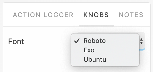
Next, you can add a Storybook control for the example that allows you to switch themes, and, as a result, switch fonts:
Here's what the Dialog component looks like when you first load the screen:
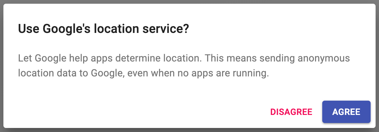
Here's what the Dialog component looks like when you change the font type to Exo:
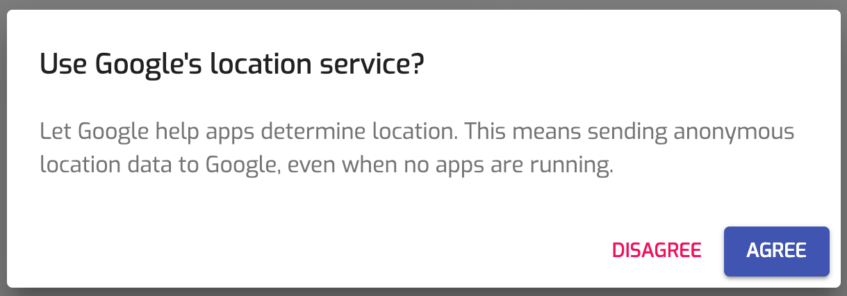
Lastly, here's what the Dialog component looks like...

lock icon The rest of the chapter is locked
Register for a free Packt account to unlock a world of extra content!
A free Packt account unlocks extra newsletters, articles, discounted offers, and much more. Start advancing your knowledge today.
Unlock this book and the full library FREE for 7 days
Get unlimited access to 7000+ expert-authored eBooks and videos courses covering every tech area you can think of
Renews at $19.99/month. Cancel anytime
Banner background image