Search icon CANCEL
Subscription
0
Cart icon
Your Cart (0 item)
Close icon
You have no products in your basket yet
Arrow left icon
Explore Products
Best Sellers
New Releases
Books
Videos
Audiobooks
Learning Hub
Newsletter Hub
Free Learning
Arrow right icon
timer SALE ENDS IN
0 Days
:
00 Hours
:
00 Minutes
:
00 Seconds
Arrow up icon
GO TO TOP
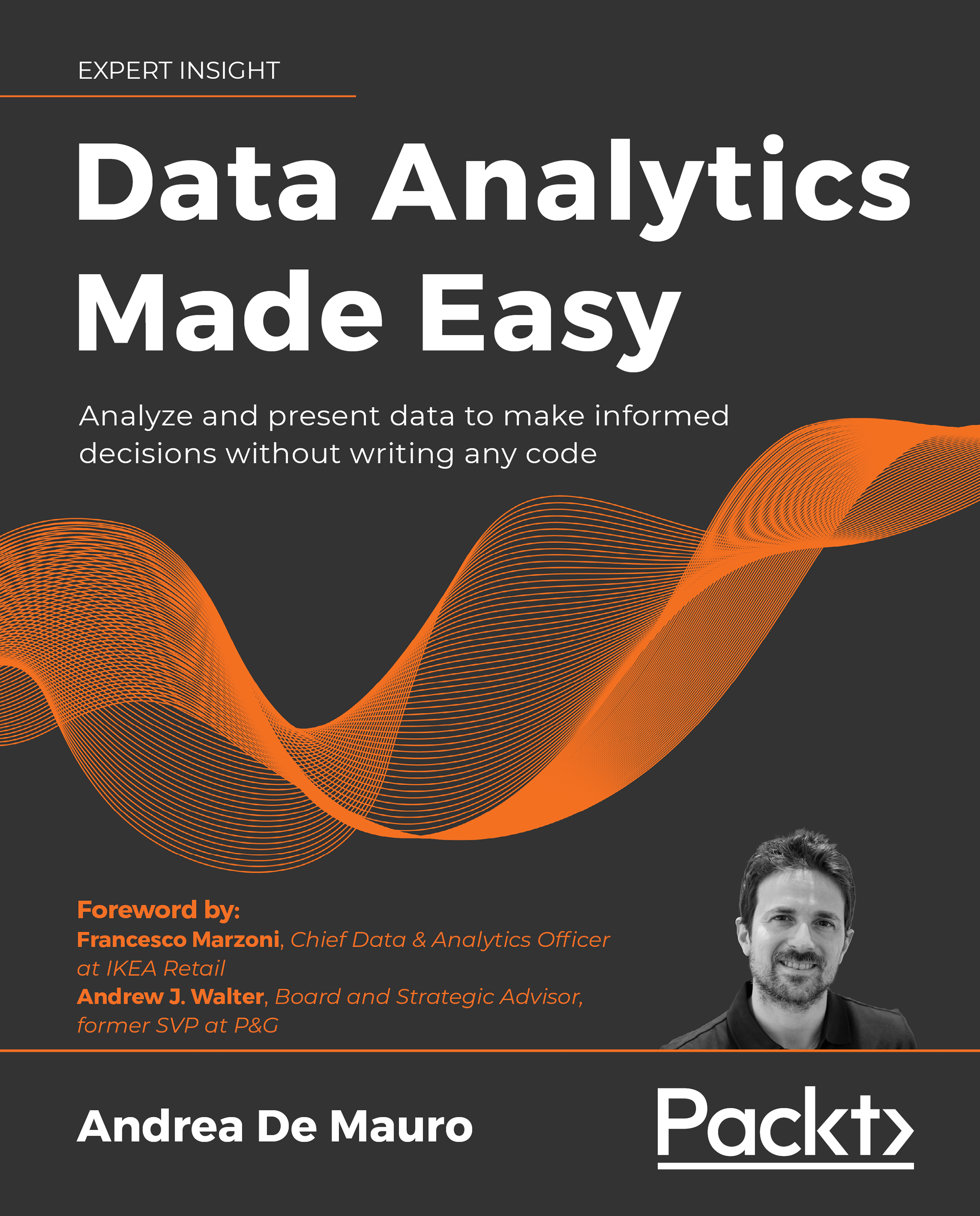
Data Analytics Made Easy

You're reading from   Data Analytics Made Easy Analyze and present data to make informed decisions without writing any code

Arrow left icon
Product type Paperback
Published in Aug 2021
Publisher Packt
ISBN-13 9781801074155
Length 406 pages
Edition 1st Edition
Arrow right icon
Author (1):
Arrow left icon
Andrea De Mauro Andrea De Mauro
Author Profile Icon Andrea De Mauro
Andrea De Mauro
Arrow right icon
View More author details
Toc

Table of Contents (14) Chapters Close

Preface 1. What is Data Analytics? 2. Getting Started with KNIME FREE CHAPTER 3. Transforming Data 4. What is Machine Learning? 5. Applying Machine Learning at Work 6. Getting Started with Power BI 7. Visualizing Data Effectively 8. Telling Stories with Data 9. Extending Your Toolbox 10. And now?
11. Useful Resources 12. Other Books You May Enjoy
13. Index

Visualizing Data Effectively

A chart is worth a thousand words, goes the old adage. Visual representation is often the preferred way to communicate numbers. As you can surely validate with your own experience, data charts are ubiquitous in business memos and presentations, as well as in newspaper articles and scientific papers. However, moving from data stored in a table to its graphic representation (a process called data visualization) is far from being trivial and risk-free. Although many software packages (including Power BI, Excel, KNIME, and so on) provide rapid ways to build charts in a matter of seconds, making effective and professional-looking visuals is far from being easy: it requires structured planning and disciplined execution.

This chapter will give you a set of practical guidelines to ensure that your business messages are communicated clearly through an effective data visualization process. In particular, we will go through the following questions:

  • What...
lock icon The rest of the chapter is locked
Register for a free Packt account to unlock a world of extra content!
A free Packt account unlocks extra newsletters, articles, discounted offers, and much more. Start advancing your knowledge today.
Unlock this book and the full library FREE for 7 days
Get unlimited access to 7000+ expert-authored eBooks and videos courses covering every tech area you can think of
Renews at $19.99/month. Cancel anytime