Search icon CANCEL
Subscription
0
Cart icon
Your Cart (0 item)
Close icon
You have no products in your basket yet
Save more on your purchases now! discount-offer-chevron-icon
Savings automatically calculated. No voucher code required.
Arrow left icon
Explore Products
Best Sellers
New Releases
Books
Videos
Audiobooks
Learning Hub
Conferences
Free Learning
Arrow right icon
Arrow up icon
GO TO TOP
Mastering Windows Server 2019

You're reading from   Mastering Windows Server 2019 The complete guide for IT professionals to install and manage Windows Server 2019 and deploy new capabilities

Arrow left icon
Product type Paperback
Published in Mar 2019
Publisher Packt
ISBN-13 9781789804539
Length 524 pages
Edition 2nd Edition
Concepts
Arrow right icon
Author (1):
Arrow left icon
Jordan Krause Jordan Krause
Author Profile Icon Jordan Krause
Jordan Krause
Arrow right icon
View More author details
Toc

Table of Contents (15) Chapters Close

Preface 1. Getting Started with Windows Server 2019 2. Installing and Managing Windows Server 2019 FREE CHAPTER 3. Core Infrastructure Services 4. Certificates in Windows Server 2019 5. Networking with Windows Server 2019 6. Enabling Your Mobile Workforce 7. Hardening and Security 8. Server Core 9. Redundancy in Windows Server 2019 10. PowerShell 11. Containers and Nano Server 12. Virtualizing Your Data Center with Hyper-V 13. Assessments 14. Another Book You May Enjoy

Using the newer Settings screen

If you work in IT and have been using Windows 10 on a client machine for any period of time, it's a sure bet that you have stumbled across the new Settings interface—perhaps accidentally, as was the case for me, the first time I saw it. I have watched a number of people now bump into the Settings interface for the first time when trying to view or configure Windows Updates. You see, Settings in Windows Server 2019 are just what the name implies, an interface from which you configure various settings within the operating system. What's so hard or confusing about that? Well, we already have a landing platform for all of the settings contained inside Windows that has been around for a zillion years. It's called Control Panel.

The Settings menu inside Windows isn't a brand new idea, but looks and feels quite new when compared to Control Panel. Windows Server 2012 and 2012 R2 had a quasi-presence of settings that as far as I know went largely unused by systems administrators. I believe that to be the effect of poor execution as the Settings menu in 2012 was accessed and hidden behind the Charms bar, which most folks have decided was a terrible idea. We will not spend too much time on technology of the past, but the Charms bar in Server 2012 was a menu that presented itself when you swiped your finger in from the right edge of the screen. Yes, you are correct, servers don't usually have touchscreens. Not any that I have ever worked on, anyway. So, the Charms bar also presented when you hovered the mouse up near the top-right of the screen. It was quite difficult to access, yet seemed to show up whenever you didn't want it to, like when you were trying to click on something near the right of the desktop and instead you clicked on something inside the Charms bar that suddenly appeared.

I am only giving you this background information in order to segue into this next idea. Much of the user interface in Windows 10, and therefore, Windows Server 2016 and 2019, can be considered a small step backward from the realm of finger swipes and touch screens. Windows 8 and Server 2012 were so focused on big app buttons and finger swipes that a lot of people got lost in the shuffle. It was so different than what we had ever seen before and difficult to use at an administrative level. Because of feedback received from that release, the graphical interface and user controls, including both the Start menu and the Settings menu in Windows Server 2019, are sort of smack-dab in the middle between Server 2008 and Server 2012. This backwards step was the right one to take, and I have heard nothing but praise so far on the new user interface.

So, getting back to the Settings menu, if you click on your Start button, then click on that little gear button just above the power controls, you will see this new interface:
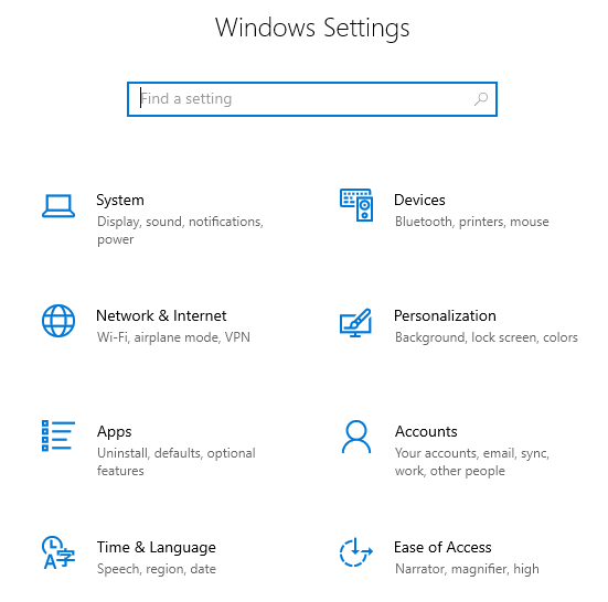
There are many settings and pieces of the operating system that you can configure in this new Settings menu. Some settings in Windows now only exist in this interface, but many can still be accessed either here or through the traditional Control Panel. The goal seems to be a shift toward all configurations being done through the new menu in future releases, but, for now, we can still administer most setting changes through our traditional methods if we so choose. I mentioned Windows Updates earlier, and that is a good example to look over. Traditionally, we would configure our Windows Update settings via the Control Panel, but they have now been completely migrated over to the new Settings menu in Windows Server 2019. Search Control Panel for Windows Update, and the only result is that you can view currently installed updates. But, if you search the new Settings menu for Windows Update, you'll find it right away.

Remember, you can always use the Windows search feature to look for any setting! Hit your WinKey and type Windows Update, and you'll be given quick links that take you straight into the appropriate Settings menus.

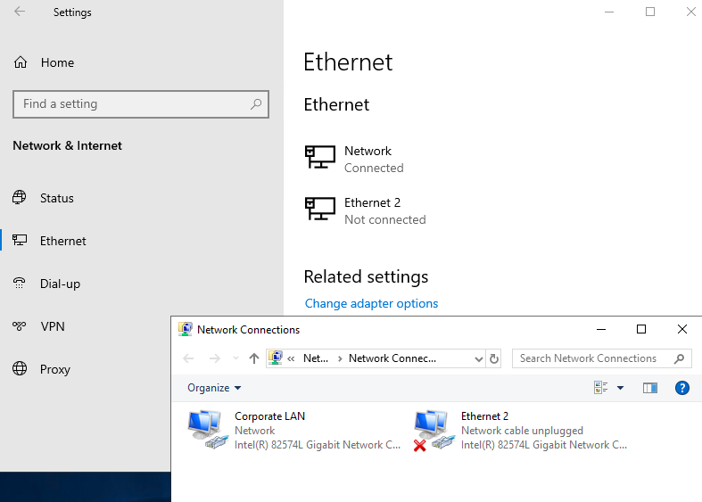
For the moment, you will have to use a combination of Control Panel and the Settings menu in order to do your work. It gets confusing occasionally. Sometimes, you will even click on something inside the Settings menu, and it will launch a Control Panel window! Try it out. Open up the Settings menu and click on Network & Internet. Click on Ethernet in the left column. Here, you can see the status of your network cards, but you can't change anything, such as changing an IP address. Then, you notice the link for Change adapter options. Oh yeah, that sounds like what I want to do. Click on Change adapter options, and you are taken right into the traditional Network Connections screen with the Control Panel look-and-feel:
Two ways to do the same thing

Potentially confusing as well, until you get used to navigating around in here, is that you can sometimes accomplish the same task in either Control Panel or the Settings menu, but the process that you take in each interface can have a vastly different look and feel. Let's take a look at that firsthand by trying to create a new user account on our server, once via Control Panel, and again via Settings.

Creating a new user through Control Panel

You are probably pretty familiar with this. Open Control Panel and click on User Accounts. Then, click on the User Accounts heading. Now, click on the link to Manage another account. Inside this screen is your option to Add a user account. Click on that and you get the dialog box where you enter a username and password for your new user:

Creating a new user through the Settings menu

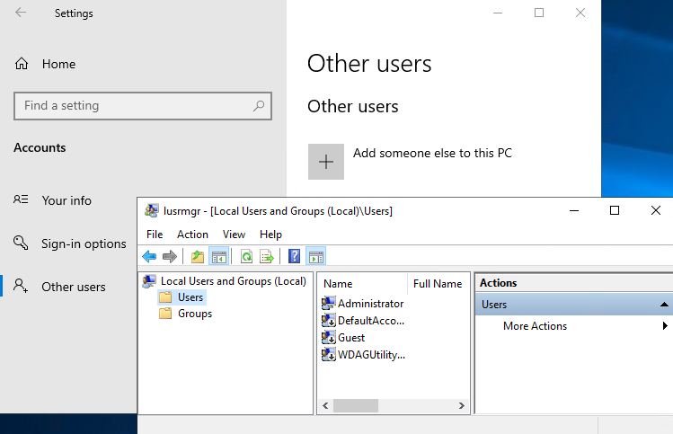
Let's take this newer Settings interface for a test drive. Open the Settings menu, and click on Accounts. Now, click on Other users in the left column. There is an option here to Add someone else to this PC; go ahead and click on that:

What in the world is that? Not what I expected, unfortunately. To my surprise, the old Control Panel user account launches a nice, fresh-looking interface from which I can create new user accounts. Accessing user accounts via the newer Settings console launches me into the old Local Users and Groups manager. Technically, from here I could definitely go ahead and create new user accounts, but it seems like there is some sort of a disconnect here. You would naturally think that the new Settings would initiate the newer, nicer screen for adding new user accounts, but we found the opposite to be true.

We walked through this simple example of attempting to perform the same function through two different interfaces to showcase that there are some items which can and must be performed within the new Settings menu context, but there are many functions within Windows that still need to be accomplished through our traditional interfaces. While Control Panel continues to exist, and probably will for a very long time, you should start navigating your way around the Settings menu and figure out what is available inside, so that you can start to shape your ideas for the best combination of both worlds in order to manage your servers effectively.

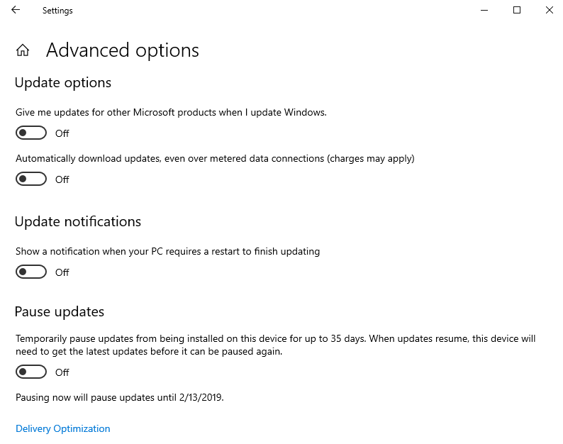
Just one last thing to point out as we start getting comfortable with the way that the new Settings menus look: many of the settings that we configure in our servers are on/off types of settings. By that I mean we are setting something to either one option or another. Historically, these kinds of configurations were handled by either drop-down menus or by radio buttons. That is normal; that is expected; that is Windows. Now, you will start to see little swipe bars, or sliders, that allow you to switch settings on or off, like a light switch. Anyone who has used the settings interface of any smart phone knows exactly what I am talking about. This user interface behavior has now made its way into the full Windows operating systems, and is probably here to stay. Just to give you an idea of what it looks like inside the context of the new Settings menu, here is a screenshot of the current Windows Update settings page inside the Update & Security settings.

This is a good example of those on/off slider buttons:

lock icon The rest of the chapter is locked
Register for a free Packt account to unlock a world of extra content!
A free Packt account unlocks extra newsletters, articles, discounted offers, and much more. Start advancing your knowledge today.
Unlock this book and the full library FREE for 7 days
Get unlimited access to 7000+ expert-authored eBooks and videos courses covering every tech area you can think of
Renews at €18.99/month. Cancel anytime