Designing for mobile
Careful consideration is needed when designing mobile ArcGIS applications. Key areas to consider include the following:
- Mobile web applications need to be simple and easy to use
- Given the range of mobile screen sizes and pixel densities, layout design becomes important
- Orientation of a mobile device after it is rotated, as this will directly affect your mobile application and the layout of user interface components
- Differences between mobile device brands such as Apple, Google, Windows, and Blackberry
- The target audience for both the application and the device
- Styling differences between traditional and mobile web applications
Again, let's consider each of these design differences in a little more detail.
Simplicity and intuition
Too often mobile web developers try to recreate a traditional web experience which results in an application that is overly complex. Simplicity and intuition are key. Don't try to do all things for all people. Workflows need to be obvious so that if a user selects a menu item or taps a button, then what they see on the screen makes sense. One screen should logically follow the next.
Note
A GIS map is made up of a base map with so-called feature overlays. These overlays are the map layers and represent geographic features through a point, line, or polygon. Points might represent water valves, lines might be buried pipelines, while polygons might represent parks.
Navigation should be simple. For example, if a user has tapped on a point feature and is viewing a full screen attribute inspector, then returning to the map should be easy and obvious.
Note
Focus on designing your mobile web apps so that they are simple and intuitive. Mobile users will stop using a mobile application if it has a cluttered interface and is hard to use.
Layout
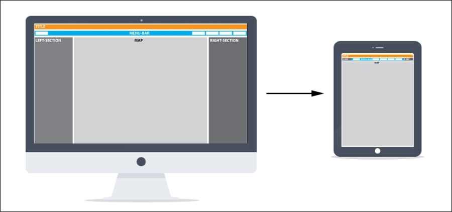
Careful consideration needs to go into mobile ArcGIS app layouts. Single column layouts combined with collapsible menus often work best. Traditional ArcGIS web applications are often designed with multiple columns, commonly with a layer list on the left-hand side, the map at the center, and a list of tools on the right-hand side.
The following screenshot illustrates the multiple versus single column layouts that we just discussed:

Multiple versus single column layouts
Collapsable menus provide ways to easily combine simple interfaces with functional options: widgets and tools. Using a responsive design, as we will discuss in Chapter 5, Providing Cross-device Support with Responsive Design, allows a multi-column layout to be adapted into a single-column layout depending on the screen size of the mobile device that is accessing the application.
Orientation
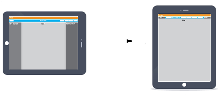
By rotating their mobile device, users can change the orientation of an application to either landscape or portrait. An orientation change affects layout. For example, a map that has a column on the right-hand side might work well in the landscape mode, but it might obscure the map if a user rotates the device to the portrait mode.
The following screenshot illustrates the mobile device orientation change:

Mobile device orientation change
Styling
Finger tap requires interactive items in mobile web applications to be larger than in traditional web applications. Buttons, links, and menu items all need to be larger than their traditional web counterparts. Recommendations on size vary considerably. For example, the recommended size for buttons varies from 44 x 44 pixels by Apple for iPhones to 28 x 28 pixels as per Nokia's smartphone suggestion. Either way, on-screen items on a mobile device need to be easy to select.
Note
We will discuss style sheets or CSS in depth in later chapters. These greatly help developers style their mobile ArcGIS apps. Both Android and Apple provide style guides and these can be found at the following links:
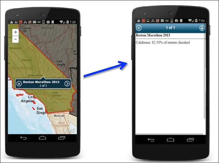
By contrast, some on-screen items are smaller on mobile devices. Popups are a good example of this.

Small popups open to attributes screen
Mobile apps are often styled for a specific device. Apple and Android have styling and design guidelines. These are recommendations for the look and feel of mobile apps on individual platforms. Though it is a little more difficult to style a mobile application for a specific platform using web technology than it is for native mobile applications, much can be done now with style sheets to provide a platform-specific look and feel to your mobile web application by targeting mobile-specific functionality.
Mobile applications are often used for different purposes than traditional web applications. Their requirements and workflows are quite different from to desktop browser applications. Thus, functionality is a key consideration. This includes the following:
- Building a mobile application on a mobile device that makes sense from a functional perspective.
- Avoid mirroring, recreating, or reusing a traditional web application for mobile use.
- Thinking carefully about your mobile ArcGIS users. Are they GIS or non-GIS users? Functionality will differ depending on the audience. We no longer build web applications that provide tools for everybody (we hope!).
Mobile targeted functionality
There is usually a clear divide between what functionality makes sense for mobile use versus desktop use. Questions around current location or use of GPS are usually mobile use cases. More complex, analytical tasks are more likely to be part of the desktop world.
Focused mobile applications
When web ArcGIS applications started to become popular, too often developers tried to recreate desktop applications for the Web. This resulted in complex applications loaded with tools that were cluttered and in many ways unusable. Web GIS had a distinctly narrower focus than desktop GIS. As we move to mobile ArcGIS development, developers need to remember lessons that they learned from the early days of the Web. Mobile web GIS again has a narrower focus than traditional web GIS. A good example of a focused mobile ArcGIS app might be one that just provides editing capabilities: add, edit, or delete a point feature. In the mobile world, focused functionality is king.
Target audience GIS versus non-GIS users
You need to build your mobile ArcGIS application for your intended audience. If your app is for maintenance workers who need to report on their work of filling pot holes, you will need to build an app that includes all the functional elements—a map with relevant layers, reporting tool, and so on—that are required to complete this task. GIS has traditionally served a GIS-trained audience. As we will discuss later, the combination of mobile and cloud technology has widened the potential user base for applications powered by ArcGIS.
Note
The world of GIS is changing. As the technology becomes more popular, the number of users unfamiliar with GIS is increasing dramatically. Developers are now building seeing it for the first time GIS-powered web applications for a new audience.
Today, a new group of users is accessing and using services provided by ArcGIS. Functionality, design, and workflows need to be carefully considered for this new audience.


