Use A/B Testing to Test Your Ideas
We can learn a great deal from our users with interviews and feedback studies, but it’s hard to achieve a large scale with these techniques—it’s just too time-consuming to talk to 1,000 or 100,000 users. A/B testing (where you compare two designs) and multivariate testing (where you change multiple design elements), are a great way to gather results and test your designs with large audiences because they can be run by robots, not humans.
A/B testing is a technique that involves splitting a user base into two groups or populations and showing two different designs (“A” and “B”) to each group to see which design performs better. A/B testing gives the best results with larger populations of users; over 1,000 is a good sensible minimum to give meaningful results.
It’s that simple: set up two different versions of your UI and use some software (many free and paid services are available) to serve them equally to visitors. Tag each group with a label in your analytics software and you can see easily which design performed better against your chosen conversion metric: whether that’s checkout conversions, sign-ups, or something else.
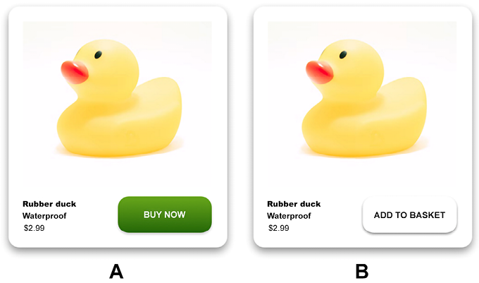
Start with a hypothesis to test. In the example below: “We suspect that making the purchase more instant and presenting the option in a brighter color will cause more checkout conversions.”

Figure 5.1: Run version A and B past 1,000 users and see how many ducks you sell for each cohort
All well and good, and a useful research tool to have in your UX research toolbox. One last word on ethics—make sure you’re helping the user, not just optimizing for company needs. That way lie deceptive patterns (see #101, Don’t Join the Dark Side).
Learning points
- Use A/B testing to work out which design performs better
- Make sure “performs better” means the design performs better for the user
- A/B testing works well with two distinctly different designs, rather than just tiny changes


