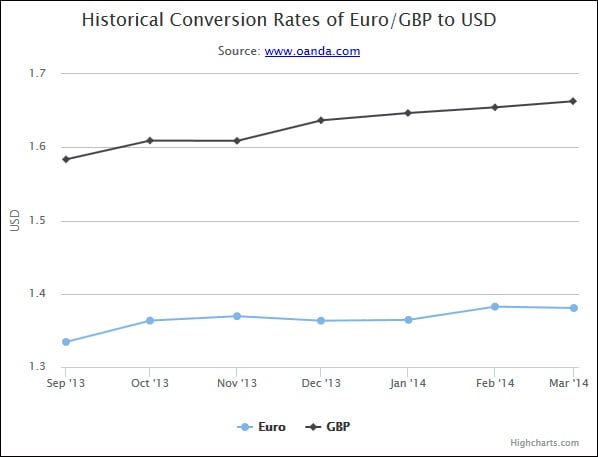
Creating line charts with multiple series
We can also create a line chart with multiple series just as we did with column charts in the previous chapter. We will also include the conversion rates of GBP in our chart along with USD and Euro.
Copy the code from the previous example and add a series for GBP:
{
  name: 'GBP',
  data: [
    [Date.UTC(2013, 08, 01), 1.5835],
    [Date.UTC(2013, 09, 01), 1.6092],
    [Date.UTC(2013, 10, 01), 1.6088],
    [Date.UTC(2013, 11, 01), 1.6368],
    [Date.UTC(2014, 00, 01), 1.6468],
    [Date.UTC(2014, 01, 01), 1.6546],
    [Date.UTC(2014, 02, 01), 1.6629]
  ]
}
Refresh the page and the series for GBP will now be included in the chart.

There is one problem though: if you hover over any data point of the GBP series, the tooltip will keep mentioning Euro instead of GBP:

This is because we hardcoded the series name as Euro in our tooltip's formatter() method. Change it to the following and the tooltip will start working correctly:
formatter: function() {
  var...


