Challenges of big data visualization
We're assuming that you have some background with the topic of data visualization and therefore the earlier deliberations were just enough to refresh your memory and sharpen your appetite for the real purpose of this book.
Big data
Let's take a pause here to define big data.
A large assemblage of data and datasets that are so large or complex that traditional data processing applications are inadequate and data about every aspect of our lives has all been used to define or refer to big data.
In 2001, then Gartner analyst Doug Laney introduced the 3Vs concept ( refer to the following link http://blogs.gartner.com/doug-laney/files/2012/01/ad949-3D-Data-Management-Controlling-Data-Volume-Velocity-and-Variety.pdf). The 3Vs, according to Doug Laney, are volume, variety, and velocity. The 3Vs make up the dimensionality of big data: volume (or the measurable amount of data), variety (meaning the number of types of data), and velocity (referring to the speed of processing or dealing with that data).
With this concept in mind, all aspects of big data become increasingly challenging and as these dimensions increase or expand they will also encumber the ability to effectively visualize the data.
Using Excel to gauge your data
Look at the following figure and remember that Excel is not a tool to determine whether your data qualifies as big data:

If your data is too big for Microsoft Excel, it still really doesn't necessarily qualify as big data. In fact, gigabytes of data still are manageable with various techniques, enterprise, and even open source tools, especially with the lower cost of storage today. It is important to be able to realistically size the data that you will be using in an analytic or visualization project before selecting an approach or technology (keeping in mind expected data growth rates).
Pushing big data higher
As the following figure illustrates, the aforementioned Volume, Variety, and Velocity have and will continue to lift Big Data into the future:
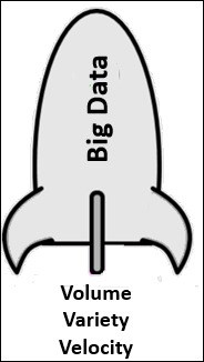
The 3Vs
Let's take a moment to further examine the Vs.
Volume
Volume involves determining or calculating how much of something there is, or in the case of big data, how much of something there will be. Here is a thought provoking example:
How fast does moon dust pile up?
As written by Megan Gannon in 2014, (http://www.space.com/23694-moon-dust-mystery-apollo-data.html), a revisited trove of data from NASA's Apollo missions more than 40 years ago is helping scientists answer a lingering lunar question: how fast does moon dust build up? The answer: it would take 1,000 years for a layer of moon dust about a millimeter (0.04 inches) thick to accumulate (big data accumulates much quicker than moon dust!).
With every click of a mouse, big data grows to be petabytes (1,024 terabytes) or even Exabyte's (1,024 petabytes) consisting of billions to trillions of records generated from millions of people and machines.
Although it's been reported (for example, you can refer to the following link: http://blog.sqlauthority.com/2013/07/21/sql-server-what-is-the-maximum-relational-database-size-supported-by-single-instance/) that structured or relational database technology could support applications capable of scaling up to 1 petabyte of storage, it doesn't take a lot of thought to understand with that kind of volume it won't be easy to handle capably, and the accumulation rate of big data isn't slowing any time soon.
It's the case of big, bigger (and we haven't even approached determining), and biggest yet!
Velocity
Velocity is the rate or pace at which something is occurring. The measured velocity experience can and usually does change over time. Velocities directly affect outcomes.
Previously, we lived and worked in a batch environment, meaning we formulate a question (perhaps what is our most popular product?), submit the question (to the information technology group), and wait--perhaps after the nightly sales are processed (maybe 24 hours later), and finally, we receive an answer. This is a business model that doesn't hold up now with the many new sources of data (such as social media or mobile applications), which record and capture data in real time, all of the time. The answers to the questions asked may actually change within a 24-hour period (such is the case with trending now information that you may have observed when you are online).
Given the industry hot topics such as Internet of Things (IoT), it is safe to say that these pace expectations will only quicken.
Variety
Thinking back to our previous mention of relational databases, it is generally accepted that relational databases are considered to be highly structured, although they may contain text in VCHAR, CLOB, or BLOB fields.
Data today (and especially when we talk about big data) comes from many kinds of data sources, and the level in which that data is structured varies greatly from data source to data source. In fact, the growing trend is for data to continue to lose structure and to continue to add hundreds (or more?) of new formats and structures (formats that go beyond pure text, photo, audio, video, web, GPS data, sensor data, relational databases, documents, SMS, pdf, flash, and so on) all of the time.
Categorization
The process of categorization helps us to gain an understanding of the data source.
The industry commonly categorizes big data this way--into the two groups (structured and unstructured)--but the categorizing doesn't stop there.
Some simple research reveals some interesting new terms for subcategorizing these two types of data varieties:
Structured data includes subcategories such as created, provoked, transactional, compiled, and experimental, while unstructured data includes subcategories such as captured and submitted (just to name a few of the currently trending terms for categorizing the types of big data. You may be familiar with or be able to find more).
It's worth taking some time here to speak about these various data formats (varieties) to help drive the point to the reader of the challenges of dealing with the numerous big data varieties:
- Created data: This is the data being created for a purpose; such as focus group surveys or asking website users to establish an account on the site (rather than allowing anonymous access).
- Provoked data: This is described as data received after some form of provoking, perhaps such as providing someone with the opportunity to express the individual's personal view on a topic, such as customers filling out product review forms.
- Transactional data: This is data that is described as database transactions, for example, the record of a sales transaction.
- Compiled data: This is data described as information collected (or compiled) on a particular topic such as credit scores.
- Experimental data: This is described as when someone experiments with data and/or sources of data to explore potential new insights. For example, combining or relating sales transactions to marketing and promotional information to determine a (potential) correlation.
- Captured data: This is the data created passively due to a person's behavior (like when you enter a search term on Google, perhaps the creepiest data of all!).
- User-generated data: This is the data generated every second by individuals, such as from Twitter, Facebook, YouTube, and so on (compared to captured data, this is data you willingly create or put out there).
To sum up, big data comes with no common or expected format and the time required to impose a structure on the data has proven to be no longer worth it.
Such are the 3Vs
In addition to what we mentioned earlier, there are additional challenging areas that big data brings to the table especially to the task of data visualization, for example, the ability to effectively deal with data quality, outliers, and to display results in a meaningful way, to name a few.
Again, it's worth quickly visiting each of these topics here now.
Data quality
The value of almost anything and everything is directly proportional to its level of quality and higher quality is equal to higher value.
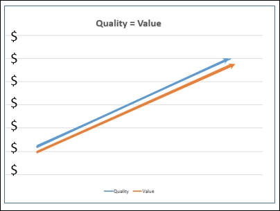
Data is no different. Data (any data) can only prove to be a valuable instrument if its quality is certain.
The general areas of data quality include:
- Accuracy
- Completeness
- Update status
- Relevance
- Consistency (across sources)
- Reliability
- Appropriateness
- Accessibility
The quality of data can be affected by the way it is entered, stored, and managed and the process of addressing data quality (referred to most often as quality assurance, data quality assurance (DQA), requires a routine and regular review and evaluation of the data, and performing on going processes termed profiling and scrubbing (this is vital even if the data is stored in multiple disparate systems making these processes difficult).
Effective profiling and scrubbing of data necessitates the use of flexible, efficient techniques capable of handling complex quality issues hidden deep in the depths of very large and ever accumulating (big data) datasets.
With the complexities of big data (and its levels of volume, velocity, and variety), it should be easy for one to recognize how problematic and restrictive the DQA process is and will continue to become.
Dealing with outliers
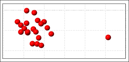
The following is a simple figure introducing the concept of an outlier, that is, one lonesome red dot separated from the group:
As per Sham Mustafa, founder and CEO of data scientist marketplace Correlation One:
"Anyone who is trying to interpret data needs to care about outliers. It doesn't matter if the data is financial, sociological, medical, or even qualitative. Any analysis of that data or information must consider the presence and effect of outliers. Outliers (data that is "distant" from the rest of the data) indicating variabilities or errors - need to be identified and dealt with."
For clarification, you might accept the notion that an outlier is an observation point that is distant or vastly different from other observations (or data points) in a sum of data.
Once identified, regularly accepted methods for dealing with these outliers may be (simply?) moving them to another file or replacing the outliers with other more reasonable or appropriate values. This way of outlier processing is perhaps not such a complicated process, but is one that must be seriously thought out and rethought before introducing any process to identify and address outliers in a petabyte or more of data.
Another point to consider is, are the outliers you identify in your data an indicator that the data itself is bad or faulty or are the outliers' random variations caused by new and interesting points or characteristics within your data?
Either way, the presence of outliers in your data will require a valid and (especially in the case of big data) a robust method for dealing with them.
Meaningful displays
Rather than words or text, the following diagram clearly demonstrates the power of a visualization when conveying information:
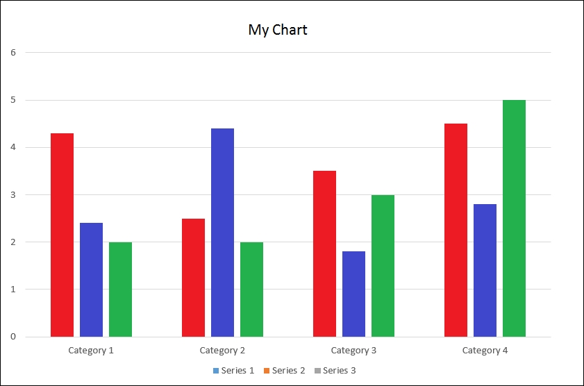
A picture is worth a thousand words and Seeing is believing are just two adages that elucidate the powers of data visualization.
As per Millman/Miller Data Visualization: Getting Value from Information 2014:
"The whole point of data visualization is to provide a visual experience."
Successfully conducting business today requires that organizations tap into all the available data stores finding and analyzing relevant information very quickly, looking for indications and insights.
Data visualization is a key technique permitting individuals to perform analysis, identify key trends or events, and make more confident decisions much more quickly. In fact, data visualization has been referred to as the visual representation of business intelligence and industry research analyst Lyndsay Wise said in an article back in 2013:
"Even though there is plenty that users can accomplish now using data visualization, the reality is that we are just at the tip of the iceberg in terms of how people will be using this technology in the future."
Refer to the following link for more information:
https://tdwi.org/articles/2013/04/02/Data-Visualization-Boosts-BI-Value.aspx
Adding a fourth V

The idea of establishing and improving the quality levels of big data might also be classified as the fourth V: veracity. Data that is disparate, large, multiformatted, and quick to accumulate and/or change (also known as big data) causes uncertainty and doubt (can I trust this data?). The uncertainty that comes with big data may cause the perhaps valuable data to be excluded or over looked.
As we've already mentioned, big data visualization forces a rethinking of the massive amounts of both structured and unstructured data (at great velocity) and unstructured data will always contain a certain amount of uncertain and imprecise data. Social media data, for example, is characteristically uncertain.
A method for dealing with big data veracity is by assigning a veracity grade or veracity score for specific datasets to evade making decisions based on analysis of uncertain and imprecise big data.
Although big data may well offer businesses exponentially more opportunities for visualizing their data into actionable insights, it also increases the required effort and expertise to do so (successfully and effectively).
Again, the same challenges are presented; such as accessing the level of detail needed from perhaps unimaginable volumes of levels of data, in an ever-growing variety of different formats--all at a very high speed--is noticeably difficult.
Visualization philosophies
A meaningful display requires you to pay attention to various proven practice philosophies; these concepts include (but are not limited to):
- The proper arrangement of related information
- Appropriately using color(s)
- Correctly defining decimal placements
- Limiting the use of 3D effects or ornate gauge designs
The reader should take note that this book is not intending to cover all of the fundamental data visualization techniques, but is focusing on the challenges of big data visualization practices and it is assumed that the reader has general knowledge of and experience with the process of data visualization. However, one who may be interested in the topic should perhaps take some time to review the idea of the Data-Ink Ratio introduced by Edward Tufte. Tufte does an excellent job in introducing and explaining this concept in the best-selling book The Visual Display of Quantitative Information, Edward R. Tufte, January 2001.
More on variety
Without context, data is meaningless and the same applies to visual displays (or visualizations) of that data.
For example, data sourced from social media may present entirely different insights depending on user demographics (that is, age group, sex, or income bracket), platform (that is, Facebook or Twitter), or audience (those who intend to consume the visualizations).
Acquiring a proper understanding (establishing a context) of the data takes significant domain expertise as well as the ability to properly analyze the data; big data certainty complicates these practices with its seemingly endless number of formats and varieties of both structured and unstructured data.
Velocity
Even if you are able to assign the appropriate context to your data, the usability or value of the data will be (at least) reduced if the data is not timely. The effort and expense required to source, understand, and visualize data is squandered if the results are stale, obsolete, or potentially invalid by the time the data is available to the intended consumers. For example, when a state government agency is preparing a budget request for the governor, the most up-to-date consensus figures are vital; without accuracy, here, the funds may fall short of the actual needs.
The challenge of speedily crunching numbers exists within any data analysis, but when considering the varieties and volumes of data involved in big data projects, it becomes even more evident.
Volume
It may (or may not) be evident to the reader that too much information displayed in one place can cause the viewer to have what is referred to as sensory overload and that simple restrictions such as real estate (the available viewing space on a web page or monitor) can (and most likely will) be detrimental to the value of a visualization trying to depict too many data points or metrics.
In addition, complicated or intricate visuals or those that attempt to aggregate or otherwise source a large number of data sources most likely will be hindered by the experience of slow performance. In other words, the more data you need to process to create or refresh your visualization, the longer wait time there will most likely be, which will increase audience frustration levels and usability and value of the visualization.
Beyond the earlier mentioned pitfalls, when dealing with big data, even creating a simple bar graph visualization can be overwhelmingly difficult since attempting to plot points for analysis with extremely large amounts of information or a large variety of categories of information simply won't work.
Visualizations of data should be used to uncover trends and spot outliers much quicker than using worksheets or reports containing columns and rows of numbers and text, but these opportunities will be lost if care is not taken to address the mentioned challenges.
Users can leverage visualizations such as a column chart, for example, to see where sales may be headed or to identify topics that need attention at a glance or glimpse. But imagine trying to churn through and chart twenty billion records of data! Even if the data could be processed into a visualization, anyone trying to view that number of plots within a single visualization will have a very difficult time just viewing so many data points.
All is not lost
Thankfully, there are various approaches (or strategies) that have come to exist and can be used for preparing effective big data visualizations as well as addressing the hindrances we've mentioned (variety, velocity, volume, and veracity).
Some of the examples include:
- You can change the type of the visualization, for example, switching from a column graph to a line chart can allow you to handle more data points within the visualization.
- You can use higher-level clustering. In other words, you can create larger, broader stroke groupings of the data to be represented in the visualization (with perhaps linked subcharts or popups allowing a selected grouping to be broken out into subgroupings) rather than trying to visualize an excessive number of groups.
- You can remove outliers from the visualization. Outliers typically represent less than 5 percent of a data source, but when you're working with massive amounts of data, viewing that 5 percent of the data is challenging. Outliers can be removed and if appropriate, be presented in a separate data visualization.
- You can consider capping, which means setting a threshold for the data you will allow into your visualization. This cuts down on the range or data making for a smaller, more focused image.
These strategies (and others) help, but aren't really sufficient when it comes to working with big data.
The remaining chapters of this book are outlined later in this chapter and I will provide practical approaches and solutions (with examples) to consider for successful big data visualization.


