Time for action—moving the sidebar below the content for tablets in portrait mode
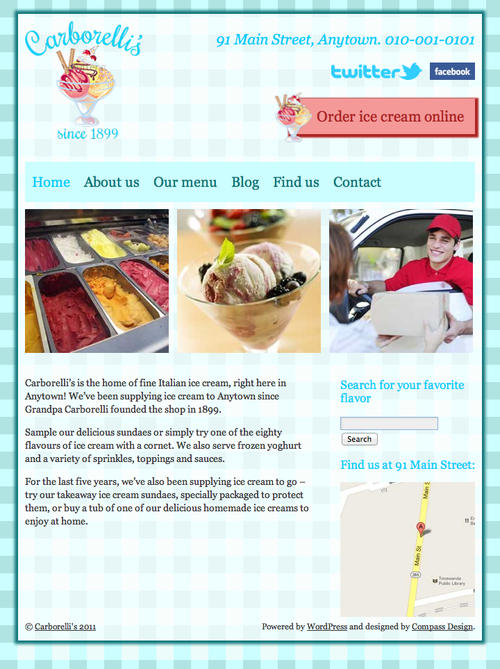
Let's start by reviewing how the site is now looking on tablets in portrait orientation, as shown in the following screenshot:

It's looking good, but there's a large empty space below the home page content, which could be filled by rearranging the content and sidebar positioning. Let's get on and write the necessary CSS. Perform the following steps for doing so:
1. First, we will find our media query for tablets in portrait mode, with the CSS we added for the header:
/*iPads in portrait mode*/
@media screen and (max-width: 768px) {
#site-title img {
width: 75%;
}
#socialmedia img {
height: 25px;
margin: 7px 0 7px 10px;
}
#header-right .CTA {
padding: 0.8em;
padding-left: 40px;
}
#access {
font-size: 18px;
}
}
2. As our new code addresses issues further down in the site's document tree, we'll write our new code below the code we've already added, but still inside the media query's curly brackets.
Note
For an explanation...


