Search icon CANCEL
Arrow left icon
Explore Products
Best Sellers
New Releases
Books
Videos
Audiobooks
Learning Hub
Conferences
Free Learning
Arrow right icon
Arrow up icon
GO TO TOP
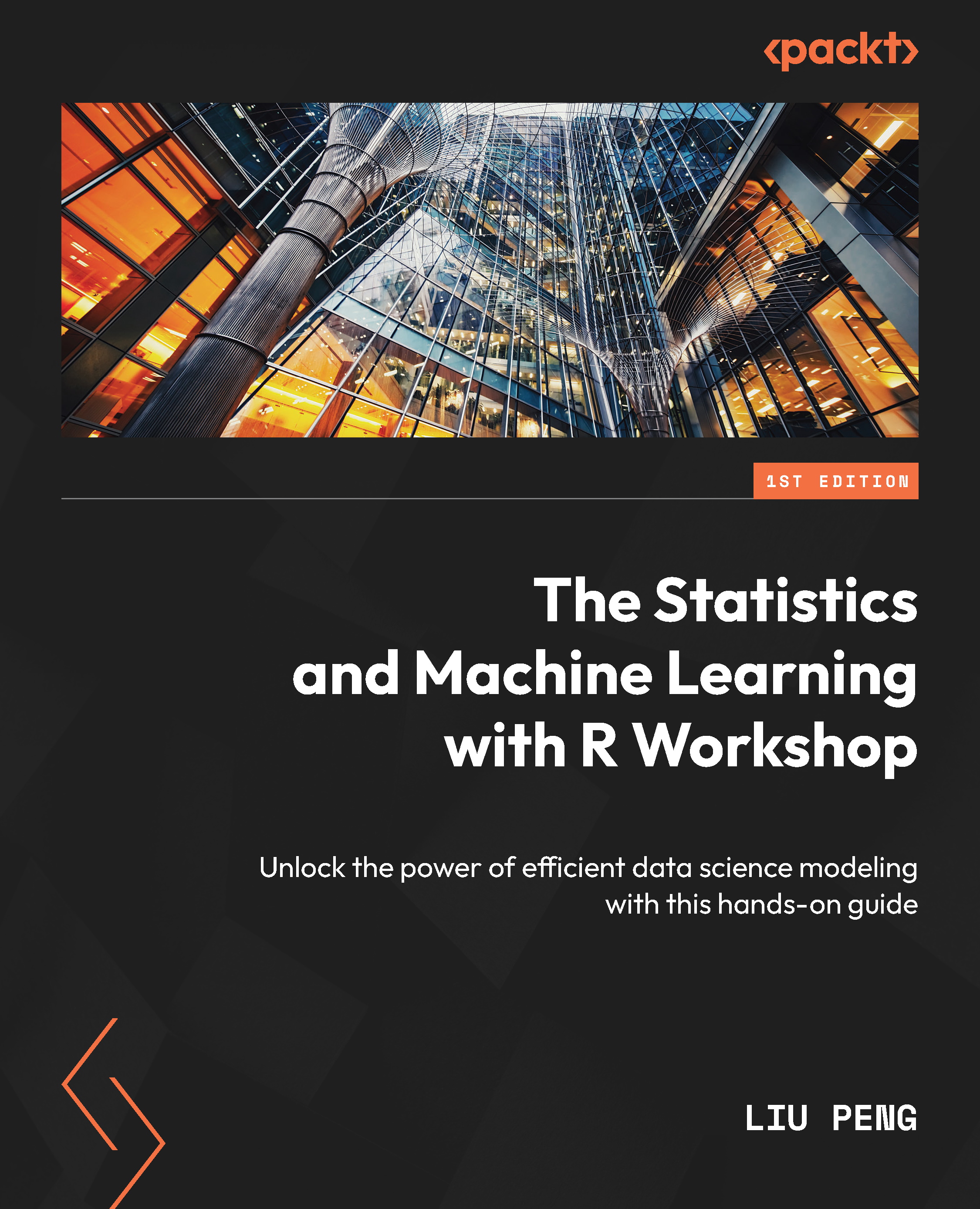
The Statistics and Machine Learning with R Workshop

You're reading from   The Statistics and Machine Learning with R Workshop Unlock the power of efficient data science modeling with this hands-on guide

Arrow left icon
Product type Paperback
Published in Oct 2023
Publisher Packt
ISBN-13 9781803240305
Length 516 pages
Edition 1st Edition
Languages
Arrow right icon
Author (1):
Arrow left icon
Liu Peng Liu Peng
Author Profile Icon Liu Peng
Liu Peng
Arrow right icon
View More author details
Toc

Table of Contents (20) Chapters Close

Preface 1. Part 1:Statistics Essentials
2. Chapter 1: Getting Started with R FREE CHAPTER 3. Chapter 2: Data Processing with dplyr 4. Chapter 3: Intermediate Data Processing 5. Chapter 4: Data Visualization with ggplot2 6. Chapter 5: Exploratory Data Analysis 7. Chapter 6: Effective Reporting with R Markdown 8. Part 2:Fundamentals of Linear Algebra and Calculus in R
9. Chapter 7: Linear Algebra in R 10. Chapter 8: Intermediate Linear Algebra in R 11. Chapter 9: Calculus in R 12. Part 3:Fundamentals of Mathematical Statistics in R
13. Chapter 10: Probability Basics 14. Chapter 11: Statistical Estimation 15. Chapter 12: Linear Regression in R 16. Chapter 13: Logistic Regression in R 17. Chapter 14: Bayesian Statistics 18. Index 19. Other Books You May Enjoy

Summary

In this chapter, we introduced essential graphics techniques based on the ggplot2 package. We started by going over the basic scatter plot and learned the grammar of developing layers in a plot. To build, edit, and improve a plot, we need to specify three essential layers: data, aesthetics, and geometries. For example, the geom_point() function used to build a scatter plot allows us to control the size, shape, and color of the points on a graph. We can also display them as text in addition to presenting points using the geom_text() function.

We also covered the layer-specific control provided by the geometry layer and showed examples using bar charts and line plots. A bar chart can help represent the frequency distribution of categorical variables and the histogram of continuous variables. A line chart supports time series data and can help identify trends and patterns if appropriately plotted.

Finally, we also covered the theme layer, which allows us to control all non...

lock icon The rest of the chapter is locked
Register for a free Packt account to unlock a world of extra content!
A free Packt account unlocks extra newsletters, articles, discounted offers, and much more. Start advancing your knowledge today.
Unlock this book and the full library FREE for 7 days
Get unlimited access to 7000+ expert-authored eBooks and videos courses covering every tech area you can think of
Renews at $19.99/month. Cancel anytime