We've created a fluid grid, which is the first foundation of a responsive web design. Foundation two is responsive images or flexible images. We want our images or at least certain images to behave the same way as our divs and sections. We want them to be fluid or flexible.
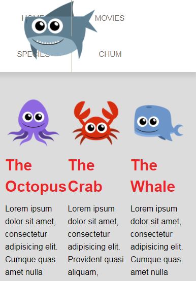
Looking at our site, what we can notice is that the three images of The Octopus, The Crab, and The Whale shrink as the column they are in gets smaller. On the other hand, the shark at the top kind of stays the same size no matter what the browser width is:

Our image in the navigation is not flexible. The three images in our columns are flexible. We'll look at the image in the navigation and see why. But first, let's go over the three things that will guarantee responsive images:
- Put the img tag inside of a container. The most semantic container is usually the figure tag, but...


