Search icon CANCEL
Arrow left icon
Explore Products
Best Sellers
New Releases
Books
Videos
Audiobooks
Learning Hub
Conferences
Free Learning
Arrow right icon
Arrow up icon
GO TO TOP
Data Modeling with Microsoft Excel

You're reading from   Data Modeling with Microsoft Excel Model and analyze data using Power Pivot, DAX, and Cube functions

Arrow left icon
Product type Paperback
Published in Nov 2023
Publisher Packt
ISBN-13 9781803240282
Length 316 pages
Edition 1st Edition
Languages
Tools
Arrow right icon
Author (1):
Arrow left icon
Bernard Obeng Boateng Bernard Obeng Boateng
Author Profile Icon Bernard Obeng Boateng
Bernard Obeng Boateng
Arrow right icon
View More author details
Toc

Table of Contents (16) Chapters Close

Preface 1. Part 1: Overview and Introduction to Data Modeling in Microsoft Excel
2. Chapter 1: Getting Started with Data Modeling – Overview and Importance FREE CHAPTER 3. Chapter 2: Data Structuring for Data Models – What’s the best way to layout your data? 4. Chapter 3: Preparing Your Data for the Data Model – Cleaning and Transforming Your Data Using Power Query 5. Chapter 4: Data Modeling with Power Pivot – Understanding How to Combine and Analyze Multiple Tables Using the Data Model 6. Part 2: Creating Insightful Calculations from your Data Model using DAX and Cube Functions
7. Chapter 5: Creating DAX Calculations from Your Data Model – Introduction to Measures and Calculated Columns 8. Chapter 6: Creating Cube Functions from Your Data Model – a Flexible Alternative to Calculations in Your Data Model 9. Part 3: Putting it all together with a Dashboard
10. Chapter 7: Communicating Insights from Your Data Model Using Dashboards – Overview and Uses 11. Chapter 8: Visualization Elements for Your Dashboard – Slicers, PivotCharts, Conditional Formatting, and Shapes 12. Chapter 9: Choosing the Right Design Themes – Less Is More with Colors 13. Chapter 10: Publication and Deployment – Sharing with Report Users 14. Index 15. Other Books You May Enjoy

Adding and formatting charts

Next up are charts. In this dashboard, we are going to insert two popular charts. We will add some formats to enhance how they appear in our dashboard.

The first chart is the area chart. This chart falls into the group of charts that are useful for visualizing trends. We are going to use this chart to show the trend of profits for the period that we select.

We will go through these steps:

  1. Create a PivotTable in the Calculations sheet in cell Q10.
  2. Put Months in the Row section and the Profit measure in the Values section.

This should give us the following PivotTable:
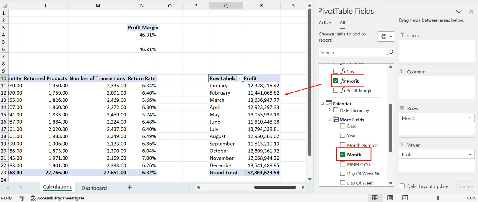
Figure 8.35 – Creating a PivotTable report on monthly profit

Figure 8.35 – Creating a PivotTable report on monthly profit

From here, we will select any cell in the PivotTable we just created and insert a PivotChart. In the chart options, we will select the Area chart:
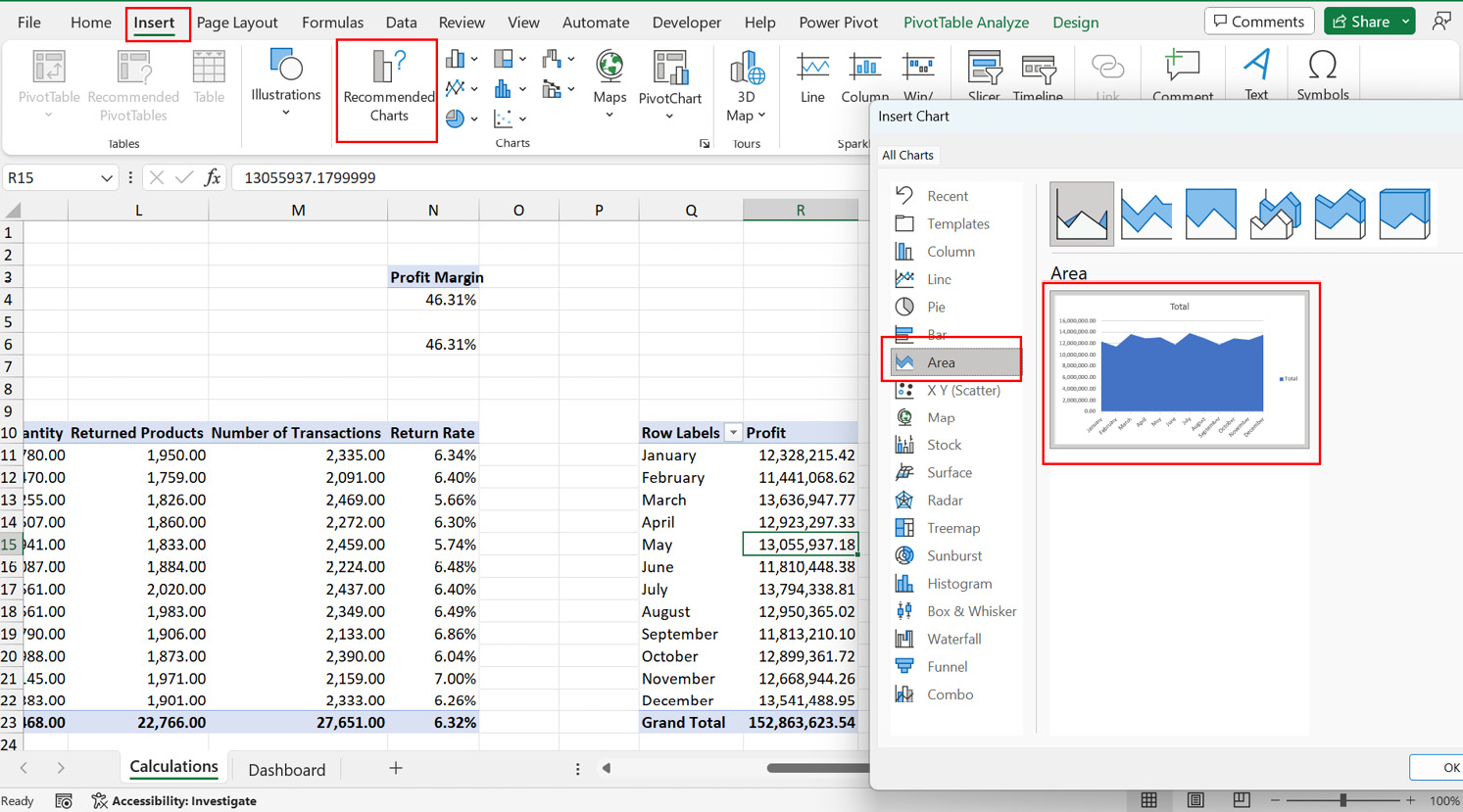
Figure 8.36 – Inserting an area chart

Figure 8.36 – Inserting an area chart

We will reduce the clutter on the PivotChart by removing...

lock icon The rest of the chapter is locked
Register for a free Packt account to unlock a world of extra content!
A free Packt account unlocks extra newsletters, articles, discounted offers, and much more. Start advancing your knowledge today.
Unlock this book and the full library FREE for 7 days
Get unlimited access to 7000+ expert-authored eBooks and videos courses covering every tech area you can think of
Renews at $19.99/month. Cancel anytime