


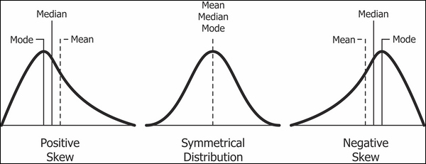
Skewness
Skewness is the name for the asymmetry of a distribution about its mode. Negative skew, or left skew, indicates that the area under the graph is larger on the left side of the mode. Positive skew, or right skew, indicates that the area under the graph is larger on the right side of the mode.
Incanter has a built-in function for measuring skewness in the stats namespace:
(defn ex-1-20 []
  (let [weights (take 10000 (dishonest-baker 950 30))]
    {:mean (mean weights)
     :median (median weights)
     :skewness (s/skewness weights)}))
The preceding example shows that the skewness of the dishonest baker's output is about 0.4, quantifying the skew evident in the histogram.
Quantile-quantile plots
We encountered quantiles as a means of describing the distribution of data earlier in the chapter. Recall that the quantile function accepts a number between zero and one and returns the value of the sequence at that point. 0.5 corresponds to the median value.
Plotting the quantiles of your data against the quantiles of the normal distribution allows us to see how our measured data compares against the theoretical distribution. Plots such as this are called Q-Q plots and they provide a quick and intuitive way of determining normality. For data corresponding closely to the normal distribution, the Q-Q Plot is a straight line. Deviations from a straight line indicate the manner in which the data deviates from the idealized normal distribution.
Let's plot Q-Q plots for both our honest and dishonest bakers side-by-side. Incanter's c/qq-plot function accepts the list of data points and generates a scatter chart of the sample quantiles plotted against the quantiles from the theoretical normal distribution:
(defn ex-1-21 []
  (->> (honest-baker 1000 30)
       (take 10000)
       (c/qq-plot)
       (i/view))
  (->> (dishonest-baker 950 30)
       (take 10000)
       (c/qq-plot)
       (i/view)))
The preceding code will produce the following plots:
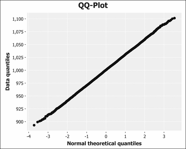
The Q-Q plot for the honest baker is shown earlier. The dishonest baker's plot is next:
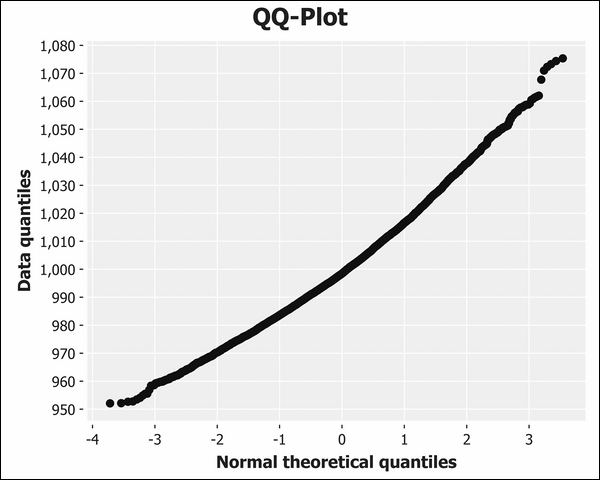
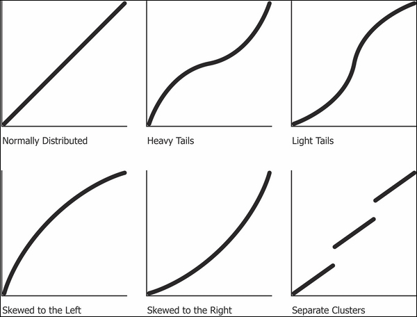
The fact that the line is curved indicates that the data is positively skewed; a curve in the other direction would indicate negative skew. In fact, Q-Q plots make it easier to discern a wide variety of deviations from the standard normal distribution, as shown in the following diagram:
Q-Q plots compare the distribution of the honest and dishonest baker against the theoretical normal distribution. In the next section, we'll compare several alternative ways of visually comparing two (or more) measured sequences of values with each other.


