Customizing Studio
After you install Studio, the program presents itself with a predefined scene that shows a gray human figure standing in the standard T pose.

This configuration is not optimal. Most of the time, we will end up deleting the default figure to start your scene with something that you want. In addition, the loading of that figure adds to the time that it takes to start Studio, and we all know how much fun it is to wait for a program to become ready. So, let's make a few changes that will help us work faster.
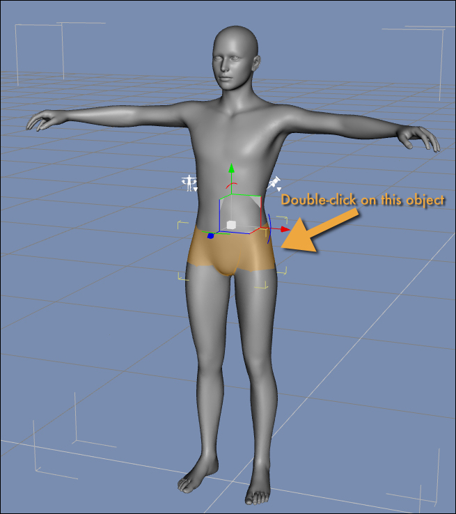
First of all we delete the figure from the scene. To do this, we double-click on the figure's pelvis and then press the Delete key.
Tip
Downloading the example code
You can download the example code files for all Packt books you have purchased from your account at http://www.packtpub.com. If you purchased this book elsewhere, you can visit http://www.packtpub.com/support and register to have the files e-mailed directly to you.
This action will get rid of the figure and give us a clear scene. Of course, repeating this operation every time we start Studio becomes very tedious very quickly. There is a much better way. We can configure Studio to start with an empty scene.
- Call the Studio configuration window by navigating to DAZStudio | Preferences (in Mac) or Edit | Preferences (in Windows).
- Click on the Startup tab.
- Uncheck the option labeled Load file.
- Click on the Accept button to save your choice.

Now, every time you start Studio, it will come up with an empty scene and it will load faster.
Now if we look at the User Interface (UI) of Studio, we can see a couple of areas where we can apply some streamlining. Studio's UI comes with a default style, but that style, the way the UI elements are drawn on the screen, can be changed. This is useful, for example, to make Studio take less screen surface to draw some widgets such as buttons and tabs. The default style used by Studio is called Main Street and it uses large widgets that take a lot of screen space. Even with a very high screen resolution this style can be a bit invasive. I strongly believe that the UI of a program should stay as essential as possible, and this is even truer for programs used for artistic expression. We need a large canvas and as few distractions as possible. To change the style of Studio, navigate to Window | Style | Select Style. A window will appear where you can select the style for the UI. From the Select a Style window, click on the drop-down list at the top and select Highway.

The Highway style is similar to the default one, but it takes a lot less screen real estate to be drawn. Click on the Accept button to confirm your choice.
Let's take a break for a moment and consider what we have done up to this point. Right now the screen of Studio looks a little tidier, the UI is not as predominant, and we get a clean slate every time we start. These little steps make the experience of using Studio better and faster. A few seconds saved every time you run the program really add up at the end of the year. In addition, the customization of the environment is the first step in making the program your own. It also shows you that you are in control of the program and not the other way around.
Lastly, we need to fix the orientation of the tabs. While having the tabs arranged vertically might seem like a good way of saving screen space, the orientation makes it very hard to read the text of the tabs and it forces us to tilt our heads sideways. To fix this issue, navigate to Window | Workspace | Orient Tabs Along Top. Refer to the following screenshot to see exactly where the menu option is:

Once you perform this last change, you will see the right pane of the window collapse to almost nothing. Don't worry about it. We will do some more rearranging of the layout later on. For now, be assured that you will be able to get access to the pane by simply clicking on the disclosure arrow.
Note
Every now and then we will see elements of the UI using small triangles, usually black, that are employed to open up or close down parts of the interface. These triangles, or arrows, are visible in the menus in the edges of panels and other UI elements. While the term disclosure triangle can be a mouthful, that's how those elements are named. Having a bit of common terminology helps us understand each other while communicating via e-mail, online forums, and social media.

Now that we have configured Studio with a much more comfortable layout, we can start putting together the elements of our first scene.


