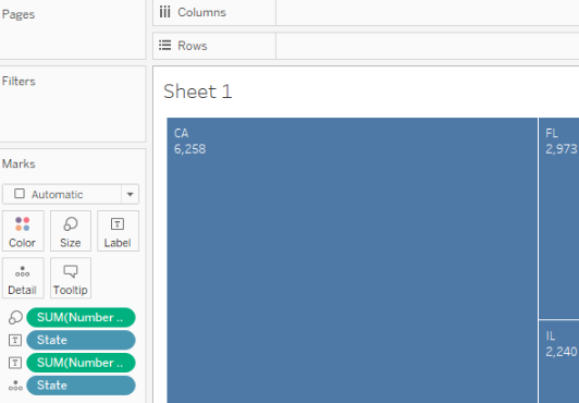
Tree maps are useful for showing relative proportions of many categories in a total. In this recipe, we will investigate the composition of our dataset to see which states are dominant, with the most records, and which are represented with fewer records.
Building a tree map
Getting ready
Connect to the Baby_names.csv data source and open a new worksheet.
How to do it...
- Drag and drop Number of Records from Measures onto Size in the Marks card.
- Drag and drop State from Dimensions onto Detail in the Marks card.
- Drag and drop State from Dimensions onto Label in the Marks card.
- Drag and drop Number of Records from Measures onto Label in the Marks card:

How it works...
The number of records is an automatically generated measure that simply represents the number of rows in the dataset. We are using it to see the relative representation of each state in our dataset.
There's more...
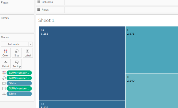
Placing a measure, in this case, Number of Records, on Size is necessary for creating a tree map. However, you can make your tree map even more intuitive by adding Number of Records to Color as well. You just need to drag and drop Number of Records from Measures onto Color in the Marks card button, and the value of Number of Records will also be reflected by a color gradient of the rectangles. You can also change and adjust the color palette by clicking on the Color button in the Marks card and choosing the settings you prefer:

See also
- For more information, look at the following Tableau Help article on building tree maps: https://onlinehelp.tableau.com/current/pro/desktop/en-us/buildexamples_treemap.html


