Using the wizard to create a box plot chart
With a simple data set, we want to see the median (or mean) values and different percentile values across the whole data set. But quite often, we want to look for a particular dimension (for example, Month), at the median and percentiles of the totals for another dimension (for example, Country). So, rather than the median for the individual values (say Sales), which could be quite small or quite large, we want to see the median for the total value by the second dimension.
We can create this manually, but this can be achieved quickly using the Box Plot Wizard.
Getting ready
Load the following script:
LOAD * INLINE [
    Country, Value, Month
    USA, 12, 2013-01-01
    USA, 14.5, 2013-01-01
    USA, 6.6, 2013-02-01
    USA, 4.5, 2013-02-01
    USA, 7.8, 2013-03-01
    USA, 9.4, 2013-03-01
    UK, 11.3, 2013-01-01
    UK, 10.1, 2013-01-01
    UK, 3.2, 2013-02-01
    UK, 5.6, 2013-02-01
    UK, 3.9, 2013-03-01
    UK, 6.9, 2013-03-01
];
How to do it…
Use the following steps to create a box plot using the wizard:

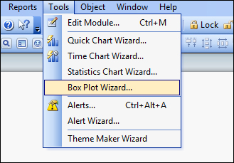
From the Tools menu, select Box Plot Wizard….
On the introductory page, click on Next:

Select the following values:
Dimension
MonthAggregator
CountryExpression
Sum(Value)Click on Next.

Select the following values:
Display Mode
Median
Include Whiskers
On or Min/Max
Use Outliers
On
Click on Finish.
How it works…
The wizard takes care of creating the expressions that will be needed for this box plot. In this case, where there is an "aggregator"; that dimension is used as part of an Aggr expression.
There are two approaches to the box plot that can be achieved from the wizard:
Median mode
The central line is defined by the median (fiftieth percentile)
Top of the box is the seventy-fifth percentile
Bottom is the seventy-fifth percentile
Upper whisker is the maximum value
Lower whisker is the minimum value
Average mode
The central line is defined by the mean value
Top of the box is the Mean + the Standard Deviation
Bottom of the box is the Mean – the Standard Deviation
Note
Min/Max Whiskers may not be valid as they could lie inside the box!

There's more…
This recipe uses the AGGR function to see the average/median values of an aggregation. However, the box plot can be used for more than averages.
See also
The Creating a box plot chart for a simple data set recipe


