Worksheet and dashboard creation
At the heart of Tableau are worksheets and dashboards. Worksheets contain individual visualizations and dashboards contain one or more worksheets. Additionally, worksheets and dashboards may be combined into stories to communicate specific insights to the end user via a presentation environment. Lastly, all worksheets, dashboards, and stories are organized in workbooks that can be accessed via Tableau Desktop, Server, or Reader. In this section, we will look at worksheet and dashboard creation with the intent of not only communicating the basics, but also providing some insight that may prove helpful to even more seasoned Tableau authors.
Worksheet creation
At the most fundamental level, a visualization in Tableau is created by placing one or more fields on one or more shelves. To state this as a pseudo-equation:
Field(s) + shelf(s) = Viz
As an example, note that the visualization created in the following screenshot is generated by placing the Sales field on the Text shelf. Although the results are quite simple - a single number - this does qualify as a view. In other words, a Field (Sales) placed on a shelf (Text) has generated a Viz:

Exercise - fundamentals of visualizations
Let's explore the basics of creating a visualization via an exercise:
- Navigate to https://public.tableau.com/profile/david.baldwin#!/ to locate and download the workbook associated with this chapter.
- In the workbook, find the tab labeled Fundamentals of Visualizations:

- Locate Region within the Dimensions portion of the Data pane:

- Drag Region to the Color shelf; that is, Region + Color shelf = what is shown in the following screenshot:

- Click on the Color shelf and then on Edit Colors... to adjust colors as desired:

- Next, move Region to the Size, Label/Text, Detail, Columns, and Rows shelves. After placing Region on each shelf, click on the shelf to access additional options.
- Lastly, choose other fields to drop on various shelves to continue exploring Tableau's behavior.
As you continue exploring Tableau's behavior by dragging and dropping different fields onto different shelves, you will notice that Tableau responds with default behaviors. These defaults, however, can be overridden, which we will explore in the following section.
Beyond default behavior
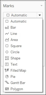
Note that in the previous exercise, the Marks card perpetually reads Automatic. This means that Tableau is providing the default view. The default view can be easily overridden by choosing a different selection from the drop-down menu:

Another type of default behavior can be observed when dragging a field onto a shelf. For example, dragging and dropping a measure onto a shelf will typically result in the aggregation Sum. To override this default behavior, right click and drag a field from the Data pane and drop it onto a shelf. Tableau will respond by opening a dialog box with the possible options. An example of this is shown in the following screenshot, where the field Region has been placed on the Rows shelf via a right-click, drag and drop action:

Exercise - overriding defaults
Let's walk through an exercise overriding the two default behaviors discussed previously:
- In the workbook associated with this chapter, navigate to the
Overriding Defaultsworksheet, right-click and drag Order Date to the Columns shelf. - Within the resulting dialog box, choose the second instance of MONTH(Order Date):

- Place Sales on the Rows shelf and Region on the Details shelf.
- Click on the dropdown in the Marks card and select Area:

Show Me
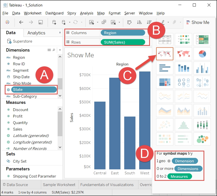
Show Me allows the Tableau author to create visualizations at the click of a button. To understand how it works, consider the following screenshot:

- A: Selected field(s) in the Data pane.
- B: Field(s) deployed in the view; that is, Pills.
- C: The recommended view.
- D: Help text communicating the requirements for creating the recommended view for any selection choice over which the cursor is placed.
- Every icon in Show Me that is not grayed out represents a visualization that can be created simply by clicking on it. For example, in the preceding screenshot, the Tableau author may choose to click on the pie chart icon to create a pie chart based on the selected and deployed fields.
Note
Show Me options are highlighted based on two criteria: the selected field(s) in the Data pane and the fields(s) deployed in the view.
- Show Me may be effectively used for the following reasons:
- Efficiency: The proficient Tableau author already knows how to create the basic visualization types. Show Me automates these basic types and thus may be used for quicker production.
- Inspiration: Determining an effective way to visualize a dataset can be challenging. Show Me can help with this challenge by allowing the Tableau author to quickly consider various options.
- Education: An inexperienced Tableau author may access Show Me to better understand how various visualizations are created. Much can be learned by reading the help text displayed at the bottom of Show Me and observing the results generated by clicking on various options.
- These three reasons communicate the strong value that Show Me provides for worksheet creation; however, there is one reason for which it should not be used: as a crutch. The Tableau author who clicks on the various options without understanding how each visualization is created is not only shortchanging the educational process, but may generate results that are not well understood and could thus lead to detrimental business decisions.
Dashboard creation
Although, as stated previously, a dashboard contains one or more worksheets, dashboards are much more than static presentations. They are an essential part of Tableau's interactivity. In this section, we will populate a dashboard with worksheets and then deploy actions for interactivity.
Exercise - building a dashboard
- In the workbook associated with this chapter, navigate to the tab entitled
Building a Dashboard. - Within the Dashboard pane located on the left-hand portion of the screen, double-click on each of the following worksheets (in the order in which they are listed) to add them to the dashboard:
- US Sales
- Customer Segment
- Scatter Plot
- Customers
- In the lower right-hand corner of the dashboard, click in the blank area below Profit Ratio to select the vertical container:
- After clicking in the blank area, you should see a blue border around the filter and the legends. This indicates that the vertical container is selected.
- As shown in the following screenshot, select the vertical container handle and drag it to the left-hand side of the Customers worksheet. Note the gray shading, which communicates where the container will be placed:

Tip
The gray shading (provided by Tableau when dragging elements such as worksheets and containers onto a dashboard) helpfully communicates where the element will be placed. Take your time and observe carefully when placing an element on a dashboard or the results may be unexpected.
- Format the dashboard as desired. The following tips may prove helpful:
- Adjust the sizes of the elements on the screen by hovering over the edges between each element and then clicking and dragging as desired.
- Note that the Sales and Profit legends in the following screenshot are floating elements. Make an element float by right-clicking on the element handle and selecting Floating. (See the previous screenshot and note that the handle is located immediately above Region, in the upper-right-hand corner).
- Create Horizontal and Vertical containers by dragging those objects from the bottom portion of the Dashboard pane.
- Drag the edges of containers to adjust the size of each worksheet.
- Display the dashboard title via Dashboard | Show Title...:

Exercise - adding interactivity to a dashboard
One of the primary benefits of Tableau is the interactivity it provides the end user. Dashboards are not simply for viewing; they are meant for interaction. In this exercise, we will add interactivity to the dashboard that was created in the previous exercise:
- Starting where the previous exercise ended, click the drop-down menu associated with the Region filter and navigate to Apply to Worksheets | All Using this Data Source:

- In order to use the map as a filter for the other worksheets on the dashboard, click the Use as Filter icon located in the top-right-hand corner of the US Sales worksheet:

- Similarly, set Customer Segment to Use as Filter.
- Navigate to the menu option Dashboard | Actions.
- Within the dialog box, navigate to Add Action | Filter and create a filter like the one shown in the following screenshot:

Having completed the preceding dashboard exercise, you should now be able to click on various objects on the dashboard and observe their interactivity. To learn advanced dashboarding techniques, be sure to check out Chapter 10, Visualization Best Practices and Dashboard Design.


