Search icon CANCEL
Subscription
0
Cart icon
Your Cart (0 item)
Close icon
You have no products in your basket yet
Save more on your purchases! discount-offer-chevron-icon
Savings automatically calculated. No voucher code required.
Arrow left icon
Explore Products
Best Sellers
New Releases
Books
Videos
Audiobooks
Learning Hub
Newsletter Hub
Free Learning
Arrow right icon
timer SALE ENDS IN
0 Days
:
00 Hours
:
00 Minutes
:
00 Seconds
Arrow up icon
GO TO TOP
gnuplot Cookbook

You're reading from   gnuplot Cookbook Visual guide to every kind of graph you can make with this plotting software with this book and ebook

Arrow left icon
Product type Paperback
Published in Feb 2012
Publisher Packt
ISBN-13 9781849517249
Length 220 pages
Edition 1st Edition
Tools
Arrow right icon
Author (1):
Arrow left icon
Lee Phillips Lee Phillips
Author Profile Icon Lee Phillips
Lee Phillips
Arrow right icon
View More author details
Toc

Table of Contents (18) Chapters Close

gnuplot Cookbook
Credits
About the Author
About the Reviewers
www.PacktPub.com
Preface
1. Plotting Curves, Boxes, Points, and more FREE CHAPTER 2. Annotating with Labels and Legends 3. Applying Colors and Styles 4. Controlling your Tics 5. Combining Multiple Plots 6. Including Plots in Documents 7. Programming gnuplot and Dealing with Data 8. The Third Dimension 9. Using and Making Graphical User Interfaces 10. Surveying Special Topics Finding Help and Information
Index

Labeling the axes


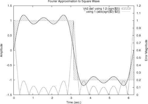
In this recipe, we add labels to our axes to explain what is being plotted and the significance of the tics and numerical scales. We also add an overall title that will appear at the top of the graph.
Getting ready

Make sure the supplied datafile ch2.dat is in your current directory. It is the result of adding the first three terms in the Fourier series approximation to the square wave. It is not important to understand what that means to follow the gnuplot recipes; we are using this file because it leads to a good graph for the purpose of illustrating annotations and labeling.

How to do it…

Following is the script that produces the previous annotated graph:

set yrange [-1.5:1.5]
set xrange [0:6.3]
set ytics nomirror
set y2tics 0,.1
set y2range [0:1.2]
set style fill pattern 5
set xlabel "Time (sec.)"
set ylabel "Amplitude"
set y2label "Error Magnitude"
set title "Fourier Approximation to Square Wave"
plot 'ch2.dat' using 1:2:(sgn($2)) with filledcurves,\'' using 1:2 with lines...
lock icon The rest of the chapter is locked
Register for a free Packt account to unlock a world of extra content!
A free Packt account unlocks extra newsletters, articles, discounted offers, and much more. Start advancing your knowledge today.
Unlock this book and the full library FREE for 7 days
Get unlimited access to 7000+ expert-authored eBooks and videos courses covering every tech area you can think of
Renews at $19.99/month. Cancel anytime
Banner background image