Search icon CANCEL
Subscription
0
Cart icon
Your Cart (0 item)
Close icon
You have no products in your basket yet
Save more on your purchases! discount-offer-chevron-icon
Savings automatically calculated. No voucher code required.
Arrow left icon
Explore Products
Best Sellers
New Releases
Books
Videos
Audiobooks
Learning Hub
Free Learning
Arrow right icon
Arrow up icon
GO TO TOP
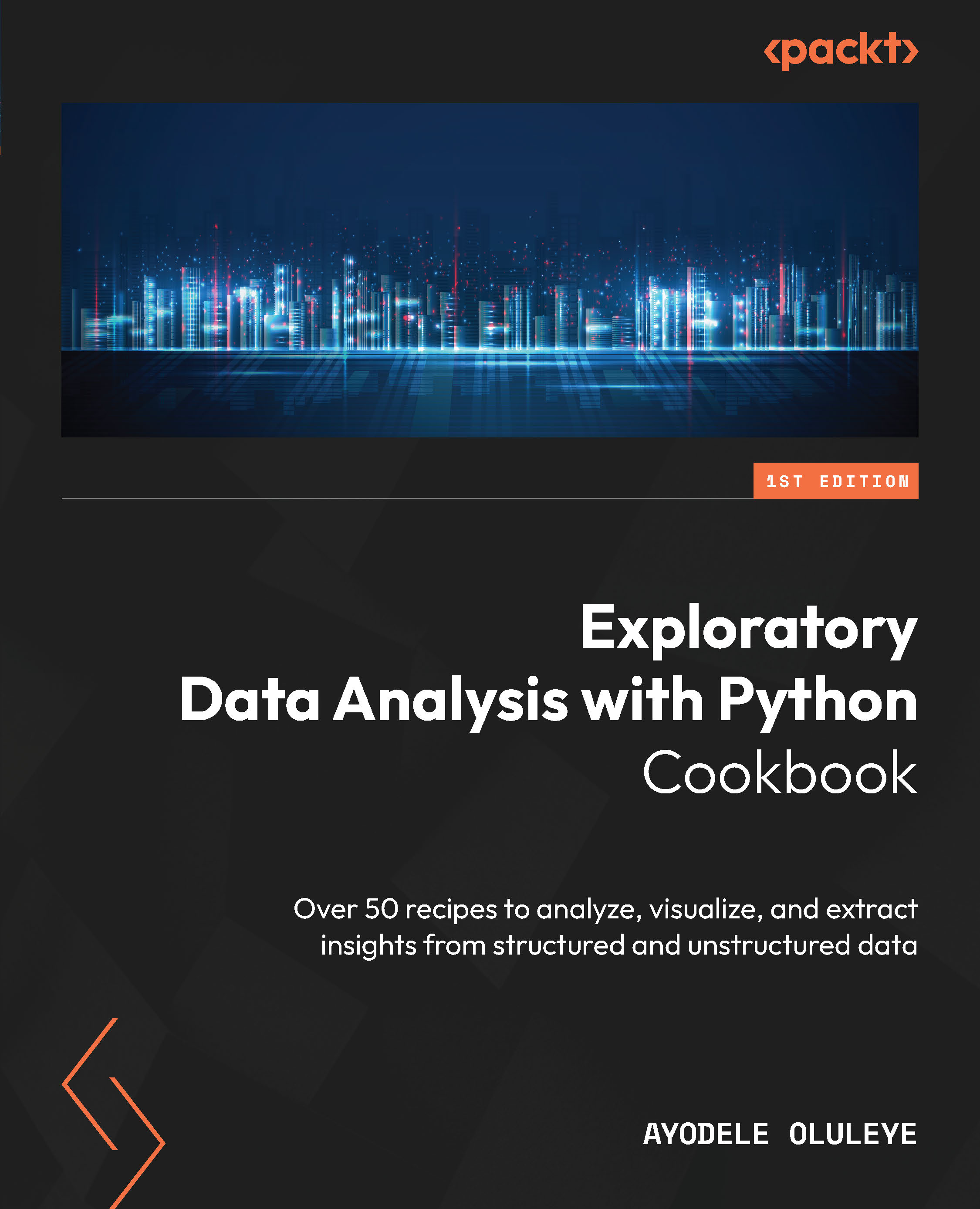
Exploratory Data Analysis with Python Cookbook

You're reading from   Exploratory Data Analysis with Python Cookbook Over 50 recipes to analyze, visualize, and extract insights from structured and unstructured data

Arrow left icon
Product type Paperback
Published in Jun 2023
Publisher Packt
ISBN-13 9781803231105
Length 382 pages
Edition 1st Edition
Languages
Arrow right icon
Author (1):
Arrow left icon
Ayodele Oluleye Ayodele Oluleye
Author Profile Icon Ayodele Oluleye
Ayodele Oluleye
Arrow right icon
View More author details
Toc

Table of Contents (13) Chapters Close

Preface 1. Chapter 1: Generating Summary Statistics 2. Chapter 2: Preparing Data for EDA FREE CHAPTER 3. Chapter 3: Visualizing Data in Python 4. Chapter 4: Performing Univariate Analysis in Python 5. Chapter 5: Performing Bivariate Analysis in Python 6. Chapter 6: Performing Multivariate Analysis in Python 7. Chapter 7: Analyzing Time Series Data in Python 8. Chapter 8: Analysing Text Data in Python 9. Chapter 9: Dealing with Outliers and Missing Values 10. Chapter 10: Performing Automated Exploratory Data Analysis in Python 11. Index 12. Other Books You May Enjoy

Performing univariate analysis using a histogram

When visualizing one numeric variable in our dataset, there are various options to consider, and the histogram is one of them. A histogram is a bar graph-like representation that provides insights into our dataset’s underlying frequency distribution, usually a continuous dataset. The x-axis of a histogram represents continuous values that have been split into bins or intervals while the y-axis represents the number or percentage of occurrences for each bin.

With the histogram, we can quickly identify outliers, data spread, skewness, and more.

In this recipe, we will explore how to create histograms in seaborn. The histplot method in seaborn can be used for this.

Getting ready

In this chapter, we will work with two datasets: the Amsterdam House Prices Data and the Palmer Archipelago (Antarctica) Penguins data, both from Kaggle.

Create a folder for this chapter and create a new Python script or Jupyter Notebook file...

lock icon The rest of the chapter is locked
Register for a free Packt account to unlock a world of extra content!
A free Packt account unlocks extra newsletters, articles, discounted offers, and much more. Start advancing your knowledge today.
Unlock this book and the full library FREE for 7 days
Get unlimited access to 7000+ expert-authored eBooks and videos courses covering every tech area you can think of
Renews at $19.99/month. Cancel anytime
Banner background image