Search icon CANCEL
Arrow left icon
Explore Products
Best Sellers
New Releases
Books
Videos
Audiobooks
Learning Hub
Conferences
Free Learning
Arrow right icon
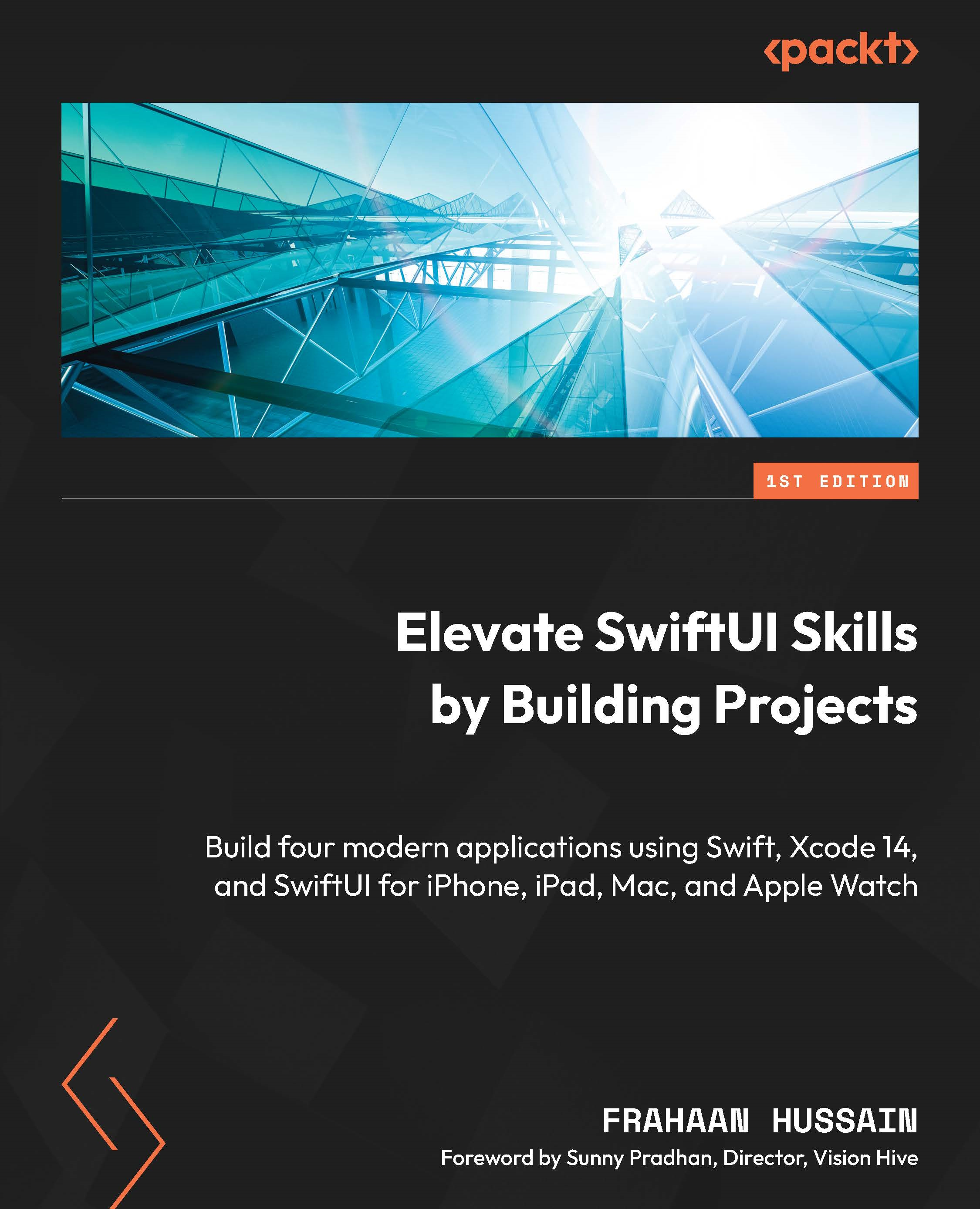
Elevate SwiftUI Skills by Building Projects

Elevate SwiftUI Skills by Building Projects: Build four modern applications using Swift, Xcode 14, and SwiftUI for iPhone, iPad, Mac, and Apple Watch

eBook
€13.99 €20.99
Paperback
€26.99
Subscription
Free Trial
Renews at €18.99p/m

What do you get with Print?

Product feature icon Instant access to your digital eBook copy whilst your Print order is Shipped
Product feature icon Colour book shipped to your preferred address
Product feature icon Download this book in EPUB and PDF formats
Product feature icon Access this title in our online reader with advanced features
Product feature icon DRM FREE - Read whenever, wherever and however you want
Product feature icon AI Assistant (beta) to help accelerate your learning
Table of content icon View table of contents Preview book icon Preview Book

Elevate SwiftUI Skills by Building Projects

iPhone Project – Tax Calculator Design

In the previous chapter, we did a recap of Swift and SwiftUI. We looked at the requirements, the coding standards used, and the basics of SwiftUI components. We will use these in the following chapters.

In this chapter, we will work on the design of our first project, a tax calculator. We will assess the requirements for designing such an application and discuss the design specifications, allowing us to get a better understanding of what is required and how it will all fit together. Then, we will start our application’s coding process to build out the UI, which will be connected together allowing the application to fully function in the next chapter. This project will teach us the foundations of SwiftUI components and how to interact with external code bases. We will discuss all of this in the following sections:

  • Technical Requirements
  • Understanding the Design Specifications
  • Building the Calculator UI

By the end of this chapter, you will have a better understanding of what is required and the design of our application. You will also have a skeleton UI that will be used as the foundation for making the calculator work in the next chapter.

In the next section, we will provide clarity on the specifications of our application’s design and look at mockups of what the app will look like.

Technical requirements

This chapter requires you to download Xcode version 14 or above from Apple’s App Store.

To install Xcode, just search for Xcode in the App Store, then select and download the latest version. Open Xcode and follow any additional installation instructions. Once Xcode has opened and launched, you’re ready to go.

Version 14 of Xcode has the following features/requirements:

  • Includes SDKs for iOS 16, iPadOS 16, macOS 12.3, tvOS 16, and watchOS 9.
  • Supports on-device debugging in iOS 11 or later, tvOS 11 or later, and watchOS 4 or later.
  • Requires a Mac running macOS Monterey 12.5 or later.

Download the sample code from the following GitHub link:

https://github.com/PacktPublishing/Elevate-SwiftUI-Skills-by-Building-Projects

In the next section, we will provide clarity on the specifications of our application’s design and look at mockups of what the app will look like.

Understanding the Design Specifications

In this section, we will look at the design specifications of our tax calculator application. This section describes the features we are going to implement in our tax calculator app. The best method for figuring out the features required is to put yourself in the user’s shoes to determine how they will use the app and break it into individual steps.

The features of our app are as follows:

  • Income entry – the ability to enter an income.
  • Salary summary – a summary of how much is going to be taxed and how much is left as income.
  • Tax breakdown – a breakdown of how much tax is paid on a given salary, that is, tax brackets.
  • Different taxes – the ability to calculate a breakdown for different types of taxes, such as income, property flipping, inheritance, and stamp duty.
  • Tax geography – the ability to calculate a breakdown for taxes in different geographies, including countries and states.
  • Combination of the previous two – the ability to calculate a breakdown for different taxes in different geographies.
  • User system – allows users to create an account to store tax calculations, see how the tax has changed over time relative to new tax laws, and so on.

Now that we have listed the ideal features we would like, next, it is important for us to determine which features are absolutely crucial. To do this, we must understand the end use of our product. For me, the purpose of creating this tax calculator is not to release it and have it serve millions of people but to be a personal project for our use. It is to demonstrate a basic implementation of SwiftUI within the context of this book. Based on that, I know that all the features are not required; actually, it would be useful if some were omitted and assigned as extra tasks for you as the developer to undertake. Based on all of this, the following are the core features we will be implementing:

  • Income entry
  • Salary summary
  • Tax breakdown

The rest of the features will be left for you to implement as an exercise once you have completed this and the next chapter. The next section will cover the acceptance criteria for our application.

Acceptance criteria

We will discuss the mandatory requirements for our application that we absolutely want to see in the end product at the end of the next chapter. If possible, we should try to make them measurable. Let’s do this right now:

  • Error detection:
    • Not a Number (NaN) values
    • Values that are equal to or less than 0
  • Provides the before- and after-tax salaries
  • A pie chart to illustrate the breakdown visually
  • Progress bars to further expand upon the breakdown
  • Navigation to allow users to switch between the pages effortlessly

Develop test cases in which the application’s acceptance criteria will be tested. Using this method allows you to see the conditions in which the application will be used by the end user and the level of functionality that needs to be attained for it to be considered successful.

Wireframe

One of the most useful tools for designing layouts is wireframing. A wireframe is an overview of how the layout will look. The following figure shows what the front page of our app would look like using a wireframe:

Figure 2.1 – Front page wireframe preview

Figure 2.1 – Front page wireframe preview

The following figure shows the wireframe of what our results page would look like:

Figure 2.2 – Results page wireframe preview

Figure 2.2 – Results page wireframe preview

In the next section, we will build the interface for our application and make sure it looks the way we designed it in the wireframes. Though we will build it the same way, there can be small differences. This will serve as the foundation for connecting it all together in the next chapter.

Building the calculator UI

We will now build the UI for the calculator app. There are two main parts to the calculator, the first being the front page, which is loaded on launch. Once the user inputs an income and hits Calculate Tax, they are taken to the results page, which is the second part. On this page, the results of the tax calculation and a breakdown of it will be displayed. Naturally, we will start off with the first part, the front page, but before even that, we will create our project. Follow these steps:

  1. Open Xcode and select Create a new Xcode project:
Figure 2.3 – Create a new Xcode project

Figure 2.3 – Create a new Xcode project

  1. Now, we will choose the template for our application. As we are creating an iPhone application, we will select iOS from the top and then select App and click Next:
Figure 2.4 – Xcode project template selection

Figure 2.4 – Xcode project template selection

  1. We will now choose the options for our project. Here, there are only two crucial things to select/set. Make sure Interface is set to SwiftUI; this will be the UI our system will use. Set Language to Swift; this is the programming language used for our application:
Figure 2.5 – Xcode project options

Figure 2.5 – Xcode project options

  1. Once you press Next, you can choose where to create your project, as seen in the following screenshot:
Figure 2.6 – Xcode project save directory

Figure 2.6 – Xcode project save directory

  1. Once you have found the location you would like to create the project in, click on Create at the bottom right. Xcode shows your project in all its glory, as seen in the following screenshot:
Figure 2.7 – New Xcode project overview

Figure 2.7 – New Xcode project overview

In the next section, we will implement the front page of our application using SwiftUI and further look at the Xcode IDE as we do so.

Front page

In this section, we will implement the front page’s UI. As a reminder, here is what it will look like:

Figure 2.8 – Front page wireframe preview

Figure 2.8 – Front page wireframe preview

There are three main elements on the front page. As a little task, see whether you can figure out what they are. Don’t worry if you don’t know the exact UI component names; we will look at these components in the following sections.

Text

A Text component is one of the simplest components offered by SwiftUI. It allows you to display a string of characters/numbers, which is very useful for headings and providing information. We will use it to provide context to the next component, which is TextField. Without the Text component, the user doesn’t know the purpose of the TextField. The following figure shows the label on the front page, telling the user what the following text input field is used for:

Figure 2.9 – Front page label

Figure 2.9 – Front page label

TextField

TextFields allow the user to input text that can consist of numbers and any character. Our TextField will be used to input a number, hence it will only accept numbers. This is a feature we will configure. Some applications put background text in the text field providing context to the purpose of the TextField; however, we have opted for a label component to provide context and do not require this. The following figure shows the TextField that the user can use to input their salary:

Figure 2.10 – Front page TextField

Figure 2.10 – Front page TextField

Button

Buttons are used when you want the user to explicitly trigger some functionality. In our case, we want the user to press the button when they are ready to calculate their tax calculation. Naturally, we as developers must error-check this to check whether the button can be pressed when the TextField is empty or if the wrong type of data has been inputted in the TextField. We will handle that with an error message instead of displaying the tax calculation. If you take a look at the following screenshot, you will see what this button looks like:

Figure 2.11 – Front page button

Figure 2.11 – Front page button

In the next section, we will add the elements we discussed previously using SwiftUI into our application.

Adding Front Page Components

In this section, we will add the components we listed previously to create our front page. Look for the ContentView file, which can be found in the Project navigator, usually on the left, as shown in the following screenshot:

Figure 2.12 – Project navigator

Figure 2.12 – Project navigator

See the following code and add it to the ContentView file:

import SwiftUI
struct ContentView: View
{
    @State private var salary: String = ""
    var body: some View
    {
        VStack
        {
            Text( "Annual Salary" )
            TextField( "Salary", text: $salary )
            Button
            { }
            label:
            { Text("Calculate Tax") }
        }
        .padding( )
    }
}
struct ContentView_Previews: PreviewProvider
{
    static var previews: some View
    {
        ContentView( )
    }
}

Using the preceding code, we are able to render a Text, TextField, and Button. This will form the basis of allowing the user to enter their salary and click the button to calculate the tax breakdown. We use a variable called salary to store TextField’s data. Let’s take a look at the end result:

Figure 2.13 – Elements without styling preview

Figure 2.13 – Elements without styling preview

As you can see, the Text component looks pretty good, but the TextField has no obvious boundaries. I put a placeholder inside it as without it, the user wouldn’t even know where the TextField is. Next, the Button has the wrong styling. Let’s fix both of these with the following updated code:

VStack
{
    Text( "Annual Salary" )
    TextField( "", text: $salary )
        .border( Color.black, width: 1 )
    Button
    { }
    label:
    { Text("Calculate Tax") }
        .buttonStyle( .borderedProminent )
}
.padding( )

Using the preceding code, we added a black border with a width of 1 to the TextField and removed the placeholder text. Next, we added a button style to the Text component of the button. We used the borderedProminent style, which is exactly what we need. All these changes result in the following:

Figure 2.14 – Updated code preview

Figure 2.14 – Updated code preview

The preview shows we are very close. For the type of data we are inserting into TextField, it doesn’t need to be this wide. Let’s make it smaller. Modify TextField as follows:

TextField( "", text: $salary )
                .frame( width: 200.0 )
                .border( Color.black, width: 1 )

We have added a width of 200 to make the TextField look better suited for what we need. Thus far, we have changed the properties of our app’s components programmatically. However, you can use the Xcode UI to tweak the properties as well. Doing this is simple: select a component in the code by hovering the mouse cursor over it and clicking the code as if you are going to edit it. Now, on the right, a pane including the Attributes Inspector will appear.

Figure 2.15 – Attributes Inspector

Figure 2.15 – Attributes Inspector

If the Attributes Inspector pane doesn’t appear, go to View | Inspectors | Attributes.

Figure 2.16 – Opening Attributes Inspector manually

Figure 2.16 – Opening Attributes Inspector manually

We are almost done; we only have three UI components. The interface is currently quite compact. Let’s spread out the components to make it look nicer. Add the following code to space out the components:

VStack
{
    Text( "Annual Salary" )
        .padding(.bottom, 75.0)
    TextField( "", text: $salary )
        .frame( width: 200.0 )
        .border( Color.black, width: 1 )
        .padding( .bottom, 75.0 )
    Button
    { }
    label:
    { Text( "Calculate Tax" ) }
        .buttonStyle( .borderedProminent )
}
.padding( )

In the preceding code, we added padding at the bottom of the Text and TextField components to evenly spread all three items out. Feel free to experiment with the padding values to get the UI to feel like what you are looking for.

Important note

If you have four components and want to add padding to the top three, the formula would be n - 1 in terms of the number of components that need padding to be evenly spread out. n is the total number of components.

Our front page now looks like the following:

Figure 2.17 – Preview with padding

Figure 2.17 – Preview with padding

Right now, if we launch our app and click the TextField, a regular keyboard appears, as shown in the following screenshot:

Figure 2.18 – Front page of the regular keyboard preview

Figure 2.18 – Front page of the regular keyboard preview

This is fine for a field that requires text input for names or addresses, but this field only requires a salary and therefore only needs numerical input. Let’s update our code to set the keyboard type to decimalPad:

TextField( "", text: $salary )
    .frame( width: 200.0 )
    .border( Color.black, width: 1 )
    .padding( .bottom, 75.0 )
    .keyboardType( .decimalPad )

Important note

There is a numberPad option but it doesn’t allow the input of decimal numbers, so we will go ahead and use the decimalPad type.

If you run the app now, it will show the following:

Figure 2.19 – Front page decimal pad preview

Figure 2.19 – Front page decimal pad preview

The keyboard type can also be changed in the Attributes Inspector. This is a great place to quickly see all the available keyboard types:

Figure 2.20 – Keyboard Type

Figure 2.20 – Keyboard Type

Important note

For more information on keyboard types, check out https://developer.apple.com/documentation/swiftui/view/keyboardtype(_:).

If the keyboard doesn’t show in the simulator, this is due to the fact your Mac already has a keyboard and the simulator decides you don’t need it displayed. But this can be overridden. Either use the + K keyboard shortcut to open and + + K to close it, or go to I/O | Keyboard | Toggle Software Keyboard:

Figure 2.21 – Toggle Software Keyboard

Figure 2.21 – Toggle Software Keyboard

Now the software keyboard in the simulator will appear. This should only need to be done once. We have now completed the design for the front page. Currently, there is no functionality, but this will be implemented in the following chapter. But we are not done with the design. We will now implement the design for the results page.

Implementing the results page

In this section, we will implement the results page’s UI. As a reminder, here is what it will look like:

Figure 2.22 – Results page wireframe preview

Figure 2.22 – Results page wireframe preview

There are three main sections on the results page. Each section is composed of two or more components. As a little task, see whether you can figure out what they are. Don’t worry if you don’t know the exact UI component names as we will take a look at them in the following sections.

Graph Summary Section

The graph summary section comprises two main components, a Text component and a pie chart. SwiftUI doesn’t provide a pie chart, so we will use an external library. We will use the ChartView library created by Andras Samu, which can be found here: https://github.com/AppPear/ChartView.

This section will visually showcase a simple breakdown of the tax calculation.

Figure 2.23 – Graph summary wireframe

Figure 2.23 – Graph summary wireframe

Text Summary Section

In the text summary section, there are four text components. The first component informs the user that the following Text component is used to display the Before Tax salary title. The second component tells the user that the following text component is used to display the After Tax salary title. This does not include a breakdown of how the tax is split. This will come in the next section:

Figure 2.24 – Text summary wireframe

Figure 2.24 – Text summary wireframe

Individual breakdown section

The individual breakdown section displays how the tax and salary are broken down. There are six components, three Text components and three ProgressView components. Each is paired together to make three subsections, Base Salary, Tax, and National Insurance. This design is simple but extendible. Once it is created, I give you the task of adding further breakdowns of the tax, such as student loans and pension:

Figure 2.25 – Individual breakdown wireframe

Figure 2.25 – Individual breakdown wireframe

In the next section, we will add the elements that make up the results page before wrapping up this chapter.

Adding results page components

In this section, we will add the previously discussed components to our results page. However, firstly we must integrate the ChartView framework by Andras Samu. Follow these steps:

  1. Go to File | Add Packages…:
Figure 2.26 – Xcode Add Packages… option

Figure 2.26 – Xcode Add Packages… option

  1. Search for the ChartView framework using the following URL: https://github.com/AppPear/ChartView.
  2. Select Exact Version from the Dependency Rule dropdown and set the text input to 2.0.0-beta.2, or whatever the latest version is for you. Then, click Add Package at the bottom right. It is grayed out in mine as I have already added it:
Figure 2.27 – Search for the ChartView package

Figure 2.27 – Search for the ChartView package

  1. Clicking on Add Package will add the package to the project successfully.
  2. We will now create a new SwiftUI View for the results page. Right-click the calculator folder inside of your Project Navigator pane and select New File…:
Figure 2.28 – New File…

Figure 2.28 – New File…

  1. Next, we will select the type of file we want to add, which for us is a SwiftUI View (selecting this provides a SwiftUI template, which saves us time and effort retyping the SwiftUI file structure every time), under the User Interface section:
Figure 2.29 – SwiftUI View selection

Figure 2.29 – SwiftUI View selection

  1. Finally, we must rename our SwiftUI View. Let’s name it ResultsView and press Create:
Figure 2.30 – View naming

Figure 2.30 – View naming

  1. Open the ResultsView file and import the SwiftUICharts framework by adding the following code to the top of the file:
    import SwiftUICharts
  2. Next, we need to create the chart itself. Doing so is very simple, thanks to the ChartView library. First, add the data the chart will be using. For now, we will add some dummy hardcoded data for testing:
    struct ResultsView: View
    {
        var taxBreakdown: [Double] = [5, 10, 15]
        var body: some View
        {
        }
    }

    The values in the array will represent the base salary, tax, and national insurance.

  3. Next, we will implement our pie chart using ChartView:
    struct ResultsView: View
    {
        var taxBreakdown: [Double] = [5, 10, 15]
        var body: some View
        {
            PieChart( )
                .data( taxBreakdown )
                .chartStyle( ChartStyle( backgroundColor: .white,
                                         foregroundColor: ColorGradient( .blue, .purple) ) )
        }
    }

    The preceding code will result in the following:

Figure 2.31 – Pie chart added

Figure 2.31 – Pie chart added

  1. To view the ResultsView, you will need to use the Live Preview Window. By default, it should appear. If it doesn’t, use the following keyboard shortcut: + + Return. Now, Xcode will look like the following screenshot:
Figure 2.32 – Live preview window location

Figure 2.32 – Live preview window location

  1. Right now, the pie chart goes up to the edges. Let’s put the pie chart inside a VStack with padding. Edit the code as follows:
    struct ResultsView: View
    {
        var taxBreakdown: [Double] = [5, 10, 15]
        var body: some View
        {
            VStack
            {
                PieChart( )
                    .data( taxBreakdown )
                    .chartStyle( ChartStyle( backgroundColor: .white,
                                             foregroundColor: ColorGradient( .blue, .purple ) ) )
            }.padding( )
        }
    }

    The changes in the preceding code will now make the chart look like the following:

Figure 2.33 – Pie chart with padding

Figure 2.33 – Pie chart with padding

  1. Let’s add a Text component that says Summary above the pie chart. But as it will be a header, we will make it bold and set the font size to 36. Add the following code to the body:
    var body: some View
    {
        VStack
        {
            Text( "Summary" )
                .font( .system( size: 36 ) )
                .fontWeight( .bold )
            PieChart( )
                .data( taxBreakdown )
                .chartStyle( ChartStyle( backgroundColor: .white,
                                         foregroundColor: ColorGradient(
    .blue, .purple ) ) )
        }.padding( )
    }

    The following output shows the new summary text above the pie chart that we added previously.

Figure 2.34 – Summary header

Figure 2.34 – Summary header

  1. Below the pie chart, we will add four more text components, for Before Tax and After Tax: one for the heading of each subsection and one for the actual figure. For now, we will hardcode the values. Update the code as follows:
    var body: some View
    {
        VStack
        {
            Text( "Summary" )
                .font( .system( size: 36 ) )
                .fontWeight( .bold )
            PieChart( )
                .data( taxBreakdown )
                .chartStyle( ChartStyle( backgroundColor: .white,
                                         foregroundColor: ColorGradient(
    .blue, .purple ) ) )
            Text( "Before Tax" )
                .font( .system( size: 32 ) )
            Text( "£100,000.00" )
                .font( .system( size: 32 ) )
            Text( "After Tax" )
                .font( .system( size: 32 ) )
            Text( "£65,000.00" )
                .font( .system( size: 32 ) )
        }.padding( )
    }

    The preceding code will display the following:

Figure 2.35 – Before Tax and After Tax text

Figure 2.35 – Before Tax and After Tax text

  1. Right now, the text components on the bottom of the page are crammed together. Let’s add padding to the top and bottom of each text component to spread them out. You can obviously use the Attributes Inspector to do this, but we will do it programmatically:
    Text( "Before Tax" )
        .font( .system( size: 32 ) )
        .padding(.vertical)
    Text( "£100,000.00" )
        .font( .system( size: 32 ) )
        .padding(.vertical)
    Text( "After Tax" )
        .font( .system( size: 32 ) )
        .padding(.vertical)
    Text( "£65,000.00" )
        .font( .system( size: 32 ) )
        .padding(.vertical)

    After adding the padding in the preceding code, we will have a results page that looks like this:

Figure 2.36 – Results after padding

Figure 2.36 – Results after padding

  1. Next, we need to add the progress bars, which will represent the salary, tax, and national insurance. We will use the ProgressView component combined with a Text component to display the tax breakdown. After the previously added Text components, add the following code:
    Text( "Post Tax Salary" )
    ProgressView( "", value: 20, total: 100 )
    Text( "Tax" )
    ProgressView( "", value: 20, total: 100 )

    The preceding code adds the two ProgressView and Text component pairs, which shows the post-tax salary and tax. This will result in the following:

Figure 2.37 – Breakdown components added

Figure 2.37 – Breakdown components added

  1. You have probably noticed that we only added two of the three ProgressView components. The reason for this is to showcase an error that occurs. So, now add the following code after the previously added code:
    Text( "National Insurance" )
    ProgressView( "", value: 20, total: 100 )

    This will result in the following error: Extra arguments at positions #11, #12 in call. This is because you cannot have more than 10 components displayed. But there is space, so how do we get around this? The solution is simple. The limit of 10 is for components, not components within components. Put basically, we can group multiple components using the Group component, which will make the view detect it as one.

  2. We will group the three ProgressView and Text components as follows:
    Group
    {
        Text( "Post Tax Salary" )
        ProgressView( "", value: 20, total: 100 )
        Text( "Tax" )
        ProgressView( "", value: 20, total: 100 )
        Text( "National Insurance" )
        ProgressView( "", value: 20, total: 100 )
    }

    This will solve the annoying 10-limit error and result in the following:

Figure 2.38 – Components grouped

Figure 2.38 – Components grouped

Here is a look at the whole code now that we are finished with this section:

import SwiftUI
import SwiftUICharts
struct ResultsView: View
{
    var taxBreakdown: [Double] = [5, 10, 15]
    var body: some View
    {
        VStack
        {
            Text( "Summary" )
                .font( .system( size: 36 ) )
                .fontWeight( .bold )
            PieChart( )
                .data( taxBreakdown )
                .chartStyle( ChartStyle( backgroundColor: .white,
                                         foregroundColor: ColorGradient( .blue, .purple ) ) )
            Text( "Before Tax" )
                .font( .system( size: 32 ) )
                .padding(.vertical)
            Text( "£100,000.00" )
                .font( .system( size: 32 ) )
                .padding(.vertical)
            Text( "After Tax" )
                .font( .system( size: 32 ) )
                .padding(.vertical)
            Text( "£65,000.00" )
                .font( .system( size: 32 ) )
                .padding(.vertical)
            Group
            {
                Text( "Post Tax Salary" )
                ProgressView( "", value: 20, total: 100 )
                Text( "Tax" )
                ProgressView( "", value: 20, total: 100 )
                Text( "National Insurance" )
                ProgressView( "", value: 20, total: 100 )
            }
        }.padding( )
    }
}
struct ResultsView_Previews: PreviewProvider
{
    static var previews: some View
    {
        ResultsView( )
    }
}

We have covered a lot in this vast section. We started off by adding an external framework, which we saw is very easy to integrate and extremely powerful. The framework allowed us to easily implement a pie chart. This is very useful as not all basic features are provided by Apple in Swift and SwiftUI, so being able to add external code bases makes the development process less painful. After that, we implemented the pie chart, text summaries, and progress views to further illustrate the tax breakdown.

Summary

In this chapter, we covered the design of our tax calculator application. We looked at wireframes and broke down each element into SwiftUI components. We then implemented the SwiftUI components to match the design from the wireframes. We also took a look at the requirements for building this application, and the design specifications, which looked at the features a tax calculator app can have. Then, we simplified it to the core features our app will provide. We further advanced in the design specifications with acceptance criteria for what we would like our app to do. We also looked at how external libraries can be integrated to provide additional functionality.

In the next chapter, we’ll take a look at implementing the tax calculation backend functionality and tying the two views together.

Left arrow icon Right arrow icon
Download code icon Download Code

Key benefits

  • Learn how to use the latest SwiftUI features such as UIkit
  • Develop UIs for all categories of Apple devices, from the Apple Watch to the iPad
  • Enhance your applications further with advanced SwiftUI features
  • Purchase of the print or Kindle book includes a free PDF eBook

Description

Elevate SwiftUI Skills by Building Projects helps you harness the cutting-edge potential of SwiftUI and its innovative and user-friendly approach to crafting user interfaces for Apple platforms with the power of Swift. This book will enhance your UI programming skills with SwiftUI through a project-based methodology, guiding you to create four real-world projects. Starting with a quick recap of Swift and SwiftUI, you’ll gradually develop projects tailored for iPhone, iPad, macOS, and watchOS using Swift and Xcode. You’ll experience SwiftUI’s versatility in action as you build a tax calculator for iPhone and a photo gallery for the iPad, which uses a larger display to enhance the viewing experience. You’ll also create an app store for Mac and, finally, get to grips with the power of SwiftUI for smaller devices such as the Apple Watch by designing a Fitness Companion app. By the end of this book, you'll have built fully functional projects across multiple platforms and gained the expertise needed to excel as a professional SwiftUI developer.

Who is this book for?

If you are a mobile developer already well-versed in Apple development using Swift, this book will further advance your skills in UI design. Basic Swift, Xcode, and Apple OS knowledge will help you get the most out of this book.

What you will learn

  • Start with a quick recap of UI essentials in Swift and Swift basics
  • Discover how UI elements are integrated into apps
  • Understand how SwiftUI builds on top of the pre-existing Swift programming language
  • Familiarize yourself with the latest Xcode version to create SwiftUI apps
  • Develop a wide variety of applications that can be used as cornerstones
  • Design and code for watchOS, iOS, macOS, and iPadOS in SwiftUI through explicit projects
Estimated delivery fee Deliver to Portugal

Premium delivery 7 - 10 business days

€17.95
(Includes tracking information)

Product Details

Country selected
Publication date, Length, Edition, Language, ISBN-13
Publication date : Sep 08, 2023
Length: 268 pages
Edition : 1st
Language : English
ISBN-13 : 9781803242071
Vendor :
Apple
Category :
Languages :
Tools :

What do you get with Print?

Product feature icon Instant access to your digital eBook copy whilst your Print order is Shipped
Product feature icon Colour book shipped to your preferred address
Product feature icon Download this book in EPUB and PDF formats
Product feature icon Access this title in our online reader with advanced features
Product feature icon DRM FREE - Read whenever, wherever and however you want
Product feature icon AI Assistant (beta) to help accelerate your learning
Estimated delivery fee Deliver to Portugal

Premium delivery 7 - 10 business days

€17.95
(Includes tracking information)

Product Details

Publication date : Sep 08, 2023
Length: 268 pages
Edition : 1st
Language : English
ISBN-13 : 9781803242071
Vendor :
Apple
Category :
Languages :
Tools :

Packt Subscriptions

See our plans and pricing
Modal Close icon
€18.99 billed monthly
Feature tick icon Unlimited access to Packt's library of 7,000+ practical books and videos
Feature tick icon Constantly refreshed with 50+ new titles a month
Feature tick icon Exclusive Early access to books as they're written
Feature tick icon Solve problems while you work with advanced search and reference features
Feature tick icon Offline reading on the mobile app
Feature tick icon Simple pricing, no contract
€189.99 billed annually
Feature tick icon Unlimited access to Packt's library of 7,000+ practical books and videos
Feature tick icon Constantly refreshed with 50+ new titles a month
Feature tick icon Exclusive Early access to books as they're written
Feature tick icon Solve problems while you work with advanced search and reference features
Feature tick icon Offline reading on the mobile app
Feature tick icon Choose a DRM-free eBook or Video every month to keep
Feature tick icon PLUS own as many other DRM-free eBooks or Videos as you like for just €5 each
Feature tick icon Exclusive print discounts
€264.99 billed in 18 months
Feature tick icon Unlimited access to Packt's library of 7,000+ practical books and videos
Feature tick icon Constantly refreshed with 50+ new titles a month
Feature tick icon Exclusive Early access to books as they're written
Feature tick icon Solve problems while you work with advanced search and reference features
Feature tick icon Offline reading on the mobile app
Feature tick icon Choose a DRM-free eBook or Video every month to keep
Feature tick icon PLUS own as many other DRM-free eBooks or Videos as you like for just €5 each
Feature tick icon Exclusive print discounts

Frequently bought together


Stars icon
Total 94.97
Elevate SwiftUI Skills by Building Projects
€26.99
SwiftUI Cookbook
€33.99
iOS 17 Programming for Beginners
€33.99
Total 94.97 Stars icon

Table of Contents

11 Chapters
Chapter 1: Swift and SwiftUI Recap Chevron down icon Chevron up icon
Chapter 2: iPhone Project – Tax Calculator Design Chevron down icon Chevron up icon
Chapter 3: iPhone Project – Tax Calculator Functionality Chevron down icon Chevron up icon
Chapter 4: iPad Project – Photo Gallery Overview Chevron down icon Chevron up icon
Chapter 5: iPad Project – Photo Gallery Enhanced View Chevron down icon Chevron up icon
Chapter 6: Mac Project – App Store Bars Chevron down icon Chevron up icon
Chapter 7: Mac Project – App Store Body Chevron down icon Chevron up icon
Chapter 8: Watch Project – Fitness Companion Design Chevron down icon Chevron up icon
Chapter 9: Watch Project – Fitness Companion UI Chevron down icon Chevron up icon
Index Chevron down icon Chevron up icon
Other Books You May Enjoy Chevron down icon Chevron up icon

Customer reviews

Top Reviews
Rating distribution
Full star icon Full star icon Full star icon Full star icon Full star icon 5
(15 Ratings)
5 star 100%
4 star 0%
3 star 0%
2 star 0%
1 star 0%
Filter icon Filter
Top Reviews

Filter reviews by


Bruce Nov 23, 2023
Full star icon Full star icon Full star icon Full star icon Full star icon 5
I been a mobile app developer for awhile now and have industrial experience. This book was sent to me to go over and review. I went over the book and examined its contents. The book looks like it is well put together with about two projects for a few different Apple products, iPhone, iPad, Apple Watch, and Mac.It has a simplify project then an advance project which is the has the same theme. For example on iPhone there is kind of an income calculator app with graphs. There is some advance SwiftUI concepts. There is small section dedicated on a recap.It's a good resource in building a few iOS projects using SwiftUI to get yourself some more familiarity with it to help you build apps.
Amazon Verified review Amazon
John Stanley Sep 10, 2023
Full star icon Full star icon Full star icon Full star icon Full star icon 5
Great resource for using Swift UI for iOS apps with in-depth step by step projects & tutorials.
Amazon Verified review Amazon
Elma Sep 10, 2023
Full star icon Full star icon Full star icon Full star icon Full star icon 5
I came across this book as I was ready to make the transition to SwiftUI. This book takes you from the basics to advanced topics, making it suitable for both beginners and experienced developers.The authors writing style makes complex concepts easy to grasp, and the step-by-step tutorials are accompanied by practical examples and exercises that reinforce your learning.If you’re serious about mastering SwiftUI, this book is a must-have.
Amazon Verified review Amazon
Kit Kat Oct 06, 2023
Full star icon Full star icon Full star icon Full star icon Full star icon 5
This is a comprehensive guid that has something for both beginner and advance mobile developers. You get to work on four real world projects that you can use as the basis for other projects that you might have in mind. Along the way you will begin to master SwiftUI.If you don't have a full suite of apps in your portfolio this book will give you four examples you can use or build upon to help improve your understanding of building complex SwiftUI apps and help you get your next job.
Amazon Verified review Amazon
Mark Kuharich Sep 08, 2023
Full star icon Full star icon Full star icon Full star icon Full star icon 5
As a practicing Swift developer within the industry, I was extremely excited to have the opportunity to read this book.Frahaan has crafted and delivered a labor of love. His GitHub repositories and supporting instructions are instructive for both beginner and advanced Swift programmers. They are accurate and thorough.I appreciated his informative retelling of the history of Swift and SwiftUI's origins. And, somehow, he paid homage to Chris Lattner's work with LLVM without getting bogged down into the details.A beginner or advanced Swift developer can take this book and use it as a template to provide Swift and SwiftUI applications of their own.I have only two minor quibbles with this book: First as a developer from the United States, I was able to utilize Frahaan's tables and algorithms to deliver a tax calculator customized for the United States. Some states lack an income tax. Also; maybe in the future, Frahaan could add one more project template: one for Apple's new Vision Pro.All in all, this is an amazing book and a tour de force.
Amazon Verified review Amazon
Get free access to Packt library with over 7500+ books and video courses for 7 days!
Start Free Trial

FAQs

What is the delivery time and cost of print book? Chevron down icon Chevron up icon

Shipping Details

USA:

'

Economy: Delivery to most addresses in the US within 10-15 business days

Premium: Trackable Delivery to most addresses in the US within 3-8 business days

UK:

Economy: Delivery to most addresses in the U.K. within 7-9 business days.
Shipments are not trackable

Premium: Trackable delivery to most addresses in the U.K. within 3-4 business days!
Add one extra business day for deliveries to Northern Ireland and Scottish Highlands and islands

EU:

Premium: Trackable delivery to most EU destinations within 4-9 business days.

Australia:

Economy: Can deliver to P. O. Boxes and private residences.
Trackable service with delivery to addresses in Australia only.
Delivery time ranges from 7-9 business days for VIC and 8-10 business days for Interstate metro
Delivery time is up to 15 business days for remote areas of WA, NT & QLD.

Premium: Delivery to addresses in Australia only
Trackable delivery to most P. O. Boxes and private residences in Australia within 4-5 days based on the distance to a destination following dispatch.

India:

Premium: Delivery to most Indian addresses within 5-6 business days

Rest of the World:

Premium: Countries in the American continent: Trackable delivery to most countries within 4-7 business days

Asia:

Premium: Delivery to most Asian addresses within 5-9 business days

Disclaimer:
All orders received before 5 PM U.K time would start printing from the next business day. So the estimated delivery times start from the next day as well. Orders received after 5 PM U.K time (in our internal systems) on a business day or anytime on the weekend will begin printing the second to next business day. For example, an order placed at 11 AM today will begin printing tomorrow, whereas an order placed at 9 PM tonight will begin printing the day after tomorrow.


Unfortunately, due to several restrictions, we are unable to ship to the following countries:

  1. Afghanistan
  2. American Samoa
  3. Belarus
  4. Brunei Darussalam
  5. Central African Republic
  6. The Democratic Republic of Congo
  7. Eritrea
  8. Guinea-bissau
  9. Iran
  10. Lebanon
  11. Libiya Arab Jamahriya
  12. Somalia
  13. Sudan
  14. Russian Federation
  15. Syrian Arab Republic
  16. Ukraine
  17. Venezuela
What is custom duty/charge? Chevron down icon Chevron up icon

Customs duty are charges levied on goods when they cross international borders. It is a tax that is imposed on imported goods. These duties are charged by special authorities and bodies created by local governments and are meant to protect local industries, economies, and businesses.

Do I have to pay customs charges for the print book order? Chevron down icon Chevron up icon

The orders shipped to the countries that are listed under EU27 will not bear custom charges. They are paid by Packt as part of the order.

List of EU27 countries: www.gov.uk/eu-eea:

A custom duty or localized taxes may be applicable on the shipment and would be charged by the recipient country outside of the EU27 which should be paid by the customer and these duties are not included in the shipping charges been charged on the order.

How do I know my custom duty charges? Chevron down icon Chevron up icon

The amount of duty payable varies greatly depending on the imported goods, the country of origin and several other factors like the total invoice amount or dimensions like weight, and other such criteria applicable in your country.

For example:

  • If you live in Mexico, and the declared value of your ordered items is over $ 50, for you to receive a package, you will have to pay additional import tax of 19% which will be $ 9.50 to the courier service.
  • Whereas if you live in Turkey, and the declared value of your ordered items is over € 22, for you to receive a package, you will have to pay additional import tax of 18% which will be € 3.96 to the courier service.
How can I cancel my order? Chevron down icon Chevron up icon

Cancellation Policy for Published Printed Books:

You can cancel any order within 1 hour of placing the order. Simply contact customercare@packt.com with your order details or payment transaction id. If your order has already started the shipment process, we will do our best to stop it. However, if it is already on the way to you then when you receive it, you can contact us at customercare@packt.com using the returns and refund process.

Please understand that Packt Publishing cannot provide refunds or cancel any order except for the cases described in our Return Policy (i.e. Packt Publishing agrees to replace your printed book because it arrives damaged or material defect in book), Packt Publishing will not accept returns.

What is your returns and refunds policy? Chevron down icon Chevron up icon

Return Policy:

We want you to be happy with your purchase from Packtpub.com. We will not hassle you with returning print books to us. If the print book you receive from us is incorrect, damaged, doesn't work or is unacceptably late, please contact Customer Relations Team on customercare@packt.com with the order number and issue details as explained below:

  1. If you ordered (eBook, Video or Print Book) incorrectly or accidentally, please contact Customer Relations Team on customercare@packt.com within one hour of placing the order and we will replace/refund you the item cost.
  2. Sadly, if your eBook or Video file is faulty or a fault occurs during the eBook or Video being made available to you, i.e. during download then you should contact Customer Relations Team within 14 days of purchase on customercare@packt.com who will be able to resolve this issue for you.
  3. You will have a choice of replacement or refund of the problem items.(damaged, defective or incorrect)
  4. Once Customer Care Team confirms that you will be refunded, you should receive the refund within 10 to 12 working days.
  5. If you are only requesting a refund of one book from a multiple order, then we will refund you the appropriate single item.
  6. Where the items were shipped under a free shipping offer, there will be no shipping costs to refund.

On the off chance your printed book arrives damaged, with book material defect, contact our Customer Relation Team on customercare@packt.com within 14 days of receipt of the book with appropriate evidence of damage and we will work with you to secure a replacement copy, if necessary. Please note that each printed book you order from us is individually made by Packt's professional book-printing partner which is on a print-on-demand basis.

What tax is charged? Chevron down icon Chevron up icon

Currently, no tax is charged on the purchase of any print book (subject to change based on the laws and regulations). A localized VAT fee is charged only to our European and UK customers on eBooks, Video and subscriptions that they buy. GST is charged to Indian customers for eBooks and video purchases.

What payment methods can I use? Chevron down icon Chevron up icon

You can pay with the following card types:

  1. Visa Debit
  2. Visa Credit
  3. MasterCard
  4. PayPal
What is the delivery time and cost of print books? Chevron down icon Chevron up icon

Shipping Details

USA:

'

Economy: Delivery to most addresses in the US within 10-15 business days

Premium: Trackable Delivery to most addresses in the US within 3-8 business days

UK:

Economy: Delivery to most addresses in the U.K. within 7-9 business days.
Shipments are not trackable

Premium: Trackable delivery to most addresses in the U.K. within 3-4 business days!
Add one extra business day for deliveries to Northern Ireland and Scottish Highlands and islands

EU:

Premium: Trackable delivery to most EU destinations within 4-9 business days.

Australia:

Economy: Can deliver to P. O. Boxes and private residences.
Trackable service with delivery to addresses in Australia only.
Delivery time ranges from 7-9 business days for VIC and 8-10 business days for Interstate metro
Delivery time is up to 15 business days for remote areas of WA, NT & QLD.

Premium: Delivery to addresses in Australia only
Trackable delivery to most P. O. Boxes and private residences in Australia within 4-5 days based on the distance to a destination following dispatch.

India:

Premium: Delivery to most Indian addresses within 5-6 business days

Rest of the World:

Premium: Countries in the American continent: Trackable delivery to most countries within 4-7 business days

Asia:

Premium: Delivery to most Asian addresses within 5-9 business days

Disclaimer:
All orders received before 5 PM U.K time would start printing from the next business day. So the estimated delivery times start from the next day as well. Orders received after 5 PM U.K time (in our internal systems) on a business day or anytime on the weekend will begin printing the second to next business day. For example, an order placed at 11 AM today will begin printing tomorrow, whereas an order placed at 9 PM tonight will begin printing the day after tomorrow.


Unfortunately, due to several restrictions, we are unable to ship to the following countries:

  1. Afghanistan
  2. American Samoa
  3. Belarus
  4. Brunei Darussalam
  5. Central African Republic
  6. The Democratic Republic of Congo
  7. Eritrea
  8. Guinea-bissau
  9. Iran
  10. Lebanon
  11. Libiya Arab Jamahriya
  12. Somalia
  13. Sudan
  14. Russian Federation
  15. Syrian Arab Republic
  16. Ukraine
  17. Venezuela