Follow these steps to get started:
- Let's start by doing some imports:
import os
from IPython.display import Image
import rpy2.robjects as robjects
import pandas as pd
from rpy2.robjects import pandas2ri
from rpy2.robjects import default_converter
from rpy2.robjects.conversion import localconverter
We will be using pandas on the Python side. R DataFrames map very well to pandas.
- We will read the data from our file using R's read.delim function:
read_delim = robjects.r('read.delim')
seq_data = read_delim('sequence.index', header=True, stringsAsFactors=False)
#In R:
# seq.data <- read.delim('sequence.index', header=TRUE, stringsAsFactors=FALSE)
The first thing that we do after importing is access the read.delim R function, which allows you to read files. The R language specification allows you to put dots in the names of objects. Therefore, we have to convert a function name to read_delim. Then, we call the function name proper; note the following highly declarative features. Firstly, most atomic objects, such as strings, can be passed without conversion. Secondly, argument names are converted seamlessly (barring the dot issue). Finally, objects are available in the Python namespace (but objects are actually not available in the R namespace; more about this later).
For reference, I have included the corresponding R code. I hope it's clear that it's an easy conversion. The seq_data object is a DataFrame. If you know basic R or pandas, you are probably aware of this type of data structure; if not, then this is essentially a table: a sequence of rows where each column has the same type.
- Let's perform a basic inspection of this DataFrame, as follows:
print('This dataframe has %d columns and %d rows' %
(seq_data.ncol, seq_data.nrow))
print(seq_data.colnames)
#In R:
# print(colnames(seq.data))
# print(nrow(seq.data))
# print(ncol(seq.data))
Again, note the code similarity.
- You can even mix styles using the following code:
my_cols = robjects.r.ncol(seq_data)
print(my_cols)
You can call R functions directly; in this case, we will call ncol if they do not have dots in their name; however, be careful. This will display an output, not 26 (the number of columns), but [26], which is a vector that's composed of the element 26. This is because, by default, most operations in R return vectors. If you want the number of columns, you have to perform my_cols[0]. Also, talking about pitfalls, note that R array indexing starts with 1, whereas Python starts with 0.
- Now, we need to perform some data cleanup. For example, some columns should be interpreted as numbers, but they are read as strings:
as_integer = robjects.r('as.integer')
match = robjects.r.match

my_col = match('READ_COUNT', seq_data.colnames)[0] # vector returned
print('Type of read count before as.integer: %s' % seq_data[my_col - 1].rclass[0])
seq_data[my_col - 1] = as_integer(seq_data[my_col - 1])
print('Type of read count after as.integer: %s' % seq_data[my_col - 1].rclass[0])
The match function is somewhat similar to the index method in Python lists. As expected, it returns a vector so that we can extract the 0 element. It's also 1-indexed, so we subtract 1 when working on Python. The as_integer function will convert a column into integers. The first print will show strings (values surrounded by " ), whereas the second print will show numbers.
- We will need to massage this table a bit more; details on this can be found on the Notebook, but here, we will finalize getting the DataFrame to R (remember that while it's an R object, it's actually visible on the Python namespace):
import rpy2.robjects.lib.ggplot2 as ggplot2
This will create a variable in the R namespace called seq.data, with the content of the DataFrame from the Python namespace. Note that after this operation, both objects will be independent (if you change one, it will not be reflected on the other).
While you can perform plotting on Python, R has default built-in plotting functionalities (which we will ignore here). It also has a library called ggplot2 that implements the Grammar of Graphics (a declarative language to specify statistical charts).
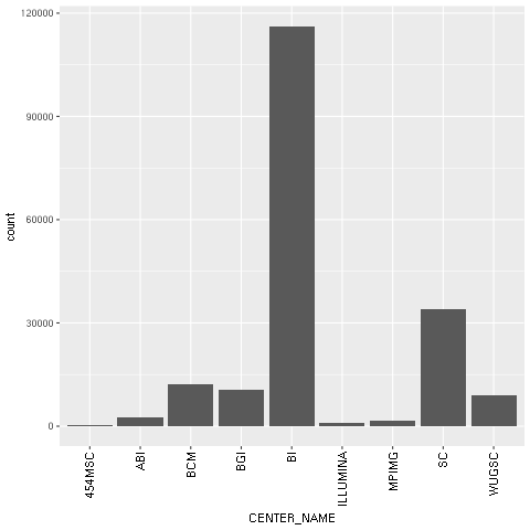
- With regard to our concrete example based on the Human 1,000 Genomes Project, we will first plot a histogram with the distribution of center names, where all sequencing lanes were generated. We will use ggplot for this:
from rpy2.robjects.functions import SignatureTranslatedFunction

ggplot2.theme = SignatureTranslatedFunction(ggplot2.theme, init_prm_translate = {'axis_text_x': 'axis.text.x'})

bar = ggplot2.ggplot(seq_data) + ggplot2.geom_bar() + ggplot2.aes_string(x='CENTER_NAME') + ggplot2.theme(axis_text_x=ggplot2.element_text(angle=90, hjust=1))
robjects.r.png('out.png', type='cairo-png')
bar.plot()
dev_off = robjects.r('dev.off')
dev_off()
The second line is a bit uninteresting, but is an important piece of boilerplate code. One of the R functions that we will call has a parameter with a dot in its name. As Python function calls cannot have this, we must map the axis.text.x R parameter name to the axis_text_r Python name in the function theme. We monkey patch it (that is, we replace ggplot2.theme with a patched version of itself).
We then draw the chart itself. Note the declarative nature of ggplot2 as we add features to the chart. First, we specify the seq_data DataFrame, then we use a histogram bar plot called geom_bar, followed by annotating the x variable (CENTER_NAME). Finally, we rotate the text of the x axis by changing the theme. We finalize this by closing the R printing device.
- We can now print the image on the Jupyter Notebook:
Image(filename='out.png')
The following chart is produced:

Figure 1: The ggplot2-generated histogram of center names, which is responsible for sequencing the lanes of the human genomic data from the 1,000 Genomes Project
- As a final example, we will now do a scatter plot of read and base counts for all the sequenced lanes for Yoruban (YRI) and Utah residents with ancestry from Northern and Western Europe (CEU), using the Human 1,000 Genomes Project (the summary of the data of this project, which we will use thoroughly, can be seen in the Working with modern sequence formats recipe in Chapter 2, Next-Generation Sequencing). We are also interested in the differences between the different types of sequencing (exome, high, and low coverage). First, we generate a DataFrame only just YRI and CEU lanes, and limit the maximum base and read counts:
robjects.r('yri_ceu <- seq.data[seq.data$POPULATION %in% c("YRI", "CEU") & seq.data$BASE_COUNT < 2E9 & seq.data$READ_COUNT < 3E7, ]')
yri_ceu = robjects.r('yri_ceu')
- We are now ready to plot:
scatter = ggplot2.ggplot(yri_ceu) + ggplot2.aes_string(x='BASE_COUNT', y='READ_COUNT', shape='factor(POPULATION)', col='factor(ANALYSIS_GROUP)') + ggplot2.geom_point()
robjects.r.png('out.png')
scatter.plot()
Hopefully, this example (refer to the following screenshot) makes the power of the Grammar of Graphics approach clear. We will start by declaring the DataFrame and the type of chart in use (the scatter plot implemented by geom_point).
Note how easy it is to express that the shape of each point depends on the POPULATION variable and the color on the ANALYSIS_GROUP:
Figure 2: The ggplot2-generated scatter plot with base and read counts for all sequencing lanes read; the color and shape of each dot reflects categorical data (population and the type of data sequenced)
- Because the R DataFrame is so close to pandas, it makes sense to convert between the two, as that is supported by rpy2:
pd_yri_ceu = pandas2ri.ri2py(yri_ceu)
del pd_yri_ceu['PAIRED_FASTQ']
no_paired = pandas2ri.py2ri(pd_yri_ceu)
robjects.r.assign('no.paired', no_paired)
robjects.r("print(colnames(no.paired))")
We start by importing the necessary conversion module. We then convert the R DataFrame (note that we are converting yri_ceu in the R namespace, not the one on the Python namespace). We delete the column that indicates the name of the paired FASTQ file on the pandas DataFrame and copy it back to the R namespace. If you print the column names of the new R DataFrame, you will see that PAIRED_FASTQ is missing.


