Search icon CANCEL
Subscription
0
Cart icon
Your Cart (0 item)
Close icon
You have no products in your basket yet
Save more on your purchases! discount-offer-chevron-icon
Savings automatically calculated. No voucher code required.
Arrow left icon
Explore Products
Best Sellers
New Releases
Books
Videos
Audiobooks
Learning Hub
Free Learning
Arrow right icon
Arrow up icon
GO TO TOP
SAP BusinessObjects Dashboards 4.1 Cookbook

You're reading from   SAP BusinessObjects Dashboards 4.1 Cookbook Over 100 simple and incredibly effective recipes to help transform your static business data into exciting dashboards filled with dynamic charts and graphics

Arrow left icon
Product type Paperback
Published in Mar 2015
Publisher
ISBN-13 9781784391959
Length 452 pages
Edition 1st Edition
Concepts
Arrow right icon
Toc

Table of Contents (17) Chapters Close

Preface 1. Staying in Control 2. Data Visualization FREE CHAPTER 3. From a Static to an Interactive Dashboard 4. Dynamic Visibility 5. Using Alerts 6. Advanced Components 7. Dashboard Look and Feel 8. Dashboard Data Connectivity 9. Exporting and Publishing 10. Top Third-party Add-ons 11. Performance Tuning 12. Increasing Productivity A. Real-world Dashboard Case Studies B. Additional Resources – Supported Excel Functions and System/Software Requirements C. The Future of Dashboarding with SAP Design Studio Index

Using the Spreadsheet Table component to debug

When developing dashboards, there will always come a time when you are totally stumped on why something is not working correctly. Refer to spreadsheet debugger.xlf to follow the example.

Getting ready

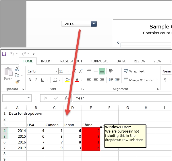
In our example, we will illustrate a simple bug and how to find its cause. Our example contains a drop-down control that populates a chart with preloaded data.

We've purposely populated the data area incorrectly ahead of time where we've accidentally forgotten to map an extra column on the row output. In reality, we won't know that the data has been incorrectly populated.
Getting ready

How to do it…

  1. Execute the dashboard. You will notice that the data looks off on the dropdown and the chart.
    How to do it…
  2. Insert a Spreadsheet Table component anywhere on the dashboard.
  3. Map the spreadsheet to the area that is populated by the data.
    How to do it…
  4. Execute the dashboard. You will see that the data looks okay. There's data under China. So let's see what the output of...
lock icon The rest of the chapter is locked
Register for a free Packt account to unlock a world of extra content!
A free Packt account unlocks extra newsletters, articles, discounted offers, and much more. Start advancing your knowledge today.
Unlock this book and the full library FREE for 7 days
Get unlimited access to 7000+ expert-authored eBooks and videos courses covering every tech area you can think of
Renews at $19.99/month. Cancel anytime
Banner background image