Search icon CANCEL
Subscription
0
Cart icon
Your Cart (0 item)
Close icon
You have no products in your basket yet
Save more on your purchases! discount-offer-chevron-icon
Savings automatically calculated. No voucher code required.
Arrow left icon
Explore Products
Best Sellers
New Releases
Books
Videos
Audiobooks
Learning Hub
Free Learning
Arrow right icon
Arrow up icon
GO TO TOP
Microsoft Power BI Quick Start Guide

You're reading from   Microsoft Power BI Quick Start Guide Bring your data to life through data modeling, visualization, digital storytelling, and more

Arrow left icon
Product type Paperback
Published in Oct 2020
Publisher Packt
ISBN-13 9781800561571
Length 296 pages
Edition 2nd Edition
Languages
Arrow right icon
Authors (4):
Arrow left icon
Bradley Schacht Bradley Schacht
Author Profile Icon Bradley Schacht
Bradley Schacht
Devin Knight Devin Knight
Author Profile Icon Devin Knight
Devin Knight
Erin Ostrowsky Erin Ostrowsky
Author Profile Icon Erin Ostrowsky
Erin Ostrowsky
Mitchell Pearson Mitchell Pearson
Author Profile Icon Mitchell Pearson
Mitchell Pearson
Arrow right icon
View More author details
Toc

Table of Contents (12) Chapters Close

Preface 1. Getting Started with Importing Data Options 2. Data Transformation Strategies FREE CHAPTER 3. Building the Data Model 4. Leveraging DAX 5. Visualizing Data 6. Digital Storytelling with Power BI 7. Using a Cloud Deployment with the Power BI Service 8. Data Cleansing in the Cloud with Dataflows 9. On-Premises Solutions with Power BI Report Server 10. Other Books You May Enjoy
11. Index

Creating new visuals

Before exploring the various visualizations available in Power BI let's look at the three ways to add visuals to the report canvas. All these methods will result in the same final product. However, depending on the type of visualization needed it may cut a few clicks off your workflow to use one method over another.

The first, and least common, method for adding a visual is using the New visual button on the ribbon. This will add a blank stacked column chart to the Report canvas at which point you can start to drag and drop fields or check the box next to a field to add it to the visual. If a stacked bar chart is not the desired visual, it can be changed by selecting a different visual from the Visualizations pane:
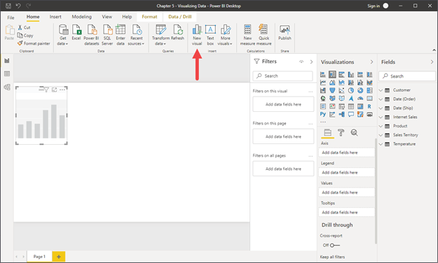
Figure 5.3: New visual button on the Home ribbon to add a blank visual

The second method for creating a new visual is starting from the Fields pane. To get started simply check the box next to a field or drag a field and drop it...

lock icon The rest of the chapter is locked
Register for a free Packt account to unlock a world of extra content!
A free Packt account unlocks extra newsletters, articles, discounted offers, and much more. Start advancing your knowledge today.
Unlock this book and the full library FREE for 7 days
Get unlimited access to 7000+ expert-authored eBooks and videos courses covering every tech area you can think of
Renews at $19.99/month. Cancel anytime
Banner background image