Building Animations with Premade Assets
To close out this first chapter, we are going to get hands-on with Animate and build a quick animation using existing assets. Animate comes loaded up with a set of static, animated, and sound assets that are accessed from the Assets panel. We can use these assets to arrange something very quickly – even without knowing how to animate with the software. We’ll also use this opportunity to configure the Animate interface and get familiar with many of its aspects.
Creating a New Document
We’ll first create a new ActionScript 3.0 document from the various presets available to us in Adobe Animate. The New Document dialog includes a series of categories containing focused sets of presets to be used. You can access this dialog by choosing File | New or by clicking the Create New button on the welcome screen.
Whichever method you choose, the New Document dialog will appear:
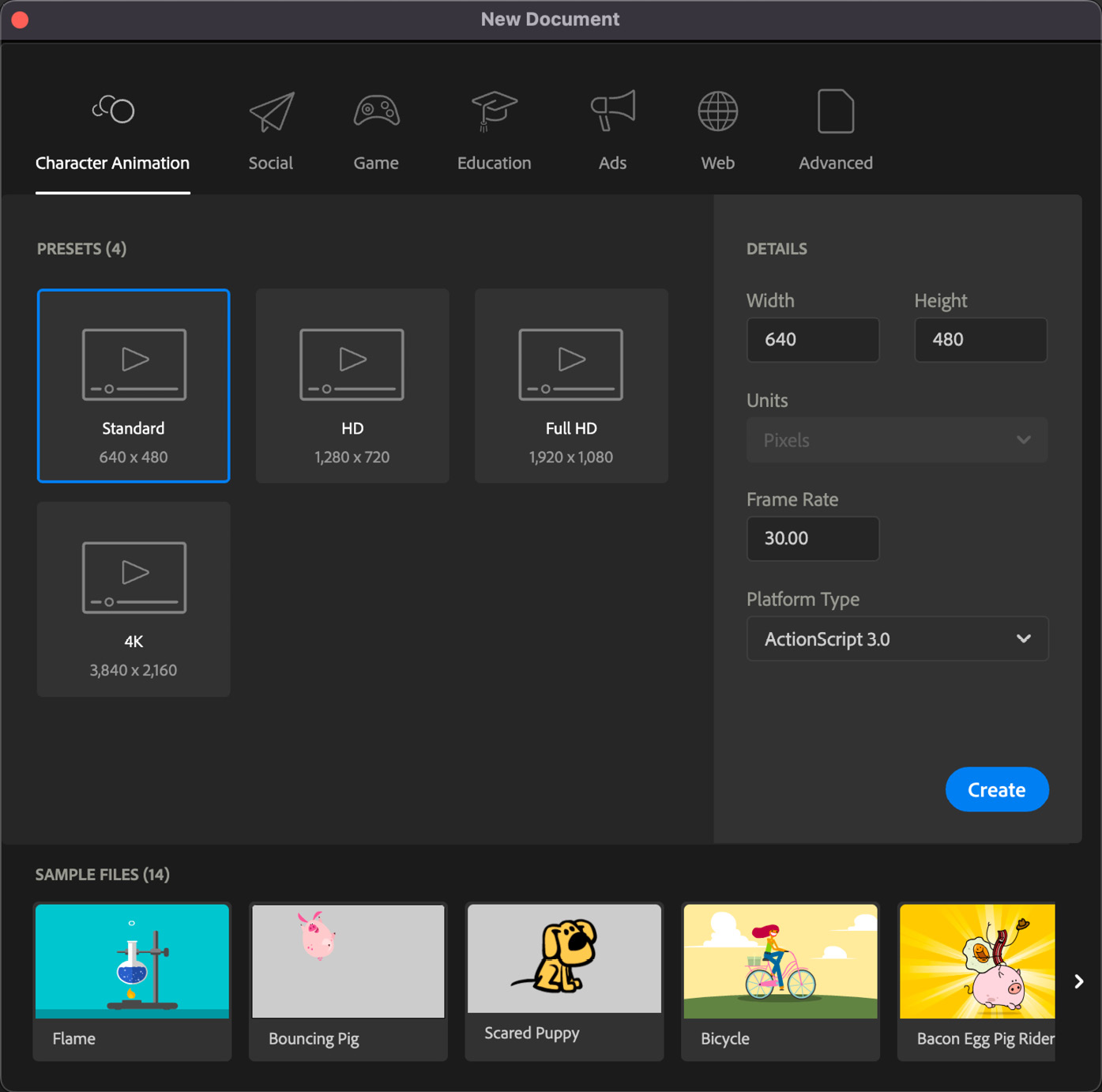
Figure 1.13 – The New Document dialog
With the New Document dialog open, we are ready to choose a preset. Along the top, you’ll find six categories: Character Animation, Social, Game, Education, Ads, Web, and Advanced. Next, follow these steps:
- Ensure that the Character Animation category is selected.
- Locate the preset named Standard and select it. It will appear highlighted with a blue border.
- The sidebar will change to display the details of our chosen preset. Note that the size of our document is
640x480, with an FPS value of30. It’s fine to adjust the Frame Rate setting if you find that the playback requires a smoother frame rate or you have too many frames for your needs, but there is no need to make any adjustments to the width and height for this exercise. - Look below the Frame Rate setting and notice that there is a Platform Type selection box. If you interact with this control, you will see two choices: the default option of ActionScript 3.0 or HTML5 Canvas. Since we are exploring native Animate features, we want to be sure that ActionScript 3.0 is selected here.
- When you are ready to create your document, click the Create button. A new document will open within Animate.
- Be sure to save your new document as
starter.flaby choosing File | Save from the application menu before moving on.
With that, our new document has been configured, saved, and is ready to be worked on:
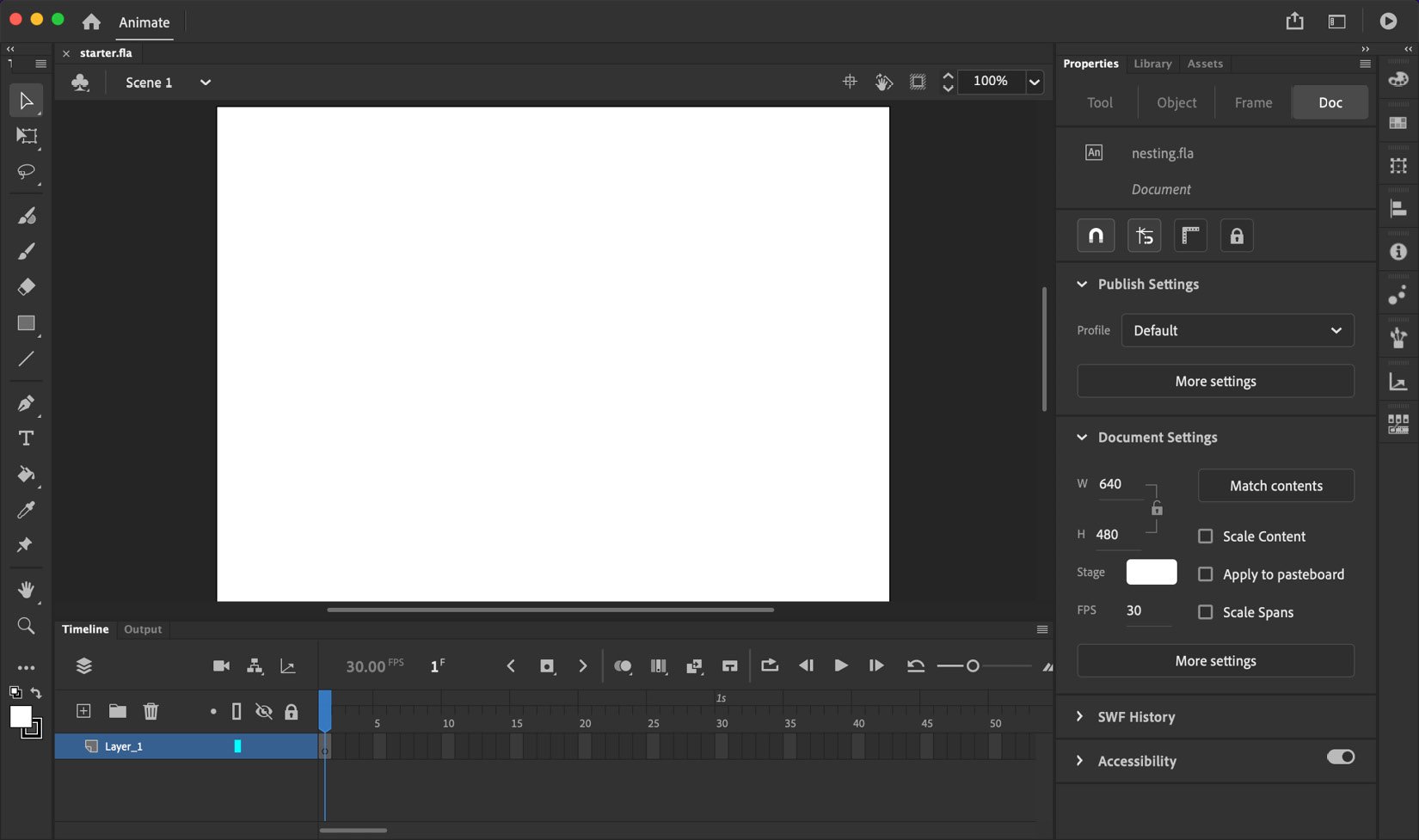
Figure 1.14 – Our newly created starter document
A quick look at the Properties panel should confirm that all of the choices we’ve made regarding the width, height, FPS, and the target platform have been preserved.
While it is absolutely true that the Animate interface can be customized to create hundreds of variants depending on specific user preferences and workflows, it is a good idea to confirm that your settings match what you will see in the figures included in this book. Let’s now ensure that this is the case.
Adjusting the User Interface
How the Adobe Animate interface appears for you, at this point, will largely depend upon a single choice made when you first run the application from a fresh install. A dialog appears before anything else and asks a simple question, New to Animate?:
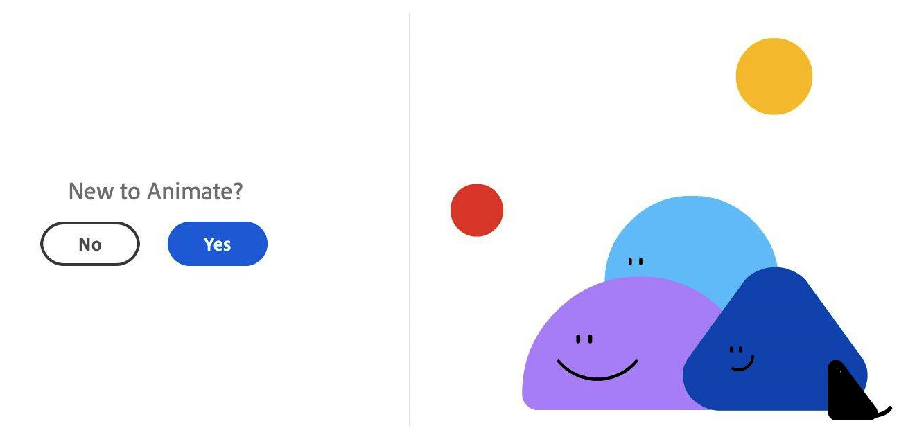
Figure 1.15 – The New to Animate? decision dialog
Answering Yes on this screen will create a default workspace within Animate that is simplified and caters to new users. Answering No will present a more traditional experience within the software.
You will either be taken to the Basic workspace with Beginner Preferences enabled or to the Essentials workspace with Expert Preferences enabled, as indicated in the following screenshot:
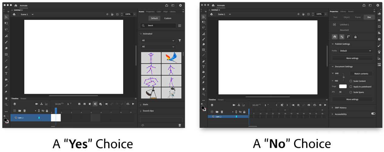
Figure 1.16 – The result of your choice
There are notable differences in the interface layouts and preferences depending upon your choice. For instance, the Basic workspace includes far fewer panels and the overall UI elements are given a Comfortable appearance. This means that the various icons, panel sections, and other elements are given a bit more space between them all. In addition, the Assets panel is given prominent placement and the Timeline view is set to Preview in Context, displaying each frame as a visual preview.
The Essentials workspace includes many more panels; in fact, it includes an entire column of additional panels along the right-hand side of the interface. The Properties panel is given prominence here and the Assets panel is grouped behind it. The UI elements are given a tighter, more Compact feel, with the icons and panel sections being given less space between them all. The Timeline view is also set to the much more traditional Standard setting, displaying keyframes rather than frame preview thumbnails.
Okay – so, what if your choice of start settings was misguided, or you simply want to switch? Don’t panic! It’s not that difficult to switch between the results you’ve been given. Again, Animate is highly customizable.
The first course of action will be to change your preferences settings. From the application menu, choose Animate | Preferences on macOS and Edit | Preferences on Windows. This will reveal a submenu, which includes the choice between Beginner Preferences or Expert Preferences. To follow along with this book and other references more closely, I suggest you switch to Expert Preferences:
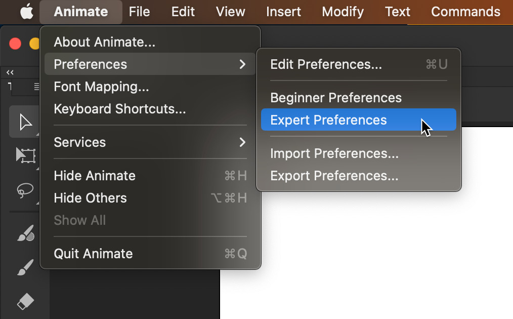
Figure 1.17 – Switching to Expert Preferences
Once you switch your preferences settings in this way, the Animate interface should conform to your chosen settings and you are likely very close to getting Animate in proper shape. There are two additional items to check though, just to be sure.
The first additional item to check is your Workspace setting. In the upper right-hand area of the Animate interface is the Workspace switcher. The icon for this looks a bit like an application window:
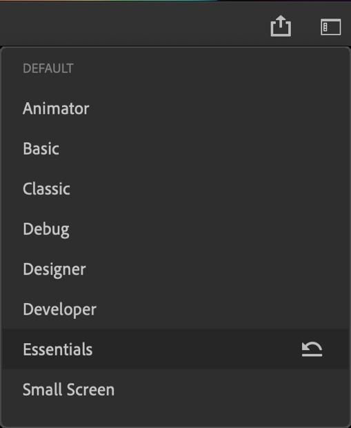
Figure 1.18 – Switching the workspace to Essentials
Clicking on this icon reveals the available workspaces you can choose from.
Tip
When working through the steps alongside this book, I recommend that you choose the Essentials workspace if it hasn’t already been chosen.
The second additional item to look for is the Timeline view setting. In the upper right-hand corner of the Timeline panel is a small icon that looks like three lines stacked atop one another:
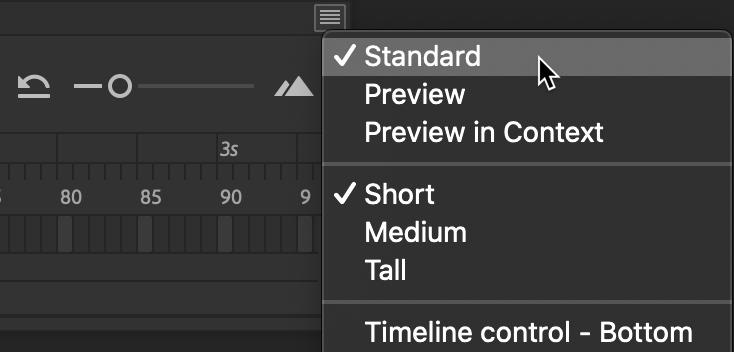
Figure 1.19 – Adjusting the Timeline view to Standard
All panels in Animate include this icon and clicking it reveals additional options for that specific panel along with a number of standard options, such as the ability to close the panel. You will want to make sure that Standard is chosen here, not Preview or Preview in Context. Additional options, such as a frame height of Short, Medium, or Tall, are left to your discretion.
Since your interface settings should now match what is shown within this book, we’ll next continue with our starter project and pull in some assets for assembly.
Assembling an Animation Using the Assets Panel
Now that we have created and saved our document and have verified and adjusted all of our preferences and workspace settings, it’s time to assemble a quick little animation using the Assets panel, the Stage, and the Timeline. Follow these steps:
- Open the Assets panel by choosing Window | Assets from the application menu:
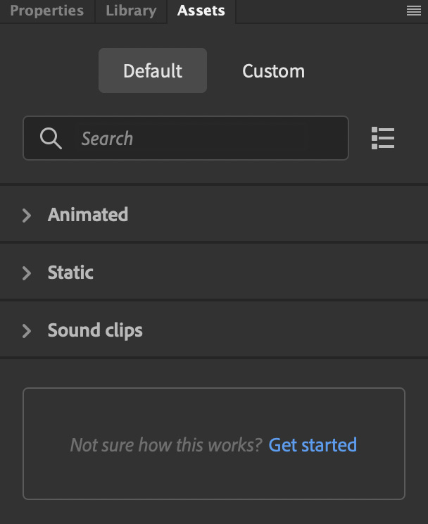
Figure 1.20 – The Assets panel
If the Assets panel is already open, it will be expanded or revealed. If it isn’t open, it will appear as a floating panel.
- Expand the Static category and select Backgrounds from the drop-down menu:
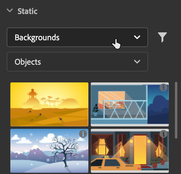
Figure 1.21 – Viewing static backgrounds
A selection of pre-designed static backgrounds will appear.
- Find a background you like and drag its thumbnail onto the Stage to place it within our document:
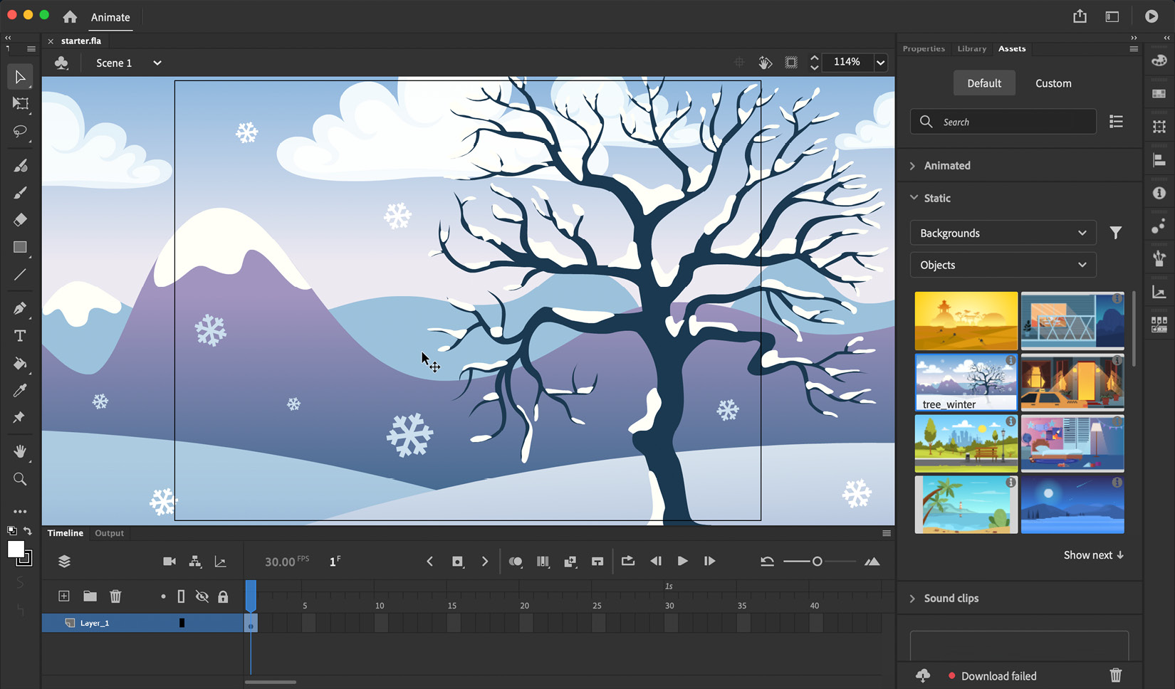
Figure 1.22 (a) – The background is placed upon the Stage
As you can see in the preceding figure, the largest visual portion of the Animate interface is the Document panel, which includes both the Stage and Pasteboard areas. Multiple documents can be opened simultaneously through a system of tabs that display the document name above this panel.
Each document also exhibits a Stage with a Pasteboard surrounding it. The Stage is effectively a viewable area through which any visual elements are displayed as you work on your project and when it is published. This is the only portion that will be visible to the viewer once a document has been published or exported. In the preceding figure, you can see a black border present, which indicates the boundary between these two elements.
Tip
You can show or hide content on the Pasteboard when working in Animate by toggling the Clip content outside the stage button at the top right of the Document panel:
_B19368.jpg)
Figure 1.22 (b) – The Clip content outside the stage button
It’s just to the left of the document-level zoom percentage.
Notice that in addition to content appearing across the Stage and Pasteboard that the Timeline also appears slightly different with the initial keyframe at frame 1 exhibiting a filled, black circle. This indicates that this keyframe has content present within it. This Timeline is where you control all of the layers within your project. They behave similarly to layers in other Adobe creative applications, such as Photoshop, in that the content of layers at the top of the layer stack will obscure content within the layers beneath. Layers can be created and managed from tools within this panel.
Let’s add another asset to our project. This time, let’s add an animated one:
- Expand the Animated category and select Characters from the drop-down menu:
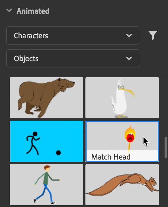
Figure 1.23 – Selecting an animated character
A selection of pre-designed animated characters will appear. Hovering over each thumbnail will display a preview of the animation.
- Locate an animated character and drag it from the Assets panel and onto the Stage.
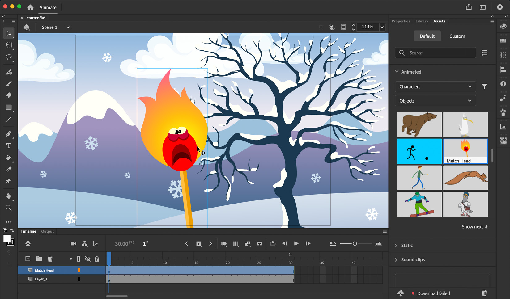
Figure 1.24 – The character is added to the stage as the timeline expands
Note that in the Timeline, an additional layer is added and now includes many more frames across time as well. More on this in a bit!
- Click the Test Movie button in the upper right of the interface to have the project playback in a native preview window.

Figure 1.25 – Performing a Test Movie preview
You can close this window whenever convenient to return to Animate.
Congratulations – you have created a simple animation by using panels, layers, and the document stage.
You will have noticed that when placing your animated character onto the Stage that a new layer is created and the frame span of both layers grows to accommodate the length of the animation. Each layer in Animate includes a number of frames that span across the timeline. These frames can be basic frames to extend the content of that layer across time, keyframes, which designate some sort of change in properties, and various types of tweens to create motion across these frames.
With our starter project complete, next we’ll look at ways to quickly share and publish your creation with the world.
Using Social Share and Quick Publish
The social share and quick publish options allow us to produce content directly to some of the most common export formats. Both are accessed from the Quick Share and Publish menu in the upper right of the Animate UI – left of both the workspace switcher and the Play Movie button:

Figure 1.26 – Quick Share and Publish appears as a box with an upward arrow emerging from it
When you click this button, you gain access to the Social share (One click social media share) and Publish (Export in multiple formats) options:
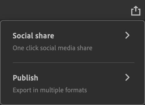
Figure 1.27 – The Social share and Publish options
Choosing Social share will bring you to the next step in that process, which presents the choice of sharing directly to Twitter or YouTube, with more social channels coming soon:
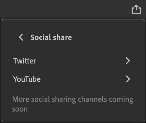
Figure 1.28 – The Social share options
Selecting either of these two options will necessitate an authentication task, which allows Animate to publish directly to the selected platform on your behalf. You only need to provide permissions once for each social network as Animate will retain this connection.
Once authenticated, Animate generates the media in a format suitable for either channel and allows the inclusion of a small message (with hashtags, of course!) before posting. After the content is successfully posted to the chosen social channel, Animate lets you know through a small confirmation dialog – at that point, the media is live.
Choosing Publish leads to some alternative choices that depend on your document’s target platform. For instance, if you’re using HTML5 Canvas as a document type, you’ll get the option to publish an MP4 video file, an animated GIF file, or a set of files compatible with HTML/JavaScript:
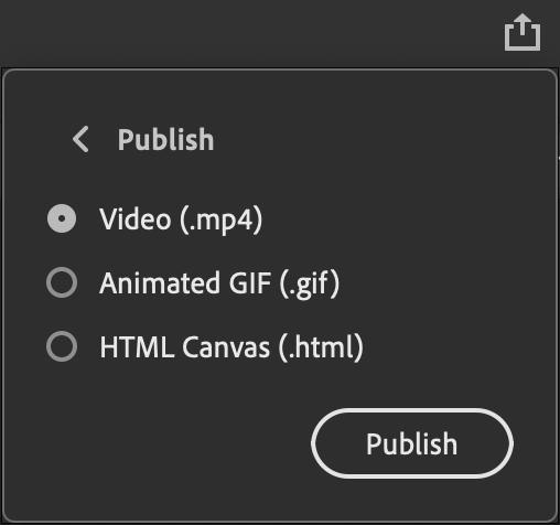
Figure 1.29 – The Quick Publish options for HTML5 Canvas
However, if working from an ActionScript 3.0 document type as we are in this chapter, you’ll be presented with the option to publish video and animated GIF files – since a .swf file is no longer appropriate for public distribution.
In this section, we explored many of the interface features of Animate through the design of a simple animation using prebuilt assets and saw how to export and publish our project quickly through the software.


