Presenting the UI Builder components tab and the sidebar
Let’s break down the components by category so that you can follow the Bubble editor as it is from top to bottom. We are going to start on the Design tab, which is the main tab you see selected when joining your Bubble editor. We are going to start with the sidebar items, making sure the UI Builder tab is selected at the top of the Visual Elements sidebar.
The Design tab and sidebar UI Builder tab are selected, as shown here:
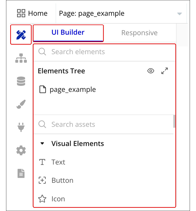
Figure 2.1: Design tab – UI Builder
Before we talk about UI components, it is important that we understand what the Elements Tree is; this is the first area on your component’s sidebar, as shown here:
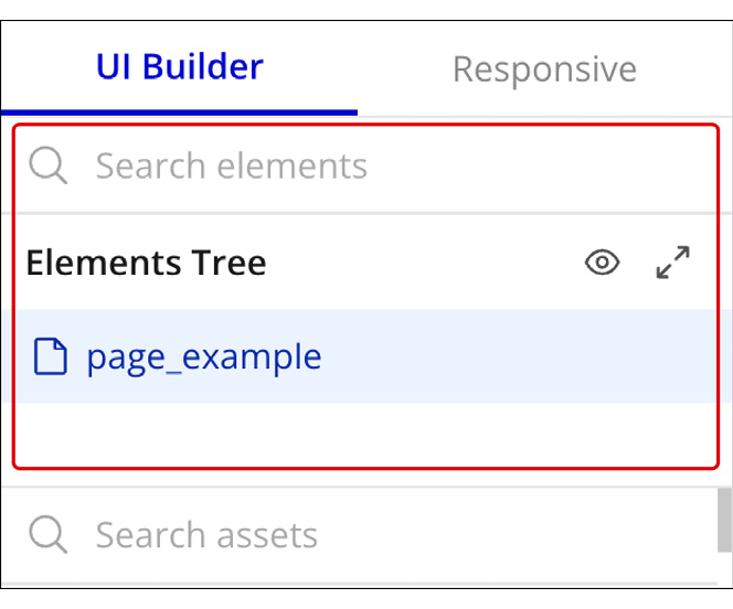
Figure 2.2: UI Builder – Elements Tree
Under the Elements Tree section, you will see each component that was applied to your page, meaning if you drag a new component to the canvas, it will show up there.
The UI Builder...


