Search icon CANCEL
Subscription
0
Cart icon
Your Cart (0 item)
Close icon
You have no products in your basket yet
Save more on your purchases! discount-offer-chevron-icon
Savings automatically calculated. No voucher code required.
Arrow left icon
Explore Products
Best Sellers
New Releases
Books
Videos
Audiobooks
Learning Hub
Free Learning
Arrow right icon
Arrow up icon
GO TO TOP
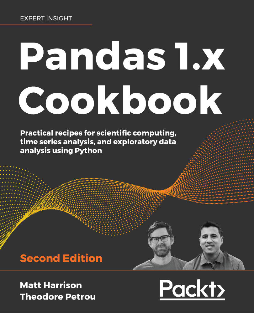
Pandas 1.x Cookbook

You're reading from   Pandas 1.x Cookbook Practical recipes for scientific computing, time series analysis, and exploratory data analysis using Python

Arrow left icon
Product type Paperback
Published in Feb 2020
Publisher Packt
ISBN-13 9781839213106
Length 626 pages
Edition 2nd Edition
Languages
Tools
Arrow right icon
Authors (2):
Arrow left icon
Theodore Petrou Theodore Petrou
Author Profile Icon Theodore Petrou
Theodore Petrou
Matthew Harrison Matthew Harrison
Author Profile Icon Matthew Harrison
Matthew Harrison
Arrow right icon
View More author details
Toc

Table of Contents (17) Chapters Close

Preface 1. Pandas Foundations 2. Essential DataFrame Operations FREE CHAPTER 3. Creating and Persisting DataFrames 4. Beginning Data Analysis 5. Exploratory Data Analysis 6. Selecting Subsets of Data 7. Filtering Rows 8. Index Alignment 9. Grouping for Aggregation, Filtration, and Transformation 10. Restructuring Data into a Tidy Form 11. Combining Pandas Objects 12. Time Series Analysis 13. Visualization with Matplotlib, Pandas, and Seaborn 14. Debugging and Testing Pandas 15. Other Books You May Enjoy
16. Index

Visualizing data with matplotlib

Matplotlib has a few dozen plotting methods that make nearly any kind of plot imaginable. Line, bar, histogram, scatter, box, violin, contour, pie, and many more plots are available as methods on the Axes object. It was only in version 1.5 (released in 2015) that matplotlib began accepting data from pandas DataFrames. Before this, data had to be passed to it from NumPy arrays or Python lists.

In this section, we will plot the annual snow levels for the Alta ski resort. The plots in this example were inspired by Trud Antzee (@Antzee_) who created similar plots of snow levels in Norway.

How to do it…

  1. Now that we know how to create axes and change their attributes, let's start visualizing data. We will read snowfall data from the Alta ski resort in Utah and visualize how much snow fell in each season:
    >>> import pandas as pd
    >>> import numpy as np
    >>> alta = pd.read_csv(&apos...
lock icon The rest of the chapter is locked
Register for a free Packt account to unlock a world of extra content!
A free Packt account unlocks extra newsletters, articles, discounted offers, and much more. Start advancing your knowledge today.
Unlock this book and the full library FREE for 7 days
Get unlimited access to 7000+ expert-authored eBooks and videos courses covering every tech area you can think of
Renews at $19.99/month. Cancel anytime
Banner background image