Modifying the Journal List screen to use a collection view
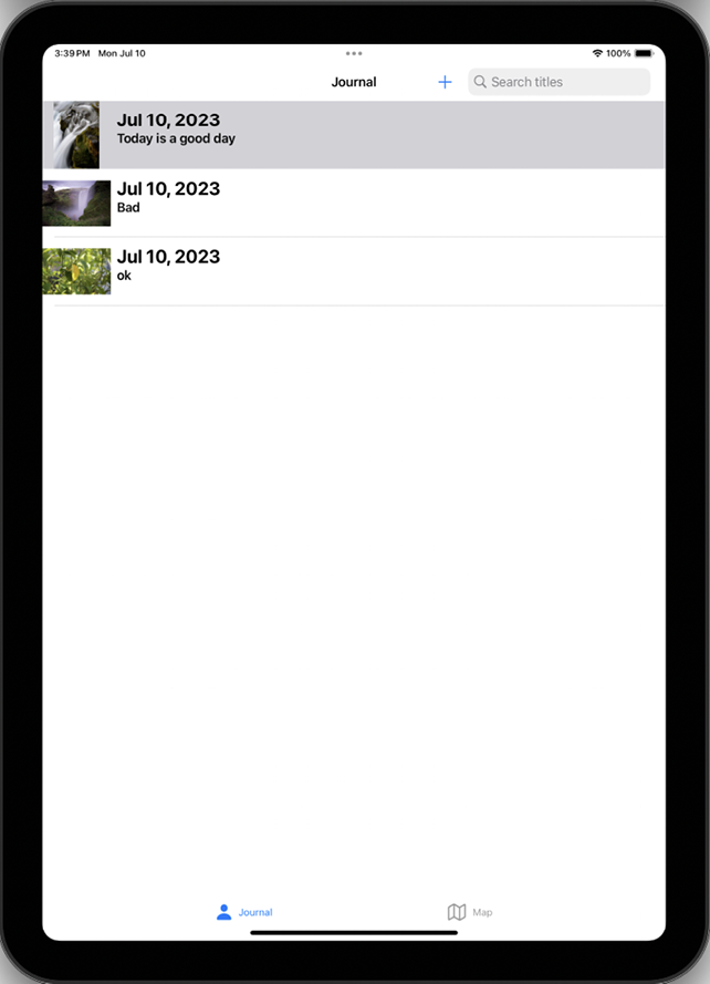
At present, the Journal List screen in the JRNL app uses a table view. A table view presents table view cells using rows arranged in a single column. This works great on an iPhone, but if you were to run the app on an iPad, you’ll see there is a lot of wasted screen space on the Journal List screen, as shown in the following figure:

Figure 22.1: Simulator showing Journal List screen containing a table view on iPad
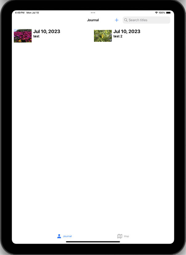
To address this, you’ll replace the table view with a collection view, which will allow you to more effectively use the available screen space, as shown in the following figure:

Figure 22.2: Simulator showing Journal List screen containing a collection view on iPad
To implement a collection view in the Journal List screen, you’ll need to do the following:
- In the
Mainstoryboard file, replace the table view in the Journal Scene with a collection view
...


