The Matplotlib figure-artist hierarchy
Everything that can be drawn in Matplotlib is called an artist. Any artist can have child artists that are also drawable. This forms the basis of a hierarchy of artist objects that Matplotlib sends to a backend for rendering. At the root of this artist tree is the figure.
In the examples so far, we have not explicitly created any figures. The pylab and pyplot interfaces will create the figures for us. However, when creating advanced interactive applications, it is highly recommended that you explicitly create your figures. You will especially want to do this if you have multiple figures being displayed at the same time. This is the entry into the OO layer of Matplotlib:
fig = plt.figure()
Canvassing the figure
The figure is, quite literally, your canvas. Its primary component is the FigureCanvas instance upon which all drawing occurs. Unless you are embedding your Matplotlib figures into a GUI application, it is very unlikely that you will need to interact with this object directly. Instead, as plotting commands are issued, artist objects are added to the canvas automatically.
While any artist can be added directly to the figure, usually only Axes objects are added. A figure can have many axes objects, typically called subplots. Much like the figure object, our examples so far have not explicitly created any axes objects to use. This is because the pylab and pyplot interfaces will also automatically create and manage axes objects for a figure if needed. For the same reason as for figures, you will want to explicitly create these objects when building your interactive applications. If an axes or a figure is not provided, then the pyplot layer will have to make assumptions about which axes or figure you mean to apply a plotting command to. While this might be fine for simple situations, these assumptions get hairy very quickly in non-trivial applications. Luckily, it is easy to create both your figure and its axes using a single command:
fig, axes = plt.subplots(2, 1) # 2x1 grid of subplots
These objects are highly advanced complex units that most developers will utilize for their plotting needs. Once placed on the figure canvas, the axes object will provide the ticks, axis labels, axes title(s), and the plotting area. An axes is an artist that manages all of its scale and coordinate transformations (for example, log scaling and polar coordinates), automated tick labeling, and automated axis limits. In addition to these responsibilities, an axes object provides a wide assortment of plotting functions. A sampling of plotting functions is as follows:
|
Function |
Description |
|---|---|
|
|
Make a bar plot |
|
|
Plot a two-dimensional field of barbs |
|
|
Make a box and whisker plot |
|
|
Plot the coherence between x and y |
|
|
Plot contours |
|
|
Plot an errorbar graph |
|
|
Make a hexagonal binning plot |
|
|
Plot a histogram |
|
|
Display an image on the axes |
|
|
Create a pseudocolor plot of a two-dimensional array |
|
|
Plot a quadrilateral mesh |
|
|
Plot a pie chart |
|
|
Plot lines and/or markers |
|
|
Plot a two-dimensional field of arrows |
|
|
Create a Sankey flow diagram |
|
|
Make a scatter plot of x versus y |
|
|
Create a stem plot |
|
|
Draw streamlines of a vector flow |
Throughout the rest of this book, we will build a single interactive application piece by piece, demonstrating concepts and features that are available through Matplotlib. This application will be a storm track editing application. Given a series of radar images, the user can circle each storm cell they see in the radar image and link those storm cells across time. The application will need the ability to save and load track data and provide the user with mechanisms to edit the data. Along the way, we will learn about Matplotlib's structure, its artists, the callback system, doing animations, and finally, embedding this application within a larger GUI application.
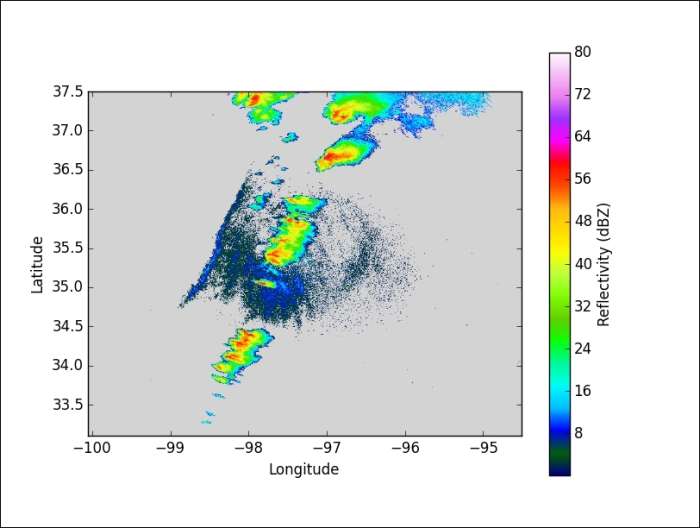
So, to begin, we first need to be able to view a radar image. There are many ways to load data into a Python program but one particular favorite among meteorologists is the Network Common Data Form (NetCDF) file. The SciPy package has built-in support for NetCDF version 3, so we will be using an hour's worth of radar reflectivity data prepared using this format from a NEXRAD site near Oklahoma City, OK on the evening of May 10, 2010, which produced numerous tornadoes and severe storms.
The NetCDF binary file is particularly nice to work with because it can hold multiple data variables in a single file, with each variable having an arbitrary number of dimensions. Furthermore, metadata can be attached to each variable and to the dataset itself, allowing you to self-document data files. This particular data file has three variables, namely Reflectivity, lat, and lon to record the radar reflectivity values and the latitude and longitude coordinates of each pixel in the reflectivity data. The reflectivity data is three-dimensional, with the first dimension as time and the other two dimensions as latitude and longitude. The following code example shows how easy it is to load this data and display the first image frame using SciPy and Matplotlib.
Code: chp1/simple_radar_viewer.py
import matplotlib.pyplot as plt
from scipy.io import netcdf_file

ncf = netcdf_file('KTLX_20100510_22Z.nc')
data = ncf.variables['Reflectivity']
lats = ncf.variables['lat']
lons = ncf.variables['lon']
i = 0

cmap = plt.get_cmap('gist_ncar')
cmap.set_under('lightgrey')

fig, ax = plt.subplots(1, 1)
im = ax.imshow(data[i], origin='lower',
               extent=(lons[0], lons[-1], lats[0], lats[-1]),
               vmin=0.1, vmax=80, cmap='gist_ncar')
cb = fig.colorbar(im)

cb.set_label('Reflectivity (dBZ)')
ax.set_xlabel('Longitude')
ax.set_ylabel('Latitude')
plt.show()
Running this script should result in a figure window that will display the first frame of our storms that we will become very familiar with over the next few chapters. The plot has a colorbar and the axes ticks label the latitudes and longitudes of our data. What is probably most important in this example is the imshow() call. Being an image, traditionally, the origin of the image data is shown in the upper-left corner and Matplotlib follows this tradition by default. However, this particular dataset was saved with its origin in the lower-left corner, so we need to state this with the origin parameter. The extent parameter is a tuple describing the data extent of the image. By default, it is assumed to be at (0, 0) and (N – 1, M – 1) for an MxN shaped image. The vmin and vmax parameters are a good way to ensure consistency of your colormap regardless of your input data. If these two parameters are not supplied, then imshow() will use the minimum and maximum of the input data to determine the colormap. This would be undesirable as we move towards displaying arbitrary frames of radar data. Finally, one can explicitly specify the colormap to use for the image. The gist_ncar colormap is very similar to the official NEXRAD colormap for radar data, so we will use it here:

Note
The gist_ncar colormap, along with some other colormaps packaged with Matplotlib such as the default jet colormap, are actually terrible for visualization. See the Choosing Colormaps page of the Matplotlib website for an explanation of why, and guidance on how to choose a better colormap.
The menagerie of artists
Whenever a plotting function is called, the input data and parameters are processed to produce new artists to represent the data. These artists are either primitives or collections thereof. They are called primitives because they represent basic drawing components such as lines, images, polygons, and text. It is with these primitives that your data can be represented as bar charts, line plots, errorbars, or any other kinds of plots.
Primitives
There are four drawing primitives in Matplotlib: Line2D, AxesImage, Patch, and Text. It is through these primitive artists that all other artist objects are derived from, and they comprise everything that can be drawn in a figure.
A Line2D object uses a list of coordinates to draw line segments in between. Typically, the individual line segments are straight, and curves can be approximated with many vertices; however, curves can be specified to draw arcs, circles, or any other Bezier-approximated curves.
An AxesImage class will take two-dimensional data and coordinates and display an image of that data with a colormap applied to it. There are actually other kinds of basic image artists available besides AxesImage, but they are typically for very special uses. AxesImage objects can be very tricky to deal with, so it is often best to use the imshow() plotting method to create and return these objects.
A Patch object is an arbitrary two-dimensional object that has a single color for its "face." A polygon object is a specific instance of the slightly more general patch. These objects have a "path" (much like a Line2D object) that specifies segments that would enclose a face with a single color. The path is known as an "edge," and can have its own color as well. Besides the Polygons that one sees for bar plots and pie charts, Patch objects are also used to create arrows, legend boxes, and the markers used in scatter plots and elsewhere.
Finally, the Text object takes a Python string, a point coordinate, and various font parameters to form the text that annotates plots. Matplotlib primarily uses TrueType fonts. It will search for fonts available on your system as well as ship with a few FreeType2 fonts, and it uses Bitstream Vera by default. Additionally, a Text object can defer to LaTeX to render its text, if desired.
While specific artist classes will have their own set of properties that make sense for the particular art object they represent, there are several common properties that can be set. The following table is a listing of some of these properties.
|
Property |
Meaning |
|---|---|
|
|
|
|
|
Color name or other color specification |
|
|
boolean to flag whether to draw the artist or not |
|
|
value of the draw order in the layering engine |
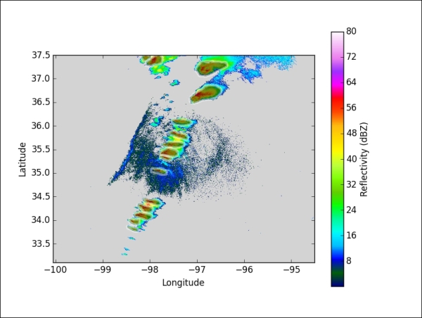
Let's extend the radar image example by loading up already saved polygons of storm cells in the tutorial.py file.
Code: chp1/simple_storm_cell_viewer.py
import matplotlib.pyplot as plt
from scipy.io import netcdf_file
from matplotlib.patches import Polygon
from tutorial import polygon_loader

ncf = netcdf_file('KTLX_20100510_22Z.nc')
data = ncf.variables['Reflectivity']
lats = ncf.variables['lat']
lons = ncf.variables['lon']
i = 0

cmap = plt.get_cmap('gist_ncar')
cmap.set_under('lightgrey')

fig, ax = plt.subplots(1, 1)
im = ax.imshow(data[i], origin='lower',
               extent=(lons[0], lons[-1], lats[0], lats[-1]),
               vmin=0.1, vmax=80, cmap='gist_ncar')
cb = fig.colorbar(im)

polygons = polygon_loader('polygons.shp')
for poly in polygons[i]:
    p = Polygon(poly, lw=3, fc='k', ec='w', alpha=0.45)
    ax.add_artist(p)
cb.set_label("Reflectivity (dBZ)")
ax.set_xlabel("Longitude")
ax.set_ylabel("Latitude")
plt.show()
The polygon data returned from polygon_loader() is a dictionary of lists keyed by a frame index. The list contains Nx2 numpy arrays of vertex coordinates in longitude and latitude. The vertices form the outline of a storm cell. The Polygon constructor, like all other artist objects, takes many optional keyword arguments. First, lw is short for linewidth, (referring to the outline of the polygon), which we specify to be three points wide. Next is fc, which is short for facecolor, and is set to black ('k'). This is the color of the filled-in region of the polygon. Then edgecolor (ec) is set to white ('w') to help the polygons stand out against a dark background. Finally, we set the alpha argument to be slightly less than half to make the polygon fairly transparent so that one can still see the reflectivity data beneath the polygons.

Note a particular difference between how we plotted the image using imshow() and how we plotted the polygons using polygon artists. For polygons, we called a constructor and then explicitly called ax.add_artist() to add each polygon instance as a child of the axes. Meanwhile, imshow() is a plotting function that will do all of the hard work in validating the inputs, building the AxesImage instance, making all necessary modifications to the axes instance (such as setting the limits and aspect ratio), and most importantly, adding the artist object to the axes. Finally, all plotting functions in Matplotlib return artists or a list of artist objects that it creates. In most cases, you will not need to save this return value in a variable because there is nothing else to do with them. In this case, we only needed the returned AxesImage so that we could pass it to the fig.colorbar() method. This is so that it would know what to base the colorbar upon.
The plotting functions in Matplotlib exist to provide convenience and simplicity to what can often be very tricky to get right by yourself. They are not magic! They use the same OO interface that is accessible to application developers. Therefore, anyone can write their own plotting functions to make complicated plots easier to perform.
Collections
Any artist that has child artists (such as a figure or an axes) is called a container. A special kind of container in Matplotlib is called a Collection. A collection usually contains a list of primitives of the same kind that should all be treated similarly. For example, a CircleCollection would have a list of Circle objects, all with the same color, size, and edge width. Individual values for artists in the collection can also be set. A collection makes management of many artists easier. This becomes especially important when considering the number of artist objects that may be needed for scatter plots, bar charts, or any other kind of plot or diagram.
Some collections are not just simply a list of primitives, but are artists in their own right. These special kinds of collections take advantage of various optimizations that can be assumed when rendering similar or identical things. RegularPolyCollection, for example, just needs to know the points of a single polygon relative to its center (such as a star or box) and then just needs a list of all the center coordinates, avoiding the need to store all the vertices of every polygon in its collection in memory.
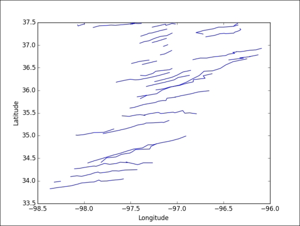
In the following example, we will display storm tracks as LineCollection. Note that instead of using ax.add_artist() (which would work), we will use ax.add_collection() instead. This has the added benefit of performing special handling on the object to determine its bounding box so that the axes object can incorporate the limits of this collection with any other plotted objects to automatically set its own limits which we trigger with the ax.autoscale(True) call.
Code: chp1/linecoll_track_viewer.py
import matplotlib.pyplot as plt
from matplotlib.collections import LineCollection
from tutorial import track_loader

tracks = track_loader('polygons.shp')
# Filter out non-tracks (unassociated polygons given trackID of -9)
tracks = {tid: t for tid, t in tracks.items() if tid != -9}

fig, ax = plt.subplots(1, 1)
lc = LineCollection(tracks.values(), color='b')
ax.add_collection(lc)
ax.autoscale(True)
ax.set_xlabel("Longitude")
ax.set_ylabel("Latitude")
plt.show()
Much easier than the radar images, Matplotlib took care of all the limit setting automatically. Such features are extremely useful for writing generic applications that do not wish to concern themselves with such details. We will come back to the handling of LineCollections later in the book as we develop this application.


