Search icon CANCEL
Subscription
0
Cart icon
Your Cart (0 item)
Close icon
You have no products in your basket yet
Save more on your purchases! discount-offer-chevron-icon
Savings automatically calculated. No voucher code required.
Arrow left icon
Explore Products
Best Sellers
New Releases
Books
Videos
Audiobooks
Learning Hub
Free Learning
Arrow right icon
Arrow up icon
GO TO TOP
SAP BusinessObjects Dashboards 4.1 Cookbook

You're reading from   SAP BusinessObjects Dashboards 4.1 Cookbook Over 100 simple and incredibly effective recipes to help transform your static business data into exciting dashboards filled with dynamic charts and graphics

Arrow left icon
Product type Paperback
Published in Mar 2015
Publisher
ISBN-13 9781784391959
Length 452 pages
Edition 1st Edition
Concepts
Arrow right icon
Toc

Table of Contents (17) Chapters Close

Preface 1. Staying in Control FREE CHAPTER 2. Data Visualization 3. From a Static to an Interactive Dashboard 4. Dynamic Visibility 5. Using Alerts 6. Advanced Components 7. Dashboard Look and Feel 8. Dashboard Data Connectivity 9. Exporting and Publishing 10. Top Third-party Add-ons 11. Performance Tuning 12. Increasing Productivity A. Real-world Dashboard Case Studies B. Additional Resources – Supported Excel Functions and System/Software Requirements C. The Future of Dashboarding with SAP Design Studio Index

Using Filtered Rows


Filtered Rows was one of the greatest additions to Xcelsius 2008 (now SAP BusinessObjects Dashboards 4.1) from Xcelsius 4.5. If we look at the following screenshot, we see that we have a set of Sales metrics that are grouped by Region and Office:
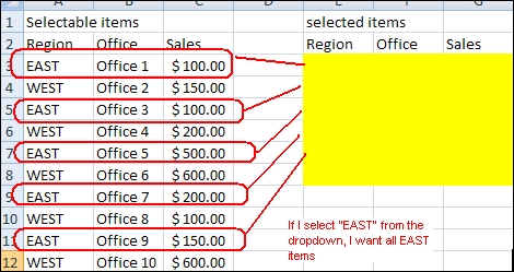
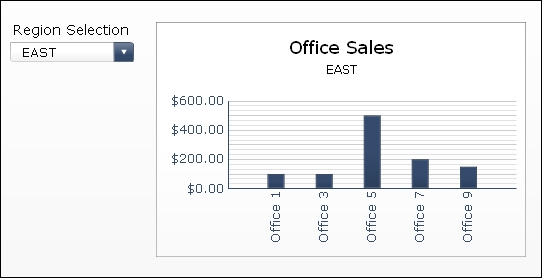
Let's say we want to be able to select a region and show a sales comparison chart between the different sales offices of that region. Before the advent of Filtered Rows, we would have had to perform a complex VLOOKUP or have the result come back through a query every time a region was selected. Both methods are very time consuming.
How to do it...

  1. We will use a Combo Box selector to choose the desired region.

  2. In the Combo Box selector properties, bind the Labels to the Region column.

  3. Select Filtered Rows as the Insertion Type. Bind Source Data to cells A3:C12. The Destination will contain the chart values as well as the selected region.

  4. Bind the chart values to the Destination section from step 3.

How it works...

The Filtered Rows insertion...

lock icon The rest of the chapter is locked
Register for a free Packt account to unlock a world of extra content!
A free Packt account unlocks extra newsletters, articles, discounted offers, and much more. Start advancing your knowledge today.
Unlock this book and the full library FREE for 7 days
Get unlimited access to 7000+ expert-authored eBooks and videos courses covering every tech area you can think of
Renews at $19.99/month. Cancel anytime
Banner background image